
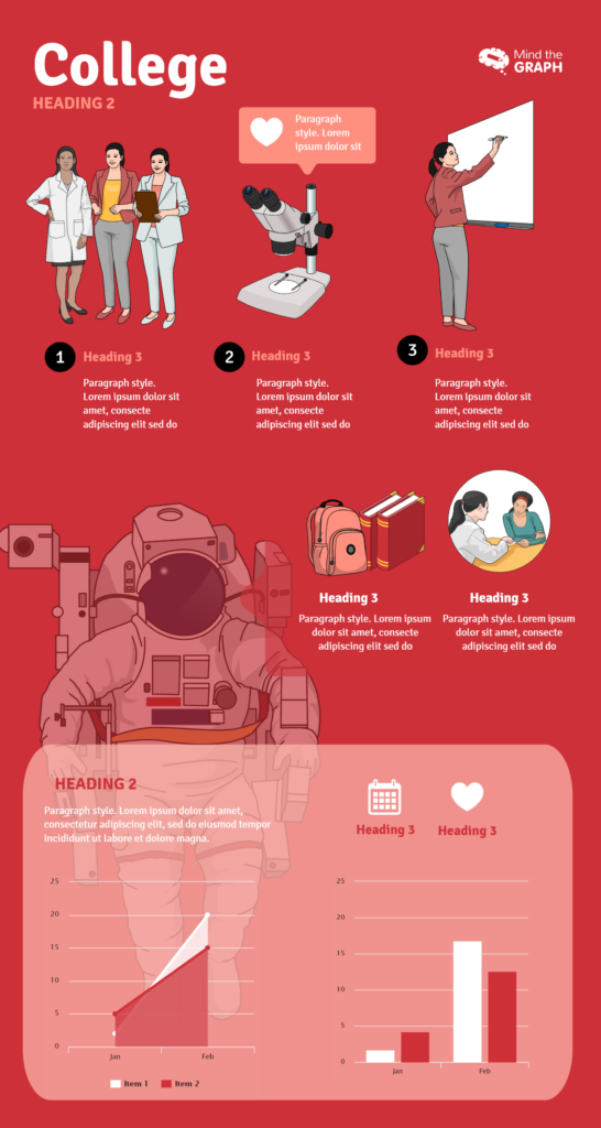
Det er derfor vi bruker infografikk.
En bransjerapport for 2019 publisert av den internasjonale søkemotoren for høyere utdanning educations.com fant at infografikk spiller en stor rolle i studentenes beslutning om valg av høyskole eller universitet. I følge rapporten, det er 105% mer sannsynlig at studenter siterer infografikk as an influence when choosing one university over another. When deciding between two or more programs, students are 75% more likely to rate infographics as highly important. This proves that visual information like infographics is gaining influence.Presentere informasjon med bilder og interessant grafikk fanger lesernes oppmerksomhet mer effektivt enn tekst alene. Students quickly skimming a university website for quick stats and facts about the school or program are more likely to spend time reading an infographic than stand-alone text or statistics. Besides the scientific evidence behind information consumption, why are students increasingly drawn to infographics when making important decisions in their academic careers?
-
Sammenlign statistikk på en enkel måte
Choosing a college or university is about more than the feeling a student gets from walking across its campus. There are many statistical variables to compare between schools or even between programs. For example:
- Hvor finnes de beste programmene innen deres interessefelt?
- Hvis de er ute etter en liten liberal arts-skole, hvor mange studenter går på universitetet?
- Hvor stor andel av studentene er internasjonale?
- Hvor mange menn og kvinner er det blant studentene?
- Hvor stor prosentandel av de som studerer programmet har fått jobb innen det aktuelle fagområdet?
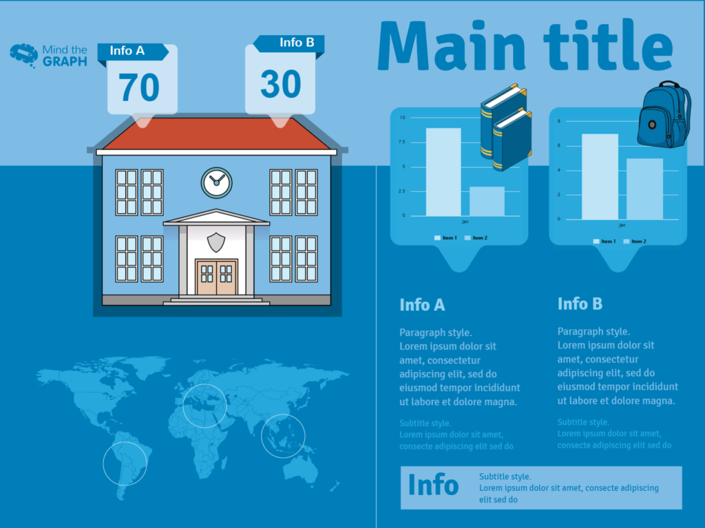
En infografikk kan vise all denne statistikken! Du kan bruke et verdenskart for å illustrere hvor du finner de beste skolene for medisin. Grafer som kakediagrammer kan også illustrere studentdemografien, mens søylediagrammer kan illustrere hvor stor sjanse du har for å få drømmejobben med en universitetsgrad. Alle disse faktaene og statistikkene kan se ganske intetsigende ut når de listes opp numerisk, men de kan komme til liv med noen få grafiske elementer! Å kunne visualisere forskjellene mellom skolene kan hjelpe elevene til å se en klar vinner.
-
Spar verdifull tid
På grunn av det store antallet statistikker som skal sammenlignes, eller kanskje fordi studenten sammenligner en rekke ulike skoler eller programmer, kan det ta lang tid å ta en beslutning om høyere utdanning. Derfor er ethvert verktøy som sparer studentene for tid, verdifullt. Når du viser dataene ved hjelp av infografikk, er det ofte tilstrekkelig med et raskt blikk for å gi studenten en god oversikt over skolen eller programmet. Tidligere måtte potensielle studenter bla seg gjennom sider med tekst for å få tak i den viktigste informasjonen om en skole. For å spare studentene for tid og krefter kan du presentere informasjonen på en oversiktlig måte ved hjelp av infografikk.
-
Engasjer deg i innholdet
I motsetning til tradisjonelt skriftlig innhold, oppmuntrer grafiske fremstillinger leserne til å samhandle og engasjere seg i informasjonen som presenteres. Det forvandler forbrukeren fra en passiv leser til en aktiv deltaker, og gjør dermed informasjonen mer minneverdig. Å formidle universitetsstatistikk i en infografikk har den ekstra fordelen at det gir merkevaregjenkjennelse. Informasjonen må feste seg i studentens minne. En infografikk som bruker skolens farger og leker med temaer som maskoten eller landemerket, kan gjøre det. Visuelt engasjerende informasjon gjør inntrykk.
Det er tydelig hvorfor så mange studenter stoler på infografikk når de skal ta viktige beslutninger i sin akademiske karriere. Infografikk hjelper studentene med å sammenligne skole- og programstatistikk, enkelt se og fordøye informasjonen og engasjere seg fullt ut i fakta. Konklusjonen er at infografikk har en lys fremtid innen akademia.
Bildene og malene som er brukt i dette innlegget, er fra Mind the Graph. Gjør et forsøk!
Forfatterens biografi
Keely Witherow er skribent for findcourses.com og educations.com, nettsteder som hjelper folk med å finne den beste utdanningen for dem. Hun har studert ved skoler i USA, Frankrike og Sverige, og vet hvor stor betydning utdanningen din har for livet ditt. Følg henne på LinkedIn hvis du deler hennes lidenskap for bedrifts- og studentutdanning!


Abonner på nyhetsbrevet vårt
Eksklusivt innhold av høy kvalitet om effektiv visuell
kommunikasjon innen vitenskap.