
That’s why we are using infographics.
A 2019 industry report published by international higher education search engine educations.com found that infographics play a huge role in a student’s decision on a college or university. According to the report, students are 105% more likely to cite infographics as an influence when choosing one university over another. When deciding between two or more programs, students are 75% more likely to rate infographics as highly important. This proves that visual information like infographics is gaining influence.Presenting information with images and interesting graphics grabs readers’ attention more effectively than text alone. Students quickly skimming a university website for quick stats and facts about the school or program are more likely to spend time reading an infographic than stand-alone text or statistics. Besides the scientific evidence behind information consumption, why are students increasingly drawn to infographics when making important decisions in their academic careers?
-
Easily compare statistics
Choosing a college or university is about more than the feeling a student gets from walking across its campus. There are many statistical variables to compare between schools or even between programs. For example:
- Where are the best programs in their field of interest located?
- If they’re looking for a small liberal arts school, how many students attend the university?
- What percentage of students are international?
- What’s the male to female ratio of the student body?
- What percentage of people studying the program have gotten a job in the corresponding field?
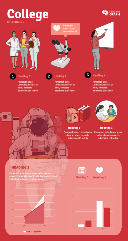
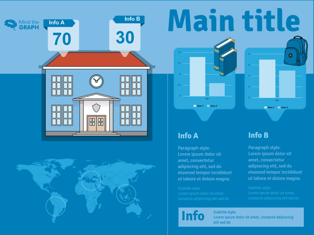
An infographic can show all these statistics! You can use a world map to illustrate where to find the best schools for medicine. Also, graphs like pie charts can illustrate student demographics, while bar charts can illustrate your higher chance of attaining your dream job with a university degree. These facts and statistics can all look fairly bland when listed numerically, but can come to life with a few graphics! Being able to visualize the differences between schools can help students see a clear winner.
-
Save valuable time
Due to the sheer number of statistics to compare, or maybe because the student is comparing a variety of schools or programs, a decision about higher education can take a long time. That’s why any tool that saves students time is valuable. When you display the data using infographics, a cursory glance is often sufficient to provide the student with a good overview of the school or program. In the past, prospective students waded through pages of text to collect the most important information about a school. To save students time and effort you can present the information clearly using infographics.
-
Engage with the content
Unlike traditional written content, graphic representations encourage readers to interact and engage with the presented information. It transforms the consumer from a passive reader to an active participant, thereby making the information more memorable. Communicating university statistics in an infographic has the added benefit of brand recognition. The information needs to stick in the student’s memory. An infographic that uses the school’s colors and plays with themes like its mascot or landmark can do that. Visually engaging information makes an impact.
It’s clear why so many students are relying on infographics to make important decisions in their academic career. Infographics help students compare school and program statistics, easily view and digest the information, and engage fully with the facts. In conclusion, the future of infographics in the field of academia looks bright.
The images and templates used on this post are from Mind the Graph. Give it a try!
Author bio
Keely Witherow is a writer for findcourses.com and educations.com, sites dedicated to helping people find the best education for them. An alumnus of schools in the United States, France, and Sweden, she knows the important impact your education has on your life. Follow her on LinkedIn if you share her passion for corporate and student education!


Subscribe to our newsletter
Exclusive high quality content about effective visual
communication in science.