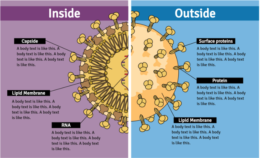
A timeline infographic is a good option if you want to show a methodology step-by-step […]
Hi there! As you may know, Friday is the day to share the new scientific […]
Students looking for a higher education institution would probably all use the same word to […]
Hi there! As you may know, friday is the day to share the new scientific […]
Como você sabe, todas as sextas-feiras compartilhamos as novas ilustrações que adicionamos no Mind the […]
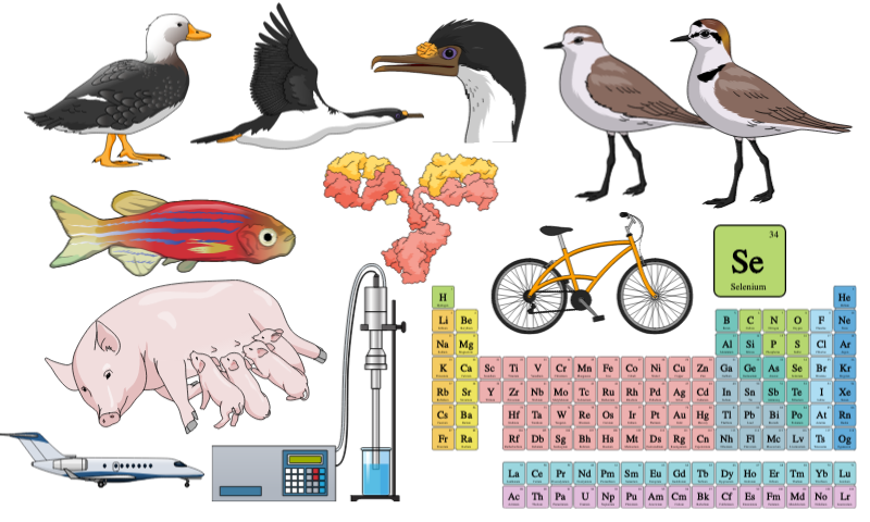
It is time to show the new Mind the Graph scientific illustrations. As you know, […]
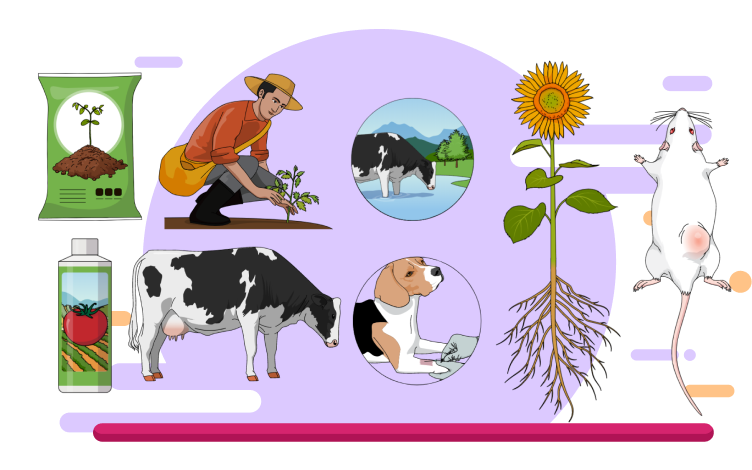
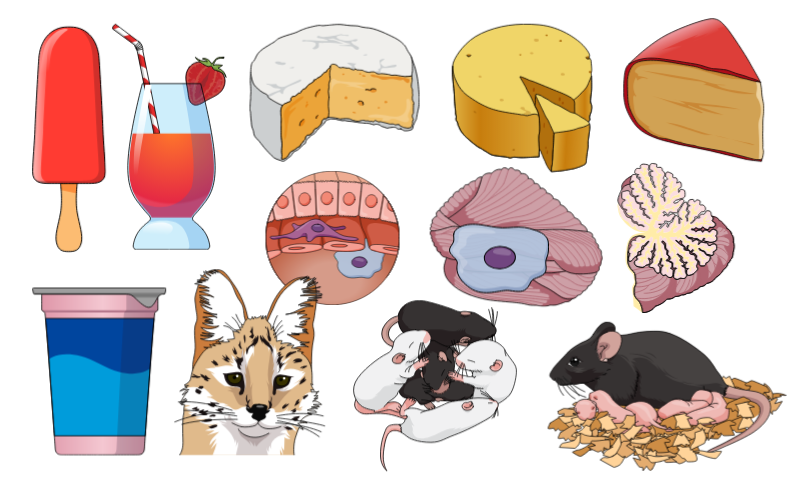
It is common to use two or three different species in a experiment. Besides that, […]
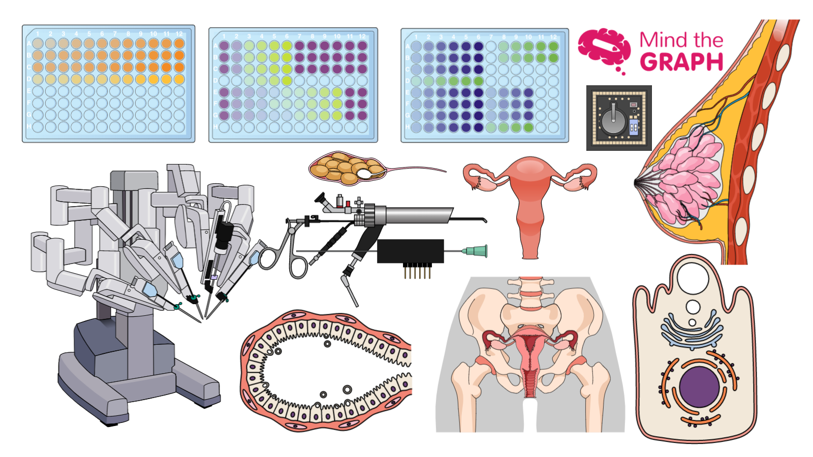
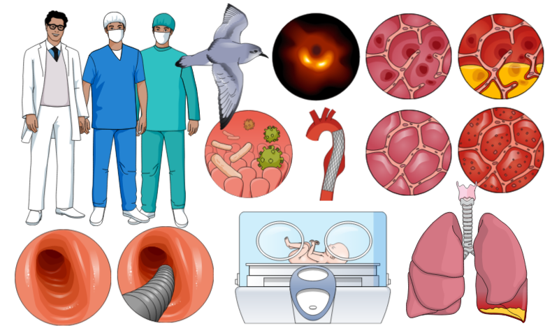
As you know, every week we add new scientific illustrations to our library on Mind […]
As you know, every week we add new scientific illustrations to our library in Mind […]
Como você sabe, adicionamos novas ilustrações científicas todas as semanas no Mind the Graph. Assim, […]