I wanna use medical scientific illustrations from Mind the Graph. How can I do that? […]
Hi there! I am writing to bring you good news: We have a lot of […]
Hi there! As you may know, friday is the day to share the new scientific […]
Hello again! As you may know, every week we add new illustrations to our library. […]
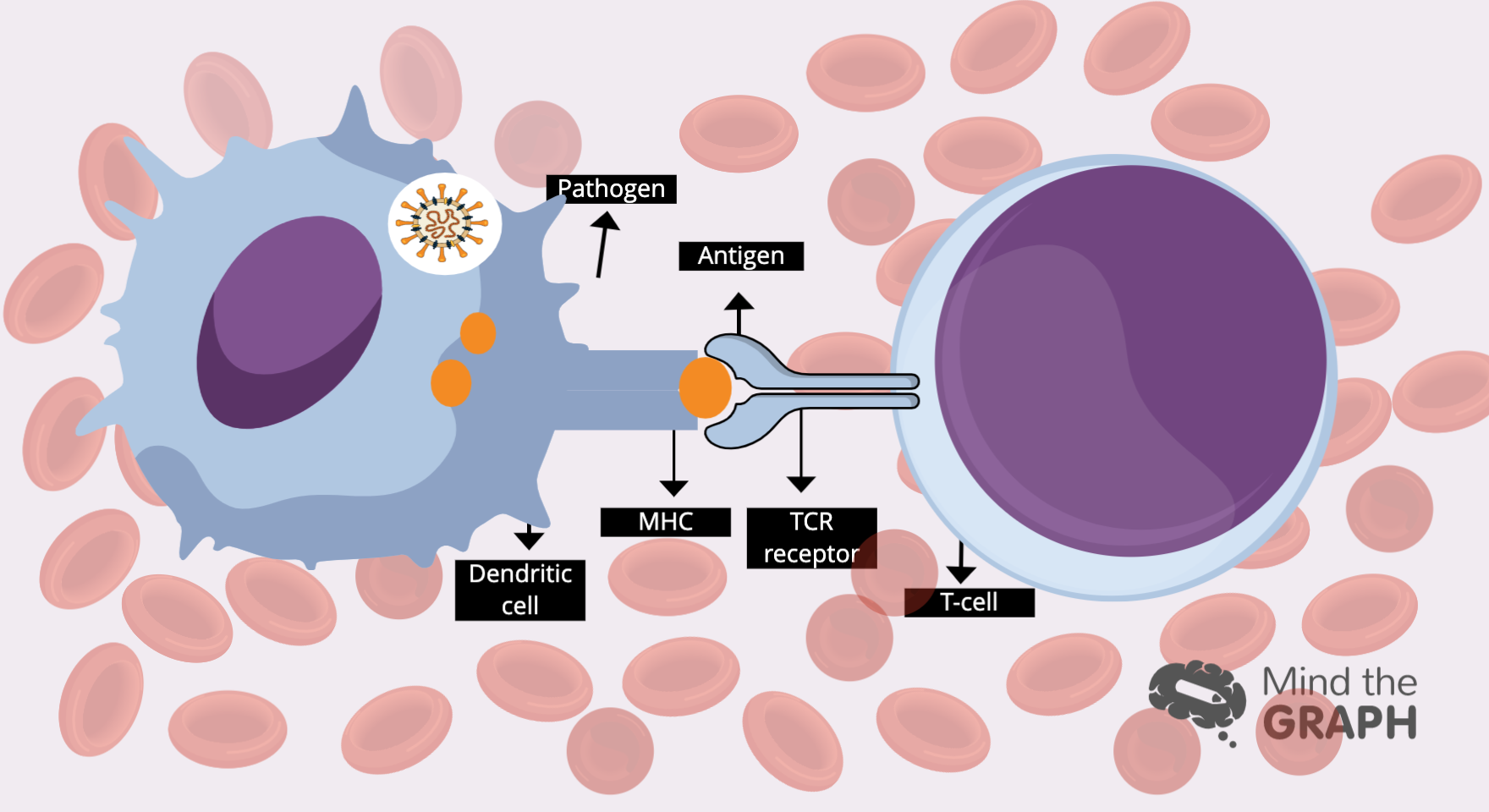
Os glóbulos brancos são responsáveis por defender nosso corpo contra ameaças, mantendo-nos vivos. Mas como […]
Hello there. Are you ready to see the best scientific illustrations of the week? As […]
Hi there! Are you ready to see the new scientific illustrations? We have a lot […]
We can see the immensity of rainforests looking at pictures of the tree tops take […]
Hi there! We have new scientific illustrations for you! Every friday we show waht is […]
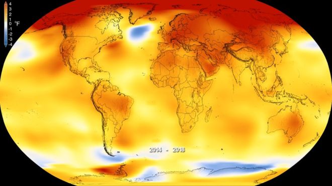
Climate change is being a controversial subject these days. We can see all over social […]