Mind the Graph Blog
  • Infographic maker
  • How it works
  • Tutorials
  • Portfolio
Mind the Graph Blog

#9 Scientific illustrations of the week: What is new for you

Fabiola Soares Portfolio April 5, 2019
As you know, every week we add new scientific illustrations to our library in Mind the Graph. We have over eight thousands illustrations now and all them are available to all mind the graph users. Most of our illustrations are…Read more
wave

#8 Scientific illustrations of the week: What is new for you – Mind The Graph

Fabiola Soares Portfolio March 29, 2019
As you know, we add new scientific illustrations every week in Mind the Graph. Thus, today I will show the new illustrations of the week. We already have a library with thousands of scientific illustrations available for all our users.…Read more
wave

#6 Scientific illustrations of the week: What is new for you – Mind The Graph

Fabiola Soares Portfolio March 15, 2019
As you know, we add new scientific illustrations every week in Mind the Graph. We already have a library with thousands of illustrations and couting. You can use our illustrations to create new graphical abstracts, presentations and infographics. This week…Read more
wave

#5 Scientific illustrations of the week: What is new for you

Fabiola Soares Portfolio March 8, 2019
Hello! As you know, we add new scientific illustrations every week in Mind the Graph. We already have a library with thousands illustrations and couting. We make new illustrations based on our users requests so, if you are a subscriber…Read more
wave

#3 Scientific illustrations of the week: What is new for you

Fabiola Soares Portfolio February 22, 2019
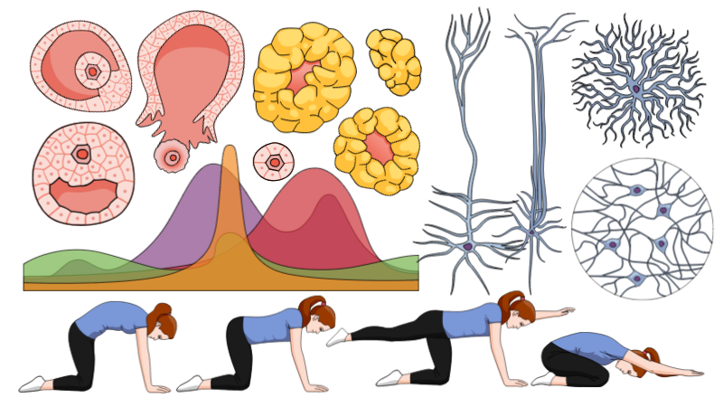
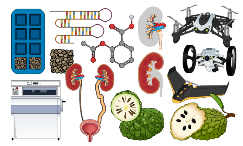
It’s time to show you the new scientific illustrations that we created this week. Every week we publish a post to show what is new in Mind the graph. Take a look at the illustrations of the week and enjoy…Read more
wave

Infographic maker for scientists: Your scientific field is included

Fabiola Soares Portfolio September 22, 2018
Sometimes, I receive e-mails from scientists, engineers, teachers and other professionals saying: Oh, I love Mind the Graph, but is only for life scientists. Indeed, this is a common mistake. Initially, we focused on biological and medical illustrations, but we…Read more
wave

How to make an infographic #3: Matching your data with the right infographic

Fabiola Soares Infographic, Tutorials March 19, 2018
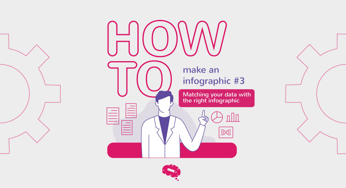
This is the third post of the series How to make an infographic. If you missed the last post, you can read it here. Now you know your burning problem, the main question of your research and also have the…Read more
wave

Sales infographics: beyond the life sciences

Fabiola Soares Design September 10, 2016
Sometimes, I receive e-mails from scientists, engineers, teatchers and other professionals saying: Oh, I love Mind the Graph, but is only for life scientists. This is a common mistake. Initially, we focused on biological and medical illustrations, but we are…Read more
wave

What is Mind the Graph? Free infographic maker for science

Fabricio Pamplona Tools October 20, 2015
You never saw a free infographic maker like this one. Mind the Graph has everything you need to create stunning presentations, banner, posters and graphical abstracts. It’s way better infographic maker than Canva or Piktochart, when it comes to scientific…Read more
wave

Free infographic maker featured in Portugal !

Fabricio Pamplona Tools September 28, 2015
This was a great surprise for us. The blog FCiencias from Portugal, posted a video showing how they created an infographic with the Mind the Graph free infographic maker. They are from the area of health and used some data…Read more
wave
  • 1
  • 2

Create beautiful scientific
infographics with no effort

We turn scientists into designers to boost your impact. Globally.

Try for free
TRUSTED BY
© 2019, Gutentim. All Rights Reserved