Mind the Graph Blog
  • Infographic maker
  • How it works
  • Tutorials
  • Portfolio
Mind the Graph Blog

Why students are using infographics to find the right school?

Fabiola Soares Trends February 10, 2020
 Students looking for a higher education institution would probably all use the same word to describe the experience: overwhelming. There are endless factors to consider when selecting a school: rankings, graduate outcomes, student demographics, faculty members, available programs and courses,…Read more
wave

How to make an infographic #7 A challenge to summarize

Fabiola Soares Infographic, Tutorials April 4, 2018
This is the seventh post in the series  How to make an infographic. If you missed the last post, you can read it here. I know, as a scientists we often have lots of content to show. Which makes very difficult the process of create…Read more
wave

How to make an infographic #6 06 Mistakes to avoid

Fabiola Soares Infographic, Tutorials March 25, 2018
how to make an infographic
This is the sixth post in the series  How to make an infographic. If you missed the last post, you can read it here. If you are reading this text, you are probably  following our series of tutorials How to…Read more
wave

Data visualization: You must learn this language!

Fabricio Pamplona Data Visualization January 21, 2016
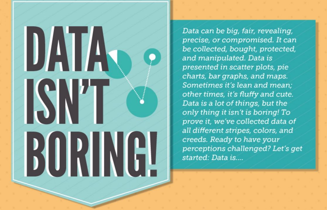
For a long time doing science meant having great insights about nature mechanisms. As it developed, the need to register occurrences and patterns boosted new analysis and complex algorithms. However, it also made science only for a few people. In…Read more
wave

The beauty of data visualization

Fabricio Pamplona Inspiration October 25, 2015
This TED talk was the beggining of everything for me. David McCandless, this genious of data visualization was my first contact with data visualization and I really recommend it to everyone interest in the topic. Just a necessary warning: YOU…Read more
wave

Health statistics in a cool way (data visualization)

Fabricio Pamplona Infographic September 25, 2015
Hans Rosling is a researcher from the Karolinska Institute (Sweden) and founder of a startup company on information design and data visualization. The name of the company is GapMinder and they created a software called Trendalyzer. It’s very very cool…Read more
wave

Create beautiful scientific
infographics with no effort

We turn scientists into designers to boost your impact. Globally.

Try for free
TRUSTED BY
© 2019, Gutentim. All Rights Reserved