
For a long time doing science meant having great insights about nature mechanisms. As it developed, the need to register occurrences and patterns boosted new analysis and complex algorithms. However, it also made science only for a few people.
In parallel, the world was spinning to a different direction. While the internet dove the world into an endless updated web, science was building up its secret club of specialists.
It was only a couple years ago that scientists felt the need to expose their findings in order to achieve the general public.
The problem was: the gap was so wide that only scientists would get interested in science.
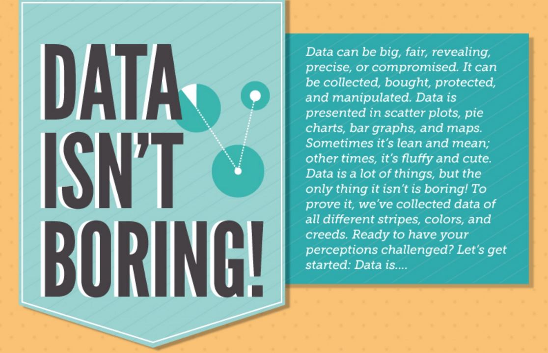
And even worse, only scientists would understand the scientific language. For the general public, “data” was a meaningless word. It was unaccountable, empty and by all means, boring.
The challenge was big: how to make people interested in science?
And the answer was clear: people have to understand the scientific language.
The scientific language we are talking about is also known as data visualization.
Data visualization is making information visual. It means presenting your work in a way that other people will be able to understand and make connections. With that in mind, the next step was to find out how to make data visualization successfully.
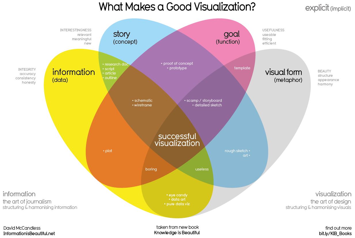
To make data visualization successfully is to present relevant information in a logic and engaging way. It is important to realize that for a person who has always spoken the scientific language, data visualization may not come easily.
For that purpose, science and design make a perfect couple.
While science provides information and a goal, design provides visual form and a story. Combined, they deliver data visualization as it should be.
Many people mix the idea of data visualization with adding any visual matter. You can work around this problem by asking yourself: what is the best way to present my findings? Would they be best explained using an illustration or a text? What about an infographic? Or a graph?
Deciding how to communicate your work is a major step in data visualization.
Once you get it done, how about taking the second step?


Subscribe to our newsletter
Exclusive high quality content about effective visual
communication in science.