Science Drawing and Scientific Illustration: Why They Are Essential for Effective Research Communication
Why Science Drawings Matter More Than Ever in Research In today’s fast-paced scientific landscape, publishing […]
Why Science Drawings Matter More Than Ever in Research In today’s fast-paced scientific landscape, publishing […]
Discover the power of SciComm: tips, strategies, and insights to communicate science to all effectively.
Describing Graphs – Understand their functionality, and harness the potential of visualizing data relationships.
Infographics in Healthcare How many times did you find yourself reading flyers in the waiting […]
Ever heard of Guernica? The Weeping Woman? Or the Girl With Mandolin? These are some […]
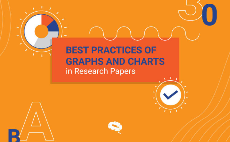
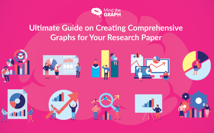
Do you want to know how to make your research papers stand out through charts and graphs? Then this blog is what you need. Read it now!
Online marketing is constantly evolving. The strategies that are relevant today might not be relevant […]
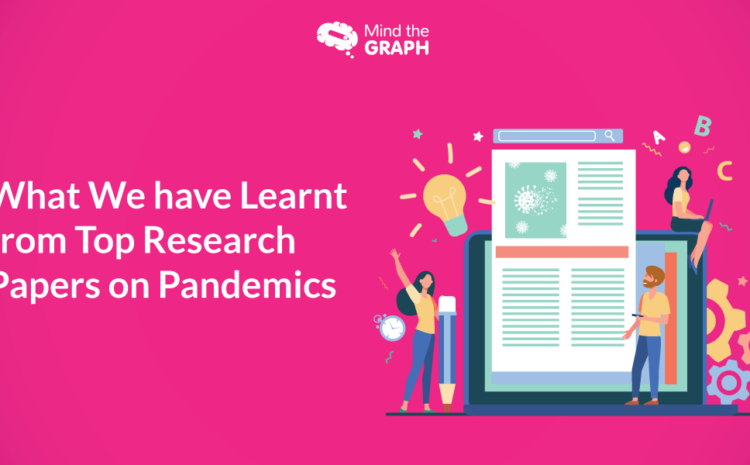
Pandemics have been the hottest topic of research in 2020. The impact of the COVID-19 […]
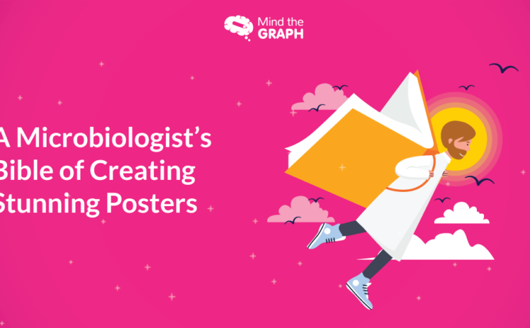
Working on your next big microbiology poster? Wondering how not to make it look like […]
If you have two minutes to skim through a research paper, what would you go […]
A visual abstract is not easy to create, but’s here to stay. So we always […]
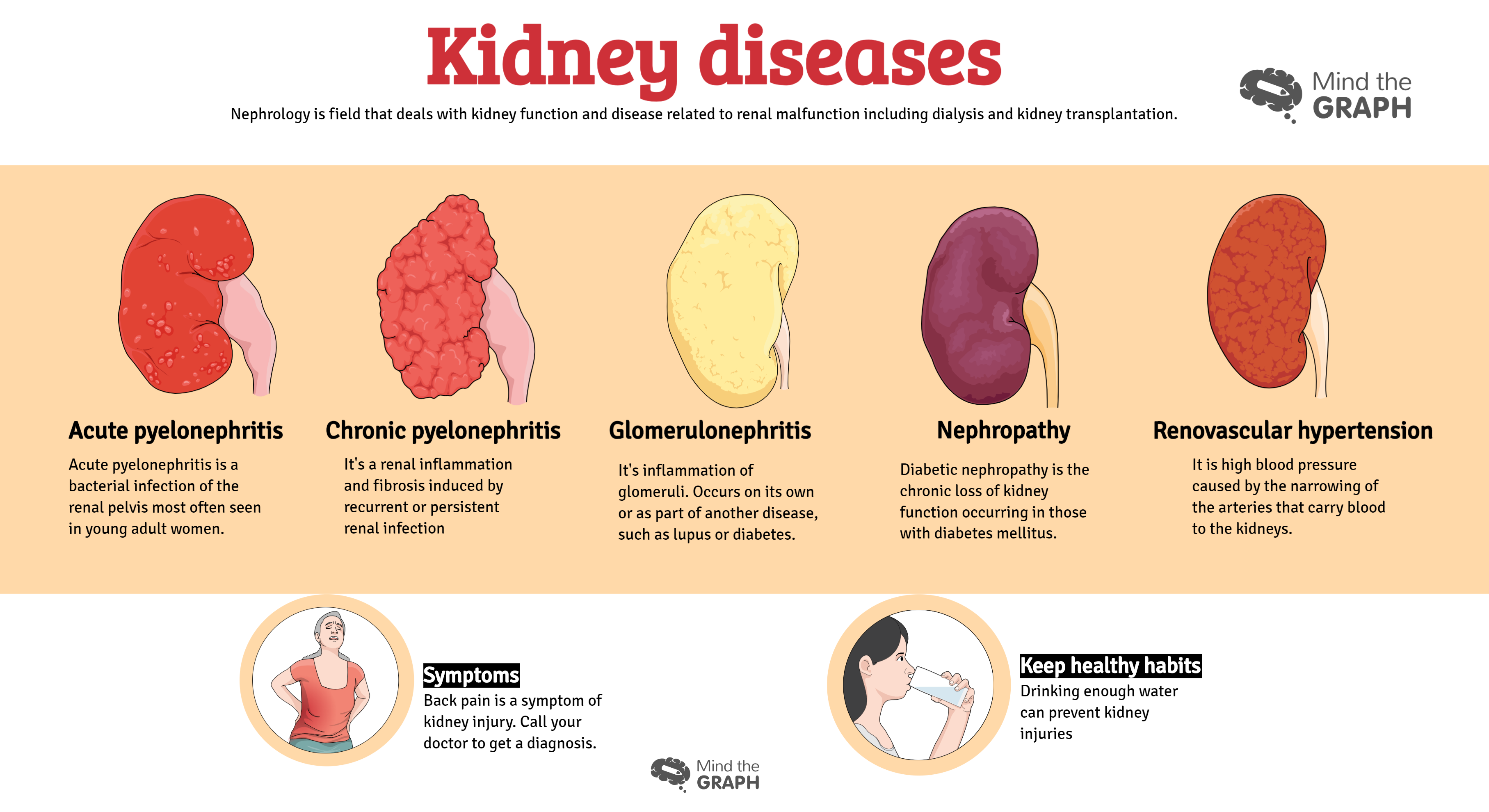
The urinary system works with the lungs, skin and intestines to maintain the balance of […]
Illustrations and infographics are great tools to show data and talk about controversial topics as […]