If you have two minutes to skim through a research paper, what would you go through? Probably the introduction, the conclusion, and? The graphs? That’s right!
Graphs are the best way to visually illustrate your research paper. Research papers usually have massive amounts of data and complicated concepts to explain.
And, graphs can be used to represent these data and concepts in a visual, easy to understand manner. Graphs can effectively help to deliver the message that you want to convey.
Also, adding graphs to your research paper can make it much, much more interesting. Something that might be needed in an otherwise monotonous research paper.
Apart from visually representing your data, graphs can also give a concrete angle to the idea of your hypothesis and research paper.
But, simply adding graphs for the sake of it won’t do. Graphs are meant to make your thesis sound more interesting and explain things better. But, you can easily go wrong with it by adding graphs that do not necessarily complement your research paper.
A good graph can make the world of difference to your research paper. It can make the text of your research paper sound more self-explanatory. If you are a student, then this means you’ll get better grades for your research paper.
So, in this ultimate guide, let’s look at some super-helpful tricks and tips on adding comprehensive graphs to your research paper to make them more interesting and appealing.

Know Your Audience
Knowing your primary audience is important to understand before you decide on the types of graphs that you want to add.
Not everyone understands graphs the same way. So, ensure that you understand your audience first before proceeding with the addition of graphs to your research paper.
Think about who is going to read your research paper. Is it a scientist, preschool teacher, or your neighbor who works in a finance firm? Different types of graphs would be suitable for people with different levels of understanding.
Based on the capacity of your audience and how they will perceive your research paper, you can decide on the types of graphs that best suit them. Here’s a list to help you out:
If your audience is less experienced, then you should go with graphs that are easier to understand without any extensive knowledge about graphs. Here are some such types of graphs:
- Flowchart
- Linear graph
- Pie graph
- Word map
- Multi-set bar graph
If your audience is well versed with the basics of your research paper’s topic and is from your industry, then you can go with more advanced types of graphs. Here are some advanced types of graphs which you can use for a more experienced audience:
- Stacked bar graph
- Stacked area graph
- Spiral plot
- Point and figure chart
- Choropleth map
- Candlestick chart
Imagine if you were to go for a Choropleth map for an inexperienced audience for your research paper. It would be a total disaster! Your message would not be delivered as efficiently.
Similarly, a simple linear graph might seem amateur in a research paper meant for scientists, when the concept could have been explained with the help of a more advanced graph.
Hence, knowing your audience is very important to understand while you write your research paper and create comprehensive graphs for it.
Keep a Check on the Aesthetics
While creating and adding graphs to your research paper, it is also important to think about its aesthetics too. There is no point in adding a graph if it looks messy and unclear. Right from the colors, the fonts, to the placement of your graphs, everything counts.
Colors
The use of the right colors can completely transform your graphs and your research paper. Whereas if you add colors that look off-putting, then your audience might not be able to read and understand your graphs well. They might even put down your research paper right away.
Colors have the ability to enhance your graphs and improve their readability. For instance, if you use different colors to represent different data points, then your graph will instantly look more readable for your audience.
The contrast of colors is also an essential aspect to consider. You should avoid using dark backgrounds with lighter colored fonts and plots. As this will decrease the readability.

As a general rule, have a lighter background and contrasting colored elements. For example, if you use a white background for your graph, do not plot your graphs with yellow-colored lines as these will not be distinguishable. Instead, use darker colored lines.
Fonts
Fonts of your graphs are also a very crucial element. If you use fonts that are too large, then your graph might look messy.
While, if you use fonts that are too small, then your graph might not be readable. Readers might have to strain their eyes to understand your graph. Hence, use the right size for the fonts in your graphs.
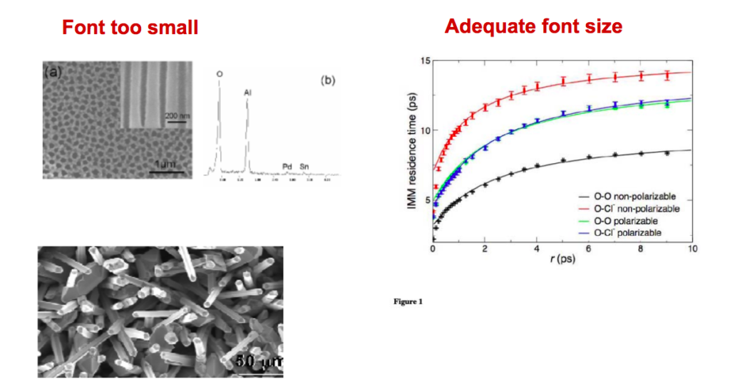
Also, try not to choose fancy fonts that are not easily understandable. Go with the standard serif fonts. You should also format your fonts properly. For example, use bold and italic fonts wherever highlighting is necessary. Do not bold the entire text. Use it selectively.
Icons
Icons can be a great addition to your research paper’s graphs. They can make your research paper self explanatory. You can use icons to label charts or graphs. Or you can also use them to label different elements of your graphs.
While using icons, you should, again, think about the color contrast. Your icons should look clear and distinguishable in the background. For example, use a darker color icon on a lighter colored background.
The fonts inside your icons also matter. Whether you design your own fonts, or you use make my graph tools, you must ensure that the fonts inside icons (if any) are readable without having to strain the eyes.
Make Your Readers Visualize Effectively
The point of adding any graph, chart, or illustration to your research paper is to help your readers easily understand your point.
Reading and understanding research papers cannot be everyone’s cup of tea. Hence, you should make persistent efforts to make it as easy-to-understand as possible.
Your audience will be able to best understand your graphs only when they can visualize them effectively. Visualization is easy to say, but difficult to implement.
You need to ensure that your graphs are designed in a way so that they can be visualized effectively. For this, you need to look at your graph with a fresh set of eyes.
If your graph seems a little too complicated, try to dial it down by breaking down a single graph into multiple smaller graphs. Or, you can also combine two or more smaller graphs to represent everything on a single graph, if that seems like a better representation.
Try to understand how your readers, who do not know entirely about your topic, look at the graphs. Will they be able to visualize and understand the message you are trying to convey?
If not, then recreate better graphs. If your graph looks plain, take the help of online make my graph tools that can aid you to create beautiful, comprehensive graphs at supper affordable rates.
If you nail this part, then your research paper will be a great resource for everyone to refer to. And, your graphs and visual representations will also be widely shared in your industry.
Know What You Want to Convey
The message you want to deliver or the concept you want to explain to your readers with the help of graphs is also important to consider.
What exactly do you not want to convey? Do you want to add a visual representation of data? Do you want to create scientific infographics that easily explain your research paper’s findings? Do you want to visually explain the differences between the two sets of data?
Based on the message that you want to convey, you can create different types of graphs. Here are a few types of graphs that can help you get started:
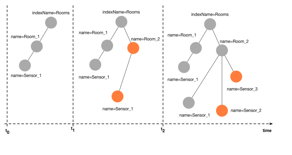
Hierarchical
Any concept that forms a hierarchy can be easily represented using hierarchical graphs.
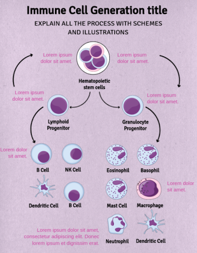
You can create beautiful graphs with hierarchical representations using an easy-to-use online graphic maker tool like MindTheGraph.
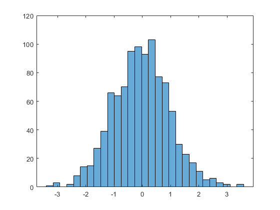
Histogram
A histogram is a graph using which you can represent the frequency distribution of a set of continuous data. You can visualize the shape of the data points and their underlying distribution.
Geospatial
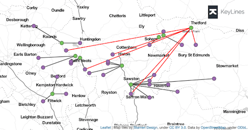
If your research paper consists of data specific to geographical locations, then you can represent that result with the help of geospatial data. Geospatial graphs represent geographical locations through latitudes, longitudes, or the names of geographic locations.
Multidimensional
Multidimensional graphs can be used to represent data that can be better visualized and represented in more than two dimensions. These can be very effective in helping your readers effectively visualize your data and findings.
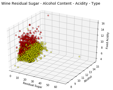
You can easily create beautiful graphs in multidimensional using online infographic maker tools like Mind the Graph.
Here’s an example of a template that you can use for creating a multidimensional infographic for your research paper.

Temporal
Temporal graphs can be used to represent data that usually change with time. You can plot different data points with one of the axes of your graph as the time axis.
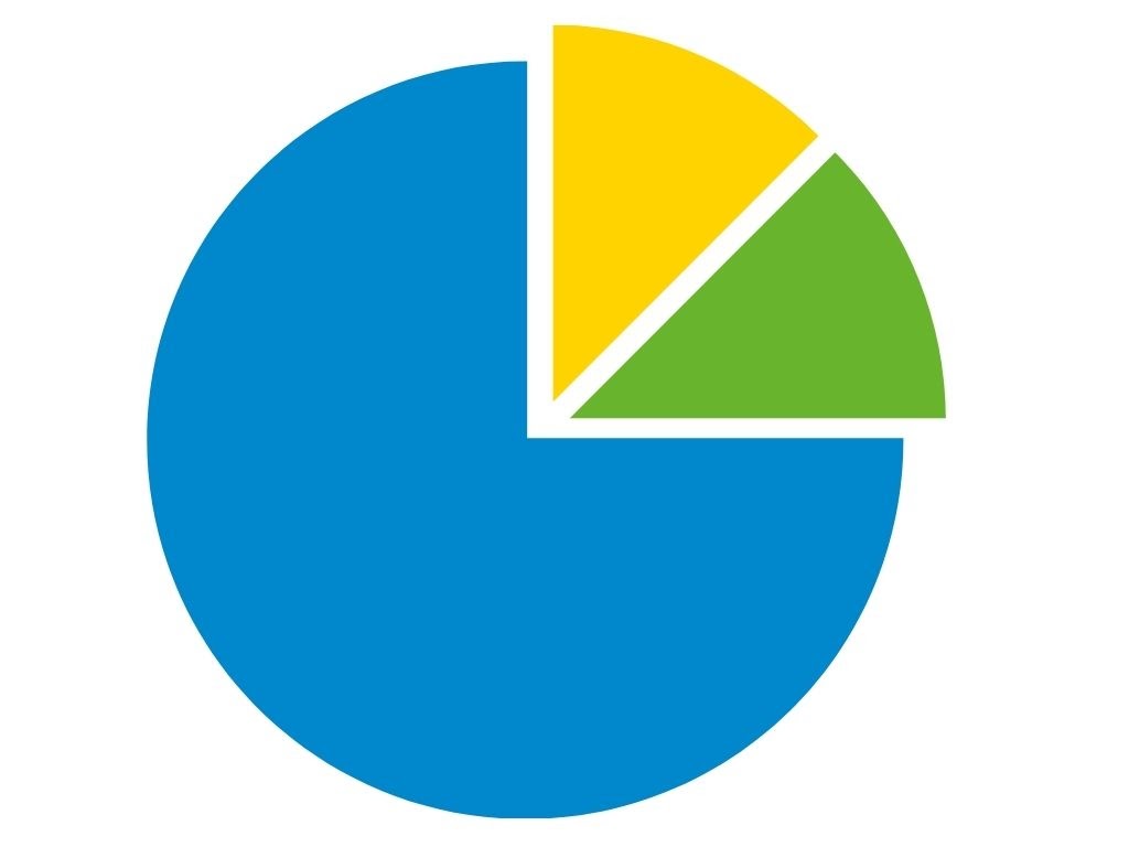
Pie charts
Pie charts are a circular statistical graph that can be used to represent different proportions of data.
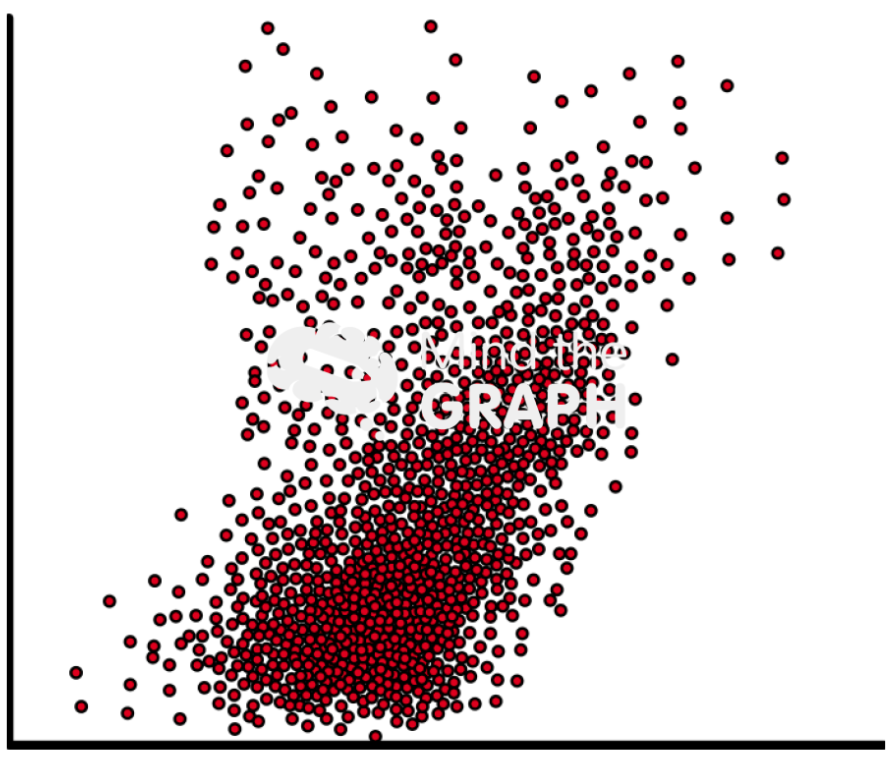
Scatter plots
Scatter plots can be used to explain the relationship between two sets of data in a visual format. In scatter plots, dots are used to represent different numerical values.
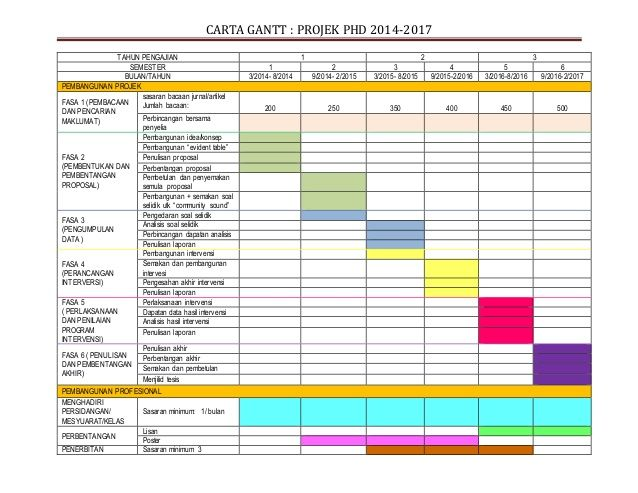
Timetable charts
Timetable charts are used to represent scientific data in the form of timelines.
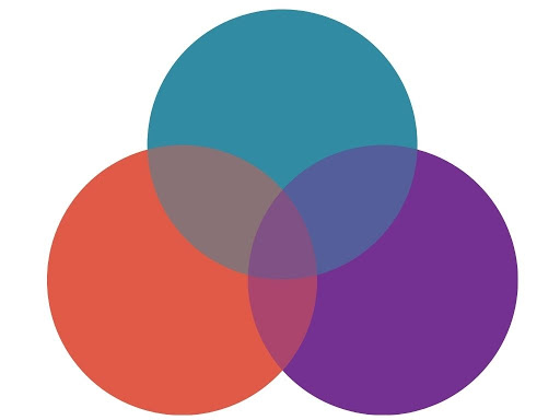
Venn diagrams
Venn diagrams are one of the most commonly used formats for visual presentation. Venn diagrams are used to show all possible logical relations amongst a finite group of things. These can be great for representing the similarities and differences between two or more things.
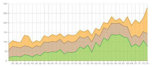
Stacked area graphs
A stacked area chart or graph is an extension of an area chart. Here, several groups of data are represented in the graph by stacking them, one above the other.
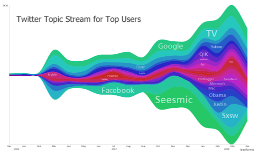
Stream graphs
Stream graphs are another form of stacked area graphs. In a stream graph, instead of stacking the layers, one above the other, layers are positioned around a central axis.
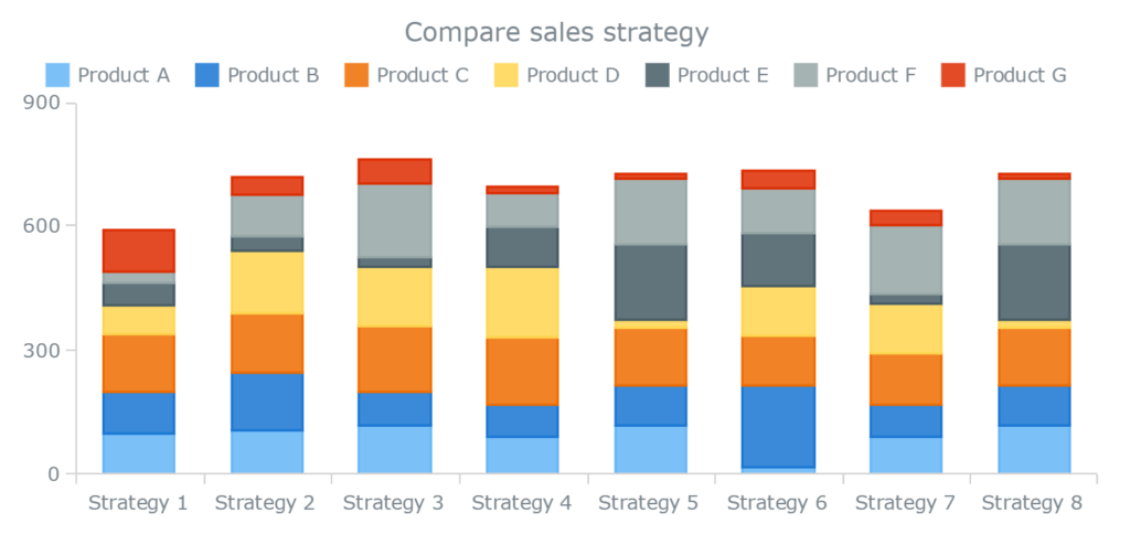
Stacked bar graphs
Stacker bar graphs are similar to stacked graphs, except where the same concept is applied to bar graphs. Different groups of data are represented by stacking them in the same bar graph, one above the other.
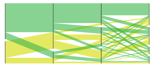
Parallel sets
Parallel sets are used to represent the flow and proportions of data. These represent data frequencies instead of individual data points.
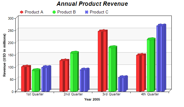
Multi-set bar charts
Multi-set bar charts, also known as clustered bar charts, are a type of bar chart. Here, two or more data sets are represented side by side for better understanding and interpretation. All the bar charts use a common axis that may be X-axis or Y-axis.
Ask Others to Share Their Feedback
Lastly, a new set of eyes to review and critique your research paper’s graphs is almost as crucial as the process of designing the graphs.
You would probably love and admire the graphs you have created. But others might have a completely different opinion about it. Hence, it is best to get others’ opinions on this.
The best way to go about it is to pick people who most likely fit your primary audience. For example, if your research paper is meant for readers experienced in your industry, then pick someone with the same kind of industry experience.
Ask them to review your graph, analyze their initial reaction, and gather their feedback. Are they able to understand your graphs? Is your graph readable and easy-to-digest without you having to explain it in depth?
Asking and answering these questions will help you understand the most likely reaction from your primary audience.
If the reviewer finds it difficult to understand, you should consider simplifying our graphs. You can do this either by using a simpler type of graph or using multiple graphs in place of one.
Whereas, if the reviewer finds the graphs unnecessary or amateur, then you might consider using more advanced graphs or removing them altogether.
Conclusion
We can conclude by saying that graphs can make or break your research paper. People can perceive your research paper in a completely different light if you have added the right graphs to it.
Right from selecting the type of graphs, to the colors and fonts to use, everything must be carefully thought upon before you start creating graphs.
Take your time and create good comprehensive graphs for your research paper. And, by doing that, you will find that people appreciate your work a lot more than they would otherwise.


Subscribe to our newsletter
Exclusive high quality content about effective visual
communication in science.