We live in a world of data! From simple to complicated and scattered to neatly arranged based on several factors – we are entirely encapsulated in it.
Furthermore, at some point or another, we have all used a graph to represent this aforementioned data in the form of a comparison, a trend, or just a division of the whole (like a pie).
Let’s be honest – what a graph is, what are its advantages, and what are its disadvantages have been discussed at length by numerous people, around the globe, over the past decades.
Yet, it retains its gravity with the increasing number of settings it can be used in, so much so that a free infographic maker can be used to provide you the most beautiful infographics in half the time.
So before we dive into the specifics of their usage in Research Papers, let’s take a quick recap, shall we?
What is a graph?
A graph, in layman terms, is a pictorial representation of organized data that helps the readers of the same understand complex information more easily.
While each kind of visual aid comes with its own pros and cons, some of the main features that underlie each can be summed up as below:
- They provide information in the form of easy-to-understand images.
- Different data types require different graphs.
- They are often unable to display the major assumptions and causes behind the data fluctuations.
- They are easier to manipulate than factual information.
When do you need a chart or graph in the research paper?
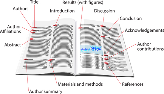
A research paper is in itself a resultant report of all the investigations and surveys you conducted, be it through primary or secondary data. However, not everyone can understand those figures or calculations and at times the reader might have to read the entire copy just to get to the numbers.
This calls for a simpler approach to ease the process. You may end up using a chart for any one or multiple reasons mentioned next.
To prove your point
It is far easier to attest to your standing when you have a graphical representation alongside the tabulated results. Your reader might be much more comfortable when they don’t have to try and understand the calculations just to realize what your final conclusion is.
To make your information more comprehensive
The level of your audience’s comprehension can be directly related to the ease with which they can make sense of the compiled data. Using a chart can help enhance this ease further.
A graph can describe more information with minimum real estate
Conveying more details in the least amount of words and space is an art that can be practiced with the help of graphs. A diagram that pictorially represents the entire data collection and its output is also more visually appealing.
Deliver complicated points
With illustrations and grids, you can put across the complex data in a simplified version which drives your point home while being easier on the reader’s eyes.
Compare data
When you are looking to compare two or more sets of data consisting of a whole lot of factors and numbers, it is a good idea to use visual aids like a chart that can help the reader understand the comparative state of each element at a glance.
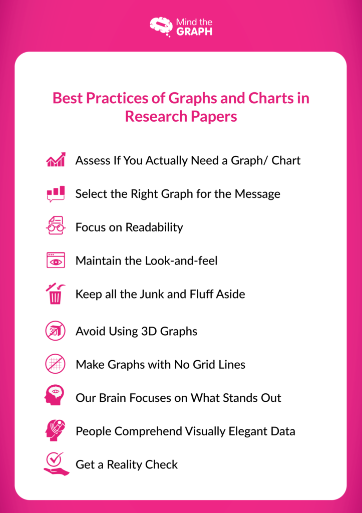
Assess If You Actually Need a Graph/ Chart
Oftentimes, students and researchers alike tend to use graphs more than needed in their papers to make their point stand out prominently.
However, there are cases where you can simply put across your premise as well as results in just a few sentences.
In such scenarios, it is advisable to avoid the usage of charts as they can lower the authority of your more important diagrams further in the research.
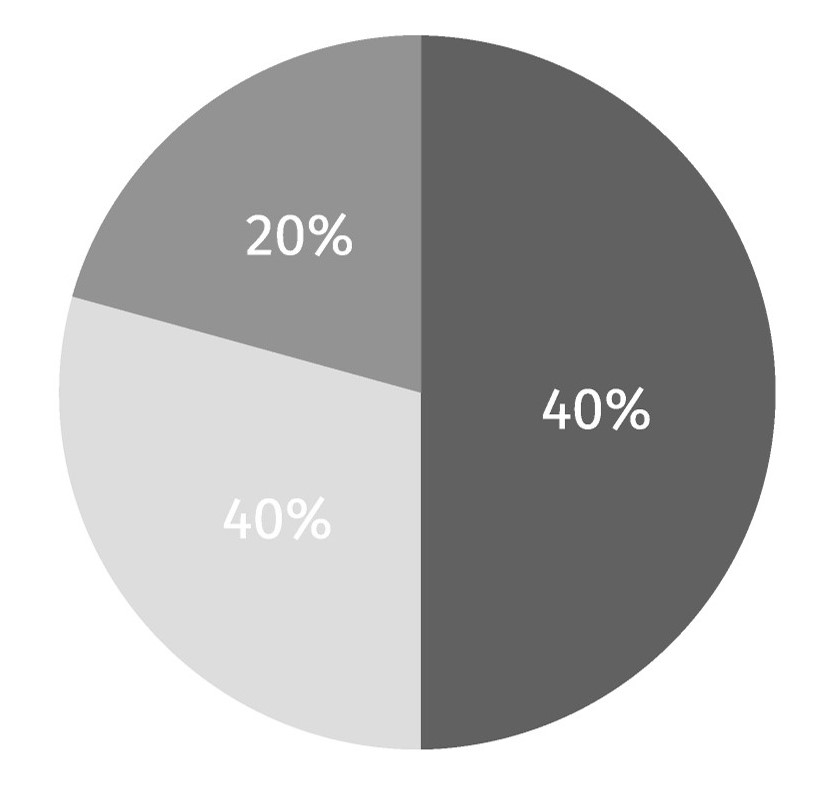
Select the Right Graph for the Message
As mentioned earlier, different types of data require different kinds of charts. On one hand, pie charts could be ascertained as perfect for displaying an approximate division of hours of a day and the way they are spent but on the other, a line graph would be more suitable to show a market trend spread over a few months or years.
A wrong graph chosen to plot your data might just make it more difficult for the user to make sense of the research rather than simplifying it and that is the absolute last thing you’d want. Using a graph creator online can be a way to go to avoid the same.
Therefore, your understanding of the variety of these diagrams is equally important. Broadly, they can be categorized into the following.
Types of graphs and charts
- Bar Graph
- Pie Chart
- Line Chart
- Scatter Plot
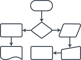
- Flowchart
- Histogram
- Pictograph
- Gantt Chart

- Bullet Chart
For understanding these and much more, you can go through other articles in our blog like: Ultimate Guide on Creating Comprehensive Graphs for Your Research Paper.
Focus on Readability
The most important function of a chart is to bring to the forefront the crux of a topic, that can be understood by anyone reading it, even without a firm grasp of the subject at hand. Having said that, we would like to strongly emphasize the need for a legible diagram.
If your reader cannot decipher the diagrams you’ve used, its presence is as good as none. Per our observation, several students, researchers, and even scientists make this error of integrating so much data in one graph that it becomes unintelligible.
An incomprehensible illustration is viewed by most as nothing more than an image, thus hampering the reading experience of your report.
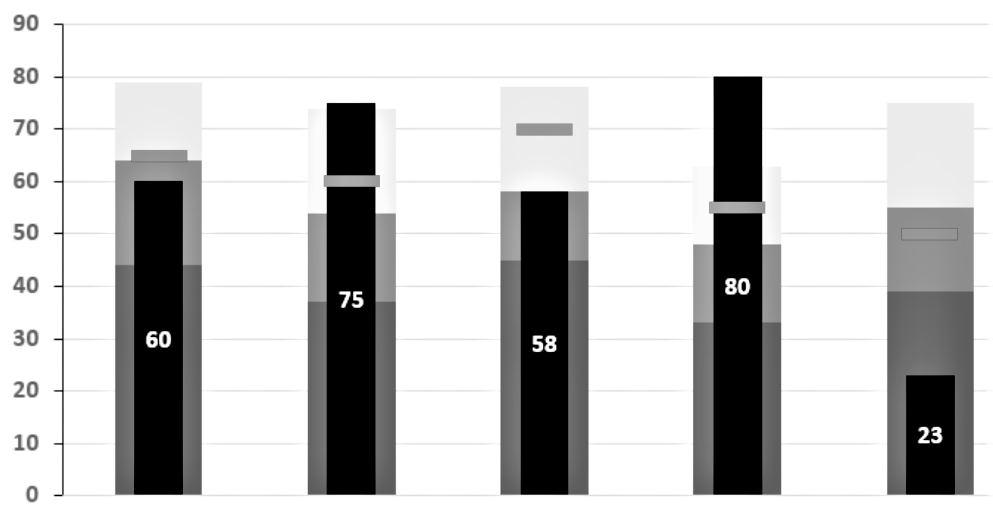
To ensure your chart is readable, formatting it optimally is a crucial step. It includes not just the font type, font size, and symbols used therein but also elements like the colors used, caption & title given to the graph, names used for each axis as well as an index or data field for reference.
Some useful considerations regarding readability:
- The text used on a diagram should always be kept to a minimum while making sure the message is not being lost.
- Symbols used should be distinct so as to avoid confusion.
- De-clutter the figure by removing all non-essential data and elements from the grid and adding it to the footnote instead.
- The background of the chart should be in good contrast to the chart itself, to make certain that the data stands out prominently.
- The axes should not be named simply “temperature” & “time” for instance unless it provides a complete clarification of the segments.
- Choose the graph’s layout to maximize readability.
Maintain the Look-and-Feel
A chart’s visual appeal is just as important as the data it is representing, if not more. An attractive diagram compels the reader to stop and go through the information it is rendering instead of glimpsing it once and moving ahead.
You can ensure this step by simply keeping in mind the following tips.
Informative Title
The heading you give to your graph is of significant importance because it lets the reader know what is it that the picture is portraying. It should be self-explanatory and clear because based on that the user will be making a decision to read or not read the chart.
Acknowledge the Source
Adding a small footnote recognizing and pointing to the source of the information being displayed lends credibility and authority to your data.
Brand Integration
If you are doing the research under a specific college, university or company, remember to use their mandatory colors and logos.
Accurate Dimensions
Give the first preference to a 2D chart as it is simpler to understand. Nevertheless, if you find yourself in a position to use a 3D graph, see to it that the same is comprehensible and includes only the truly important elements on the grid.
Indexing
Do not, under any circumstances, forget to add a relevant key to the diagram that gives clarity to the presented data.
Keep all The Junk and Fluff Aside
As we mentioned above, a clean chart is the need of the hour.
Clearing up your figures of all the unnecessary elements helps the most important information stand out, giving the reader exactly what he/ she came for.
- Use the minimum amount of text on your chart. You can add any notes you wish to in the footnote of the same.
- Use short forms and abbreviations wherever possible.
- Avoid using too many colors or the graph might become too loud and noisy for the reader.
Avoid Using 3D Graphs
If at all feasible, we would highly recommend you avoid the use of 3D Graphs. While at a glance they may make an attractive picture, but in actuality, they can often be misleading.
A three-dimensional chart, be it in the form of a pie chart or a bar graph can be difficult to interpret due to the differences in perspectives. When viewed from different angles, the figure could point to different results due to a distorted visual relationship. This also affects the information being derived from it.
Moreover, 3D spacing makes a comparison between the values and volumes of each factor challenging.
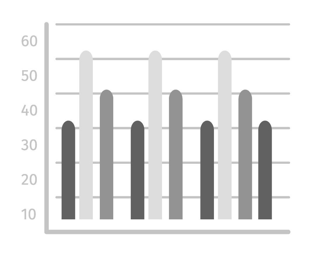
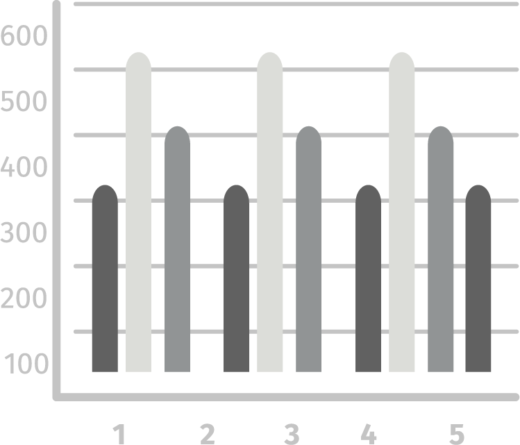
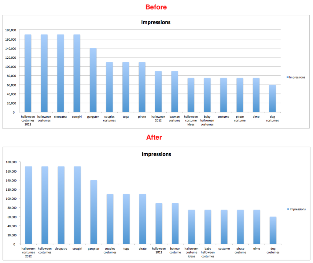
Make Graphs with No Grid Lines
Illustrated above under our ‘Focus On Readability’ section, you can find the perfect example of why using grid lines can sometimes be a bad idea.
Remember, if the reader is looking for incremental differences with exact data points, they can always refer to your tabulated facts and figures.
However, what they are indeed looking for in the graph is a general trend. Thus eliminating the grid lines might actually be a good proposition.
Our Brain Focuses on What Stands Out
While designing an infographic, be it in Excel or in a specialized tool like Mind the Graph, one of the most essential things to keep in mind is that you have a lot of data and not all of it is as highly significant.
Always ensure that you are highlighting the important parts in a way that they are vividly noticeable and attract attention.
You would not want your readers to miss out on those bits in a sea of data and the only way to make certain that they don’t is by creating the graph accordingly.
People Comprehend Visually Elegant Data
Take a quick look at the picture below.
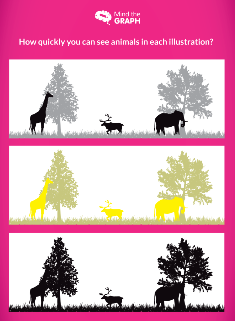
I’m certain that while spotting the animals in the first two images would have been simple, it would have taken a little more effort for your brain to process its presence in the third one.
This happened because where in the first two, contrasting colors were used for the animal and the trees behind, there was no such differentiation in the last picture.
This is to illustrate our simple point that your mind, just like your reader’s, is programmed to comprehend information that is visually refined. Therefore, using colors that aren’t too loud and similar is the right choice to make.
Get a Reality Check
After going through the above tips, we are sure you’re going to be able to take your graphs’ quality a notch higher. But if you’re still apprehensive, we recommend getting a reality check.
Take an Opinion
Have your best friend, your project guide, or anyone you trust and hold in esteem go through your infographics. Just remember to choose a person who would be giving you the best and unbiased advice.
Gather Feedbacks
Ask the aforementioned people to give you honest feedback about your graphs along with suggestions to make them better.
Edit Away
Depending on the responses you’ve received, get down to editing the charts to make them more comprehensive and readable.
Summing Up
Research papers are some of the most important documents you write and publish in your entire life and good statistical and scientific visualizations are the key to making them that much better.
Your charts will always be dependent on the kind of data you wish to represent, but these tips are going to help you across all domains. Here’s a recap of everything we went through in this article:
So what are you waiting for?
Bring out that data you’ve compiled and get down to creating some of the most beautiful graphs seen.

Subscribe to our newsletter
Exclusive high quality content about effective visual
communication in science.