Har du noen gang hørt om Guernica? Den gråtende kvinnen? Eller Jente med mandolin?
Dette er noen av de mest kjente verkene til mesteren Pablo Picasso selv, i hvert fall ifølge internett!
Men når man har produsert over 1500 kunstneriske verk i løpet av et helt liv, er det litt vanskelig å velge ut noen av de aller beste.
I tillegg til å være den mest kjente og innflytelsesrike maleren gjennom tidene, er Picasso også kjent for å ha oppfunnet og oppdaget en rekke nye malestiler og kunstformer, som skulptur og collage, samtidig som han hadde sine egne kunstfaser, som den blå perioden, kubismeperioden og så videre.
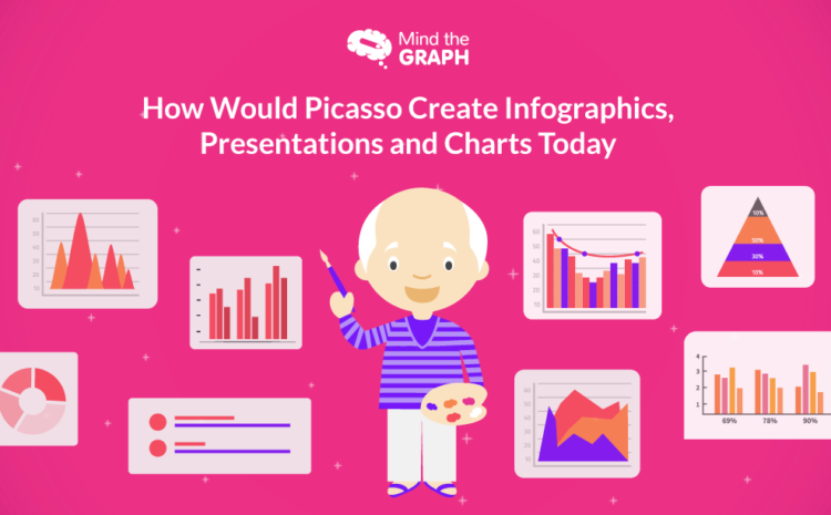
Og etter alt han har oppnådd, lurer vi på hva han ville ha tenkt om infografikken og prosessen med å lage den slik vi ser den i dag?
Å lage infografikk er en kunst
We, at Mind the Graph, strongly believe that designing a beautiful piece of graph is no less than painting an empty canvas to express what you can’t verbally.
Begge er parallelle på den måten at en nøyaktig gjengivelse av en følelse, et faktum eller en trend kanskje ikke er like lett mulig eller forståelig som farger på et papirark, sølt på en slik måte at de på en presis måte presenterer det budskapet som skaperen ønsker å formidle til seerne.
I løpet av de siste årene har vi likevel sett et stort antall diagrammer som forsøker å vise informasjon, men som mislykkes på grunn av små feil som er begått av den som har laget dem.
Therefore, hereon we attempt to tackle each of these errors and while we’re at it, give you some basic tips to turn your infographic into a masterpiece, quite like the maestro himself.
Hvorfor er infografikk viktig i det hele tatt?
Grafer har blitt brukt i flere tiår nå på grunn av deres evne til å få frem budskapet på en effektiv måte. For en rask oppsummering har vi listet opp noen få grunner nedenfor.
Å kommunisere et budskap på en kompakt måte
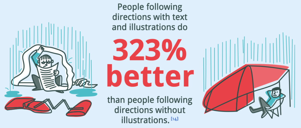
It is very important to communicate clear messages in the most effective and attractive way possible, just like Picasso used to. His paintings touched the audiences in their heart’s innermost crevices and your chart needs to reach your viewer’s deepest consciousness. That is a great way to ensure an information’s recall value. The numbers suggest that up to 65% av data kan huskes av en leser hvis den deles gjennom et bilde sammen med teksten.
Økt forståelse for lekfolk
Not everyone is a whiz at statistics and mathematics – I know I’m not – and you need to keep that in mind while publishing your reports. It could be a topic as simple as how you spent your entire day or a complex one like the division of sources of income in an economy, your results would only be of use when they can be comprehended by all interested parties. The use of a graph is an amazing solution to that!
Enklere å analysere data og se årsakssammenhenger
The readers of your infographic are not always looking for exact figures but sometimes just for a cause behind the fluctuations in a certain element or factor. This analysis is simpler to go through with when one is dealing with line charts or bar graphs as opposed to tabulated data with a bunch of statistical formulae applied to it.
Raskere oppdagelse av mønstre
Realizing the presence of an existing or upcoming pattern or trend is incredibly useful, especially when dealing with time-sensitive data. Be it the predictions for the share market, climate change, or even something as significant as matters of national security, charts prove useful in providing information at a glance.
Visuelt tiltalende som tiltrekker seg leserens oppmerksomhet
En lekmann som blar gjennom en casestudie eller en undersøkelsesrapport, er kanskje ikke like interessert i å lese hele den 40 sider lange rapporten du har publisert, som han/hun ville være i å få vite sluttresultatet og kanskje årsaksfaktorene. I slike tilfeller er det best å lage infografikk som kan gi ham/henne nøyaktig den informasjonen de er ute etter, uten å måtte gå gjennom lange sider med tekniske termer og statistiske data. 49% av markedsførerne, ifølge en undersøkelse utført av Venngage, emphasize the use of visual content for their blogs.
Hvorfor valgte vi Picasso som tema?
Picasso er utvilsomt en av de største mesterne i sin kunst, og som vi diskuterte ovenfor, er det å lage infografikk en minst like stor kunstform.
Men hvis du lurer på hvorfor vi valgte å gå for ham av alle artister - vel, les videre for å finne svarene dine.
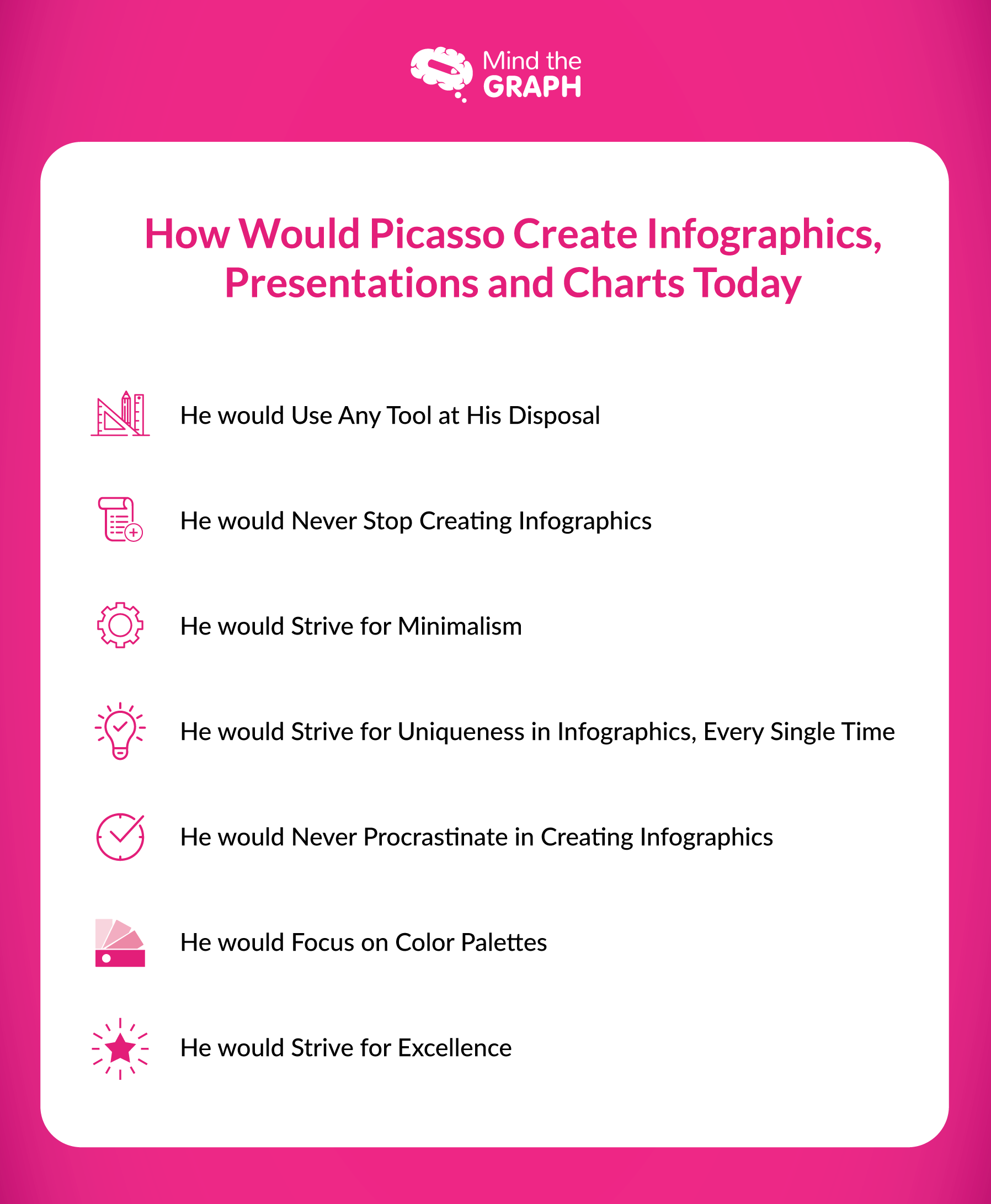
Han ville brukt alle verktøy han hadde til rådighet
Maleren var aldri det man kan kalle en kresen kunstner. Faktisk ble han en gang sitert på at han ville brukt blå farge i stedet for rød hvis det var det han hadde til rådighet. Han brydde seg ikke om midlene - det han virkelig brydde seg om, var å få frem budskapet sitt med så stor klarhet og overbevisning som mulig.
Similar to him, while creating a graph, you have to be ready to use any and every tool that is feasible and employable for a successful and crisp communication. Mind the Graph is one such super-efficient tool that can help you create the best and most beautifully comprehensive charts for all your scientific and technical reporting. It not only helps your brand get an edge on the digital platforms with higher views and traffic but is above all, ABSOLUTELY FREE OF COST. With us, you can go ahead with designing some attractive infographics and tables with the best graph generator online.
Han ville aldri slutte å skape
Pablo trodde fullt og fast på en tanke han forkynte - "Lær deg verktøyene som en proff, slik at du kan bruke dem som en kunstner."
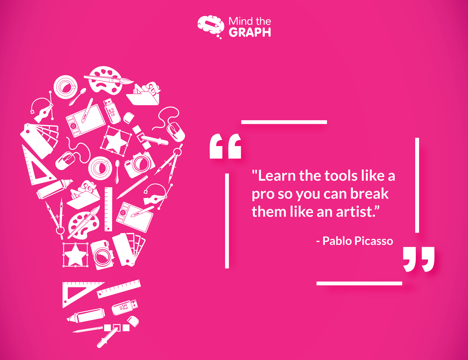
Han mente at for å skape noe som helst, må man først forstå hva man arbeider med. Først når du har en fullstendig forståelse av det, kan du utnytte de minste detaljene "verktøyet" har å by på når du bygger opp ditt eget mesterverk.
Han var også overbevist om at man bare kan nærme seg perfeksjon gjennom kontinuerlig øvelse, og han ville ikke gi opp å lage diagrammer før han hadde laget de beste som fantes - de som sendte riktig informasjon til målgruppen på en lettfattelig måte.
Coincidently, that is also the secret behind online success – experiment! And keep experimenting till you have achieved the goals you’ve set for yourself while beginning with the creation process.
Han ville strebe etter minimalisme
"Kunst er eliminering av det unødvendige."
Og i likhet med malerier og skulpturer bør du bruke samme tilnærming når du lager infografikk. En billedlig fremstilling av data betyr i seg selv at du ikke trenger å skrive for mange ord for å dele budskapet raskt. Imidlertid har både markedsførere, studenter, lærere og forskere ofte begått den feilen at de har forsøkt å innkapsle for mye informasjon i en graf.
Resultatet er et diagram som er for høylytt og støyende, med mye uvesentlig informasjon som lett kunne ha vært plassert i fotnoten i stedet. Ikke bare reduserer dette figurens visuelle appell, men det frastøter også leserne i stedet for å tiltrekke seg dem, for la oss være ærlige - hvis de ønsket å lese så mye for å forstå poenget ditt, ville de ha gått gjennom hele rapporten og ikke bare infografikken.
Simultaneously, even if a viewer is interested in the subject, he/ she might just want to take a look at the end result of your research before deciding whether or not they want to study the whole thing.
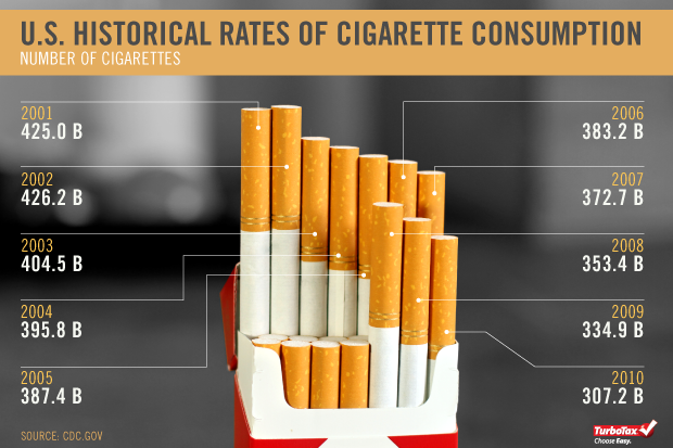
Følgende bilde gir for eksempel tydelig uttrykk for fakta, samtidig som det er minimalistisk og kreativt.
Han ville strebe etter unikhet i infografikk, hver eneste gang
Picasso var en unik kunstner, og maleriene hans forble også unike opp gjennom årene. Selv i de forskjellige kreative periodene hans, som den blå perioden, der han hovedsakelig brukte fargen blå i maleriene sine, var hvert maleri forskjellig i hva det formidlet til betrakteren og hvordan det fikk dem til å føle seg.
Ikke ulikt ham, er det det du også må strebe etter i din rapportering. Selv om temaet allerede er behandlet av tusenvis før deg, må du vise leseren at din forskning er annerledes enn deres. Og den raskeste måten å gjøre det på, er ved å bruke infografikk. På denne måten kan leserne raskt gå gjennom resultatene dine og de sammenhengene og mønstrene som diskuteres i rapporten, og forstå hvordan din studie er unik i sin tilnærming. Dette vil videre føre til at de faktisk leser rapporten din i stedet for å hoppe over den på grunn av et overbrukt tema.
Samtidig må du også passe på at hver graf du lager, er spesiell og skiller seg ut fra andre grafer du har laget tidligere - enten det er til samme oppgave eller til en helt annen. Vi forstår at det kan være fristende å bruke samme stil, eller i det minste en stil som ligner på en som har lykkes tidligere. Du må likevel huske på at hvis du fortsetter å bruke samme stil, vil infografikken din bli ensformig for leseren, selv om dataene som deles er forskjellige.
Mind the Graph kan nok en gang hjelpe deg gjennom denne gåten ved å tilby sine ulike særegne maler for alle dine rapporteringsbehov. Det er til syvende og sist opp til deg selv å avgjøre om du vil bruke disse eller lage en fra bunnen av, men verktøyene våre vil definitivt kunne hjelpe deg i begge tilfeller.
Han ville aldri utsette å lage infografikk
Mesteren sa en gang: "Utsett bare til i morgen det du er villig til å dø uten å ha gjort det."
Og han holdt ord når det gjaldt å skape kunst, det være seg et maleri, en skulptur eller til og med et enkelt veggmaleri, og han avsto fra å utsette det. Vi er sikre på at han heller ikke ville ha utsatt det å lage et diagram til senere, i motsetning til det du gjør akkurat nå!
Vi vet hvor godt det noen ganger kan føles å bare la oppgaven ligge til i morgen. Det er også kjent at merkevarer og bedrifter ofte gjør det. De utsetter også idédugnader om og om igjen, helt til det er på høy tid å publisere en kreasjon.
Hvis du utsetter innholdsproduksjonen, blir det bare en av de tingene du må gjøre på en fredagskveld før du drar til helgen.
Og du vet hva Benjamin Franklin sa om å skynde seg - hastverk skaper sløsing!
Hvorfor ikke begynne tidlig? Planlegg disposisjon og rammeverk på forhånd, og gå deretter over til de finere detaljene i informasjonen som skal formidles. Ta deg tid til å lage noen visuelt attraktive infografikker og publiser dem. Dette vil hjelpe deg med å forstå hva som fungerer for målgruppen din, og hva de helst vil unngå.
Han ville fokusere på fargepaletter
Vi har alle ofte kommet over ting, kjoler og steder i forskjellige farger, og mens vi har sett på dem, har noen gjort oss glade, noen har gjort oss triste, noen har holdt oss rolige og noen har gjort oss sinte. Dette er også hva fargepsykologi dikterer. Den fokuserer på de forskjellige effektene de ulike fargene kan ha på oss.
Each color can have a different impact on a person based on the context it is used in. The color Red when made a part of a Valentine’s Day celebration signifies love, but use it in a skull on an electric meter and it instantly creates unrest in the viewer’s mind, telling them that danger lies ahead.
Det er utrolig viktig å bruke farger nøyaktig når man lager infografikk for å formidle det rette budskapet.
Pablo sier: "Farger, som trekk, følger følelsene."
Og vi er enige!
Fokuser på følelsen du ønsker å formidle gjennom grafen din, og velg farger i samsvar med den.
Følgende eksempel gjelder en infografikk basert på julen. Se hvordan fargene skaper den feststemningen de ønsket å skape.

Han ville strebe etter det ypperste
Fremragende kvalitet er ikke noe man får i gave, men noe man oppnår.
Og det mente Picasso også.
Han ble en gang sitert på følgende: "Andre har sett det som er og spurt hvorfor. Jeg har sett det som kunne vært og spurt hvorfor ikke."
Det er det gylne mantraet for å lage en vellykket infografikk.
Gjør det til en vane å lage slike visuelle hjelpemidler. Se på alt innhold du er i ferd med å publisere, enten det er en lang artikkel eller en kort blogg, og spør deg selv om dette er en passende mulighet til å integrere et diagram i det. Jo mer du legger ut slike grafer sammen med innholdspublikasjonene dine, jo flere muligheter får du til å engasjere kundene dine på nettet. Hold også øye med hva som fungerer for leserne og hva som ikke gjør det, slik at du kan ta nødvendige forholdsregler når du lager neste diagram.
Avsluttende tanker
In the end, we would just like to remind you that while an infographic can justly be called a summarized visual representation of your work, its integration with said work is of utmost importance to enhance the attention captivity and span of the reader.
Picasso var en mester i dette og en mester i sin kunst.
Det er din tur til å bli den neste Picasso!

Abonner på nyhetsbrevet vårt
Eksklusivt innhold av høy kvalitet om effektiv visuell
kommunikasjon innen vitenskap.