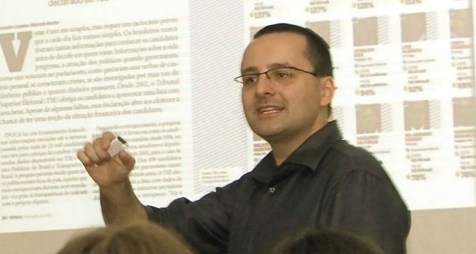
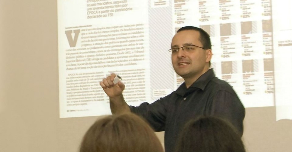
Reference in data visualization, Alberto Cairo is one of the biggest names when the subject is infographics.
Alberto was born in Spain, where he led the creation of the Interactive Infographics Department at El Mundo and won several awards with his team. Later on, Alberto worked for one of the biggest media groups in Brazil, Editora Globo, as the executive director of Época magazine.
Alberto curriculum also includes two books, the first journalism Massive Open Online Course and teaching at the University of North Carolina – Chapel Hill. Pretty impressive, huh?
At the moment, he is the Knight Chair in Visual Journalism at the School of Communication, and director of the Visualization Program – both at the University of Miami. All that while teaching courses on infographics and data visualization around the world.
Alberto has a clear view on how data visualization should work.
As he says himself: infographics are like glasses. If you take the glasses off, everything is blurry and you can’t distinguish what is in front of you. The blurry mess is data. When you put the glasses on, everything makes sense. The glasses are adapted to you and it filters the blurry mess into something you can understand. The glasses are infographics.
Making an infographic is getting easier than ever. However, you need to have the theory to do it right. Infographics are multidisciplinary. That means you need the basic knowledge on different fields to make one good infographic.
Here is the recipe: journalism, cartography, statistics, arts, animation and programing.
The idea is to focus in one field and have the basics of all others. By doing that, you will be able to ask questions to data and evidence while skipping from the “she/he said” method.
By doing that, you will develop the evidence based thinking. And this is what infographics are all about. Alberto Cairo got inspired by big names on infographics like Nigel Holmes and huge references on data visualization like The New York Times.
Maybe you should aim high too.
Does it sound difficult? That’s ok. Take your first step!

Subscribe to our newsletter
Exclusive high quality content about effective visual
communication in science.


