
Mind the Graph is an online platform that allows scientists to create beautiful and accurate scientific infographics, presentations and graphical abstracts. Moreover, we produce templates and infographics, so our users don’t need to start from a blank canvas. Our aim is to improve communication in science and empower scientists.
Today I want to share with you our three most accessed infographics. They are also available on Mind the Graph website.
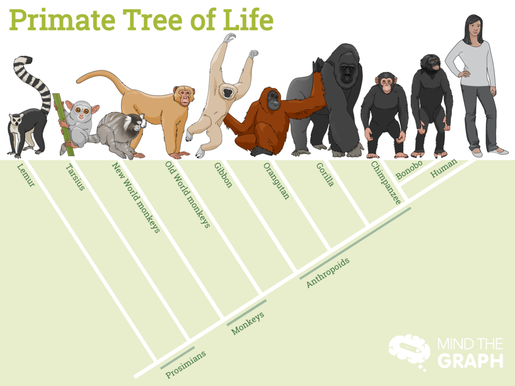
01. Primate tree of life
This beautiful infographic was created to show the difference between the ape family and the monkeys. As you see, cladograms can be beautiful too.
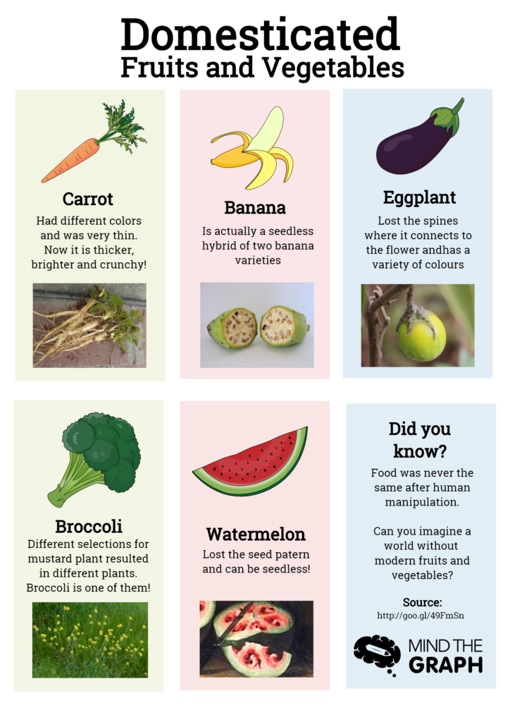
02. Domesticated fruits and vegetables
What pops on your mind when you hear the word domestication?
Probably dogs and cats, right?
Have you ever thought about how our world would be without domesticated fruits and vegetables?
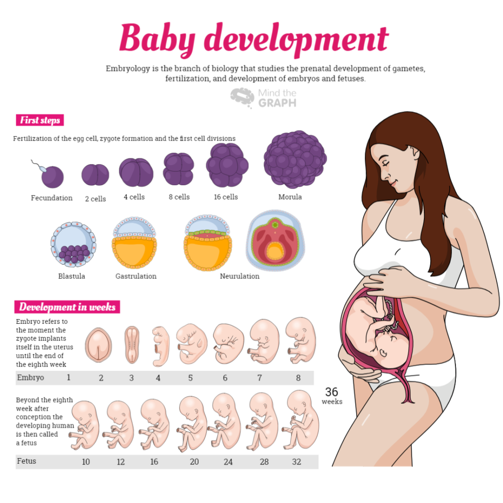
03. Pregnancy scientific infographic
We have a complete library with illustrations of ginecology, embryology and cell biology. In this infographic we use some of these illustrations, but you can find more on our platform.
All these illustrations are available on Mind the Graph. If you aren’t an user yet, you can start now for free:


Subscribe to our newsletter
Exclusive high quality content about effective visual
communication in science.