Science can be complicated and difficult to grasp, but with the right visual aids, it can become approachable and even intriguing. Infographics have long been used to aid in the communication of scientific ideas and evidence since they can improve our ability to understand and retain knowledge by making it more digestible.
This article will look at the significance of graphics for science, how they can be used to enhance scientific understanding, and some of the best tools for producing effective scientific graphics.
Graphics for Science: Overview
Graphics play an essential role in science by making complex information and concepts more accessible and comprehensible, particularly for those who do not qualify as scientists. Charts, graphs, diagrams, illustrations and flowcharts are all examples of visuals that are frequently used in research. Each variety has its own advantages and disadvantages when communicating different types of information.
Diagrams are especially useful for illustrating the structure, function, or relationships between different elements, while charts and graphs are ideal for presenting numerical data and trends. Illustrations are often used to help explain complex ideas or to visualize objects that are too small or too large to see with the naked eye. Finally, flowcharts are frequently used to demonstrate a process or a series of steps in a clear and concise way.
By understanding the unique strengths of each type of infographic, scientists can choose the most effective way to present their data and ideas to their intended audience.
When making visuals for science, consider the audience and objective. Clarity, correctness, and simplicity are critical factors to consider when creating an effective and instructive graphic. Scientists who use graphics successfully can convey their results more plainly, engage their audience, and improve the impact of their research.
Types of Graphics Used in Science
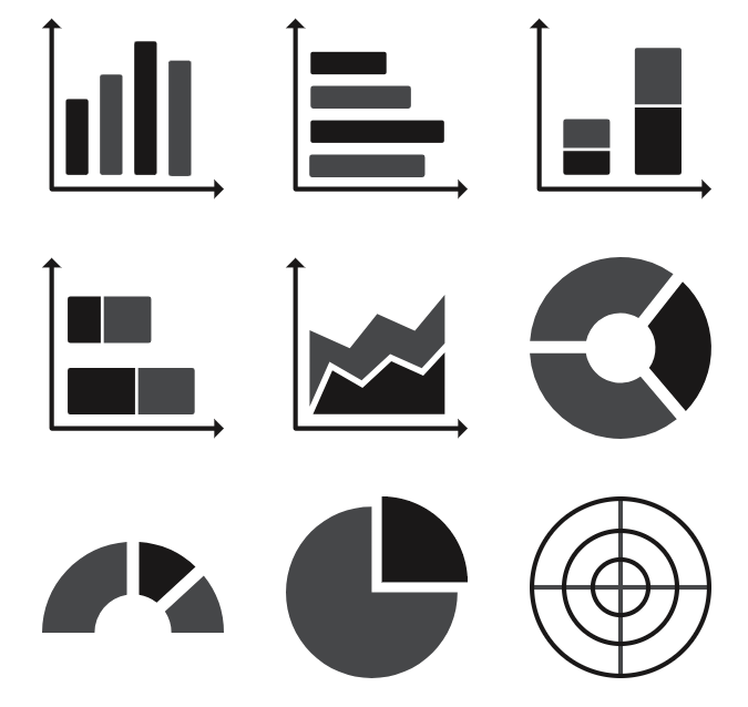
Data visualization
Data visualization is essential in science due to how it allows researchers to convey their results and ideas to other scientists and the general public.
Selecting the proper graphical style for the data being displayed, such as line charts, bar graphs, scatter plots, or heat maps, is essential for effective data visualization. It also entails employing suitable color schemes, labels, and annotations to make the material plain and understandable.
Data visualization is especially helpful for finding patterns or trends in large databases, spotting outliers or anomalies, and emphasizing correlations or causative interactions between variables.
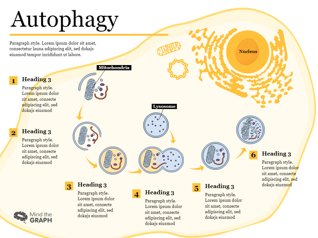
Scientific illustrations
Scientific illustrations are mostly illustrations that can take multiple forms, such as drawings, diagrams, sketches, photographs, and 3D models.
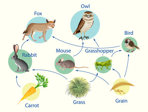
Scientific illustrations are important in many areas of science, including biology, chemistry, physics, and geology, to name a few. They are used to aid in the visualization of structures at different levels of order, including molecules, cells, tissues, organs, and creatures. Illustrations can also be used to demonstrate connections between different elements, such as evolutionary trees or food webs.

Illustrations can also be used for showing objects that are either too small or too large to be seen with the naked eye, such as microscopic creatures. Data from scientific equipment or simulations can be used to create these images.
Infographics
Infographics can be used in science to convey the results of research, scientific concepts, or other material to a broad audience.
Flowcharts, timelines, process diagrams, comparative charts, and statistics maps are all examples of infographics. They frequently use illustrations, icons, color palettes, and fonts to communicate information in an aesthetically appealing manner.
One of the primary advantages of infographics is their ability to break down complex information into bite-sized chunks, making it simpler for the audience to comprehend and remember. They can also serve to make scientific ideas more accessible to a broader audience, including those with no scientific background.
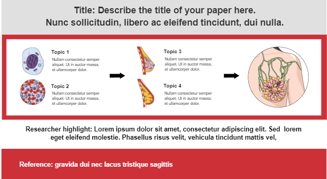
Graphical abstracts
Graphical abstracts are a type of graphic used in scientific papers to summarize the major results or ideas of a research project. They frequently appear at the opening of a scientific paper and typically consist of a single picture or a group of images, as well as a brief caption.
A graphical abstract’s purpose is to give readers a fast and succinct summary of the study, emphasizing key results or ideas in a graphically attractive and easily comprehensible manner. Graphical abstracts can be used to communicate complicated scientific information to a wider audience, including scholars from various disciplines as well as members of the general public who may not have a specialized expertise in the subject matter.
Graphical abstracts can range from basic diagrams and schematics to more complex drawings or 3D models. They are usually made by the scientific study’s authors, often in collaboration with expert graphic designers or using an appropriate tool.
While infographics and graphical abstracts share some similarities, it is important to keep in mind that graphical abstracts are a specific type of infographic used to summarize the main findings of a specific scientific paper. To better understand the differences between the two, read “Graphical Abstracts vs. Infographics: Learn the Differences” which provides detailed explanations of each one.
Tips on Choosing the Right Graphics for Science
- Determine your target audience: Consider who your audience is and what their needs are before selecting a graphic. Are they experts or members of the broader public? What degree of specificity do they require? What is the graphic’s goal, and what statement do you want to convey?
- Consider the data: Consider the sort of data you’re working with. Is it number, textual, or visual? Is it static or dynamic? How much data do you have, and what patterns or trends do you want to emphasize?
- Apply the graphic to the data: After you’ve determined the audience and data, select a graphic that corresponds to the sort of data you have. Use charts or graphs to represent numerical data, illustrations to represent complicated processes or systems, and infographics to communicate complex ideas or comparable features.
- Select a suitable format: Take into account the way in which your graphic will be displayed. Is it going to be in a printed volume, a web page, or a presentation? Select a suitable format for the medium in which it will be presented.
- Maintain simplicity: Avoid using too many graphics or selecting designs that are excessively complicated. Stick to a straightforward and basic style that is easy for your audience to comprehend and interpret.
Tools for Creating Graphics for Science
Free Design Software
- Mind the Graph: Mind the Graph is widely regarded as one of the best free tools for creating graphics for science due to the world’s largest scientifically-accurate illustration gallery along with its science-focused features, easy-to-use interface, and customization options, among other benefits.
- Canva: Canva is a popular graphic design platform with a straightforward user interface and a large selection of templates and design tools. The platform has a free version that gives users access to a large collection of design elements and allows them to create different types of graphics such as infographics, charts, and illustrations.
- Inkscape: Inkscape is an effective vector graphics tool that is free and open-source. It is widely used for making and modifying illustrations, diagrams, and charts. Inkscape is a popular option for scientists and researchers who need to create high-quality illustrations for scientific publications due to its extensive range of sophisticated features, such as the ability to modify shapes and paths, create gradients and patterns, and add text and images. Furthermore, the open-source nature of Inkscape allows users to cooperate on projects and build custom extensions, making it a flexible and customizable graphic design tool.
Paid Design Software
- Adobe Creative Cloud: Adobe Creative Cloud is a creative software package that contains Photoshop, Illustrator, and InDesign. These programs are frequently used to create graphics and illustrations, as well as to revise and organize research papers. Adobe Creative Cloud is popular among scientists, and it provides a variety of pricing options, including student and academic discounts.
- CorelDRAW Graphics Suite: CorelDRAW Graphics Suite is an expert graphic design software that includes a variety of tools for making and modifying graphics, illustrations, and layouts. Scientists frequently use it to create science graphs, charts, and drawings. CorelDRAW has a variety of pricing choices, including a one-time buy and a subscription-based model.
- GraphPad Prism: GraphPad Prism is a scientific graphing and data analysis software that researchers frequently use to create high-quality graphs and charts. It has a number of sophisticated features, such as the ability to conduct statistical analyses and make graphs suitable for publishing. GraphPad Prism is available in a variety of pricing options, including a perpetual license and a subscription-based plan.
Are You Looking For On-Demand Figures And Illustrations To Communicate Science?
Mind the Graph is an easy-to-use tool that allows scientists to easily produce high-quality scientific illustrations, diagrams, and other types of visuals. The platform is specially intended for scientific communication and includes a variety of templates and tools suited to research in science. Enjoy a free limited version or select from a selection of pricing options to find the one that best meets your needs!


Subscribe to our newsletter
Exclusive high quality content about effective visual
communication in science.