Academic life requires a good domain of writing a paper. However, the scientific life outside the laboratory demands more than that. It demands getting updated with new techniques and tools. On that matter, there is a new and trending expression popping out: visual abstract. Also known as Graphical Abstract.
Especially for Life sciences and Health sciences, visual abstract and scientific infographics have been good partners to communicate new findings and relevant information to other scientists and lay audience.
On the other hand, other sciences are only now finding out the benefits of using visual stimuli to reach different and bigger audiences.
Around the world, many journals are already adapting their content to this new visual abstract format. Also, with recent changes in publishing format, almost all the publishing houses are encouraging submission with visual abstracts.
The publishers are adopting visual elements, infographics, and visual abstracts in all sorts of scientific areas, including non-biological fields, like Astronomy, Physics, Chemistry, etc, although apparently the “movement” started in Physiology, Pharmacology, Biochemistry, Neuroscience, and other medical-related fields.
What Are Visual Abstracts?
Visual abstracts are high-resolution images representing the overall idea of a research paper. They can summarize research articles, review articles, or short communications.
The visual abstracts intend to make the reader aware of the research article in a few minutes and usually contains the overall idea of experimental design, hypothesis, and an indication of results.
They allow fast screening of the information, while also stimulating further exploration of the research topic. Some figures are so innovative and spectacular that they make us question ourselves as to how they were made.
Undoubtedly, making a good visual abstract is no easy feat. You must have a clear and thorough idea of the subject before even starting.
Even if you follow all the rules of data visualization and look for hundreds of tutorials, practice is indeed the only way to perfection.
However, as scientists, we are not aiming to be known for our perfect art or designing skills. Our goal is to simply communicate our findings. If we have trouble doing that — and we often do — then we have a problem that needs solving.
Ok, first things first. What does it mean to have good communication in the scientific world?
Let’s take a look at some visual abstracts.
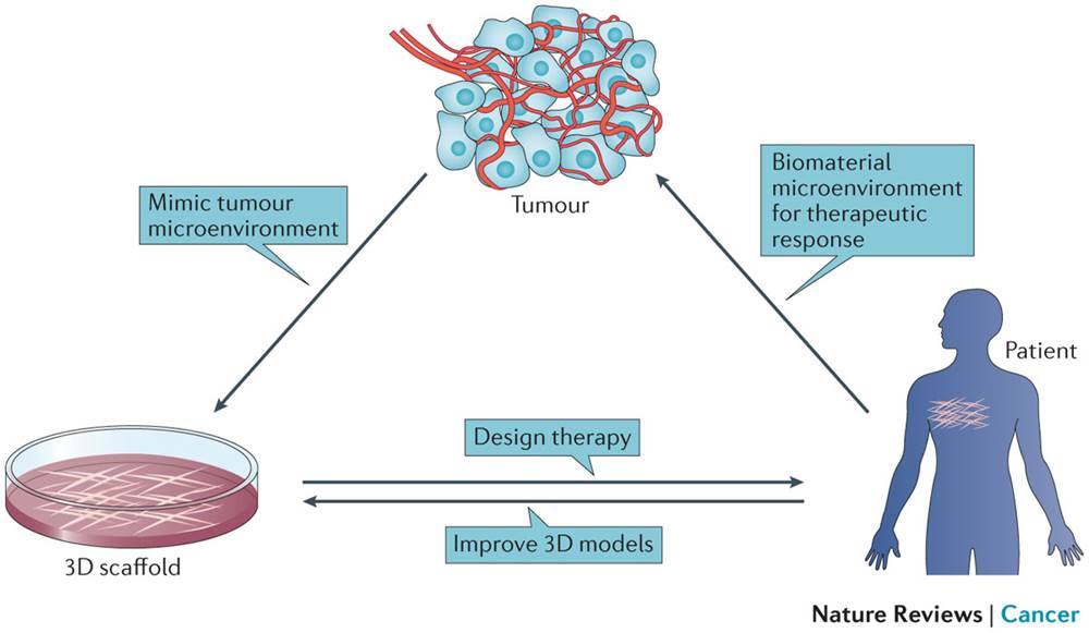
It looks pretty basic, right? That’s because it is supposed to be that way.
It can be a bit surprising but this simple-looking visual abstract was published in Nature Reviews Cancer, the renowned peer-reviewed scientific journal.
What does that tell us? That even the biggest journals don’t want you to be the best graphic designer in the world. What they want is graphical material that effectively supports the text.
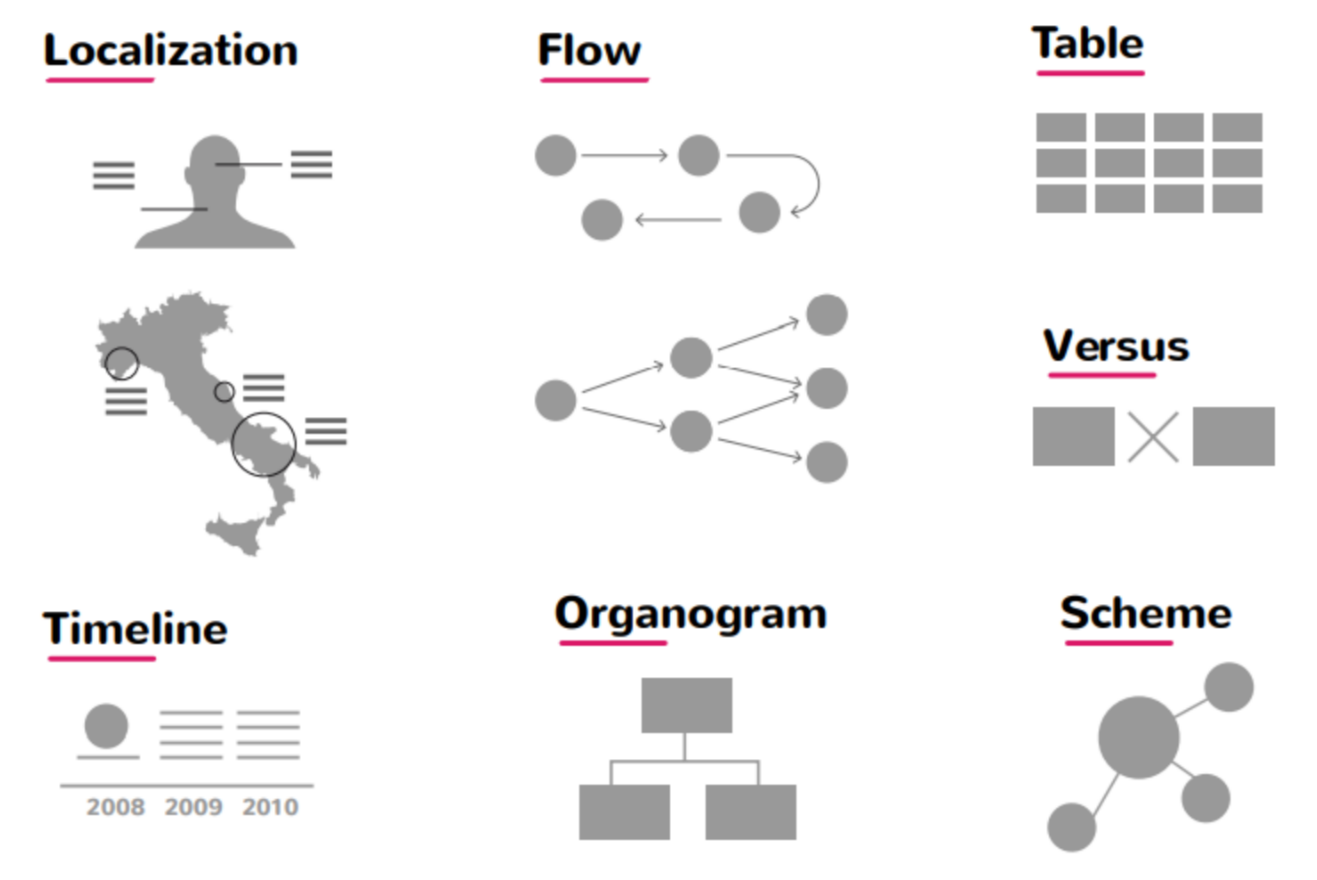
Types of visual abstracts
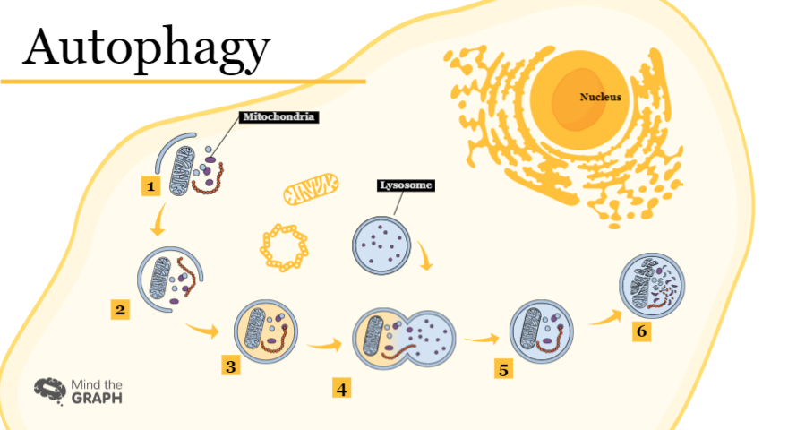
Diagram-style: Usually helps when there are plenty of molecular structures involved.
Infographic style: Preferred when you have images with high visual impacts and text to be incorporated into the same diagram. You can try the Mind the Graph’s infographic Maker.
Comic type: The most appropriate type for communicating in magazines.
Why Use Visual Abstract?
The pictorial communications are well-received by the audience in the gathering. Similarly, a few-page long article is concisely presented in one image by a visual abstract.
Using visual abstracts is an effective way of narrating the crucial points to be conveyed by the author. It also becomes a quick review object of the research article and saves time for the reader.
A well-presented visual abstract ultimately represents the whole story of a research paper and becomes the heart of the article.
Pragmatically, visual abstracts also enhance page views (i.e. bring readers) and increase the chance of being cited in other publications!
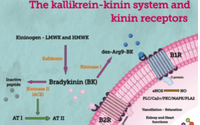
Here is one example of an interesting image from a paper published in “Frontiers in Cellular and Infection Microbiology” that used an infographic in the visual abstract to attract the attention of the readers.
The paper with a visual abstract has over 2 times more page views than the average of the edition in which it was published. It’s 200% more audience to learn about your scientific findings.
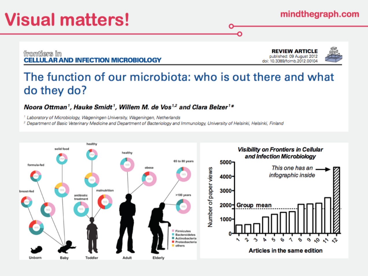
According to a famous study mentioned in the Economist “Graphic Details: The Importance of Diagrams to Science” having an infographic as a visual element in the paper increases citations by 120%. So… why not use a visual abstract? Sounds like the right thing to do.
How To Make a Visual Abstract?
When thinking about creating a visual abstract for your research paper, here are a couple of questions you can ask yourself:
- What is my research about?
- What are my main findings?
- How are my findings compared to what was previously known?
- How do my findings matter to the audiences, i.e. what’s the relevance?
In other words, you must understand your own work very clearly before trying to communicate it.
Do you understand your own work clearly enough to explain it even to a lay person? If your answer is yes, you have no excuse not to use a visual abstract maker online.
Even though you and your colleagues may understand the research and findings perfectly, you have to help your audience understand it just as well, and a free online tool is the ideal way to achieve this. Make it visual!
If your answer is no, I’m afraid that you might have trouble writing your paper from abstract to acknowledgments. In this case, a free abstract generator also could help you feel more confident and in control of your work. And thus, I strongly recommend you try creating your own visual abstract online.
Some readers may find it even complicated to understand a scientific paper’s title. Make it visual! All in all, an image explains more than a thousand words. Don’t know how? We are here to help.
Now, along with having an effective tool to help, here are some tips to create a compelling visual abstract.
Tips To Create A Compelling Visual Abstract
Make Sure You Know The Main Points
Write the takeaways in as few words as you can and then, trim it down even more. Simplify the main points until you have only a sentence or two. This will serve as the base for your graphical abstract.
See What Has Worked For Others
While you will want your visual abstract to be original, looking at existing material can help you decide what to include and what to leave out.
The Cell Press Graphical Abstract Guidelines include examples of different styles of visual abstracts and how to improve them.
Search the journal you are submitting to for already published visual abstracts and you’ll know the style, fonts, and colors to use.
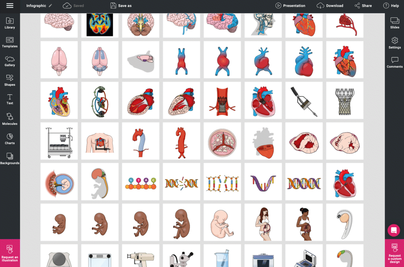
You may also check Mind the Graph’s gallery of customizable visual abstract templates for inspiration, which you can edit if needed.
Tailor your abstract to match your goals
The flow of your abstract depends on the kind of data you’re presenting. If your findings are that A leads to B, then a bold arrow between the two can illustrate that clearly.
If you’re trying to find the missing link between B and C, then a question mark between those two images would work well.
Likewise, if the research unveils a protein structure, then showcase a picture of that structure. And a flowchart-type visual can be ideal for illustrating processes or mechanisms.
Include keywords and nothing more
What are those specific words or phrases that the reader is looking for to understand what the paper is all about? Include those in the image, and leave out the minute details — the text abstract and the paper will cover those.
Ensure it’s self-explanatory
If the reader has to spend more than a couple of minutes to understand your visual abstract, then that defeats the purpose and might even make the reader lose interest.
So, create a clear and simple visual that’s easy to understand in one go.
Edit the visual abstract
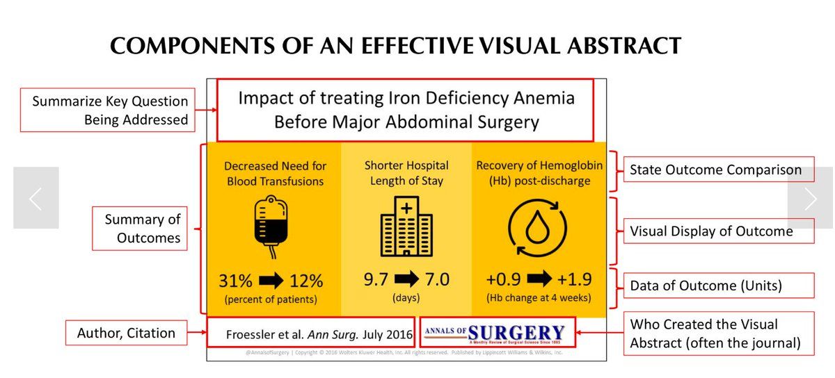
Message: Prioritize the key message. Visual display of your message depends on the type and number of messages / outcomes you hope to convey.
Layout:
- Title with Key Question Being Addressed.
- Visual fields: Can be done with colored boxes, panels, or shapes. For ease of browsing, the visual abstract should have a clear section separation.
- Lettering should be clearly legible and no smaller than 10 point font for normal text.
- Add author, citation, and Journal.
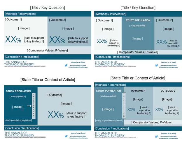
Examples of layout:
Color: Effort should be taken to use colors that complement each other or of different shades. If you are not sure about colors, use a monochromatic style.
Figures: These can be figures used in the manuscript or images that you either have a copyright to use, make sure you use trustful resources for your image bank, such as Mind the Graph.
The process of creating visual abstracts with Mind the Graph’s platform is very straightforward. Log in to the platform, select the required icons, drag and drop them to the page.
Arrange the icons according to their relationships and add the text that explains your story! Yes! That’s it.
You get to choose from various background colors, themes and we have pre-prepared formats too. Also, if you need any specific icon that is not already in the library, we can custom design them for you in no time.
Visual abstract examples and free templates
This is a typical example of a visual abstract for Annals of Surgery created by Mind the Graph team for a client.
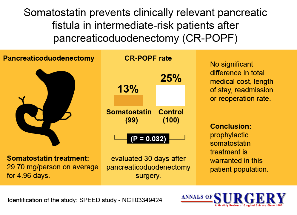
You don’t need to prepare anything from scratch, at Mind the Graph, you will have access to many templates and thousands of scientifically accurate illustrations to start. From mice and rats, lab animals, any medical, and life science-related area is there. And it’s all made for and with the aid of research scientists.
Are you ready to start creating your visual abstracts? There are plenty of opportunities and resources to do that at Mind the Graph. Don’t let the lack of skills or experience turn you down from this amazing experience. Start creating right now with Mind the Graph.


Subscribe to our newsletter
Exclusive high quality content about effective visual
communication in science.