Science Drawing and Scientific Illustration: Why They Are Essential for Effective Research Communication
Why Science Drawings Matter More Than Ever in Research In today’s fast-paced scientific landscape, publishing […]
Learn how to create amazing posters and take some tips on how to make them more eye-catching for congresses, presentations, and other events.
Why Science Drawings Matter More Than Ever in Research In today’s fast-paced scientific landscape, publishing […]
It’s time to learn the distinction between a graphical abstract and an infographic, as well as how to apply both.
Let’s take a look at what a sigmoid pattern or function is and all the different stages of them in this article.
Understand the impact of a science color palette on your scientific study, how to choose palette colors and to accomplish color accessibility.
Learn about the anatomical position and why they are so important for each species of organism in medicine.
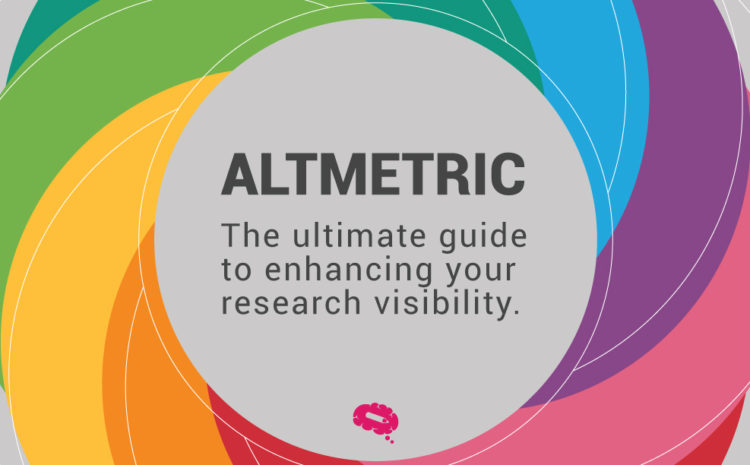
It’s time now to look at something called Altmetrics, what it is, how it works, and everything you should be familiar with.
CACTUS plans to scale up its technology offerings by providing an automated DIY solution for their customers in academia and the life science industry.
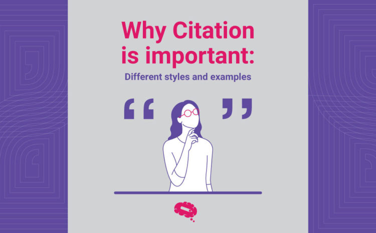
Understand why citation is important to validating a paper, citation styles and examples, and tools to help you accomplish it the best way.
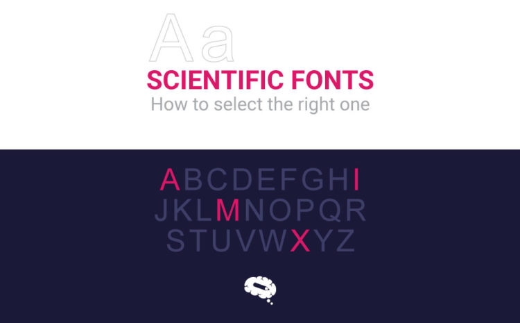
Choosing the right font for the right kind of content is imperative, this article will aid your decision when it comes to scientific fonts.
Making sure your proposal is perfect will drastically improve your chances of landing a successful research position. Follow these steps.
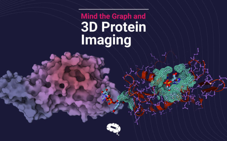
Ever tried to create a molecular illustration with classic molecular viewers? If the answer is […]
The Poster Maker is a new tool created by Mind the Graph’s team, that helps scientists create beautiful scientific posters with no effort.
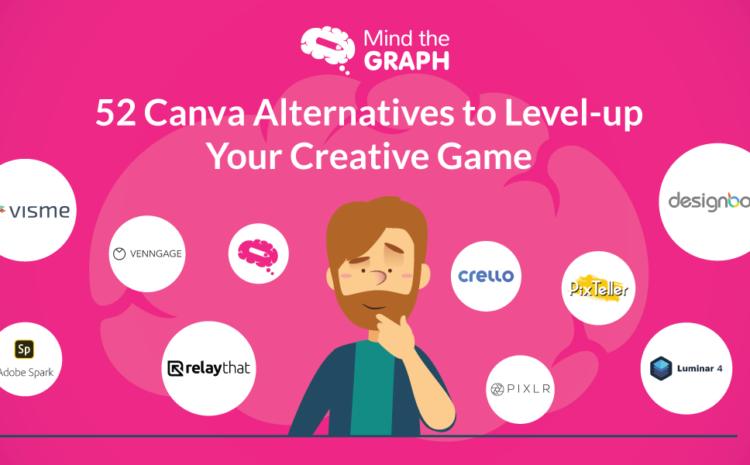
Canva is surely one of the best graphic design tools we have on the web. […]