Those in the scientific community are aware that it might be a challenge to create something visually pleasing or appealing for the audience, especially when dealing with complex subjects. That is why the visual aesthetics of any study or data must be taken into consideration for it to stand out and be presented in the best way possible.
Establishing a color palette is incredibly important when attempting to make a research paper or poster more aesthetically attractive. Colors can convey a lot about data; for instance, using blue and red on a heat map causes the audience to think of hot and cold, or even using a different color can highlight something important in your data.
Why should you care about a science color palette?
One of the most essential modes of communication is visual. Every scientist’s greatest interest is to make numbers and their information as accurate and clear as feasible, therefore, color is one of the most powerful components to achieve this, because it can visually convert data into meanings.
A color palette can be useful in various areas, including the initial immediate impression of votes cast in political elections, the mapping of climate change, and even the influence of rainfall on agricultural fertility.
However, if colors are employed poorly, they might be ineffectual. That is why, when choosing your color palette, you should use extreme caution to avoid data manipulation by emphasizing certain data over others, ignoring the needs of persons with color vision deficits or removing the significance when displayed in black and white.
How to use color in your research paper?
This section will take you through some basic steps to help you learn the best practices for a science color palette.
Fundamentals of colors
The first thing you should understand is that color is a perception, colors are seen by humans as light waves. Our eyes detect information, and data is transferred from our eyes to our brains, which indicates that as a specific hue. Objects reflect light in various wavelength combinations. Our brains detect these wavelength combinations and convert them into the phenomena known as color.
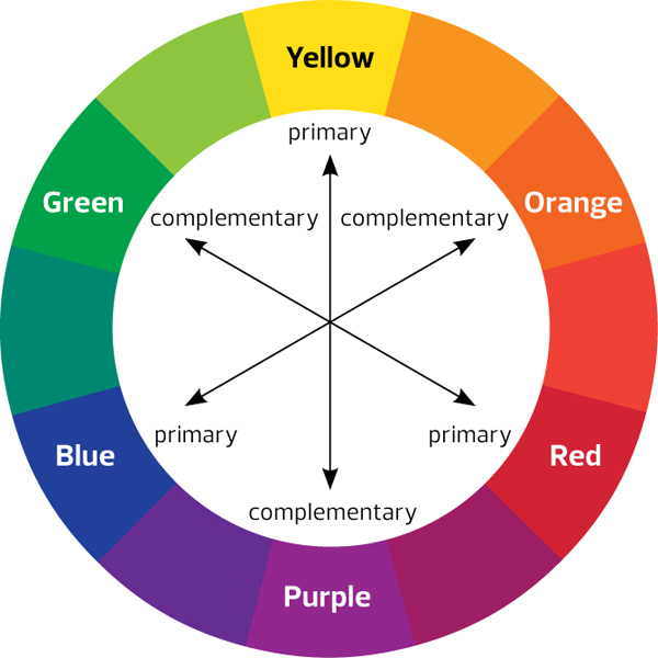
There are three sorts of colors: primary colors (red, yellow, blue), secondary colors (colors generated when primary colors are mixed: green, orange, purple), and tertiary colors (colors made from primary and secondary colors, such as blue-green or red-violet). This is known as a color wheel.
Best science color palette combination
Color combinations with opposing hues on the color wheel are some of the greatest choices; these colors can help with data understanding. It is important to note, however, that you should not feel confined by only using opposite combinations, you may use any color combination as long as it is extremely contrasting, even if it is a different shade of the same hue.
Tools, like Material Palette or Adobe Color Wheel, can assist you in determining which color you want to begin with.
Things to avoid
- Too many different hues: A typical error is to utilize too many distinct colors in your image. Most of the time, individuals do this to achieve realism. Using green and brown for trees is a typical example. But if you do this for every piece, you end up with an excessively cluttered image.
- Too saturated: The more saturated a color is, the more intensity it has and the more attention it pulls, which is why it is best to employ saturation for highlights or areas of concentration rather than entire forms, so use it with caution. Using too many colors in deep saturation can cause a jet or rainbow color map.
- No color context: Consider the context in which color will be utilized to choose the right one. The context is responsible for the operation of a limited palette, saturation, and controlled values. To work effectively, everything in your image is dependent on the components around it. Reds, for example, seem redder next to shades of green; so think carefully when determining which shade of red to use.
- Overlooking accessibility: The argument about design accessibility is heating up. However, many designers continue to overlook the fact that designing for colorblind users or those who use prescription glasses is just as essential as designing for those who do not.
Color accessibility
There are numerous color-based visual defects that are collectively known as “color blindness.” Color vision deficit (CVD) affects around 8 percent of males and 0.5 percent of women. As a result, you almost surely know someone with CVD, and someone with CVD is almost probably interested in your scientific research.
One simple technique to confirm that your figure is CVD-friendly is to turn it to grayscale and see if you can still comprehend the plot as efficiently as when it was in color.
You may also use an excellent tool called Viz Palette to see if your colors are accessible to individuals with various forms of color blindness.
Make scientifically accurate infographics in minutes
Check out how the Mind The Graph tool may assist you in combining colors to create an excellent infographic that will add visual value to your science study.


Subscribe to our newsletter
Exclusive high quality content about effective visual
communication in science.