It can be very difficult to choose the ideal font for a project, as any graphics designer could confirm. Deciding the font becomes more important when you anticipate its extensive and frequent usage.
It’s an essential part of typography, which is the art of making your design appear visually cohesive. A font group’s general design usually kicks off the search, but with a little digging, you can find yourself in the creator’s most detailed selection.
There are a number of research studies that have focused on typography to discover some good grounds for selecting a particular font for a particular project category.
It is also best to pick a professional font that is easy to read without many extraneous features.
Scientific research, for example, should be written in such a manner that the reader focuses on the information, not just the format.
Some people find today’s scientific fonts boring and overdone. Because of their legibility and simplicity, these fonts are everywhere. Use a trusted font to make your work appear professional.
In terms of font selection, there are more considerations than seem to be apparent at first glance. For instance, some fonts have a reputation for being legitimate, while others don’t.
We have a handful of scientific findings to share throughout this article in the hopes that they will aid your decision-making when it comes to scientific fonts.
If you have ever found the choice of fonts intimidating, the purpose of this article is to offer guidance and information to help you make a decision.
What is the importance of Fonts?
When a typeface is carefully chosen, it is able to deliver the desired effect to the reader, and give the words the sense of life they deserve, all the while reflecting the field it represents.
The font represents the words on a page visually instead of an image, allowing the words to convey their intended meanings as they are read. A font that is too large or small may not convey the seriousness of some issues or messages.
What is the most recent time that you wrote a text or sent an email and the words were read incorrectly? We can communicate more effectively using our vocal tonality, simple hand gestures and expressions, we can convey our message more effectively than simple words on a paper.
On fancy documents such as invitations, using a script font can be spectacular, but on children’s books it can look off, and in the event of too much text it may not be readable.
As you can see, choosing the right font for the right kind of content is very important. However, using the right font is only part of the equation. Misleading fonts result in incorrect information.
7 fonts that strengthen scientific research’s credibility and professional appearance
1. Arial
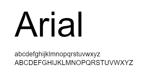
In recent years, fonts.com has reported that Arial is among the most used typefaces. With its distinctly contemporary design, Arial is more in sync with the last decade of the twentieth century than many of its predecessors.
There is no horizontal line at the bottom of the edges of Arial letters. They are angled instead. It helps give the face a more organic appearance by cutting the terminals on a diagonal.
The Arial family of typefaces is incredibly robust. Suitable for setting text for reports, articles, publications, and for use in display media, newspapers, and promotional materials.
Whether you’re writing small or large chunks of text, Arial makes reading easy. Figures should be formatted in Arial or Helvetica as per Nature’s instructions.
Labels and legends in particular benefit from this typeface. As a rule of thumb, keep font sizes small *8 points when using Arial for figure legends.
2. Baskerville
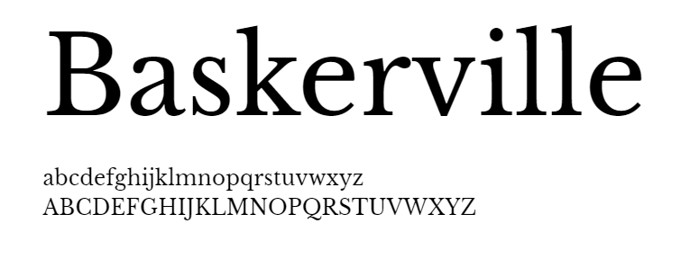
Designed by John Baskerville in 1757, Baskerville is a typeface that can be read easily and looks good in print. The letters were straightforward and elegant according to Baskerville.
Here and there, Baskerville font was found to increase reliability of text in comparison to other fonts. The readers’ behavior on the same study was most negatively influenced by Comic Sans.
The Baskerville family of fonts are known as the first transitional roman. These fonts distinguish between thin and thick strokes. The large size of Baskerville looks good because of this feature.
Based on its serif style, Baskerville has “tails” on the edges of its letters. This font is best suited for printing. For long text blocks, it is most suitable.
For best results, try to keep the font size between 8 and 14 points. Then your text will look more professional.
3. Helvetica
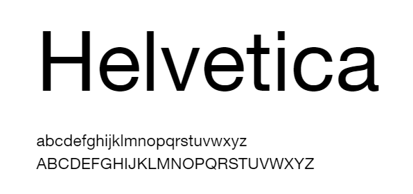
The most commonly used font is Helvetica. Max Miedinger, a Swiss designer, initially created Helvetica in 1957.
Designed to be simple to read, the font immediately gained popularity. It is named after the Latin term for Switzerland, Helvetia. Neue Helvetica is the name of the newer version of the font, which was introduced in 1983.
Even a movie has been made about Helvetica. Helvetica is not only a Hollywood (Indie) font, it looks fantastic on screen and print.
Science, Nature, and Cell ask for the figure captions to be in Helvetica. Even though it looks good when printed in small formats, it looks even better when printed in large formats.
It’s hard for authors to keep track of how many figures they’ve labelled with Helvetica now, since that’s what publishers use.
4. Georgia
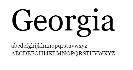
In spite of Georgia’s role in providing clarity at low resolutions on the screen, it is imbued with a typographic aesthetic that strikes a chord with readers.
This friendly face is evident even at small sizes. A stunning, smooth italic accompanies Georgia’s design; the artwork minimizes the complexity of making a screen-friendly italic.
As opposed to many contemporary typefaces, it has authentic italics, including the slender lowercase letters a and g.
The bold weight is also carefully tailored, with a heavier weight than the regular; this is particularly useful at small screen sizes where the two weights must be distinguished(phone screens).
5. Garamond
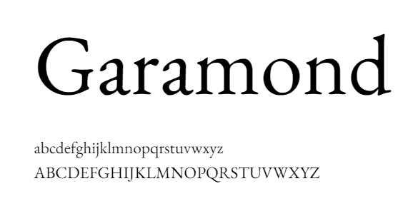
The history of this font also dates back a long way. French King Francis I of France (1515-1547) commissioned Claude Garamond to design a typeface for use in a series of books.
It was revived by Robert Slimbach in 1989 as an electric typeface. Garamond comes in many different variations because there are different sources available. The most commonly used version is Adobe Garamond.
French publishers continue to use Garamond extensively. Size 9 is also a must for Garamond in France. The history of France’s publishing industry is published in Garamond, as is Histoire de l’édition française.
This font was chosen due to its elegance, opulence, and legibility as well as a simple layout highlighting the detailed writing and offer an enlightened insight on the contemporary aspect of the content.
In long documents such as thesis papers, dissertations, and academic books, Garamond is a reliable font to use. Garamond is the font that many master’s thesis writers use.
6. Caslon
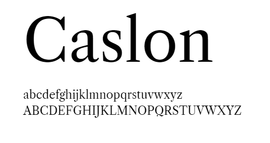
Among the long-established fonts is Caslon. The typeface was designed in the early 1700s by William Caslon. English typefaces began with this one. It was a common font used in colonial America, and even the US Declaration of Independence was written with this font.
Because there is no enforceable trademark on the name “Caslon”, there are many typefaces called “Caslon”, some of which are exact copies of the originals, while others are not.
It is best used in blocks of text since it is a serif font (with tails). If you want best results, keep the font size between 8 and 14 points, as you would with Baskerville. The best place to make use of this would be in an application or a report.
7. Times New Roman
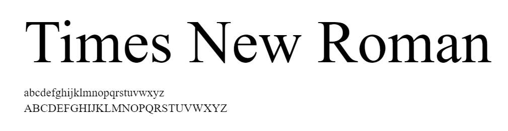
First published by The Times of London newspaper in 1932, this typeface was designed for the publication.
In the years since, it has evolved into one of the most popular typefaces in the world. Victor Lardent at The Times created the original designs under the direction of Stanley Morison.
Monotype’s Type Drawing Office then further refined it in an extensive step-by-step process. Many of its characteristics were taken from Morison’s experiments with Perpetua and Plantin, but it was adapted so that it was highly readable and also very efficient.
There are vast uses for it in books and journals, in reports, in presentations, and in advertising.
Is there anything else you need to think about when selecting the right font?
When choosing a font, there are a number of things to keep in mind besides these categories. For example, does it have all the features you are looking for?
You may be able to get away with just using the letters of the alphabet for the first piece, but what if you have to write a quick article for the public?
Are there symbols such as a currency symbol or exclamation point in the text? Especially when you are submitting a funding proposal. (Read our guide to everything you need to know about Research Proposals.)
Every once in a while, we find ourselves trying to add a price but the symbol we need isn’t there.
As well as the font size, there are other considerations, such as does it come in many sizes and styles or are only light, regular and bold available?
If you don’t have a lot of specifics, that’s alright, but you should take into account a broader perspective and what you intend to accomplish.
When it comes to communicating your message, different font sizes can be really helpful. Despite the fact that it’s good to have different typefaces, there is a rule that suggests only using a maximum of three typefaces in one contribution.
If you use any more than that, you risk-taking away the emphasis of what is being said. Complementary fonts are important, but they shouldn’t be too similar as this could result in a cluttered look that could be confusing.
Lastly, when picking a font, we should consider the print aspects to ensure it will be easy to read. These factors include colour, size, and style. The most decorative script fonts may look good, but they aren’t always a good option.
Hence, make sure to put into consideration every possible aspect of the information that may be published around the world through various mediums.
How to use Scientific fonts?
A reader’s primary objective should be to understand the facts about your project clearly. An easy-to-read document will help you achieve that goal.
The editors of newspapers, as well as publishers of journals, have developed many guidelines to make text more readable. These guidelines are now available for scientific purposes.
- Keep the main body text font size at least 16 points. Any smaller would make the text difficult to read.
- A project title should have a minimum height of 2 inches.
- It is recommended that headlines have at least one inch tall letters.
- If you want to stay with the norm, use Arial, Times New Roman, or another typeface similar to these.
- If you intend to draw attention to anything, use italics or boldface.
- Place your text below your picture; that makes it easier to read.
- Please refrain from using ALL CAPS; they can be difficult to perceive.
- You should not use reverse typeface (light text on dark background).
- If you type in a script font, avoid using artistic fonts, since they are harder to follow.
- You can choose between Serif or Sans Serif depending on the medium or the audience you will be addressing to.
- Your poster or paper should not contain more than two or three contrasting fonts.
- For body copy and headings, Time New Roman and Arial combine nicely.
Please note that every journal or publication house has different guidelines based on how they handle submissions, so make sure you check them.
It is also important to consider the medium on which the text will appear when choosing a font. Posters will need to have better fonts that appear decent when printed.
Selecting the wrong font can negatively affect future decision-making. It is important to remember that the typeface that you select to present your research or information will have a major impact on its effectiveness.
Make sure you make the right choice because it will leave a meaningful impression on the reader. (You can learn how to create an outstanding presentation that will leave the audience impressed, here)
Fonts for scientific illustrations and infographics
Infographics, or informational graphics, are a growing trend in data presentation. This style of presentation allows you to convey your message quickly and easily.
In order to make complex topics understandable, illustrations are extremely useful. A good font is essential no matter what.(See our guide to scientific illustrations)
Your choice of font is as important as the research itself when it comes to presenting it. (In most cases.) Generally, book, journal, and newspaper fonts are serif fonts, which are characterized by small lines at the end of each stroke.
The vast majority of online content uses sans serif fonts. Serif fonts make it easier for readers to follow lines of text, which is certainly useful when designing illustrations or use the infographic maker.
The best typeface for graphic design is sans serif. Arial, Calibri, Helvetica, Verdana, and open sans, which are readily available, improve content legibility significantly.
If you understand how certain font choices affect the composition of your content, deciding on a family of fonts and a typography scheme becomes much more straightforward.
As you become more familiar with the values, tone, and vision of the work, you will begin to can identify what works. It is possible to convey your ideas in a non-verbal and yet powerful way, using fonts.
Now that we have reached our final section, you should also know where to find all the fonts in one place.
You can find all the best science fonts for graphic design at one place
We at mind the graph understand the importance of typography and how it plays an integral part in representation of scientific ideas. Mind the graph, the most user-friendly tool.
Scientists and academicians from over 100 top academic, educational, and industrial institutions trust Mind the Graph. This is why everything is up-to-date and scientifically sound.
You will find all the A to Z fonts you need for all things scientific here. Besides that, we also suggest fonts that are appropriate for your content type. You can choose from the list we have.
Furthermore, we have many templates to assist in the creation of posters and graphics. Additionally, they can be customized according to your needs. However, guess what is even better than that? We offer a FREE trial, so you can decide what plan fits you best.
When you join, you join us in our mission to increase easy access to the best science tool for as many people as possible. Our blog section has a variety of information about everything from making Science posters to a list of the best science podcasts of 2022, definitely worth checking out.


Subscribe to our newsletter
Exclusive high quality content about effective visual
communication in science.