Dette innlegget er en del av en serie med undervisningsmateriell som tar sikte på å gi kvalifisert informasjon til forskere og helsepersonell som ønsker å kommunisere ved hjelp av infografikk. Vet hvorfor infografikk er et godt verktøy for vitenskapelig kommunikasjon.
Hvis du foretrekker det, kan du laste ned pdf-kopi av "The Den ultimate guiden til vitenskapelig infografikk" av Mind the Graph.
What’s the difference between a simple chart and an infographic?
Information design is the practice of representing information in a visual format. A visual representation of information could include visualizing data, processes, hierarchy, anatomy, chronology and other facts. While a simple chart is technically an information graphic, most information graphics are multifaceted and contain explanations or insightful descriptions in addition to charts.
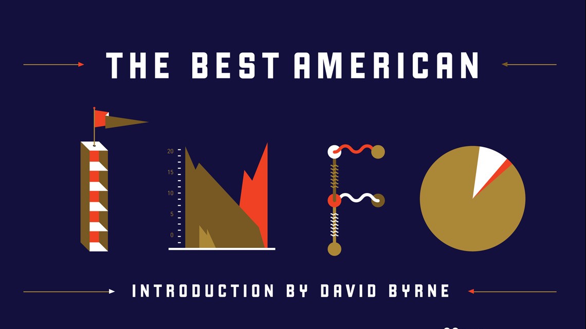
“Infographic” is an abbreviation of “information graphic” and uses visual cues and structured data to tell a story. They don’t need to contain a certain amount of data, possess a certain complexitiy or presente a certain level of analysis. Theoretically, it can be as simple as a road sign that let you know that there is a construction site ahead or as complex as a visual analysis of the global economy. The bottom line is that an infographic uses data and visual elements to tell a story.
This series of posts will guide you trough the many aspects of the infographic creation process in the context of scientific communication. You can interpret this information as a modern way to use your charts, or as a revolutionary tool that will make you leap from the restricted ground of a scientific paper that very few people read to a super attractive communication that will make your science bloom.

Det grunnleggende
If you are thinking of creating an infographic, I suppose you already have some innhold å kommunisere. Det er sannsynligvis den result of your research og den har en verktøy, which is to impact the audience of a conference talk, poster session or the readers of your paper. True?
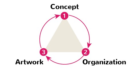
Bra. Nå trenger du en infografikk. Begynn med det grunnleggende. En god infografikk er basert på tre enkle prinsipper: konsept, organisering og illustrasjon. Hvis du følger dem til punkt og prikke, er det stor sannsynlighet for at du ender opp med et attraktivt informasjonsdesign som vil påvirke publikum. Disse tre prinsippene er de viktigste du bør ta hensyn til når du lager infografikk. Vi anbefaler at du ser på hvert enkelt prinsipp som et "trinn" i prosessen. Det vil si
- Legg stor vekt på "ideen", vit på forhånd hva du vil fortelle, hva som er budskapet.
- Bruk deretter litt tid på å organisere det visuelt.
- Finally, you should look for figures and care about artwork styles.
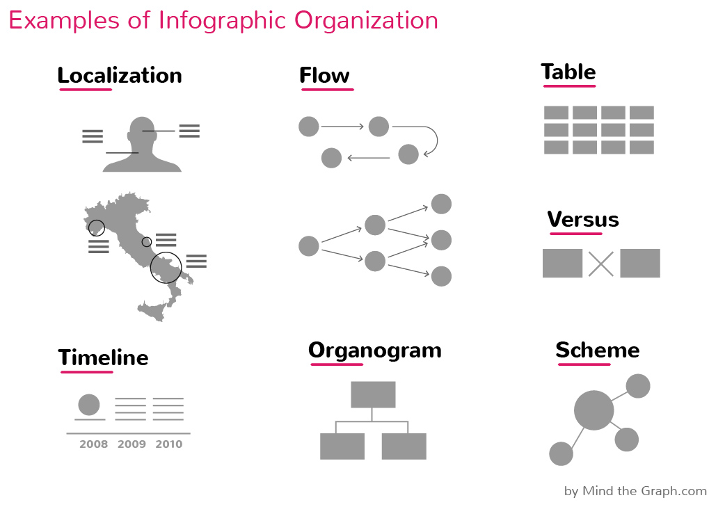
Interessante og nyttige former for infografikk for forskere er avbildet ovenfor. Det er lett å få øye på noen populære organisasjoner, og du har sikkert allerede brukt minst "lokalisering", "tidslinje" og "organogram". Har du ikke?
I de neste innleggene i denne serien skal vi se nærmere på hvordan de kan produseres. Tegnestilen er det som vanligvis fanger publikums oppmerksomhet, som i disse eksempler på prisbelønt infografikk fra pressenMen tro oss, dette er bare slutten på det.
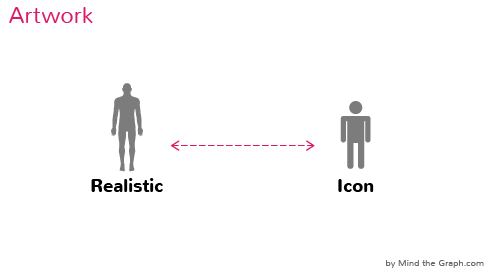
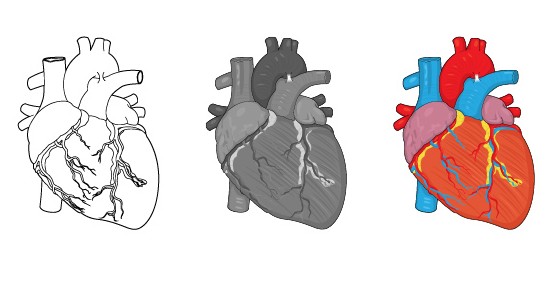
I Mind the Graphkan man bytte fra 5 forskjellige illustrasjonsstiler with a simple mouse click.Sweet. Font types and colors are also part of the style, this is the “language” of the infographic. The elements must combine well and constitute an harmonic final image. That’s why your Google Images normally don’t work well… cappicci? If you are ready, jump inn i plattformen og begynn å lage fantastisk vitenskapelig infografikk med harmoniske illustrasjoner og infografikkelementer.
Naviger gjennom veiledningen:
Chapter 1 – What makes a good infographic?
Hvis du foretrekker det, kan du laste ned pdf-kopi av "The Den ultimate guiden til vitenskapelig infografikk" av Mind the Graph.

Abonner på nyhetsbrevet vårt
Eksklusivt innhold av høy kvalitet om effektiv visuell
kommunikasjon innen vitenskap.