
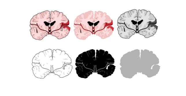
As you probably know at this point, we are have the biggest library of accurate scientific illustrations. We have over eight thousands of scientific illustrations now and couting. But did you know that each illustration has six different version that you can use?
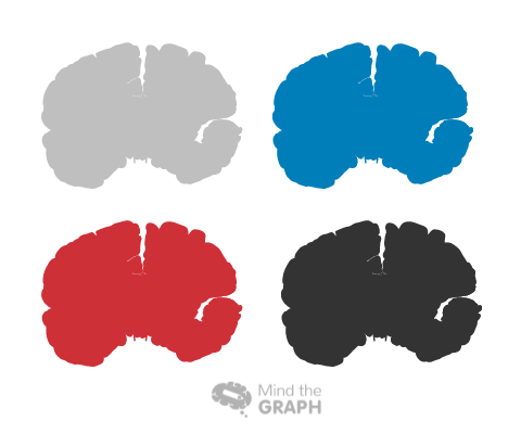
Besides that, you can change it and use the color you want to.
This is an important tool to create hierarchy in your creations. You can use more than one illustration in your graphical abstract, but it is important to know what is your main image. To know that, you need first to know what is your main question. I already explained that in other article:
- How to make an infographic – #1 Communication in science
- How to make an infographic #2 Show your data in an awesome way!
The importance of different styles
It is very important to us that our users be able to enjoy the most of our features. This way your graphical abstract will look very professional and unique. Besides our tutorials available on blog, we have a youtube channel with video tutorials and tips. We can watch the videos about hierarchy to understand better how to use illustrations to create an organized flow and catch the attention of your audience.
So if you feel ready to try it, you can start now for free! You can also send us your creation so we can see how our users are enjoying Mind the Graph.
Last but not least, we are always open to hear from you! Feel free to reach us and send your feedback: contact@mindthegraph.com


Subscribe to our newsletter
Exclusive high quality content about effective visual
communication in science.