3 min read
08/28/2018
Mind The Graph Scientific Blog is meant to help scientists learn how to communicate science in an uncomplicated way.
Once all work is done and reviewed a couple of hundred times, the so awaited moment arrives: time to submit your scientific paper! It is a long well-known road. But, chances your paper will be accepted at first try are low, so you get prepared for the following steps: Let’s take a closer look at […]
If you think publishing a paper is the only way to get visibility to your […]
When the subject is information, combining figures and texts is no trend. Calling it infographic […]
Reference in data visualization, Alberto Cairo is one of the biggest names when the subject […]
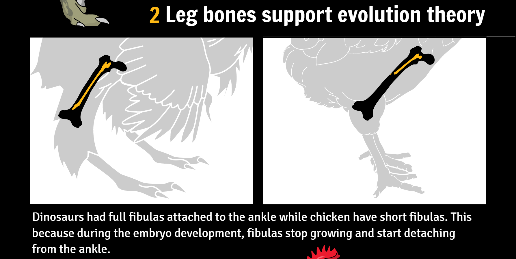
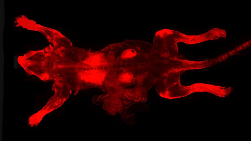
Last week, Botelho et al. published a new research on gene manipulation in chicken. Their […]
Science fiction movies have given us hope about developing superpowers such as invisibility, super strengh […]
Paris, France & San Diego, CA (27 October 2016) – AgileBio, a leading global provider […]
Isaac Newton Age 45 – Published the Philosophiae Naturalis Principia Mathematica (Mathematical Principles of […]
It’s always a celebration when we see the amazing work of our users. I already wrote about […]
Being a scientist is no easy task. The autonomy of having your own work comes […]
The first impression Mind the Graph users have once they login at our platform is: […]
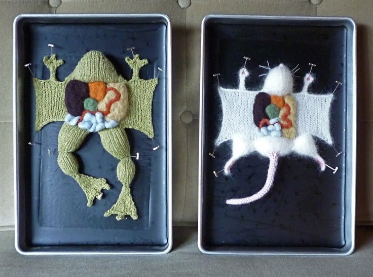
When it comes to science art, most of us immediatly think about super realistic and […]
Post doctor in Biological Sciences, Gabriela Trevisan is especialized in pain and inflammatory processes. Her […]