When the subject is information, combining figures and texts is no trend. Calling it infographic isn’t much new either. So why do we keep talking about infographics as the ultimate idea of the decade?
Simply because the usage of infographics became a tool more than a consequence. People are becoming aware of scientific infographic power to deliver information successfully. And not just any people. Really big massive influential people.
In 2014, Nature posted on their blog about science communication and how cool it is to use a scientific infographic. The way they did it was simple: showing that a couple of friends (NASA and Scientific American) think scientific infographics are cool too.
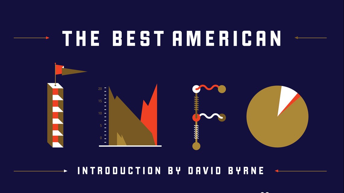
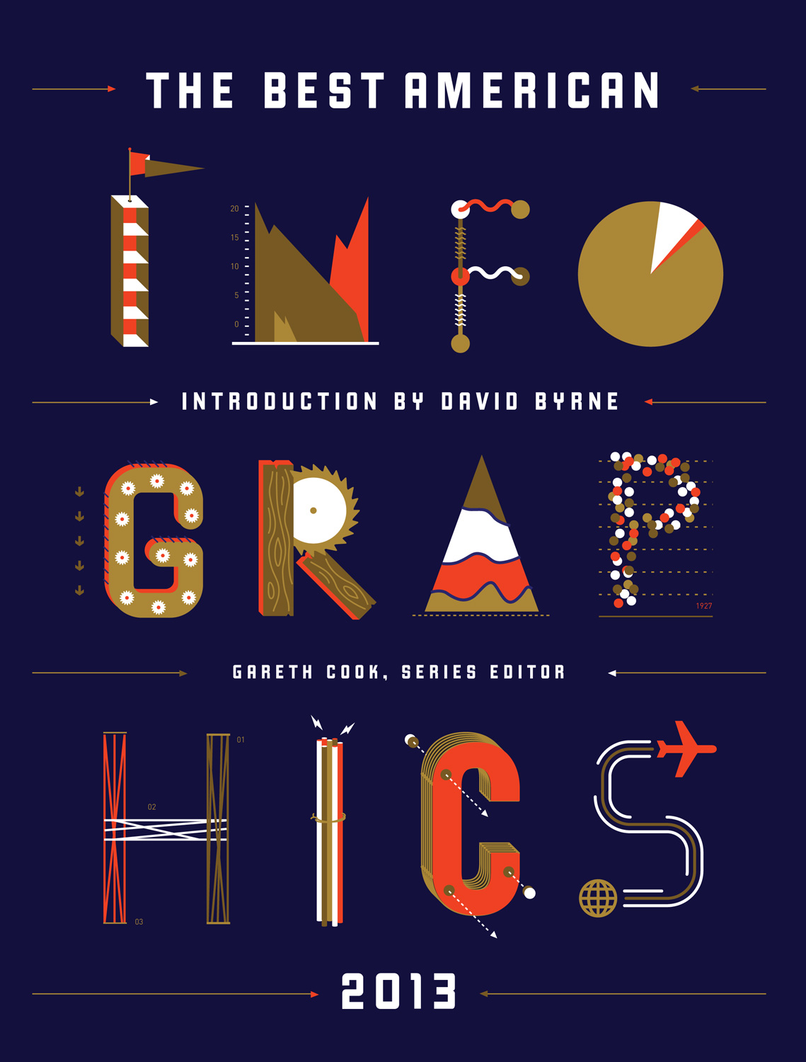
They started the post with a Pulitzer Prize-winning, Gareth Cook, and his book “Best American Infographics 2013”.
The book proves the importance of scientific infographic by showing how embracing they can be.
From mapping ocean noise to the anatomy of speed, infographics are a great tool to make yourself understood. And when it comes to science, it’s a natural fit.
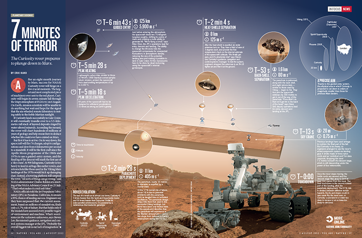
“Science is a field where infographics are particularly useful and powerful (…).Our quest to understand space is a great example of this – with distances and forces so large it’s hard for the average person to make sense of what has been discovered. What is it like to land on Mars? How alone are we in the Milky Way, truly? These are questions that demand visual answers.” Gareth Cook
In Cook’s book we can find a guide to NASA’s Curiosity rover landing on Mars in August 2012. NASA provided amazing illustrations and Nature created the information design. Working together, they made this:
Not only, Cook’s book also contains a Scientific American’s infographic entitled “Planets Everywhere”. And Scientific American’s art director of information graphics , Jen Christiansen, upholds the usage of scientific infographics:
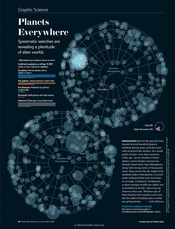
“Graphics can often communicate scientific concepts more efficiently than words, for any audience. Visuals that are developed for a science savvy but non-specialist audience, like this one above, can help make scientific findings accessible to broader audiences. By removing barriers (such as technical jargon), and providing context (in this case, the two constellations), the information is presented in an immediately intuitive and engaging manner.” Jen Christiansen
If Nature, NASA and Scientific American think scientific infographic is cool, maybe you want to learn how to make it!

Subscribe to our newsletter
Exclusive high quality content about effective visual
communication in science.