During conferences or gatherings of the scientific community, researchers have the opportunity to share their scientific knowledge with an array of different audiences.
The discussion will provide the opportunity to hear the suggestions and criticisms of experts in the field, practitioners, and people associated with the field of research.
Two types of presentations are typically presented at research conferences: (1) oral presentations and (2) posters. Poster presentations allow for direct interaction between researchers and conference participants.
Posters are good tools for networking. Rather than summarizing every nuance of your research, a poster is designed to attract the attention of readers by using limited words and good graphics.
The best posters at research symposiums are often awarded prizes and accolades. Most posters are evaluated based on their visual appeal, which is determined by the content of the research as well as how it is portrayed. Presenters are judged on how well they interact with conference attendees.
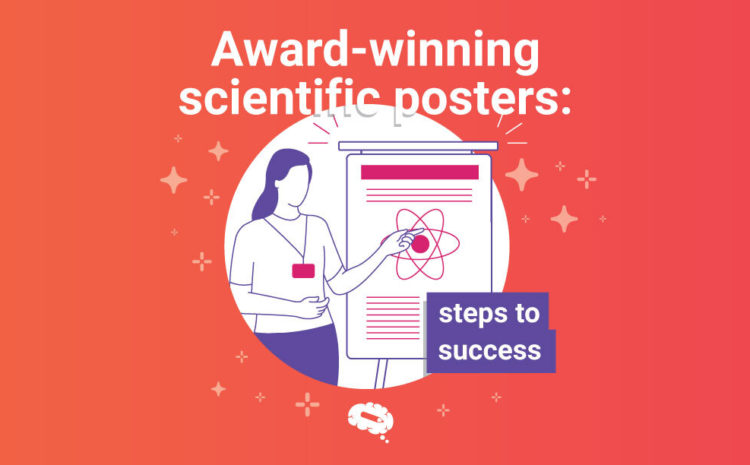
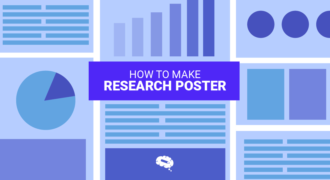
This article will show you how to make an award-winning poster and highlight the key elements that make an outstanding research paper. Keep an eye out for important articles in our blog that will help you with enhancing the whole process.
How to Create an Award-Winning Poster?
Your goal should be to engage them in an informal conversation about your research and share your story. A poster should be a catalyst for discussion.
In addition, a poster is an effective communication medium. Visuals should be used to captivate the attention of a group of people. Eventually, as people read your piece, you can provide them with context for your work.
Be able to articulate why you did what you did, and understand the broader impact of your actions.
Prepare a Plan
Prepare your poster according to the conference’s requirements before you begin. Conference layouts can either be portrait or landscape, and they will usually be different from conference to conference.
Before you begin, it is a good idea to check these things out. It will prevent you from later having to reformat!
Creating a plan may also be helpful. Prepare a comprehensive list of the figures you will feature and how you will exhibit them. Your material should be arranged according to a sequential order. To make the flow clear, you may wish to list the sections.
A poster should be self-contained, which means the reader should be able to comprehend how you arrived at your conclusion and why should be clearly understood.
Including figure legends, a good rule of thumb for minimizing text is 1,000 words. It is a good number to use on a large poster in order to strike the right balance between providing enough explanation of the research and providing room for graphics and white space.

The removal of unnecessary chunks of text should also improve the aesthetic of the design.

Conceptualization
To conceptualize is simply to outline everything that needs to be included on the poster.
Use solid backgrounds so that figures and texts aren’t overwhelmed. Use a single background color to create a unified look. Choosing a background color for a template should be largely influenced by the theme of the research.
Color is usually what grabs a reader’s attention in terms of the concept. Color also enhances the text’s visibility. Make it more readable by using a light and clean color scheme.
Choose light, neutral colors for your background. As a result, your text will appear more prominent, as it should usually be black. If you choose to use bold colors, it will be apparent that this is a significant part of the poster.
Backgrounds must be plain and untextured. There is not much to gain from this, and it can detract from your poster. Keeping these factors in mind is crucial.
Create columns on the page to make the lines easier to read and shorter. Adding vertical lines to the layout helps with alignment. Furthermore, the order of the information will be more easily recognizable on your poster.
The Text
Limit the amount of text you use. Many posters are cluttered with too much text. Keep it simple and eliminate any information that is not necessary. Keep the typeface consistent. Avoid writing in paragraphs by using bullet points.
You want to make sure that you don’t use anything too fancy in your fonts, rather keep it simple. Use italics or bold for those parts that you would like to draw attention to.
Headings should be written in sans-serif font. A few meters away, they should be big enough to make it easy to spot keywords.
Serif fonts are easier to read when printed, and should therefore be used for body text. Using too many fonts or sizes will look unprofessional, so please be careful.
Make the most of white space. In common scientific posters, unlike award-winning scientific posters, there is a tendency to fill the space with as much information as possible. As a result, onlookers are likely to pass by a confusing and difficult-to-read poster.
By using white space effectively, the poster will be easy to read. Through it, the focus will move from one aspect to another, logically. Readers will be given a sense of related information as well. Here’s a guide to help you choose the right font type and size: Scientific Fonts: How to Select the Right One.
Illustrations
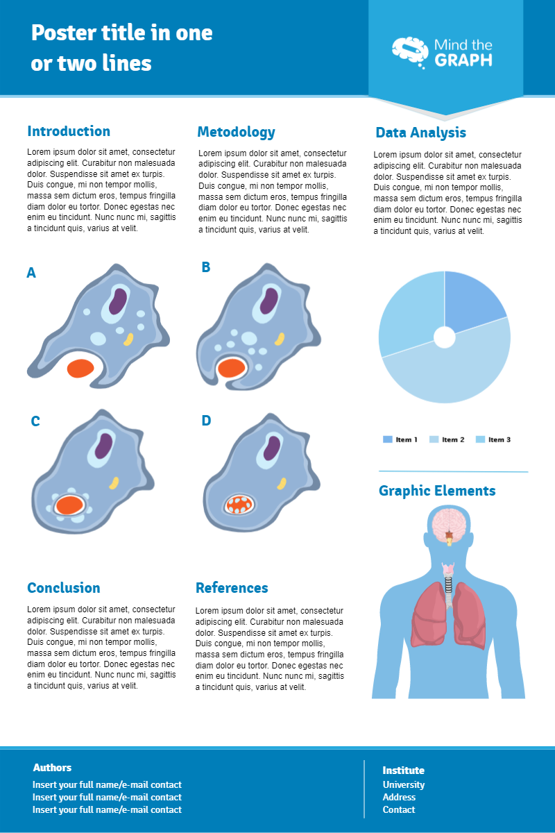
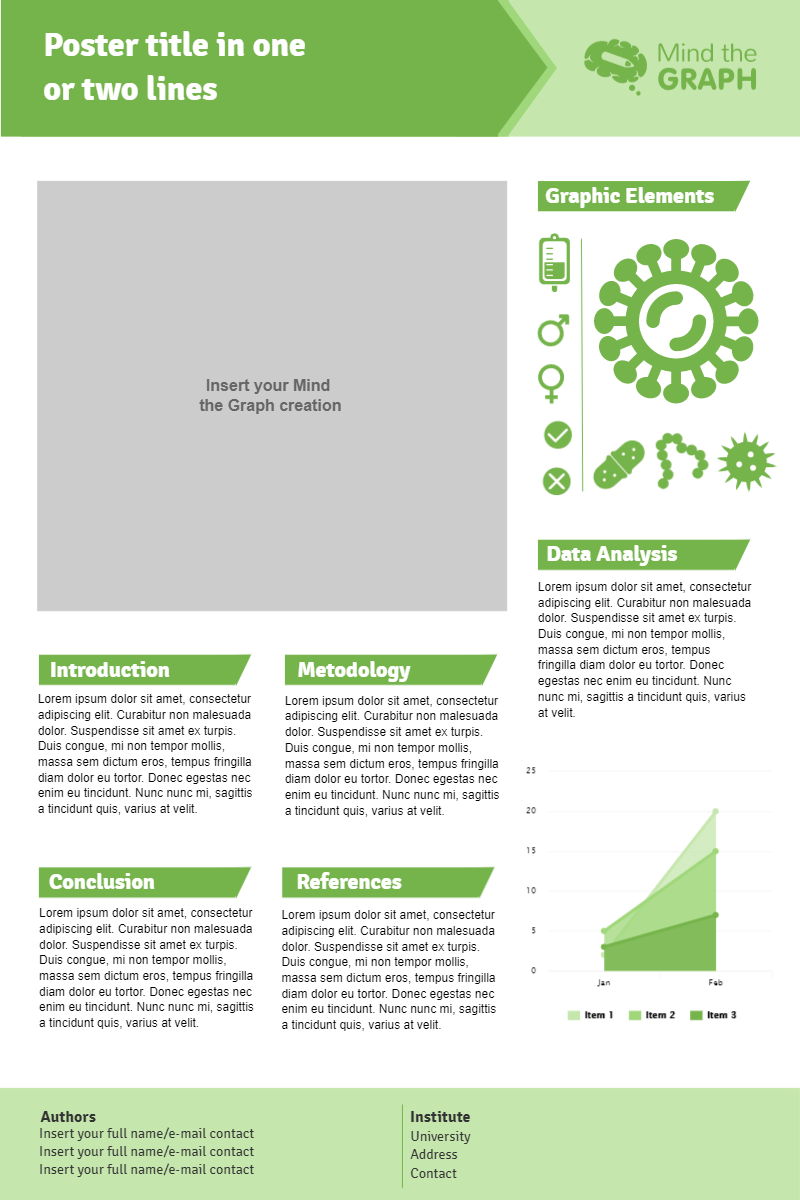
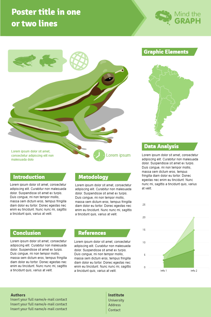
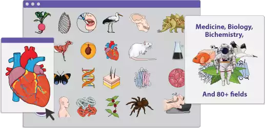
Illustrations should be large enough for the viewer to see them from at least one meter away. In order to make complex texts easier to understand for even novice readers, illustrations should clarify complex text. Instead of tables, graphs are usually a better choice. So, meet Mind the Graph.
For the steps you used, you can also create a diagram, which will simplify text. Use 20 percent text, 40 percent illustrations, and 40 percent white space for your layout.
Keep your illustrations simple and straightforward. Once again, use the correct dimensions and clear printing, so it looks good on your poster. In addition, make sure that every one stands out clearly.
You can grab attention from a distance by using an eye-catching image that’s a decent size. Each figure must be titled and explained in a prominent place on the poster (so it is clear which figure you are discussing). For tips on how to create an outstanding scientific illustration, read the article: Scientific Illustration: The Key To a World of Visual Science.
An Outline Of Your Poster
- If you want to entice people from a distance, you need to create an engaging title. It’s got to be easy to read 3-4 m away!
- Getting your audience interested starts with a strong introduction. Make sure to be succinct, but remember to explain the research’s purpose. Do not bury your concluding remarks and key figures at the bottom of your document. Make your key findings stand out and put them at the top of the page. Make sure the font color in this section is light, and the background is dark.
- Include all data, experimental design, materials, and analytical methods you used in your study. Whenever possible, use graphs and pictures.
- The most entries are in the results section. Design the poster to focus on your figures. Make sure your graphs have labels to make it easier for your audience to understand them.
- Summarize your takeaway message here. What conclusions did you draw? Did you find your hypothesis to be valid? Consider the larger picture; how does the result fit into the bigger picture?
Read the article How to Create a Poster For Research Presentation related to the topic. Keep an eye out for important points.
Last But Not Least
A trial print can be done before making a final one. A4 copies should always be printed before a real poster is printed. If a poster features images on one side and text on the other, it’s not effective, since the reader is overwhelmed with too much text.
Be sure to review it carefully for errors, unusual symbols and fonts, and check the placement of the figures. If you want to make sure it’s perfect, have a person proofread it.
Someone with a fresh perspective will be able to spot errors more easily. Relationships between data points should be displayed as clearly as possible on graphs.
Plot lines, titles, and axes labels should be clear. Never wait until the last minute to have your posters printed, so you don’t experience stress at the last minute.
You can send yourself a copy of your poster if you are traveling or take a copy with you. You never know where your poster will end up!
To Be Successful, A Poster Must Be Well Presented
Now let’s talk about D-Day. This is a crucial component of winning an award. Be willing to walk your audience through all the important elements of your poster.
Let them know about your field of research shortly after you introduce yourself. The amount of time you spend discussing the background will depend on how much detail about the research you need to share.
Make sure you practice presenting your poster before the actual presentation. To help audience members understand difficult concepts, use illustrations.
A thorough illustration can sometimes make a difficult concept more clear and easier to understand. It is easy to become confused and misunderstood when describing with text, as text can be overly complex and long-winded.
Create a two-minute elevator pitch. Do not memorize it; let it flow naturally. Be enthusiastic about your work, as enthusiasm is contagious.
Take notes on your interactions and any suggestions that came up during your conversations. We have a guide that will help you better present your research and ideas: How to Create an Outstanding Business Presentation.
Templates Made By Scientists
Mind the Graph revolutionizes scientific communication by offering scientists a user-friendly platform with scientifically-themed templates. Publication-ready exporting ensures seamless integration into scientific papers and presentations. Mind the Graph empowers scientists to make their research more accessible and engaging through visually appealing posters. Start your free trial now!


Subscribe to our newsletter
Exclusive high quality content about effective visual
communication in science.