2 min read
10/24/2018
Mind The Graph Scientific Blog is meant to help scientists learn how to communicate science in an uncomplicated way.
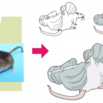
How to empower your research in Life Sciences with graphical abstracts? It isn’t easy to create accurate and beautiful images of cell signaling pathways. However, As I already wrote about how most Cell Press journals ask for a Graphical Abstract and how this can be a barrier if you are a scientist, but not a designer. […]
Illustrations and infographics are great tools to show data and talk about controversial topics as […]
Children in general have a curious mind and so many questions. Exactly how scientists should be. Therefore, […]
Sometimes, I receive e-mails from scientists, engineers, teachers and other professionals saying: Oh, I love […]
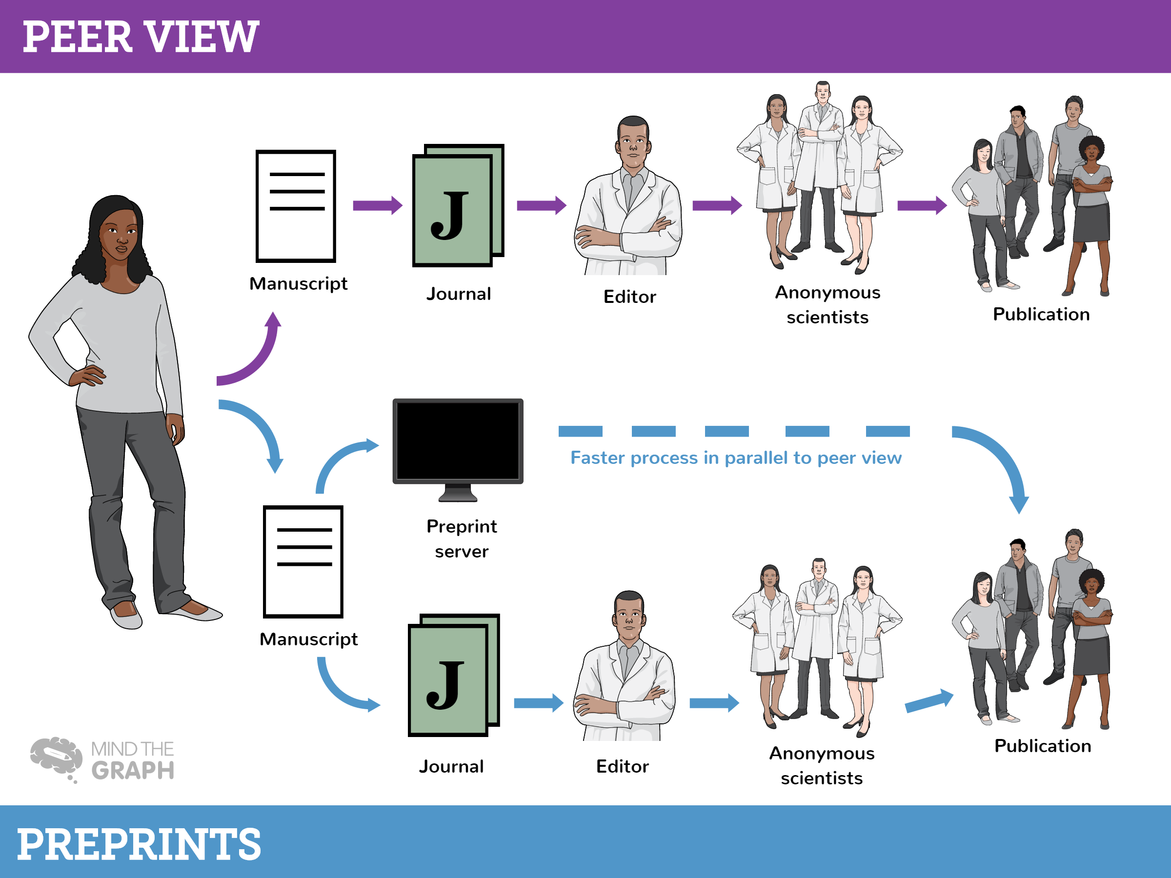
Scientific publishing. Only a researcher can understand the mixed feeling of hearing these words. At […]
Science communication not always meant to get published in journals. From the beginning of science, […]
To our absolute surprise, Mind the Graph has been recently featured in a post about meaningful strategies of digital branding.
Everyday we are overloaded with information in all formats. It has never been easier to […]
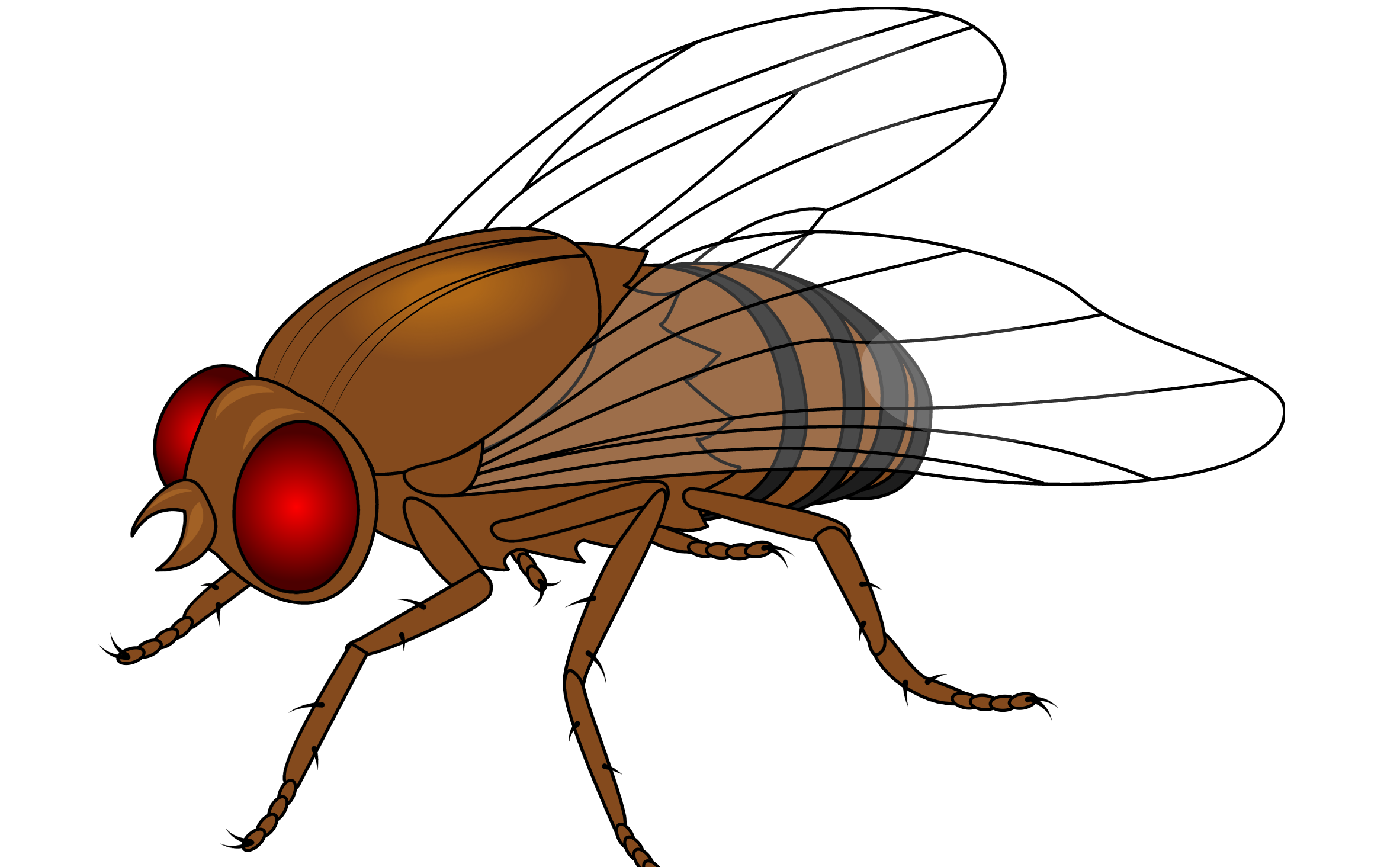
Drosophila melanogaster or fruit flies are one of the most important models in medical and […]
What if you could broadcast your research to millions of people and make your work […]
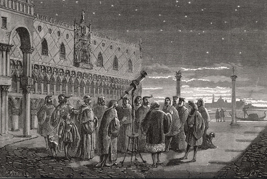
The scientific paper format was a revolution in science. Before it, the scientific communication was made […]
Publishing a paper that no one will ever read is no fun. Instead, it is […]
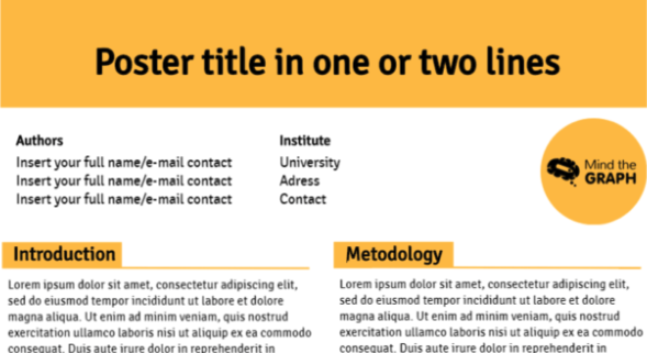
Present a scientific poster is a common way to communicate a scientific research. It is an […]