To our absolute surprise, Mind the Graph has been recently featured in a post about meaningful strategies of digital branding. It’s noteworthy to highlight the words of the co-founder Fabricio Pamplona emphasizing the empathic aspect behind the platform (see below).
Empathy is a crucial point in mindthegraph product development since the beginning. This was not a deliberate strategy on digital branding, but rather, a legitimate strategy to create a product that is meaningful for our dear users.
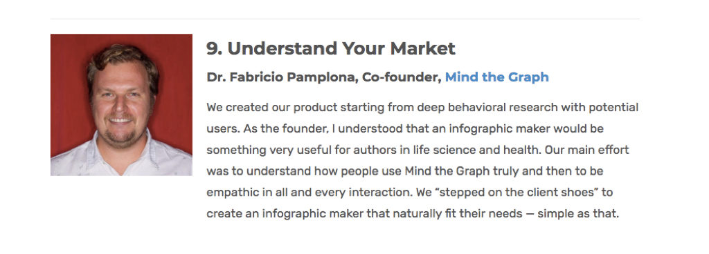
Understanding the market (deeply) is crucial to create a meaningful product. And that came naturally, as one of the co-founders is a scientist himself. Fabricio had been following initiatives like the “Article of the Future” by Elsevier and knew that scientist struggles to create figures and presentations to represent their work.
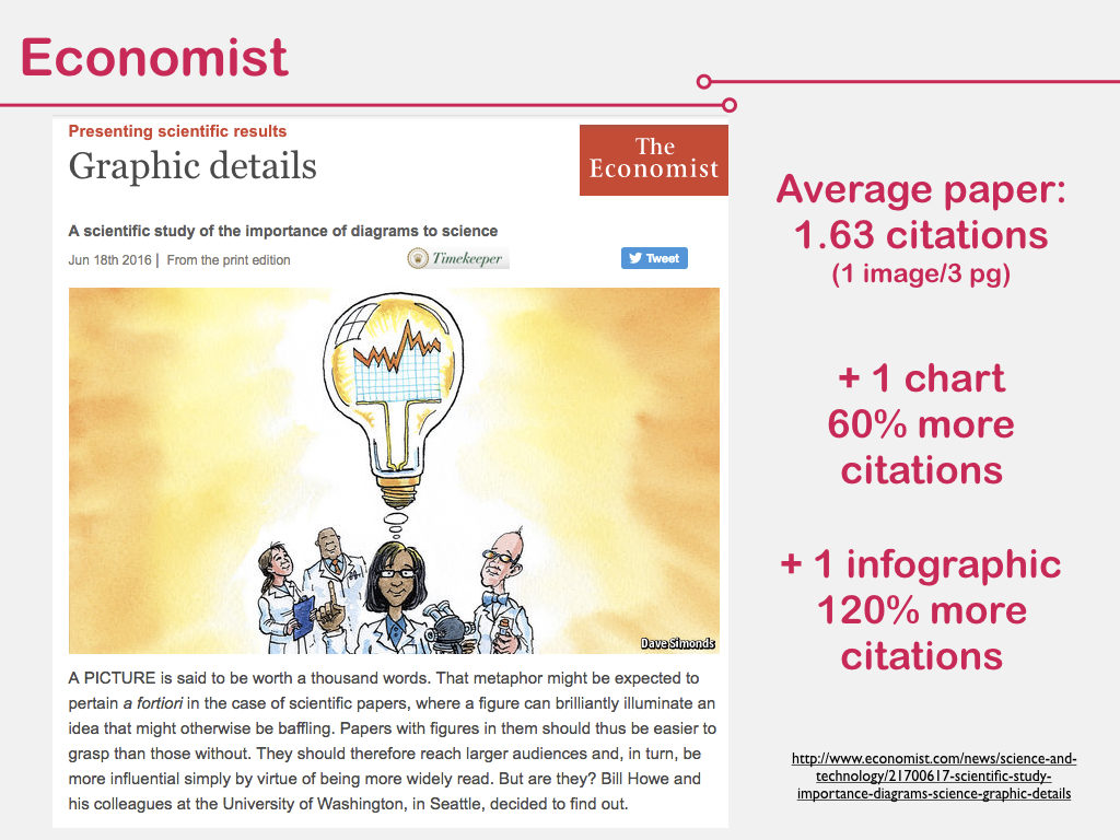
A scientific paper depicts research where one spent, on average, 30K to 100K USD, and all this insightful (and expensive) information is hidden behind a literal wall of words. Nobody reads, nobody cites, nobody cares. Sad, isn’t it?
A recent study by the Economist shows that a regular paper receives less than 2 citations… Why does it matter? Because being cited means “relevance” in the community for a researcher. In other words, it’s the currency researchers use to compensate one another for the efforts.
Now, look at that: if you use figures and infographics, your citation rate is more than double!
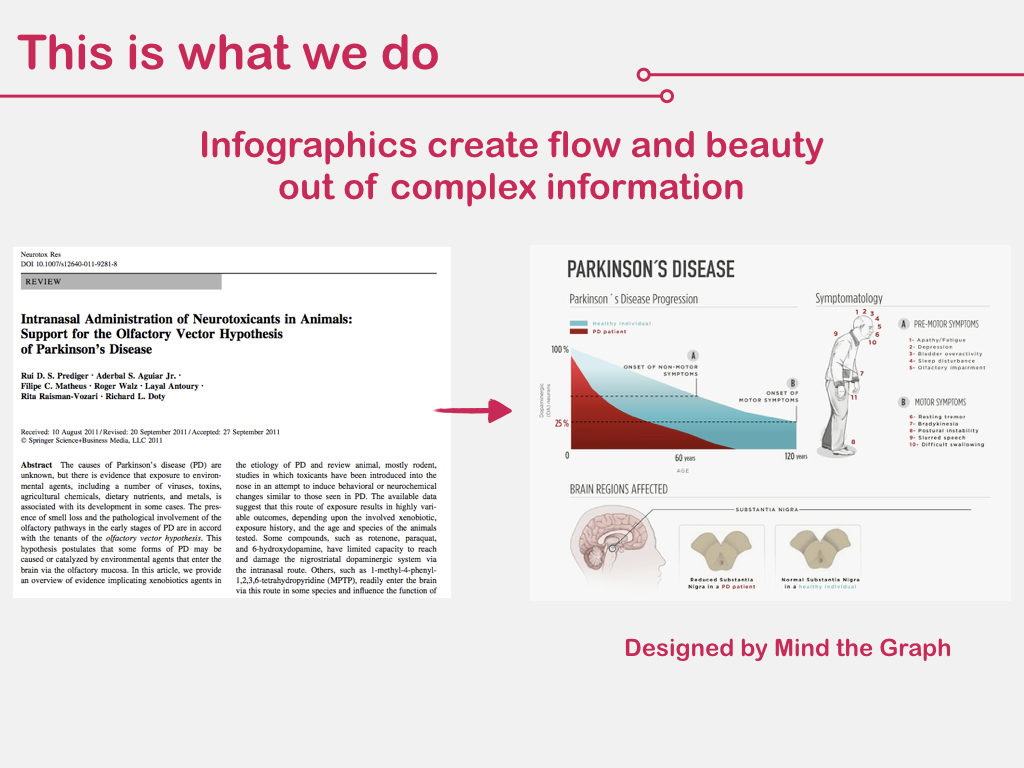
This is exactly what we believe in Mind the Graph: that infographics create flow and beauty out of complex information. They turn unpalatable scientific data into something nice to read, cite, and share.
People actually understand more, keep more, and have more pleasure while studying with infographics. See for example the figure created for one of our clients Prof. Prediger to summarize the Parkinson’s disease model. You explain a lot in just one figure and it attracts the reader to dive into the more dense content.
Before beginning the business, we already understood the need – visual communication for scientists – but we were not sure on how to delivery it. Therefore, we started by doing what is called “concierge validation” in the product design process, that’s it we used to meet the user need by delivering a service to understand how they think and what they actually want. In product design jargon: to feel where it hurts.
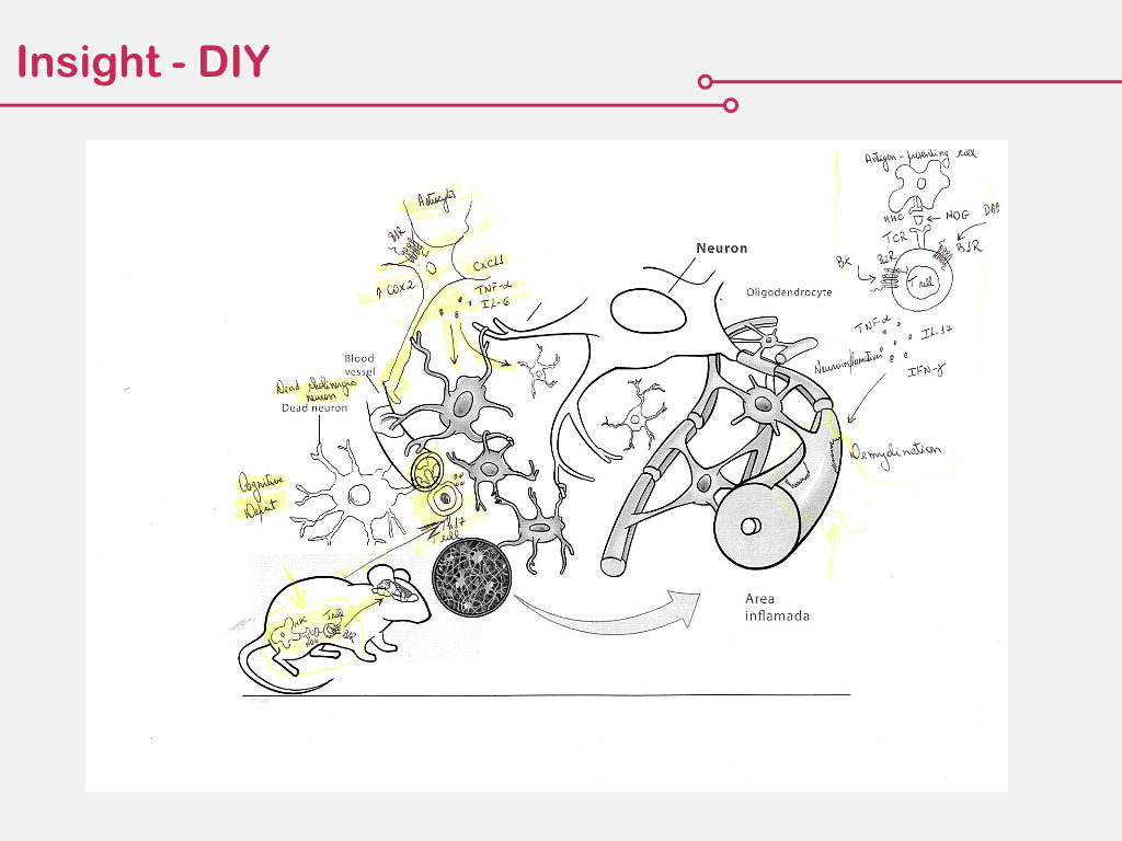
The figure below shows the exact Eureka moment for the creation of the Mind the Graph platform. There you see the actual feedback of a user on a figure created by us on demand. He apparently liked, but took the time to print it and highlight some parts in yellow, to write legends, and even include new draws.
We realize the client was saying: I like what you do, but please, do it this way. Do it MY WAY. That was the click that Mind the Graph should be a do-it-yourself platform, where we enabled the creative force of the people on the other side.
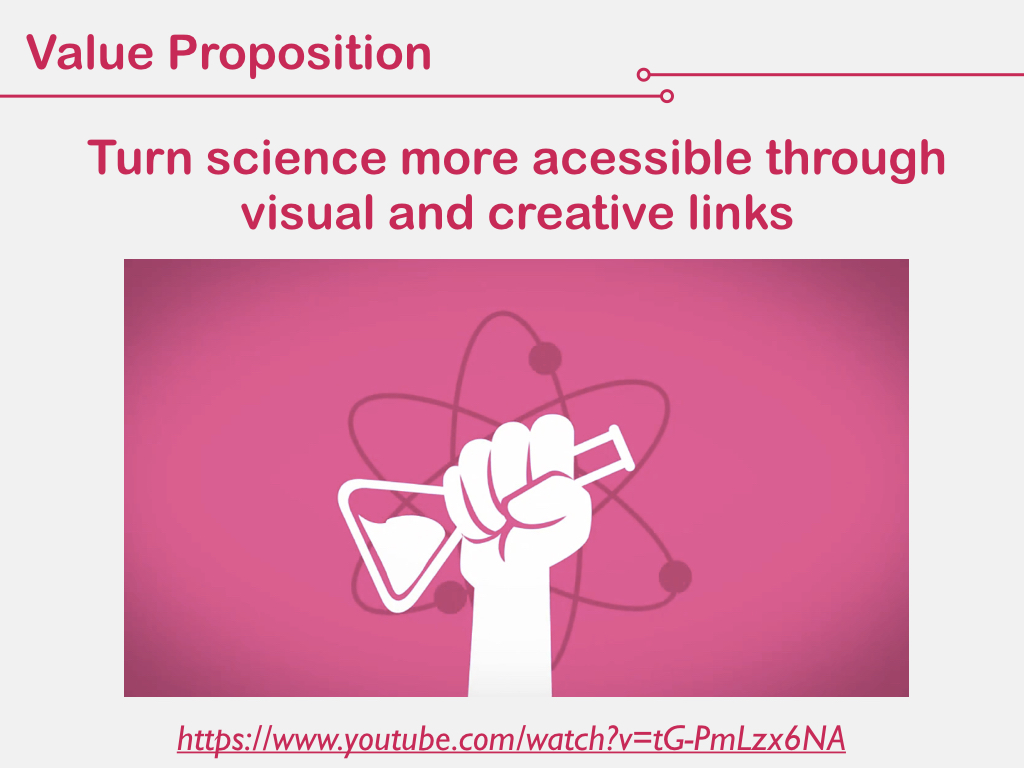
At this very moment, we decided to empower scientists and make THEM BECOME DESIGNERS. Our value proposition is to untangle science through visual and creative links and fundamentally, to provide the tools, not the answers. Is like teaching to fish, instead of providing the fish. How do you feel about it, have we done right? 🙂


Subscribe to our newsletter
Exclusive high quality content about effective visual
communication in science.