Til vår store overraskelse, Mind the Graph har nylig blitt omtalt i et innlegg om meningsfulle strategier for digital merkevarebygging. Det er verdt å merke seg ordene til medgrunnleggeren Fabricio Pamplona understreker det empatiske aspektet bak plattformen (se nedenfor).
Empathy is a crucial point in mindthegraph product development since the beginning. This was not a deliberate strategy on digital branding, but rather, a legitimate strategy to create a product that is meaningful for our dear users.
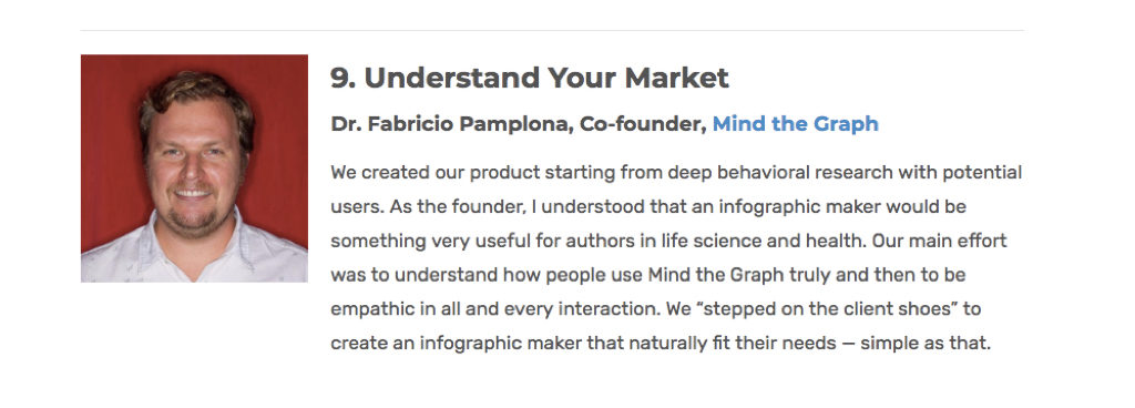
Understanding the market (deeply) is crucial to create a meaningful product. And that came naturally, as one of the co-founders is a scientist himself. Fabricio had been following initiatives like the “Article of the Future” by Elsevier and knew that scientist struggles to create figures and presentations to represent their work.
A scientific paper depicts research where one spent, on average, 30K to 100K USD, and all this insightful (and expensive) information is hidden behind a literal wall of words. Nobody reads, nobody cites, nobody cares. Sad, isn’t it?
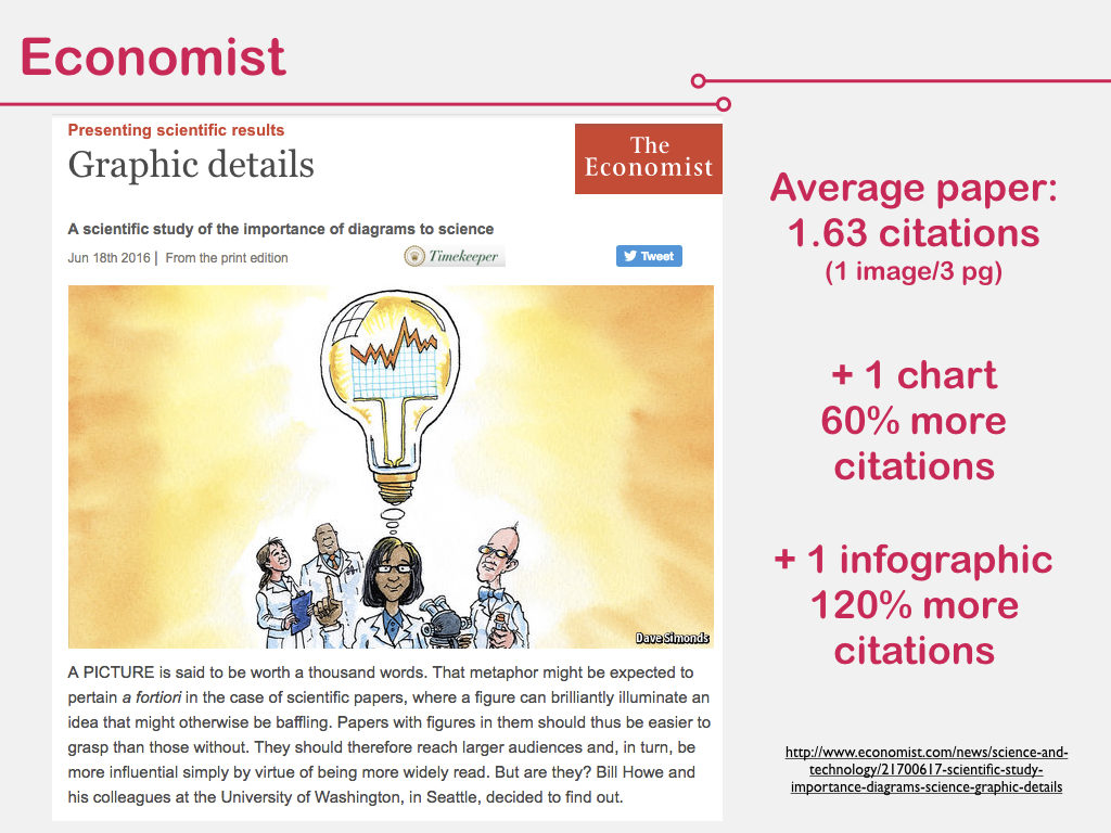
En fersk undersøkelse utført av Economist viser at en vanlig artikkel får mindre enn to siteringer... Hvorfor er det viktig? Fordi det å bli sitert betyr "relevans" i forskersamfunnet. Det er med andre ord den valutaen forskere bruker for å kompensere hverandre for innsatsen.
Se på det: Hvis du bruker figurer og infografikk, blir siteringsfrekvensen mer enn dobbelt så høy!
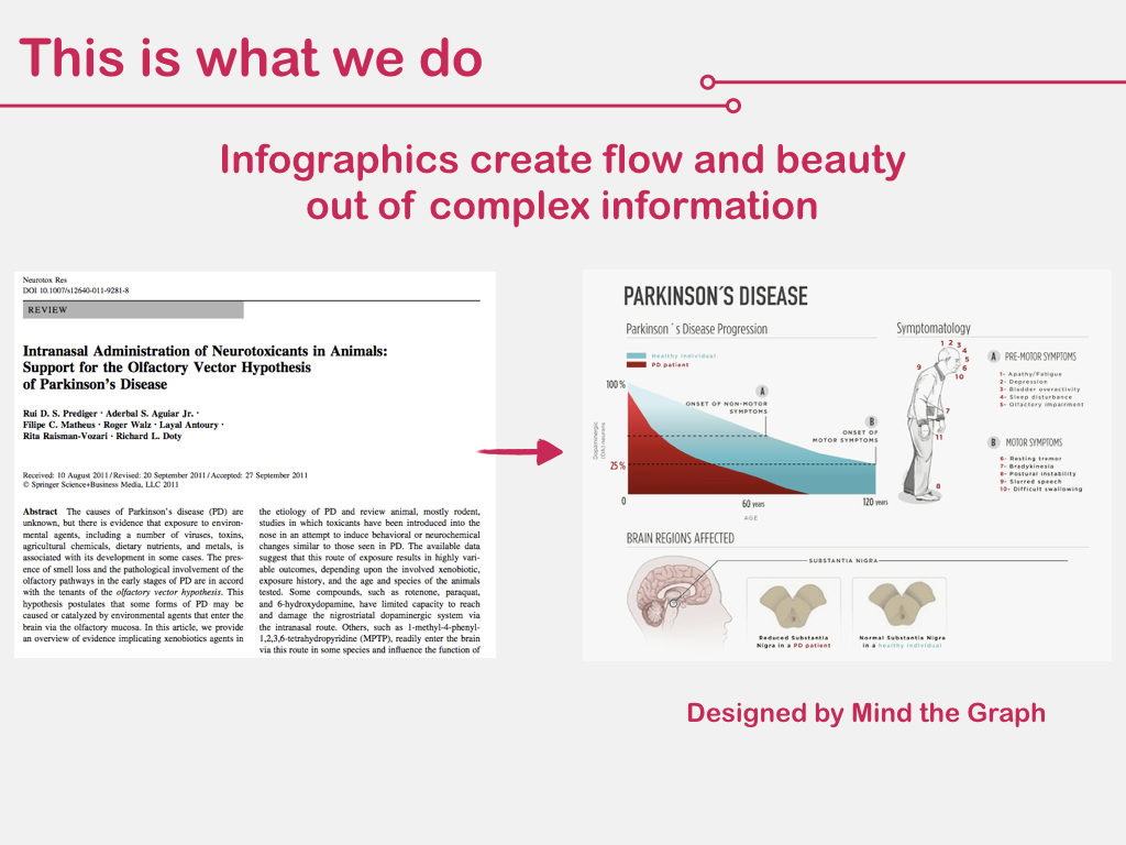
Det er nettopp dette vi tror på i Mind the Graph: at infografikk skaper flyt og skjønnhet ut av kompleks informasjon. De gjør usmakelige vitenskapelige data om til noe hyggelig å lese, sitere og dele.
Folk forstår faktisk mer, husker mer og har større glede av å studere med infografikk. Se for eksempel figuren er laget for en av våre kunder, professor Prediger. for å oppsummere modellen for Parkinsons sykdom. Du forklarer mye i bare én figur, og det lokker leseren til å dykke ned i det mer omfattende innholdet.
Before beginning the business, we already understood the need – visual communication for scientists – but we were not sure on how to delivery it. Therefore, we started by doing what is called "concierge-validering" i produktdesignprosessenVi pleide å møte brukernes behov ved å levere en tjeneste for å forstå hvordan de tenker og hva de faktisk vil ha. På produktdesignsjargong: å føle hvor det gjør vondt.
Figuren nedenfor viser det nøyaktige Eureka-øyeblikket for opprettelsen av Mind the Graph-plattform. Der ser du den faktiske tilbakemeldingen fra en bruker på en figur opprettet av oss på forespørsel. Han likte tilsynelatende, men tok seg tid til å skrive den ut og markere noen deler i gult, å skrive legender og til og med inkludere nye tegninger.
We realize the client was saying: I like what you do, but please, do it this way. Do it MY WAY. That was the click that Mind the Graph should be a do-it-yourself platform, where we enabled the creative force of the people on the other side.
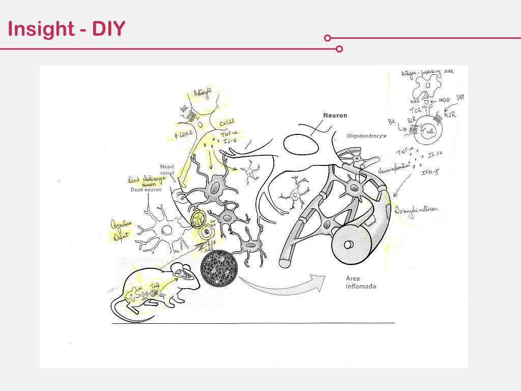
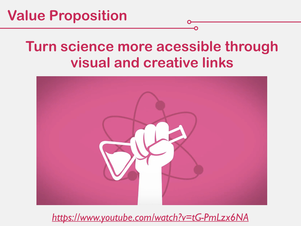
At this very moment, we decided to empower scientists and make THEM BECOME DESIGNERS. Our value proposition is to untangle science through visual and creative links and fundamentally, to provide the tools, not the answers. Is like teaching to fish, instead of providing the fish. How do you feel about it, have we done right? 🙂


Abonner på nyhetsbrevet vårt
Eksklusivt innhold av høy kvalitet om effektiv visuell
kommunikasjon innen vitenskap.