This is the fourth post in the series How to make an infographic. If you missed the last post, you can read it here.
Now we already know the importance of sketching. The first version is always different from the final version. So, start working and make the first draft. Visualization is important for new insights.
Keep in mind the main question of your infographic. You need to highlight that.
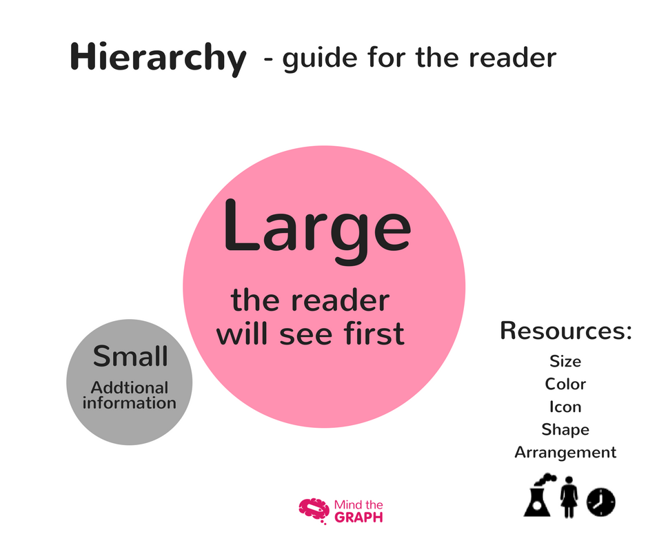
You should structure the layout to create a natural information flow, with highlighted information that the reader will see first, even from a distance, such as title and main image. The more secondary information should be less prominent in order not to pollute the view and take priority.
To create the hierarchy of the elements, edit the colors, size and fonts.
Choosing the colors
The infographic colors should match with all elements. Choose a palette and combine styles. You can use complementary colors or monochrome tones.
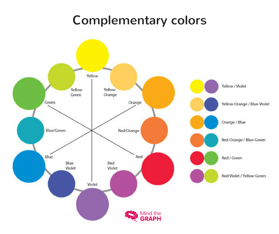

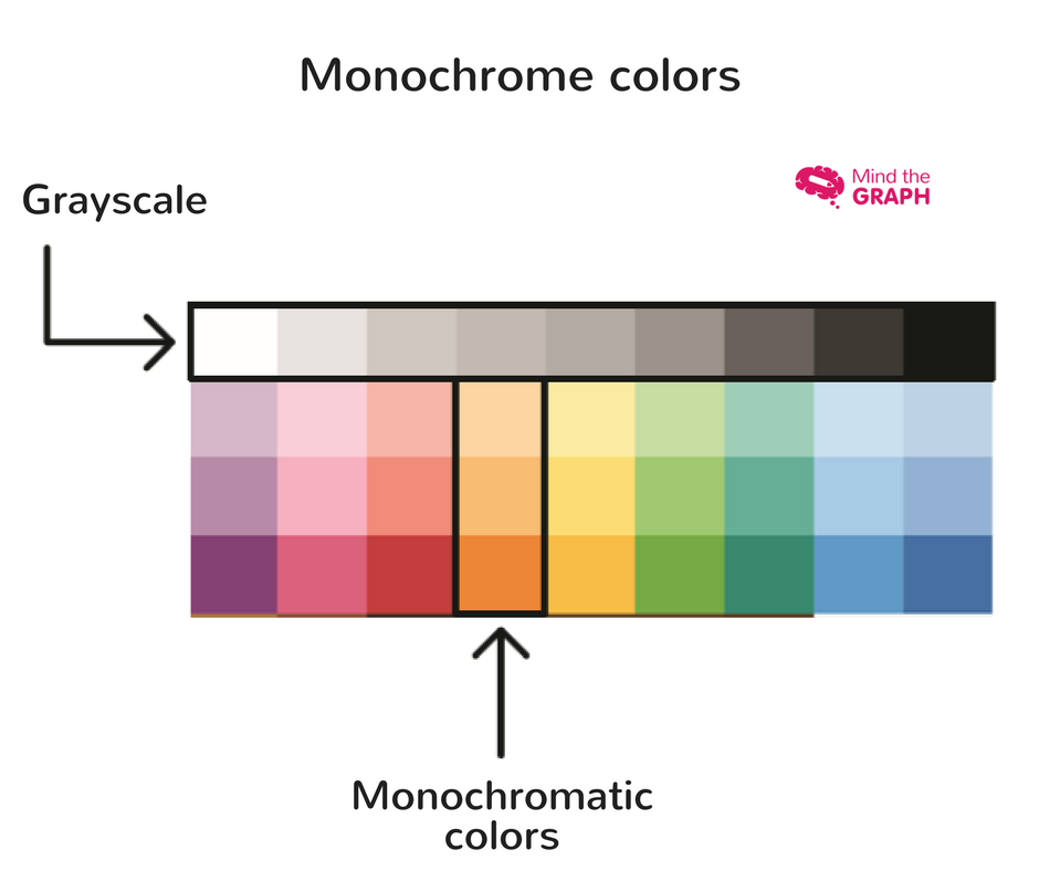
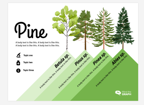
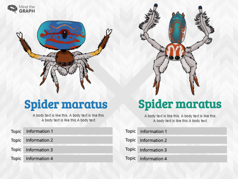
Use color to highlight important information or to group related elements. In this Mind the Graph template, the highlight information is the colors of the spiders. Therefore, all the infographic is in grayscale to not compete with the main data.
If you want to know more about how to use colors and illustrations, watch the video that our designers created to help you. Click the button below and watch it now:
How to make an infographic with amazing illustrations?
A picture is worth a thousand words.
The illustrations are easier to understand and catch the reader’s attention. But, it is not easy to find stunning images to use in presentations, graphical abstracts, mainly scientific illustrations. It is not enough to use images, you need quality images, scientifically accurate, beautiful and that combine with your infographic design. A beautiful and professional creation makes a lot of difference in the bottom line.

In our platform you’ll find thousands illustrations of science in general. But, if you don’t find the illustrations you need, you can request them. As a Mind the Graph subscriber, you can request as many illustrations you need, all that for a few dollars a month. If you are already a subscriber and want to request an illustration, write to contact@mindthegraph.com. I’m looking forward to your contact!
Post series by Mind the Graph
- Post #1 – Communication in science
- Post #2 – Make your data Awesome
- Post #3 – The right kind of chart
- Post #4 – Let’s talk about colors!
- Post #5 – Less is more: minimalist infographic design
- Post #6 – Mistakes to avoid in science communication
- Post #7 – A shortcut summary to GET IT DONE
The posts are a guide, made by our designers. They make the amazing illustrations and templates you see on our platform. Also, you can get for free our ebook. Learn how to make science infographics and improve your presentations

Subscribe to our newsletter
Exclusive high quality content about effective visual
communication in science.

