3 min read
08/30/2022
Mind The Graph Scientific Blog is meant to help scientists learn how to communicate science in an uncomplicated way.
It’s time to learn how to make a scientific table to increase the readability and attractiveness of your research paper.
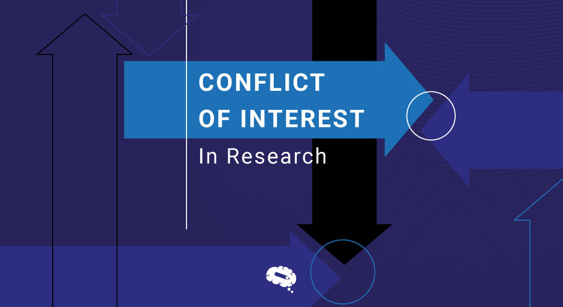
Learn how a conflict of interest might be employed in research, how they can impact, what the types are and how to dodge them.
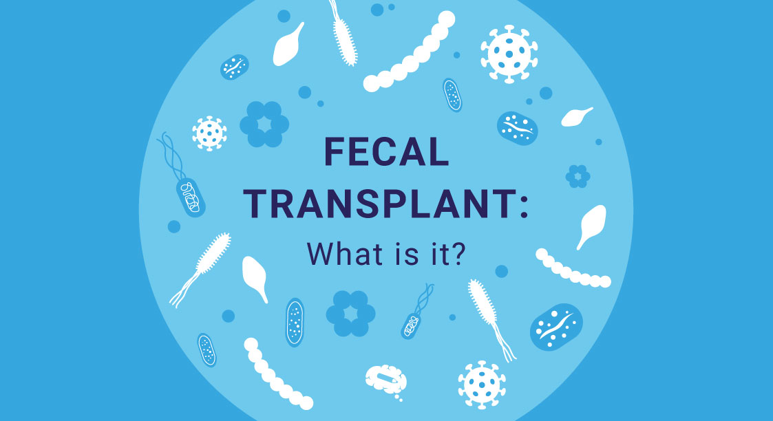
It’s time to learn what Fecal Transplant is, who needs it, the side effects and everything about the procedure.
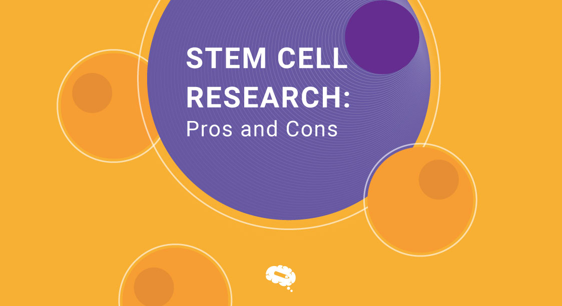
Learn about stem cell research, including the benefits and drawbacks, as well as the numerous types of stem cells accessible.
Now it’s time to learn what scientific notation is and how to write numbers in it by using examples in this article.
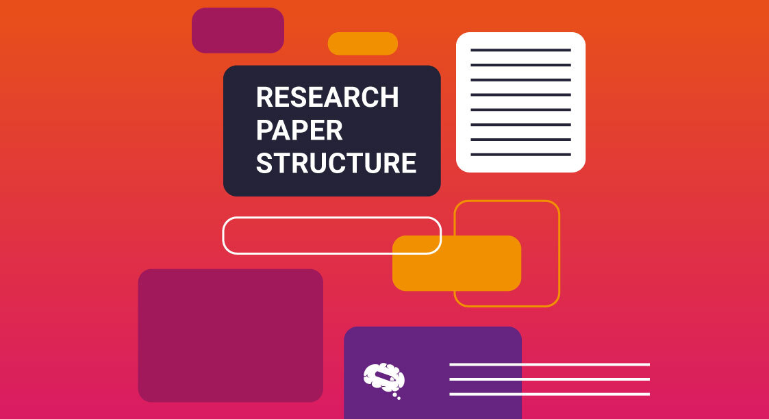
This Mind The Graph article will teach you how to format your research report and present you with some simple yet life-changing tips.
Discover many styles for producing your research paper, how to correctly arrange and format your research paper in this easy-to-read article.
Understand the impact of a science color palette on your scientific study, how to choose palette colors and to accomplish color accessibility.
Learn how to write a strong and efficient research paper introduction by following the suitable structure and avoiding typical errors.
Thesis and research papers are incomplete without research methodology. Learn what is, why it is important and how to write one.
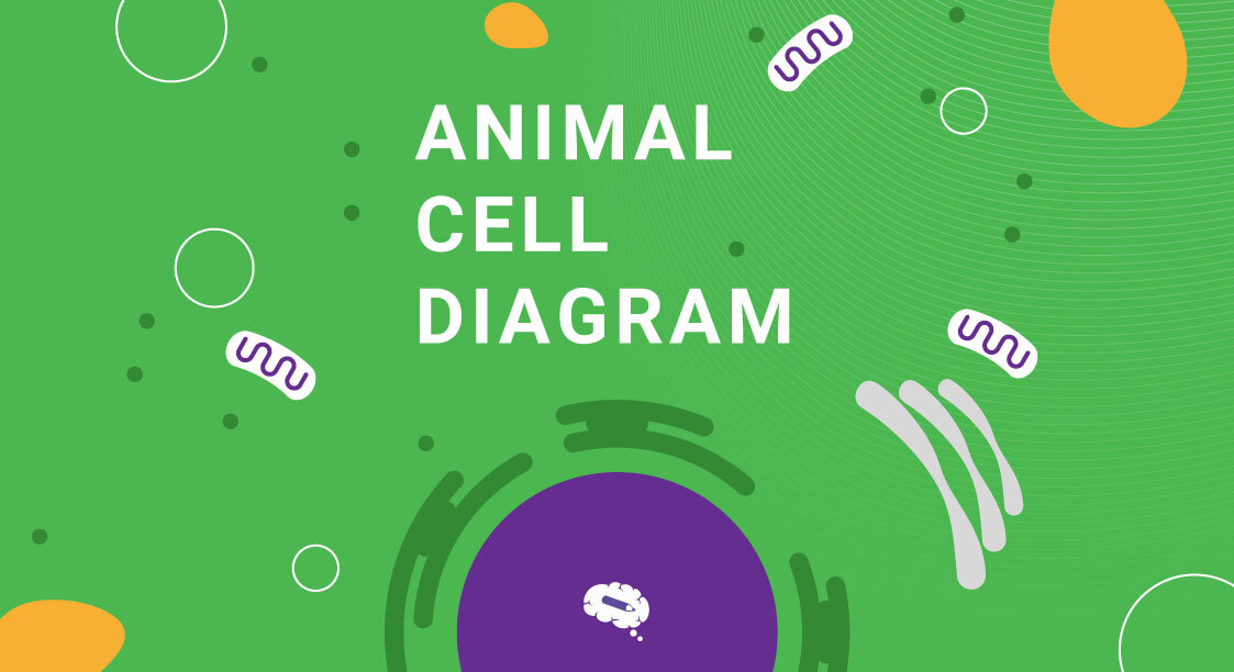
Learn what is an animal cell, its components, and how to create a useful diagram to aid in visual understanding.
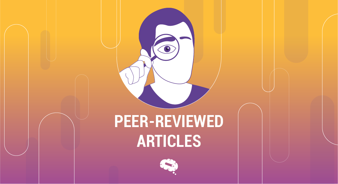
This article will look at what peer-reviewed articles are and why it’s considered necessary for ensuring academic scientific quality
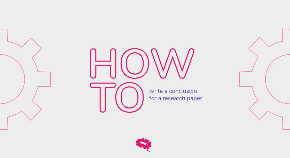
Find out which type of conclusion best suits your research, how to write it step-by-step, and common mistakes to avoid.