Mind the Graph is a powerful and user-friendly platform that allows you to create stunning scientific illustrations and graphical abstracts with ease. The platform is constantly evolving, with new features and tools being added all the time.
Therefore, we paired up with Cactus Communications to bring amazing new features to our workspace, providing a whole new experience and even more consistent visual deliveries. Scientists, PhD students, and all other science-related experts can now create professional-looking science designs in just a few minutes with even greater ease and precision.
In this blog article, we’ll take a closer look at some of our most recent upgrades released and how they can make your visuals even more powerful and beautiful.
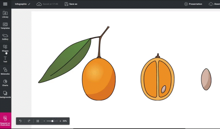
New stock of icons
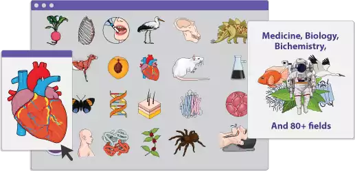
A new stock of icons has been added to Mind the Graph as one of the most recent updates. With more than 6,600 new options, finding the ideal icon for your needs is now simpler than ever. The new icon stock has you covered whether you need an icon to illustrate a certain scientific idea or simply want to spice up your images visually.
Arrows and Dynamic Lines
The arrows and dynamic lines tool has been enhanced in Mind the Graph as well, which is another significant development. You may now link and connect items more efficiently, creating logical and eye-catching visual flows and infographics, among other designs. Standing out is now easier than ever thanks to the ability to change the size, shape, and color of your lines and arrows.
Automatic Lists and Tables
An automatic tool for lists and tables is also available now. You may quickly and easily construct lists and tables using this tool, which will save you time and effort. Your data can be styled and formatted to suit your needs, making sure that your graphics look polished and professional.
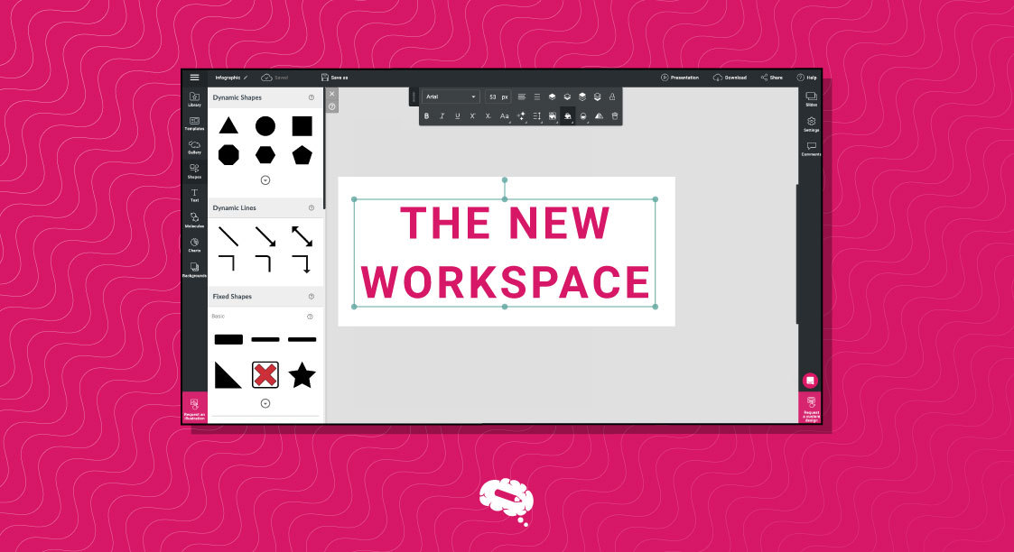
New Text Custom Options
Emphasize, highlight, and represent information properly with these brand-new text customization options. You can change font size and style, as well as formatting such as bold, italic, underlining, exponential number, and line spacing. With these additional options, customizing your text and ensuring that it looks exactly how you want it to is now simpler than ever.
New Chart Models
The horizontal bar chart, stacked horizontal bar chart, semi-donut chart, and pie chart are among the new chart types included in Mind the Graph. Using these new chart models makes it much easier than ever before to express difficult scientific ideas and depict data.
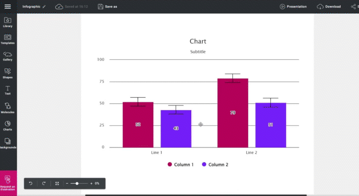
Show the transparency of your data with the error bar tool
As science-related professionals, we know that the transparency of data is crucial. In addition to the new chart models, we also included the error bar feature, which you can use to represent the variability of data and also to indicate the error or uncertainty in a reported measurement.
You can try all the new tools and features for free right now
The platform Mind the Graph is strong and easy to use, and it is becoming better and better every day. Making amazing scientific graphics and graphical abstracts has never been simpler thanks to the constant addition of new features and tools. You can try all the new tools and features for free by subscribing to a 7-day free trial. Well, the workspace is waiting for you!


Subscribe to our newsletter
Exclusive high quality content about effective visual
communication in science.