2 min branja
11/05/2025
Namen znanstvenega bloga Mind The Graph je pomagati znanstvenikom, da se naučijo, kako na enostaven način sporočati o znanosti.
AI has quietly become a co-author in modern research. From grammar checks to literature reviews, tools powered by artificial intelligence are helping academics write faster and smarter. But there’s a growing challenge — most researchers don’t disclose their use of AI, even when journals require it. In fact, recent data shows that over 75% of […]
Over the past few years, AI tools for researchers have become crucial, simplifying everything from […]
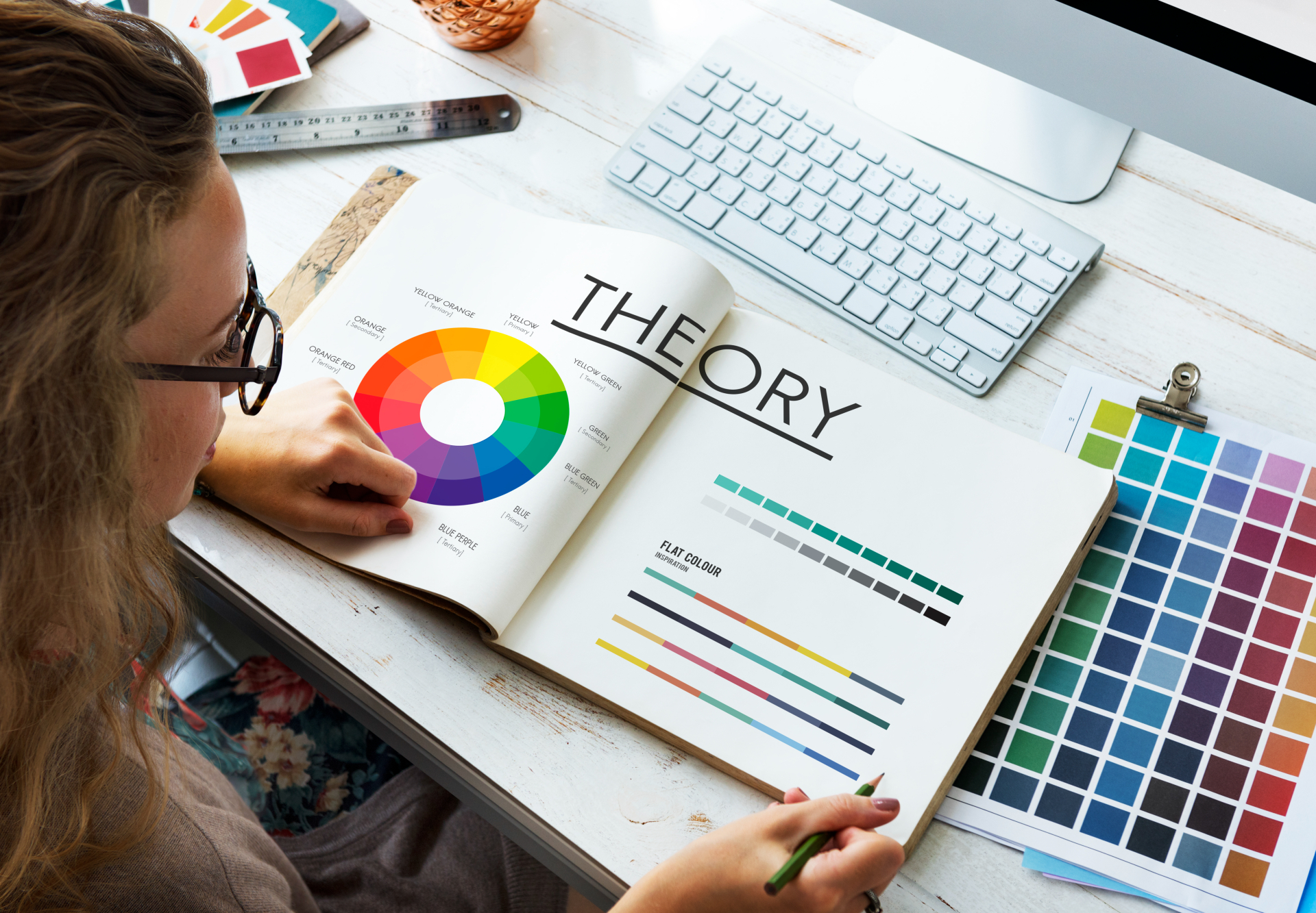
Choosing the right color palette is one of the most important steps in creating clear, […]
AI tools have revolutionized the way researchers work, making academic writing and scientific communication more […]
In a world where attention spans are shrinking, visual learning is no longer a “nice-to-have” […]
Great academics know that powerful visuals can transform research—but not all tools give you that […]
A scientific poster is an important and widely used format for sharing research in academic […]
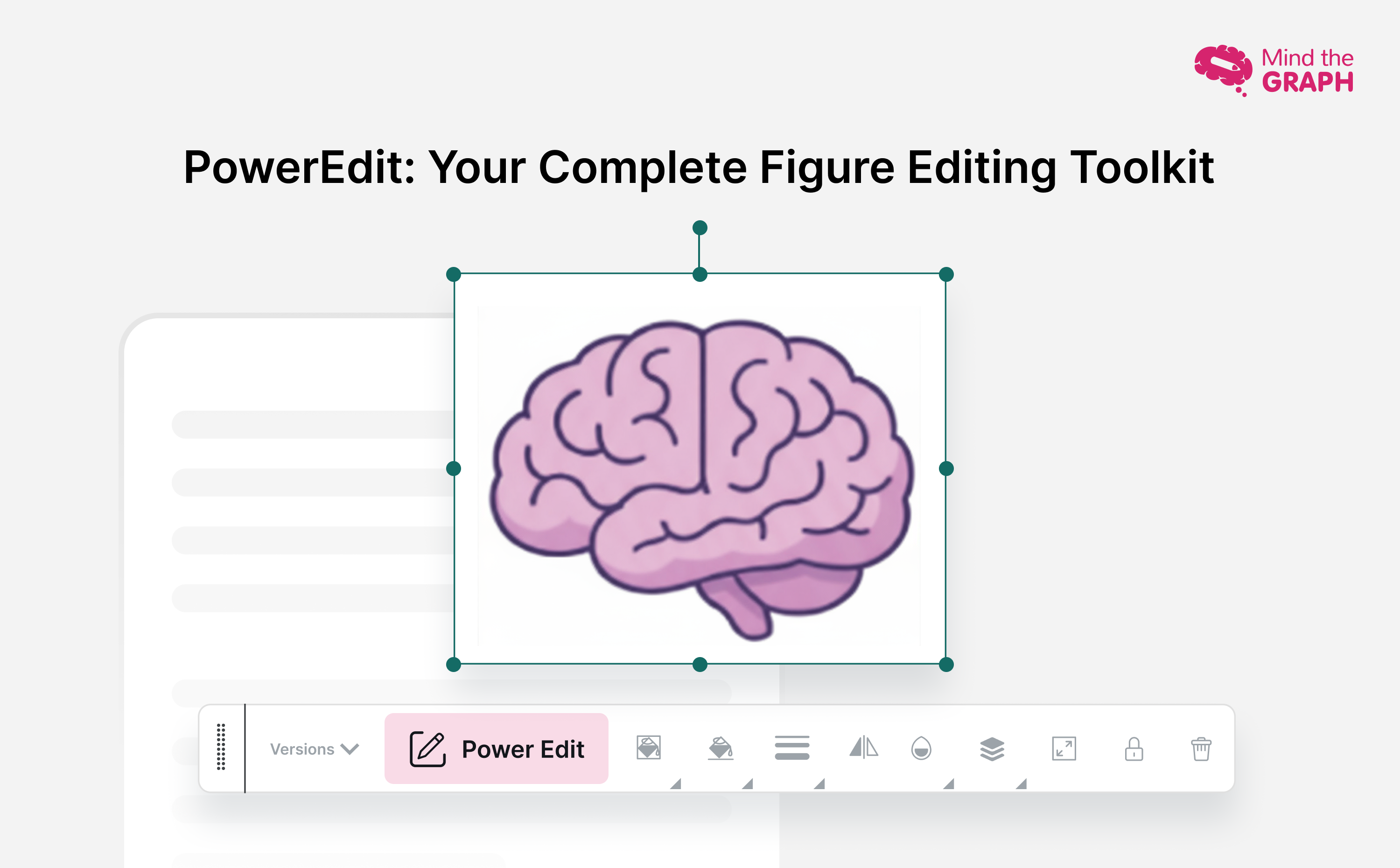
Creating compelling scientific illustrations shouldn’t require a PhD in graphic design or drain your research […]
Research design is the backbone of any successful study—it’s the structured plan that guides how […]
Generative AI tools are transforming how researchers and students write, yet many still face uncertainty […]
As social media grows noisier, infographics in social media have become one of the most […]
Barve so bistveni del življenja in znanosti. Z njo lahko pritegnemo pozornost, vzbudimo [...]
Znanstvena ilustracija velja za univerzalni jezik, ki premošča razlike med disciplinami in geografskimi območji. [...]