Conferences, seminars and presentations are very common in a researcher routine. But you probably already know that. However, as we have always a lot of lab work to do, it isn’t easy to find time to create an attractive and professional presentation. Especially when you don’t have the right tool.
But an attractive presentation is very important not just to keep the audience attention but to be taken seriously as a scientist. In other words, you need to value your data. You will achieve this by stetting high standards.
I already wrote several tutorials on how to create presentations for scientific conferences. You can find them here and here. But today I want to talk specifically about the use of pattern between the slides. It is the best way to create an harmonic and professional presentation. This means, you need to combine the cover with the other slides.

Take a look of 3 things to pay attention when you are creating a presentation for scientific conferences:
01. Color
Colors are a powerful tool to set a pattern in a creation. It will help the reader (or the audience) to follow you and understand the connection between the subjects you are presenting to them.
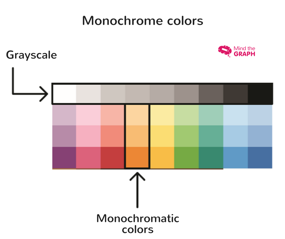
According to our designers, you must to structure the layout to create a natural information flow, with highlighted information that the reader will see first, even from a distance, such as title and main image. The more secondary information should be less prominent in order not to pollute the view and take priority. The best way to do that is using colors. A vivid color will catch the attention quickly. Keep them to the main information of your slide. Meanwhile a grayscale will be more discreet and it is recommend to be used in secondary elements.
Important: Choose one or two main color to your presentation and the repeat it in the slides.
Check out this video tutorial:
To combine colors you can use complementary colors. I explained about in this post
02. Typography
Choosing the font of your presentation is very important. This will help you to make it more professional and provide an intuitive experience to the reader. Keep in mind that your audience will be at a considerable distance, so test if your text is easy to be seen and read. Separate paragraphs and headlines clearly and do not use many different fonts.
Also, remember that you will be speaking while your audience look to the slides and read the text. Do not pollute the slide with too many text.
The slide must NOT compete with you. Rather, slides are a tool to help people visualize what you are saying to them.
Choose at most 3 fonts and maintain consistency. Also, choose fonts that are more professionals and easy to read like helvetica, gothan and so on . You can use a different and cool font to the headline but avoid the “comic sans” effect.
03. Images
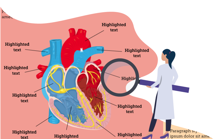
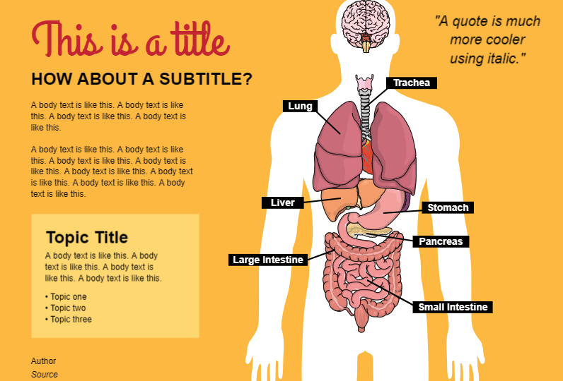
This is my favourite part of creating a presentation. Images are very powerful to explain something and catch the attention of the audience. Normally the images in scientific conferences are charts, photography and illustrations.
It is important to use accurate scientific illustrations.
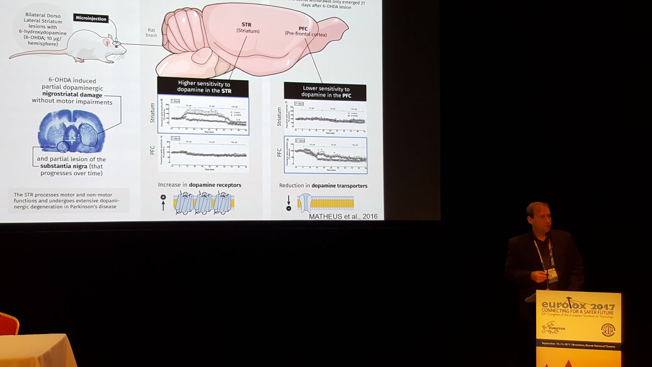
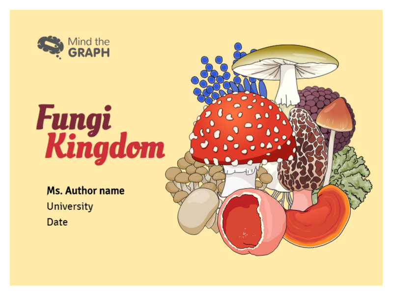
I strongly recommend you to move from this to this:

On mind the graph you will find thousands of scientific illustrations to use on infographics, posters, presentations and more. You can create your presentation and download it in pdf or png format. You also can present directly on mind the graph.
To use a photography or to show a chart you can upload it to the platform. It is very easy.
To save time: Start from templates
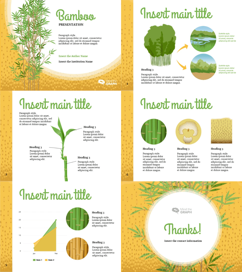
We have several presentation templates available. It is a good way to save time and create something beautiful at the same time. The good news? You can start NOW!

Subscribe to our newsletter
Exclusive high quality content about effective visual
communication in science.

