A meta-analysis is a statistical approach that combines the findings of several studies to offer a more complete picture of the effects of a certain intervention or treatment.
Meta-analyses are frequently utilized in the medical and health fields, as well as many other areas, to give evidence-based suggestions for clinical practice, policy formulation, and future study.
The use of forest plots is very common within meta-analyses, as a straightforward and succinct method to represent the findings of multiple studies, following a direct comprehension of the effect sizes and confidence intervals for each of these studies.
This article aims to answer the following questions: what is a forest plot and what it is used for? So that you are ready to begin utilizing forest plots in your next study.
What is a forest plot and what is it used for?
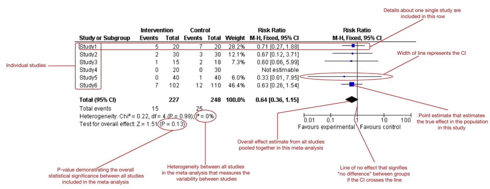
A forest plot is a graphical representation of meta-analysis findings. A forest plot depicts the findings of a meta-analysis by displaying the effect size and confidence interval for each individual research, as well as the overall summary effect and confidence interval. Individual studies are depicted by horizontal lines, with each line’s length denoting the confidence interval.

The overall summary effect is frequently represented as a diamond shape, with the width of the diamond reflecting the confidence interval.
The forest plot enables a straightforward comparison of the results of dozens of studies by presenting the results of a meta-analysis in a simple and understandable visual format, making it a useful element for researchers, healthcare professionals, and policymakers who want to make well-informed decisions based on the results of a meta-analysis.
Is it related to trees in any way?
No, a forest plot has nothing to do with trees. The plot is called a “forest plot” since it looks like a forest, having individual studies depicted by vertical lines (like tree trunks) and the overall summary effect indicated by a diamond shape (like a clearing in the forest). The term is a metaphor for numerous distinct research combining to generate a wider and more thorough picture of the facts.
Effective infographics are just one step away
We created Mind the Graph as an easy-to-use option for scientists designing beautiful infographics effortlessly. Once in the workspace, you just need to drag and drop elements into your canvas or, if you prefer, you can also start by editing one of our templates, and done! As simple as that you can raise the chances of your paper getting more citations with the power of visuals.
Parts of a forest plot
Several crucial parts are included in a forest plot:
- Identification of the study: Each individual study is identifiable by a distinct name or identifier.
- Effect size: The intensity of the intervention or treatment impact is measured by the effect size. Depending on the type of data being examined, it is often reported as a mean difference, odds ratio, risk ratio, or hazard ratio.
- Confidence intervals: The confidence interval is a measurement of the uncertainty surrounding the estimation of the effect size. It is often illustrated by a horizontal line, the length of which indicates the range of values that is likely to encompass the genuine effect size.
- Summary effect: The overall summary effect is the total of the effect sizes from all of the individual studies included in the meta-analysis.
- Heterogeneity: The variability in the outcomes of individual studies is referred to as heterogeneity. The forest plot can identify any sources of variability in the findings and indicate any outliers or discrepancies.
- P-value: A statistical indicator of the statistical validity of the effect size. If the null hypothesis is true, it reflects the likelihood of getting the reported effect size by chance.
- Weight: The weight is an indicator of how much each particular study contributes to the overall total impact. The weight is frequently dependent on the size or precision of each study.

Tips on how to interpret a forest plot
Now that you understand what is a forest plot and what it is used for, you should be able to interpret it.
- Look for the diamond shape in the figure, which shows the overall analysis’s effect size. The width of the diamond represents the amount of uncertainty surrounding the estimated effect size.
- The horizontal lines stretching from each study show the confidence ranges for each research’s effect sizes. If the line has a zero, it signifies that there is insufficient data to demonstrate a meaningful effect from the intervention or treatment under consideration.
- Examine the findings for outliers or discrepancies, which may be indicated by horizontal lines that are substantially longer or shorter than the rest. This might imply that the findings of one study are inconsistent with those of others, which could have an impact on the overall conclusion.
- Take into account the general direction of the effect sizes. If most of the lines are to the right of zero, it indicates that the intervention or treatment had a favorable effect. A negative influence is shown if most of the lines are to the left of zero.
- Consider the magnitude of each study, as indicated by the weight allocated to each study in the analysis. Larger, better-designed research may have a higher influence on the final finding than smaller ones.
We care about your success with visual communication and scientific education
Using clear, simple, and engaging visual elements can help increase success in communication and scientific education. By making the knowledge more engaging and interactive, visual elements can also serve to engage and encourage learners as a result of an improved comprehension of the subject. Use Mind The Graph as your tool of choice and improve your research right away.


Subscribe to our newsletter
Exclusive high quality content about effective visual
communication in science.