Scientific research often involves complex data that can be challenging to communicate effectively. However, the power of visualizing scientific data cannot be underestimated. That’s where Mind the Graph comes in. This online platform offers scientists and researchers a user-friendly tool to create visually appealing scientific figures, infographics, graphical abstracts, presentations, and posters. Whether you’re a beginner or a seasoned professional, Mind the Graph caters to your needs, allowing you to enhance your research by transforming your data into visually engaging representations. With over 75,000 scientifically accurate illustrations in more than 80 popular fields, Mind the Graph provides a vast library to choose from, making it easier to illustrate and communicate your research findings. By offering a solution to the challenge of visualizing complex scientific data without specialized design skills, Mind the Graph aims to enhance scientific communication and make it more accessible for researchers of all levels.
Understanding Scientific Data Visualization
Emphasis on Visual Aids in Scientific Research
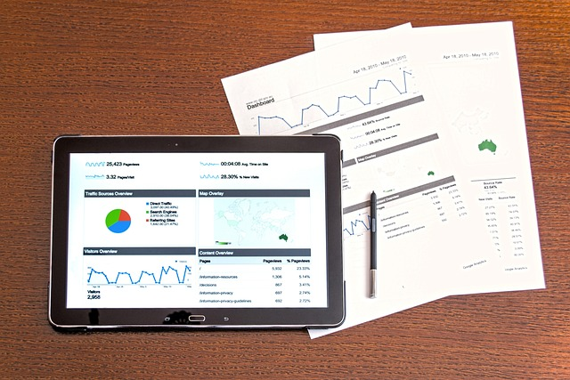
Visual aids play a pivotal role in scientific research. They transform complex data into a format that’s easier to comprehend, enabling scientists to communicate findings more effectively. Visuals aren’t just about beautifying data; they can reveal patterns, trends, and insights that might otherwise go unnoticed.
The increasing complexity and volume of scientific data make visual aids especially important. They help researchers make sense of vast amounts of information, enabling them to spot anomalies, identify correlations, and derive meaningful conclusions. Scientific data visualization isn’t merely a matter of convenience; it’s a necessity for modern research.
Moreover, visual aids foster better understanding among various stakeholders, including funders, policymakers, and the general public. They break down barriers of technical jargon and abstract concepts, making scientific research accessible to a broader audience. Thus, the role of visual aids extends beyond the scientific community, influencing how society understands and engages with science.
The Challenge in Presenting Scientific Data
Despite the critical role of visual aids in data science, presenting scientific data effectively is no easy task. One of the main challenges lies in the complexity of the data itself. Scientific data often involves numerous variables, intricate relationships, and complex patterns. Conveying these intricacies in a visual format that’s easy to understand can be a daunting task, especially for researchers who may not have specialized design skills.
Another challenge is ensuring accuracy and precision. Unlike other types of visual content, scientific data visualization must accurately represent the data without distortion or oversimplification. Balancing simplicity and accuracy can be a fine line to walk.
Lastly, the presentation of scientific data must be engaging enough to capture and hold the audience’s attention. In a world saturated with information, researchers must compete for attention, making it necessary to present data in a way that is not only clear and accurate but also visually compelling.
These challenges highlight the need for tools and resources that can help researchers overcome these hurdles and present their scientific data effectively.
Redefining Data Presentation using Mind the Graph
Introduction to Mind the Graph
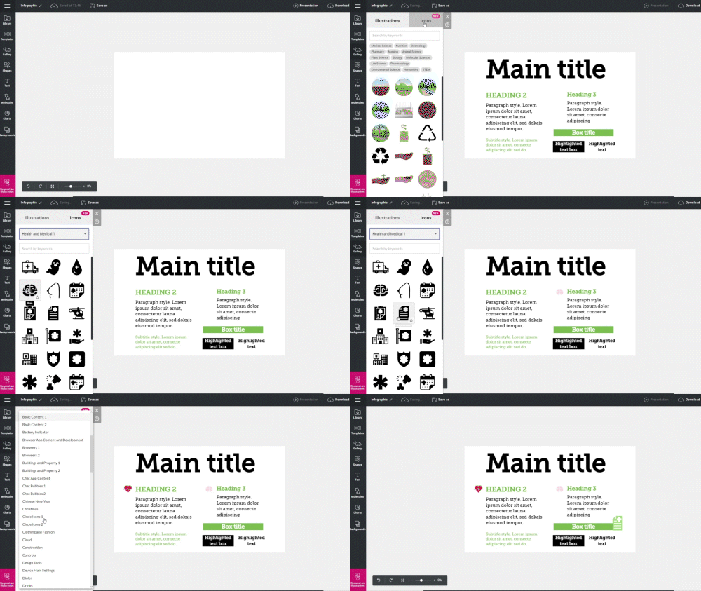
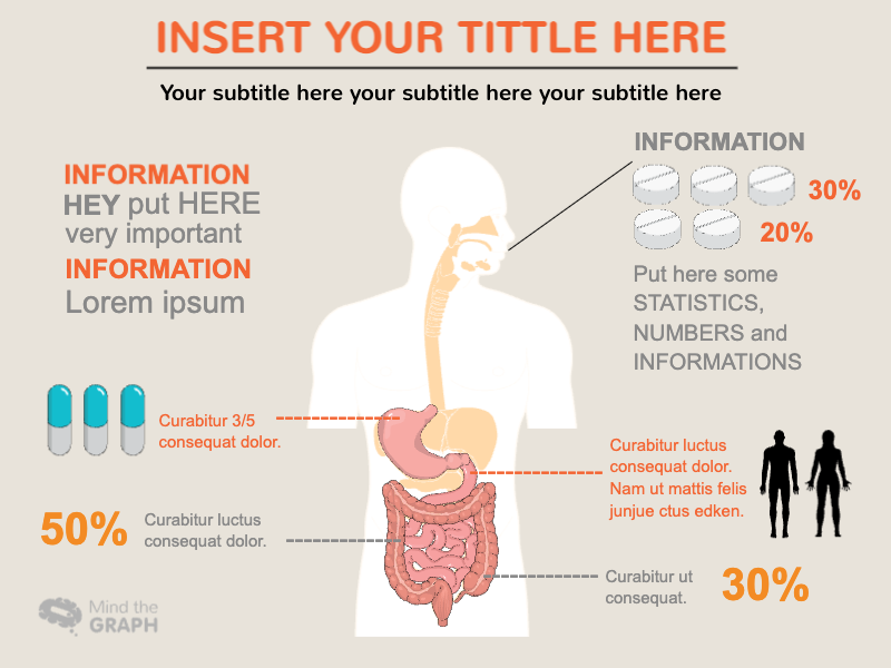
Mind the Graph is an online platform designed to revolutionize the way scientific data is presented. It provides an intuitive interface that with data visualization software enables scientists and researchers to create visually appealing figures, infographics, graphical abstracts, presentations, and posters. Mind the Graph is not just about visualizing data—it’s about making scientific research more accessible and engaging.
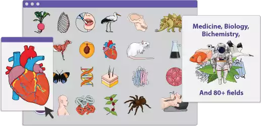
Mind the Graph boasts a vast library of over 75,000 scientifically accurate illustrations spanning more than 80 popular fields of study. This wide selection makes it easier for researchers to find and use visuals that are most relevant to their specific area of research. Users can seamlessly integrate these visuals into their work, enhancing the clarity and impact of their research findings.
Whether you’re a beginner or a seasoned professional, Mind the Graph caters to your needs. It’s designed to be user-friendly and accommodating, empowering scientists to transform their big data into visually engaging representations without requiring specialized design skills. This way, Mind the Graph is helping researchers around the world bridge the gap between data complexity and effective communication.
The Underlying Philosophy of MindTheGraph

At the heart of Mind the Graph lies the belief that scientific data doesn’t have to be dull or intimidating. Rather, the platform is built on the philosophy that visualizing scientific data can make it more accessible, engaging, and ultimately, more powerful.
Mind the Graph aims to empower scientists to communicate their research more effectively. It seeks to break down the barriers that often exist between complex scientific data and the audiences who need to understand it. By transforming complex data into visually appealing representations, Mind the Graph helps researchers tell compelling stories with their data, making science more relatable and its impact more tangible.
Moreover, Mind the Graph acknowledges the vast diversity within the scientific community. It recognizes that each researcher has unique needs, and therefore, it provides a flexible platform that caters to different levels of expertise, research disciplines, and presentation formats.
Above all, Mind the Graph is committed to enhancing scientific communication. It believes that making scientific data more visually engaging, it can help scientists reach broader audiences, foster a better understanding of their research, and ultimately drive scientific progress forward.
Exploring the Features of MindTheGraph
Tools Available for Visualizing Scientific Data
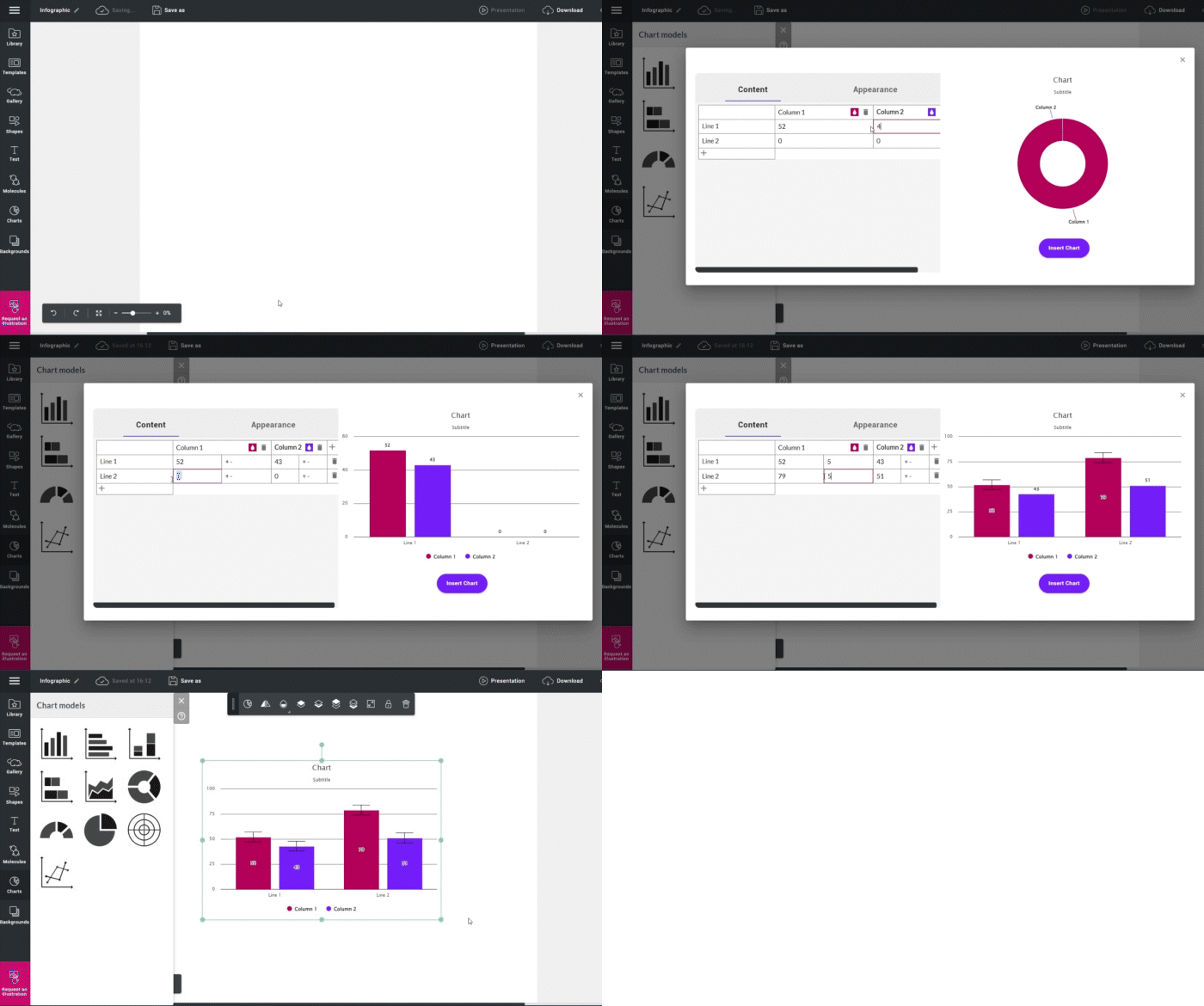
Mind the Graph offers a suite of tools designed to make the process of visualizing scientific data as seamless and effective as possible. Among the most notable features is their extensive library of scientifically accurate illustrations. With over 75,000 illustrations in more than 80 popular fields, users have a vast array of visuals at their disposal. These visuals can be used as is, or customized to better fit the data and the narrative of the research.
To help users make the most of these visuals, Mind the Graph provides a user-friendly interface that allows for easy manipulation and customization of visuals. Researchers can adjust colors, sizes, and orientations, and even add annotations to make the visuals more informative.
In addition, Mind the Graph offers several templates for various presentation formats, including infographics, posters, and presentations. These templates provide a starting point for researchers, saving them time and effort in creating visually engaging representations of their data.
Together, these tools provide a comprehensive solution for visualizing scientific data, making Mind the Graph a valuable asset for researchers seeking to enhance their data presentation.
Customizing Visuals for Individual Research
Mind the Graph understands that every research project is unique and requires a personalized approach. To cater to this, the platform provides a range of customization options that allow users to tailor visuals to their specific research needs.
Researchers can choose from a vast library of illustrations, each of which can be customized to better represent their data. They can adjust the color, size, and orientation of the illustrations, allowing them to craft visuals that represent data and that align with their research findings and overall narrative. Users can also add textual annotations to the visuals, ensuring that crucial information isn’t lost in translation.
Furthermore, Mind the Graph offers a variety of templates for different formats, such as infographics, posters, and presentations. Each template can be modified to suit the individual researcher’s needs, providing flexibility and control over how the data is presented.
By offering these customization options, Mind the Graph enables researchers to create visuals that are not only engaging and informative, but also truly representative of their own data sets and research. This ensures that the visuals serve their purpose effectively—communicating complex scientific data in a way that’s easy to understand and visually appealing.
The Benefits of Using Mind the Graph
For the Individual Scientists and Researchers

For individual scientists and researchers, Mind the Graph can be a game-changer. It offers a user-friendly platform for creating visually engaging representations of scientific data, which can greatly enhance the clarity and impact of their research findings.
With a vast library of scientifically accurate illustrations and customizable templates, researchers can save valuable time and effort that would otherwise be spent on designing visuals from scratch. This not only increases efficiency but also allows researchers to focus more on their research and less on the presentation of their data.
Moreover, Mind the Graph provides a means for researchers to overcome the challenge of presenting complex data simply and understandably. By transforming intricate data into visually appealing figures and infographics, researchers can communicate their findings more effectively to a wider audience.
Importantly, Mind the Graph caters to all levels of expertise, making it a valuable resource for both beginners and seasoned professionals. Whether you’re a first-time researcher or a veteran in your field, Mind the Graph can enhance your ability to visualize and communicate your scientific data.
For Small Labs and Large Organizations
Mind the Graph is not just for individual researchers. Small labs and large organizations can also reap significant benefits from using this platform. For these groups, the ability to visually present scientific data clearly and engagingly can greatly enhance their ability to secure funding, attract talent, and influence policy decisions.
Small labs, which often operate with limited resources, can particularly benefit from the cost and time savings offered by Mind the Graph. The platform’s user-friendly interface, vast library of illustrations, and customizable templates can help small labs produce professional-quality visuals without the need for expensive design software or specialized design skills.
Large organizations can utilize Mind the Graph to standardize their data presentations, ensuring consistent quality across different departments and research teams. The platform’s flexibility allows for customization according to the organization’s branding guidelines, ensuring a coherent and professional image.
Moreover, Mind the Graph can help both small and large organizations make their research more accessible to non-scientific stakeholders, such as funders, policymakers, and the public. By transforming complex data into visually appealing representations, these organizations can effectively communicate the value and impact of their research to a broader audience.
Breaking Down the User Experience
Interface and Ease-of-Use
One of the defining features of Mind the Graph is its user-friendly interface. The platform has been designed with the user in mind, ensuring a smooth and intuitive experience. Navigating through the vast library of illustrations is straightforward, and integrating these visuals into your work is a breeze.
The platform’s tools for customizing visuals are easy to use. Users can adjust colors, sizes, and orientations of illustrations, add textual annotations, and manipulate the layout of their visuals with simple clicks and drags. This makes the process of creating visuals not only easy but also enjoyable.
Moreover, the tool provides several templates for different presentation formats, such as infographics, posters, and presentations. These templates serve as a useful starting point and can be customized to fit the user’s specific needs.
By making the process of visualizing scientific data as easy and straightforward as possible, Mind the Graph allows scientists and researchers to concentrate on what they do best—conducting research and making discoveries. The platform takes care of the presentation, ensuring that their findings are communicated effectively and appealingly.
Support and Resources for Beginners
Mind the Graph is committed to supporting users at every step of their data visualization journey, especially those who are new to the field. To this end, the platform provides ample resources and support to help beginners get started.
Firstly, Mind the Graph offers a range of tutorials and guides that cover the basics of using the platform. These resources break down the process of creating visuals into manageable steps, making it easy for beginners to learn the ropes.
Secondly, Mind the Graph’s customer support is readily available for users who need assistance. Whether it’s a question about how to use a specific feature or a technical issue, users can count on swift and helpful responses from the support team.
In addition to these supports, this amazing infographic tool also fosters a community of users. This allows beginners to learn from more experienced users, get inspiration for their visuals, and share their successes and challenges.
By providing these resources and supports, Mind the Graph ensures that every user, regardless of their level of expertise, can successfully visualize their scientific data and enhance their research communication.
Reviewing the Professional Experience
For seasoned professionals, Mind the Graph offers an unparalleled experience in scientific data visualization. The platform’s vast library of scientifically accurate illustrations and flexible customization options allow professionals to create visuals that not only represent their complex data accurately but also align with their research narrative and style.
Professionals will appreciate the time and effort they can save with Mind the Graph. The platform’s user-friendly interface and pre-designed templates provide a fast and efficient way to create visually engaging representations of their data, allowing them to focus more on their research and less on the presentation of their data.
In addition, Mind the Graph understands the need for consistency in professional settings. Therefore, it provides options for standardizing visuals across different presentations and research papers, ensuring a consistent and professional image.
Moreover, Mind the Graph values the input of its professional users. It allows users to give feedback and contribute to the platform’s continuous improvement. This commitment to user satisfaction further enhances the professional experience on Mind the Graph, making it a go-to resource for many researchers in the scientific community.
Making Scientific Communication More Engaging
Visual Features that Aid Understanding
The visual features of Mind the Graph are specifically designed to aid understanding and make scientific communication more engaging. The platform’s scientifically accurate illustrations help transform complex data into a format that’s easier to comprehend, revealing patterns, trends, and insights that might otherwise go unnoticed.
Color coding, for instance, is an example of a feature that can enhance understanding by providing visual clues about the data. It can be used to differentiate between categories, highlight important points, or indicate changes over time.
Size and orientation adjustments can also play a significant role in enhancing understanding. They can be used to emphasize the importance of certain data points or to show relationships between different elements.
Furthermore, textual annotations can be added to the visuals to provide additional context, ensuring that important information isn’t lost in translation.
These effective data visualization features work together to make scientific data more understandable and engaging. By leveraging these features, researchers can enhance the clarity of their data, making it easier for their audience to understand their findings and appreciate the implications of their research.
How Mind The Graph Enhances Learning
Mind the Graph doesn’t just make scientific communication more engaging; it also enhances learning. By transforming complex scientific data into visually appealing figures and infographics, the platform helps users and their audiences better understand the data and the story it tells.
Firstly, visual representations of data help our brains process information more quickly and easily. They allow us to spot patterns, trends, and anomalies that might be hard to discern in raw, numerical data.
Secondly, visuals created with Mind the Graph are more than just pretty pictures. They’re scientifically accurate, which means they accurately represent the data. This accuracy is crucial for learning, as it ensures that the information being conveyed is truthful and reliable.
Lastly, the visual features of Mind the Graph, such as color coding, size adjustments, and textual annotations, all contribute to enhanced learning. They provide additional context, emphasize important points, and guide the viewer’s attention, making the data more comprehensible and memorable.
By enhancing understanding and memory retention, Mind the Graph not only enhances scientific communication but also contributes to better learning outcomes.
Successful Scientific Data Visualization with Mind the Graph
Case Studies: Showcasing Successful Users
Mind the Graph has been instrumental in the success of numerous researchers in visualizing and communicating their scientific data. These case studies provide real-life examples of how the platform can enhance research communication.
For instance, a researcher in environmental science used Mind the Graph to create an infographic for her research on the impact of climate change on marine ecosystems. The infographic was not only visually appealing, but it also effectively communicated the complex relationships and trends in her data. As a result, her research gained wider recognition and had a significant impact on policy decisions regarding marine conservation.
Similarly, a team of geneticists used Mind the Graph to create a graphical abstract for their research paper. The graphical abstract helped them present their complex genetic data in a way that was easy to understand, making their research more accessible to a broader scientific community.
These case studies highlight the impact that effective data visualization tools can have on research communication. They show how Mind the Graph can help researchers successfully present their data, reach a wider audience, and make a larger impact with their research.
Stepping into the Future of Scientific Presentation
Mind the Graph is not just enhancing the present of scientific communication; it’s shaping its future. By making data visualization accessible, engaging, and scientifically accurate, the platform is paving the way for a new era of both scientific visualization and presentation.
In the future, we can expect to see an even greater emphasis on visual communication in science. As data becomes increasingly complex, the need for effective visualization tools will only grow. Mind the Graph is well-positioned to meet this demand, with its user-friendly interface, vast library of illustrations, and customizable templates.
Moreover, as science becomes increasingly interdisciplinary, the need for tools that can help communicate across different fields will become more critical. Mind the Graph, with its wide range of scientific illustrations, is perfectly suited to facilitate this cross-disciplinary communication.
By using Mind the Graph, researchers are not just enhancing their current work; they’re stepping into the future of scientific presentation. A future where complex data is easily understood, where findings are effectively communicated, and where clear and engaging visuals accelerate scientific progress.

Subscribe to our newsletter
Exclusive high quality content about effective visual
communication in science.

