
Many scientific maganizes already request a graphical abstract to publish a paper and others suggest as an option to reach more people. As science communication become more important than ever, graphical abstracts and illustrations are powerful tools for scientists. However, a study of Atanasov and collaborators, shows that if are doing a graphical abstract, better take care that it is of a very, very good quality – otherwise it can even be harmful.
Despite the importance of communicate better in science, many scientists struggle with the process of creating a graphical abstract. This makes sense, after all, we are not designers. So, our goal in Mind the Graph is improve science communication and help scientists to present their work in a beautiful and professional way. We provide accurate scientific illustrations and graphical abstracts templates in an easy-to-use platform.
However, the process of creating a graphical abstract isn’t all about illustrations. You need to organize the content and the design of your creation. If you are struggling to make beautiful abstracts, here is our guide to help you:
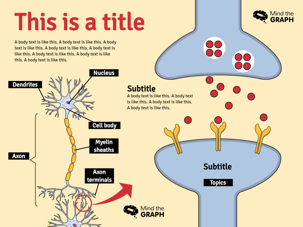
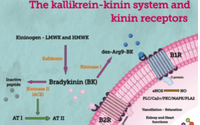
I chose a mind the graph template to show the creation process:
Now, let’s follow the steps to create it.
1 – Summarize the content
After years of hard work at a laboratory, you probably have a lot of data to present in your paper or presentation. So, it is very important to know the main data that you want to present as a visual presentation. I know that isn’t easy. However it’s very important to summarize the information, choosing what will be highlighted and what will be cut off. Hard but necessary. If you put too much information, you’ll let your readers confuse and make them lose the interest.
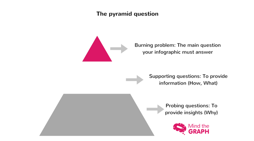
So, before thinking about aesthetics, ask to yourself: What is my main data? What is the most important information that my readers need to understand?
A good tool to do that is the pyramid question:
How Mind the Graph helps you:
You need to do this step before start your creation in Mind the Graph. However, our goal is to help you during the entire process. So, we are always producing new content on this topic. All tutorials are available for free on blog and on our youtube channel.
Here there is some links to help you:
2 – Make a sketch to create the graphical abstract structure
Create the graphical abstract structure is an organizational task. Do not worry or use your time with the details of aesthetic decoration yet. You recommend you always draw a free-hand sketch of what you want to do. First organize the elements and then think about the final details. Look the sketch our designer did before starts creating in mind the graph platform:
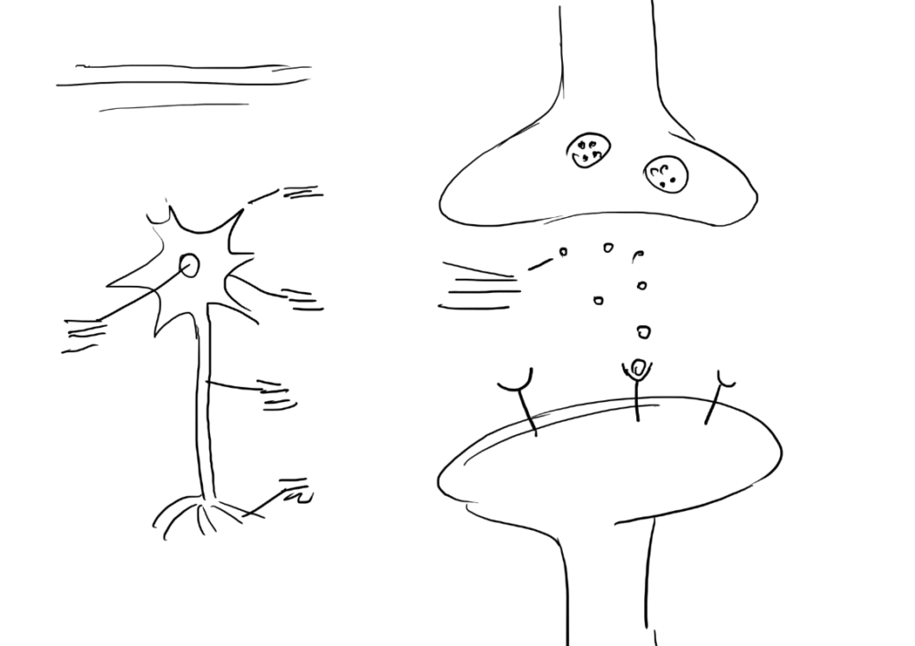
In this part it’s very import choose want you want to highlight and give more space for that. The example above, the synapses process is highlighted with the biggest illustration and take a large space.
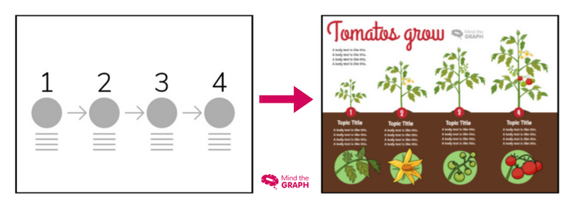
Below you can see other example of a sketch made for a template, when the ideia is to show a timeline:
How Mind the Graph helps you:
The infographic examples that I showed you in this post are Mind the Graph templates, available to our users. Our designers create templates of all kinds of infographics, so you don’t need to start from a white canvas. Just take a look, choose your favorite and edit as you want. That is great, right? You can see our templates here.
Free users can visualize the templates but not edit them. If you are a free user, you can use the template as an inspiration to your creation or upgrade your plan to have access to all features of Mind the Graph.
3 – Final adjustments: Choose the illustrations, color and typography
If you have the structure of your graphical abstract, it’s time to aesthetics. Now you have to find accurate scientific illustrations and choose colors, typography and all the final adjustments. Many scientists still use google images to illustrate their work. However, sometimes this images are not professional enough, or don’t show the exact aspects we need. They are not scientifically “sound”, so to speak. Also, there is copyright issues. Moreover, if your research is brand new information, you probably won’t find any illustration available. So, to find scientific illustrations, we recommend you to use Mind the Graph. You can start for free and stop wasting time looking for illustrations on google or worrying about copyright.
How Mind the Graph helps you:
We have a library with thousands of scientific illustrations. Moreover, we add new illustrations every week. You can use our illustrations to create your own graphical abstract in Mind the Graph. Besides that, you are able to add your text, change colors and typography, use symbols as arrows. In other words, you’ll find all the tools you need to create a professional graphical abstract.
If you have any difficult to make your creation, you can see our tutorials. We have many videos showing how to improve your creation, including the tutorial for this template:
If you want to create better graphical abstracts, you can start using mind the graph for free.


Subscribe to our newsletter
Exclusive high quality content about effective visual
communication in science.