In an increasingly data-driven world where data speaks volumes, the ability to interpret and describe graphical data accurately is not just a skill but a necessity. Describing graphs effectively enables developers, data analysts, educators, and business professionals to convey complex data in understandable terms, facilitating informed decision-making and clear communication. Let us understand how to enhance your data presentation skills through this article.
What Are Graphs?

Graphs are powerful tools that transform raw data into visually interpretable formats, making complex information more accessible and understandable. The ability to describe graphs effectively is crucial because it directly influences how data is perceived and the decisions based on that data.
A well-articulated graph description can highlight trends, uncover insights, and support evidence-based arguments, making it a pivotal skill in educational technology and beyond.
Understanding Different Types Of Graphs
Graphs are a visual way to show data, making it easier for you to see patterns, trends, and comparisons at a glance. Each type of graph has its strengths, so choosing the right one for your data can make a big difference in how your message comes across.
Let’s understand some of the most common types of graphs you might use.
Bar Graphs
Imagine you want to compare the number of cookies sold by different flavors in your bakery. A bar graph would be perfect for this. It shows data with rectangular bars where the length of the bar represents the amount. The longer the bar, the more of that item you have.
When To Use Bar Graphs
Use bar graphs when you have data that can be divided into separate categories (like cookie flavors) and you want to compare them. They are great for looking at how different things stack up against each other.
Line Graphs
Now, suppose you’re interested in tracking how the sales of your cookies change over the year. A line graph, which plots data points connected by lines, helps you see the ups and downs over time. It’s like drawing a line that follows your sales: up when business is good and down when it slows.
When to Use Line Graphs
Line graphs are ideal when you need to show changes over time. They can help you identify trends, such as whether your sales are generally increasing or if there are specific times when sales spike or drop.
Pie Charts
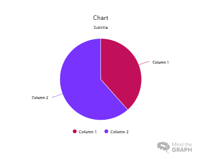
If you’re curious about how much each flavor contributes to your total sales, a pie chart could be the answer. This chart shows your data as slices of a pie, so you can easily see what portion of the whole each category represents. For instance, you can quickly tell if chocolate chip cookies are your best seller or if they make up a smaller slice of your sales pie.
When to Use Pie Charts
Pie charts are best when you want to show how parts of a whole compare with each other. They make it easy to see which categories are more significant or minor parts of the total.
Scatter Plots
Let’s say you want to explore whether spending more on advertising leads to an increase in cookie sales. A scatter plot could help you figure this out by plotting points that show the relationship between two types of information — in this case, advertising expenditure vs. sales. You’ll be able to see if higher spending usually goes hand-in-hand with higher sales.
When to Use Scatter Plots
These are powerful for examining the relationships between two variables. They can show correlations, like whether an increase in one thing might be related to an increase in another, and help you spot outliers or unusual points that don’t fit the pattern.
By choosing the right type of graph and understanding what it can tell you, you’re better equipped to present your data clearly and make informed decisions based on what you see. Each graph has its place depending on what you’re looking at, so think about what you want to know from your data when you choose how to graph it.
How To Effectively Describe Graphs
When you’re faced with a graph, whether it’s in a meeting, a report, or even a news article, knowing how to describe what you see can help you and others understand the data better. Here’s how you can effectively break down and communicate what’s in a graph.
Understanding The Graph
First things first, you need to get to know the graph you’re dealing with.
Reading The Graph Title
The title of the graph is like the headline of a news article. It tells you what the graph is about. Make sure you read it to get a sense of what the data is going to show you.
Identifying The Variables
Look at what each axis (the horizontal and vertical lines) represents. One axis usually shows what is being measured, and the other shows the range of values. For example, if you’re looking at a graph about temperatures over a week, one axis will list the days of the week, and the other will have temperatures.
Interpreting The Scale And Units
Pay attention to the scale (the numbers) along the axes. This will tell you the units of measurement and how much each tick mark on the axis represents. Understanding this will help you accurately interpret the data points.
Describing Trends
Once you understand the basics of the graph, you can start describing the trends you see.
How To Describe Increasing Trends
If the line on a line graph goes up, or if the bars on a bar graph get taller, you can say that the trend is increasing. It might be useful to point out how steep the increase is or if there are any peaks (high points) that are particularly noticeable.
How To Describe Decreasing Trends
Conversely, if the line goes down, or the bars get shorter, the trend is decreasing. Mention if the decline is gradual or sharp. This can be important in showing how quickly something is falling.
How To Describe Constant Trends
Sometimes, the line might be flat, or the bars might be the same height across the graph. This shows that there is no significant change over time. It’s important to highlight stability or consistency in data when it occurs.
Comparing Data
Often, you’ll need to compare data within the same graph to draw more detailed conclusions.
How To Compare Two Or More Data Sets
If there are multiple lines, bars, or data sets in the graph, compare them. Look for where they intersect, where one is higher than the others, and any patterns in differences. For instance, you might notice that one product consistently outsells another in a sales graph.
How To Compare Different Time Periods
When describing changes over time, focus on identifying any periods of significant change or stability. For example, if sales spike every December, mention this pattern.
Common Tips For Describing Graphs
Use Precise Language
Be specific about what the data shows. Use words like “increase,” “decrease,” “double,” or “halve” to precisely describe changes.
Refer to Specific Data Points
When possible, cite exact figures to support your descriptions. Saying “sales peaked at 500 units in July” is more impactful than just saying “sales were high in the summer.”
Keep It Simple and Clear
Avoid jargon or overly technical language. Stick to clear, simple descriptions that anyone can understand.
Describing graphs effectively is about making data accessible and understandable. By breaking down the graph’s components and clearly articulating the trends and comparisons, you empower your audience to grasp complex information quickly and easily. Whether you’re presenting to colleagues, writing a report, or just trying to make sense of the figures in a newspaper, these skills will help you communicate more effectively.
Common Mistakes When Describing Graphs
Describing graphs is a crucial skill in many areas, from business reports to academic presentations. However, it’s easy to make a few common mistakes that can confuse your audience or lead to misinterpretation of the data. Here’s what you should watch out for when you’re explaining graphs.
Overlooking the Scale and Units
One of the first things you should check when you look at a graph is the scale and units used on the axes. A common mistake is not paying attention to these, which can lead you to misinterpret the size or significance of changes in the data. For example, if a graph’s vertical axis starts at 900 instead of 0, a small change might look more dramatic than it really is. Always make sure you understand the scale before you discuss what the graph shows.
Ignoring Outliers
Outliers are data points that are significantly different from the others. Sometimes, people ignore these when they describe trends, but outliers can often tell an important part of the story. For instance, if there’s a sudden spike in your data, it might indicate something unusual that needs to be explained, like a one-time event that increased sales dramatically. Don’t overlook these points; instead, highlight them to give a complete picture.
Misidentifying Trends
When you describe trends in a graph, it’s crucial to accurately convey whether the data is going up, down, or staying the same. A common error is misinterpreting the direction of the trend or exaggerating a slight increase or decrease as a significant trend. Take your time to look closely at the graph and make sure you describe the trend correctly.
Not Using Precise Language
Vague language can make your description of a graph unclear or ambiguous. For instance, saying “sales went up a lot last year” is less clear than saying “sales increased by 20% last year.” Whenever possible, use specific numbers and clear terms to describe what’s happening in the graph.
Focusing Too Much on Details
While details are important, getting too caught up in them can distract from the main insights the graph offers. When you describe a graph, start with the big picture — the overall trend or the most significant findings. Then, if necessary, you can go into more detailed observations. This approach helps keep your audience focused on what’s most important.
Assuming Knowledge
Don’t assume that everyone understands the graph as well as you do. This can lead to explanations that are too technical or too brief. Remember to explain any specific terms or unusual features in the graph. Make your description accessible to someone who might not be familiar with the data or the context.
Forgetting to Contextualize the Data
Finally, a graph doesn’t just show numbers; it tells a story. Make sure you explain why the data matters. For example, if you’re showing a graph of rising temperatures over several years, explain the potential impact on climate or weather patterns. Linking the data to its broader implications helps your audience understand why they should care about the figures.
By avoiding these common mistakes, you ensure that your description of a graph is clear, accurate, and meaningful. This will make your presentations more professional and your conclusions more convincing. Remember, the goal is not just to show data but to communicate insights effectively.
In conclusion, we explored the critical skill of effectively describing graphs, which is essential for conveying complex information clearly and making informed decisions. We covered the various types of graphs—bar graphs, line graphs, pie charts, and scatter plots—each suited for different data presentation needs.
Key techniques for describing graphs were discussed, including understanding the graph’s basic elements, accurately describing trends, and making meaningful comparisons. We also highlighted common pitfalls to avoid, such as overlooking graph scales, ignoring outliers, and using vague language. By mastering these skills, you can enhance your ability to present and interpret data effectively, ensuring your audience grasps the full story behind the numbers.
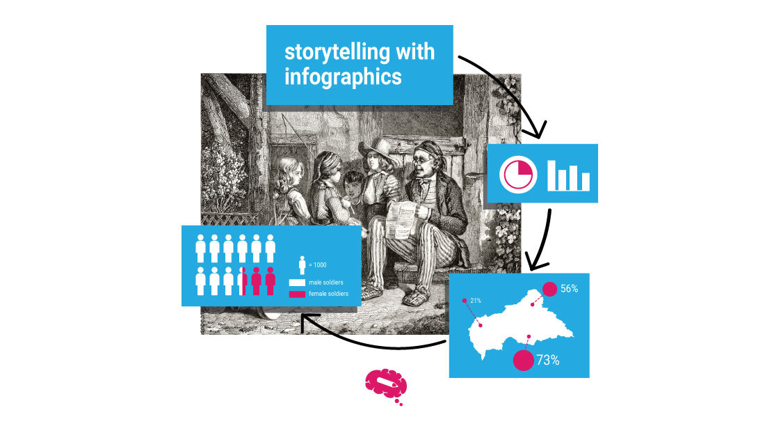
Unleash The Power Of Infographics With Mind the Graph
To enhance your research work, a visual in the form of graphs and infographics is essential. But it’s not everyone’s cup of tea to create these illustrations. Enter Mind the Graph – an infographic tool that helps to communicate science effectively and make your work impactful. Sign up now to learn more!


Subscribe to our newsletter
Exclusive high quality content about effective visual
communication in science.