Mind the Graph Blog
  • Infographic maker
  • How it works
  • Tutorials
  • Portfolio
Mind the Graph Blog

Laboratory procedures – Scientific illustrations #41

Fabricio Pamplona Portfolio May 8, 2020
Create beautiful scientific infographics with no effort We turn scientists into designers to boost your impact. Globally. Try for freeRead more
wave

Virosis symptoms – Scientific illustrations #40

Fabricio Pamplona Portfolio May 1, 2020
Create beautiful scientific infographics with no effort We turn scientists into designers to boost your impact. Globally. Try for freeRead more
wave

Pneumonia infographic template – science communication on it’s best

Fabricio Pamplona Coronavirus, Infographic April 27, 2020
pneumonia lung
Create beautiful scientific infographics with no effort We turn scientists into designers to boost your impact. Globally. Try for freeRead more
wave

Scientists portrait – Scientific illustrations #39

Fabricio Pamplona Portfolio April 24, 2020
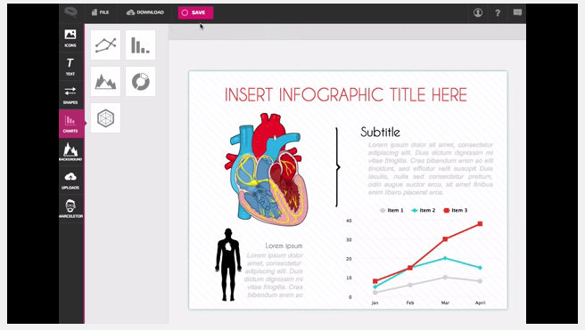
I wanna use medical scientific illustrations from Mind the Graph. How can I do that? Mind the Graph is an online platform that allows scientists and teachers to create their own presentations, papers and graphical abstracts in an attractive and professional…Read more
wave

How to prevent infectious diseases

Fabricio Pamplona Design, Inspiration April 20, 2020
Create beautiful scientific infographics with no effort We turn scientists into designers to boost your impact. Globally. Try for freeRead more
wave

Tutorial video: creating a vaccination infographic template

Fabricio Pamplona Infographic, Tutorials April 15, 2020
Visual Tips - vaccination infographic
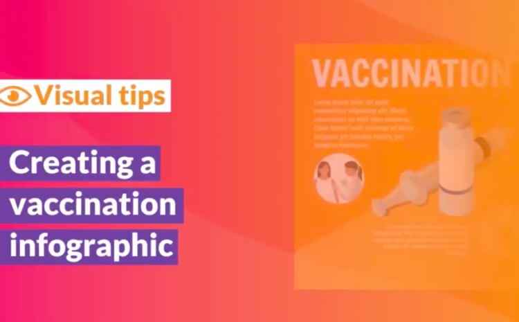
Tutorial on how to create an attractive vaccination infographic with scientific illustrations on Mind the Graph, the infographic maker for scientists and academics. We turn scientists into designers to boost their impact! If you liked the video, access Mind the Graph…Read more
wave

#13 New scientific illustrations of the week: You don’t wanna miss it!

Fabiola Soares Portfolio May 10, 2019
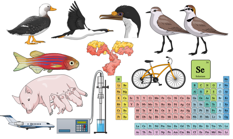
It is time to show the new Mind the Graph scientific illustrations. As you know, every week we add new scientific illustrations to our library on Mind the Graph. As a result, we already have over eight thousands illustrations now…Read more
wave

Scientific illustrations: get more visibility!

Fabricio Pamplona Tools May 3, 2016
For undergrads and grad students in Biomedical sciences, it’s common to face the need to create scientific illustrations for posters, papers or for a educational assay, isn’t it? You often need schemes and figures to improve the appearance of the…Read more
wave

Drink a lot of coffee. It is Healthy [infographic]

Fabiola Soares Infographic November 7, 2015
Coffee, is it good or bad for our health? This kind of question is not very easy to answer because of the complexity of our diet, and the difficulty to isolate the different effects of each food. The only way…Read more
wave

Health statistics in a cool way (data visualization)

Fabricio Pamplona Infographic September 25, 2015
Hans Rosling is a researcher from the Karolinska Institute (Sweden) and founder of a startup company on information design and data visualization. The name of the company is GapMinder and they created a software called Trendalyzer. It’s very very cool…Read more
wave

Create beautiful scientific
infographics with no effort

We turn scientists into designers to boost your impact. Globally.

Try for free
TRUSTED BY
© 2019, Gutentim. All Rights Reserved