
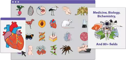
Are you a scientist or researcher looking to enhance your scientific presentations? Look no further! Mind the Graph is an online platform designed to help scientists and researchers create visually stunning science posters, figures, infographics, graphical abstracts, presentations, and more. With over 40,000 scientifically accurate illustrations in 80+ popular fields, Mind the Graph offers a wide range of visually appealing figures for your research. Whether you’re a beginner or a professional, this user-friendly platform caters to all skill levels, making it accessible for individuals, small labs, and large organizations alike. Say goodbye to the challenges of visualizing complex scientific data without specialized design skills – Mind the Graph is here to enhance scientific communication by offering visually engaging and accessible tools for the scientific community. Visit Mind the Graph today and take your scientific posters and presentations to the next level.
Understanding Science Posters
The Importance of Science Posters in Research
In the world of research, science posters play a crucial role. They are a standard method to communicate scientific findings effectively and concisely. A well-designed science poster can summarize complex data into a visual format, making it easily digestible to a broad audience. Science posters also foster interactive discussions between researchers, as they allow for a more informal and personal interaction compared to traditional presentations. This form of visual communication is especially advantageous at conferences, where researchers can present their findings to peers from around the globe. Moreover, science and research posters can be a valuable educational tool, serving as a visual aid in classrooms or labs. They can guide students through complex concepts and methodologies, promoting better understanding and retention of information. Therefore, mastering the art of creating effective science and research posters is a valuable skill for any scientist or researcher.
Exploring Different Types of Science Posters

There are various types of science posters, each tailored to serve a specific purpose within the scientific community.
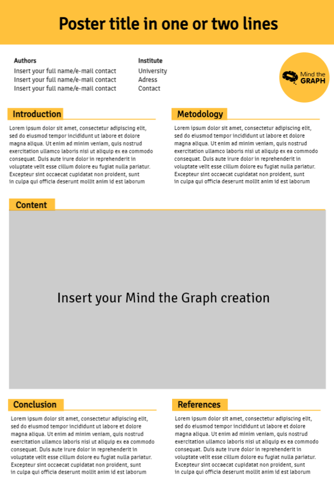
Firstly, research posters are commonly used at academic conferences. They summarize a study or experiment, presenting the aim, methodology, results, and conclusions in a visually appealing format. This type of conference and poster enables meaningful dialogue and fosters knowledge exchange among researchers.
Secondly, educational posters are primarily used in teaching settings. They simplify complex scientific concepts or processes, making information and the learning process more engaging and easier to read and understand for students.
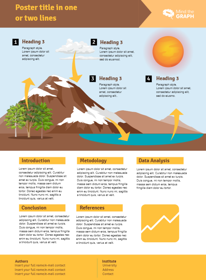
Finally, we have infographic posters. These posters are designed to present scientific information, data or statistics clearly and concisely. They often use graphs, charts, text, and images to deliver information quickly and clearly.
Science posters are a powerful tool for disseminating scientific knowledge. Whether you’re sharing your latest research findings, teaching students a challenging subject, or explaining intricate data in science, there’s a science poster that can meet your needs.
Mind the Graph: A New Age Solution
The Unique Features of Mind the Graph
Mind the Graph is a game-changer in the realm of scientific posters and presentations. It offers a unique set of features designed to simplify and enhance the creation of science posters.
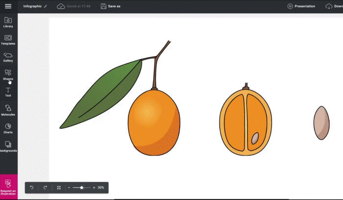
Firstly, it boasts a vast library of over 40,000 scientifically accurate illustrations covering more than 80 popular scientific fields. This extensive collection allows users to find the perfect visuals to represent their complex data clearly and attractively.
Secondly, Mind the Graph offers a user-friendly interface. It’s designed to cater to all skill levels, making it accessible for both beginners lacking design skills and seasoned professionals. Users can easily navigate through the platform and create or customize their science posters with just a few clicks.
Additionally, it facilitates the sharing and presentation of your work. Once a poster is created, it can be downloaded, printed, or shared digitally. This flexibility makes it a convenient tool for researchers wanting to present their findings in different settings.
In conclusion, Mind the Graph, with its unique features, is an effective solution to the challenges faced in creating visually compelling science posters.
Creating Compelling Figures with Mind the Graph
Creating visually appealing and effective figures is a cinch with Mind the Graph. It’s all about transforming complex scientific data into concise, easy-to-understand visuals that grab the audience’s attention.
Start by choosing from the platform’s vast library of scientifically accurate illustrations. You can filter these images based on your field of research, ensuring relevance and accuracy.
Next, customize these illustrations and charts to align with your research data. You can adjust colors, fonts, sizes, and orientations to perfectly represent your data. You can also add text, icons, and additional graphics to further enhance your visual representation.
Then, organize these elements on your canvas. MindtheGraph.com allows you to move, resize, and orient your elements in a way that best conveys your message. You can also choose from a variety of layout templates to get a head start on your design.
Finally, review and finalize your design. Make sure your visual representation is clear, comprehensive, and compelling. With Mind the Graph’s workspace, crafting compelling figures for your science poster is not just possible – it’s straightforward and enjoyable.
Power of Visual Representation in Science
Breakdown of Complex Data through Visuals

The power of visual representation in science is undeniable. Visuals have the unique ability to break down complex data into understandable information, a task often complicated by the inherent complexity of scientific research.
The use of visuals, such as diagrams, charts, and infographics, can simplify and clarify data, making it easy for any audience to comprehend. They help in illustrating relationships, showing patterns, and revealing trends that might be difficult to understand in a textual format.
For instance, a bar chart can quickly convey the relative frequencies of different data categories, while a line graph can demonstrate changes over time. Similarly, a well-designed infographic can simplify a complex process or concept into a series of easy-to-follow steps.
Mind the Graph is an excellent tool for creating these visuals. It provides a wide variety of scientifically accurate illustrations and charts that can be customized and organized to represent your data most effectively. Thus, using visuals, particularly with the help of Mind the Graph, can significantly enhance the understanding and impact of your scientific research.
Ensuring Effective Scientific Communication Through Graphics

Effective scientific communication is critical in disseminating research findings, influencing policy decisions, and driving knowledge advancement. Graphics play a fundamental role in this process.
Visuals, such as diagrams, charts, and infographics, can amplify the impact of scientific communication. They condense large amounts of data into a digestible format, bridging the gap between complex scientific concepts and the intended audience. This clarity aids in the comprehension and retention of information, making communication more effective.
Moreover, well-designed graphics can attract and hold the audience’s attention. They add aesthetic appeal to presentations, making them more engaging and memorable. This increased engagement can lead to more in-depth discussions and greater understanding.
Mind the Graph provides the tools to create these impactful graphics. With its vast library of scientifically accurate illustrations and user-friendly interface, it enables researchers to effectively communicate their findings through visually compelling science posters. Therefore, by harnessing the power of graphics, scientists and researchers can ensure more effective and impactful scientific communication.
Crafting Your First Science Poster with Mind the Graph
User-Friendly Platform for Beginners and Professionals
Whether you’re just starting your journey in science communication and posters or are a seasoned professional, Mind the Graph caters to all skill levels. Its user-friendly platform is designed to make the process of creating science posters seamless and enjoyable for everyone.
For beginners, Mind the Graph offers an intuitive interface that is easy to navigate. It guides you through the process, from selecting relevant illustrations to customizing and organizing them on your poster. You can also take advantage of various layout templates that can be easily modified to suit your needs.
For professionals, the platform provides advanced features to further enhance your science posters. You can delve deeper into customization options, adjust intricate details, and create unique visuals that accurately represent your research data.
In addition, Mind the Graph offers helpful resources and tutorials to guide users through the process. This support ensures that everyone, regardless of their design experience, can create visually stunning and scientifically accurate posters. With Mind the Graph, crafting your first science poster is a straightforward and rewarding process.
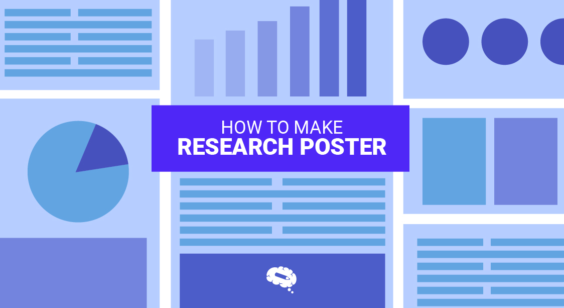
The Process of Poster Creation on Mind the Graph
Creating a science poster on Mind the Graph is a straightforward and intuitive process. Here’s a step-by-step guide to help you get started.
Step 1: Choose Your Illustrations – Start by browsing the platform’s extensive library of over 40,000 scientifically accurate illustrations. You can filter these images by your field of research to find the most relevant visuals for your science poster here.
Step 2: Customize Your Illustrations – Once you’ve chosen your illustrations, it’s time to customize them. Adjust colors, fonts, sizes, and orientations to ensure they accurately represent your research data.
Step 3: Organize Your Canvas – Position your illustrations on the canvas. Mind the Graph’s easy-to-use drag-and-drop feature makes it simple to move and resize your visuals.
Step 4: Add Text and Additional Graphics – Enhance your poster by adding text and any other graphics. You can also choose from a variety of fonts, colors, and text sizes for the text in your posters, captions and labels.
Step 5: Review and Finalize Your Poster – Before you finalize your poster, review it for clarity and coherence. Ensure that your visuals accurately convey your research data and that your poster is visually appealing.
Following these steps, you can create a compelling and scientifically accurate science poster with ease.
Driving Greater Engagement with Mind the Graph
From Small Labs to Large Organizations: Who Uses Mind the Graph?

Mind the Graph is widely used across the scientific community, from small labs and conferences to large organizations.
For individual researchers and small labs, the platform provides an affordable and user-friendly solution to visually communicate scientific findings. Whether presenting at a conference or publishing in a journal, researchers can use Mind the Graph to create compelling visuals that clarify and enhance their data.
Educational institutions also find value in Mind the Graph. Teachers and professors can create engaging visual aids to help explain complex scientific concepts to students. Similarly, students can use the platform to create impactful presentations and posters for their coursework.
Large organizations and research institutions use Mind the Graph to streamline their scientific communication. The platform allows for consistent and clear visuals across their communication materials, improving their professional image.
By catering to a wide range of users, Mind the Graph is driving greater engagement in the scientific community, enhancing the way research is communicated and understood.
Enhancing Accessibility and Engagement through Visuals
Visuals play a crucial role in enhancing accessibility and engagement in scientific communication. They break down complex scientific data into a form that is easily understood by a broad audience, including those from non-scientific backgrounds. This increased accessibility fosters wider engagement with the research, expanding its reach and impact.
Mind the Graph is a potent tool in this regard. It allows users to create visually appealing and scientifically accurate posters, figures, infographics, and more. These visuals not only make the information more accessible but also more engaging. They capture the audience’s attention and make the information more memorable.
Moreover, the user-friendly nature of Mind the Graph ensures that this increased accessibility and engagement is not limited to those with design skills. Anyone, from beginners to professionals, can use the platform to create visually stunning science posters. This inclusive approach further enhances engagement within the scientific community and beyond, redefining the way scientific information is shared and understood.
Examples and Benefits
Real-Life Success Stories Using Mind the Graph
Several users have experienced success with Mind the Graph in a variety of settings.
For instance, a researcher from a renowned university used Mind the Graph to create a science poster for his presentation at an international conference. The visually appealing science poster helped him stand out among hundreds of presenters, leading to a successful presentation and several fruitful discussions with peers.
Another example is a high school biology teacher who used the platform to create educational posters for her classroom. These posters made complex biological concepts more understandable and engaging for her students, improving their understanding and performance in the subject.
A PhD student also benefited from the tool when preparing her thesis defense. She created clear and compelling visuals to represent her research data, making her defense more convincing and ultimately successful.
These real-life success stories demonstrate how Mind the Graph can enhance scientific communication in various contexts. Whether it’s for a conference presentation, poster, classroom teaching, or thesis defense, Mind the Graph.com is proven to deliver success.
Advantages of Using Mind the Graph
Mind the Graph brings several advantages to its users in the realm of scientific communication.
Accessible: The platform is designed to be user-friendly, catering to all skill levels. Whether you are a beginner with no design skills or a seasoned professional, you can navigate through the platform with ease.
Versatile: With over 40,000 scientifically accurate illustrations in 80+ popular science fields, the platform offers an extensive range of visuals to cater to various research requirements.
Quality Graphics: The graphics are scientifically accurate, ensuring that your research is represented correctly and professionally.
Convenient: Once your science poster is created, it can be conveniently downloaded, printed, or shared digitally, making it a flexible presentation tool for various presentation settings and conferences.
Educational: For educators and students, it’s a valuable tool to create visually engaging educational materials that can enhance students’ understanding of complex scientific concepts.
Community: Mind the Graph also fosters a community of scientists and researchers, encouraging knowledge sharing and collaboration.
In a nutshell, Mind The Graph is an effective tool that offers multiple benefits to its users, enhancing the way scientific communication is presented and received.
Mind the Graph Aids Scientists In Crafting Visually Captivating Figures For Their Research
Offering customizable scientific illustrations, templates, and design tools, enables researchers to produce engaging visuals that effectively convey their findings. With options to integrate data into graphs and tailor colors, fonts, and styles, scientists can personalize their figures to match their research style, enhancing accessibility and memorability for a broader audience.


Subscribe to our newsletter
Exclusive high quality content about effective visual
communication in science.