If you are a scientist, doctor, student or researcher, you know that doing presentations is a part of our routine. And (in my opinion) this is a good thing. We need to be able to present our results and communicate science in an attractive and understandable way. This is the key to fight against pseudoscience and fake news at the same time we show how science is important to society. But, if you struggle to speak in public, you probably don’t like this part of the scientific work, right? Well, there are a few hacks to help you with that. However, today I will focus on just one: Create an eye-catching presentation will give you more self-confidence. After all, as your clothes, your slides also can help you look more professional.
When you go to present your data in a scientific conference, you probably talk about precious results that you achieve after years of hard work. So, my point is: Your data deserves to be presented in a professional and attractive way. If you agree with me, let’s go to the next step: how to do that? How long do you spend creating presentations? The final result meets your expectations? Don’t worry, this post is to help you!
So, let’s move from that:

To that:
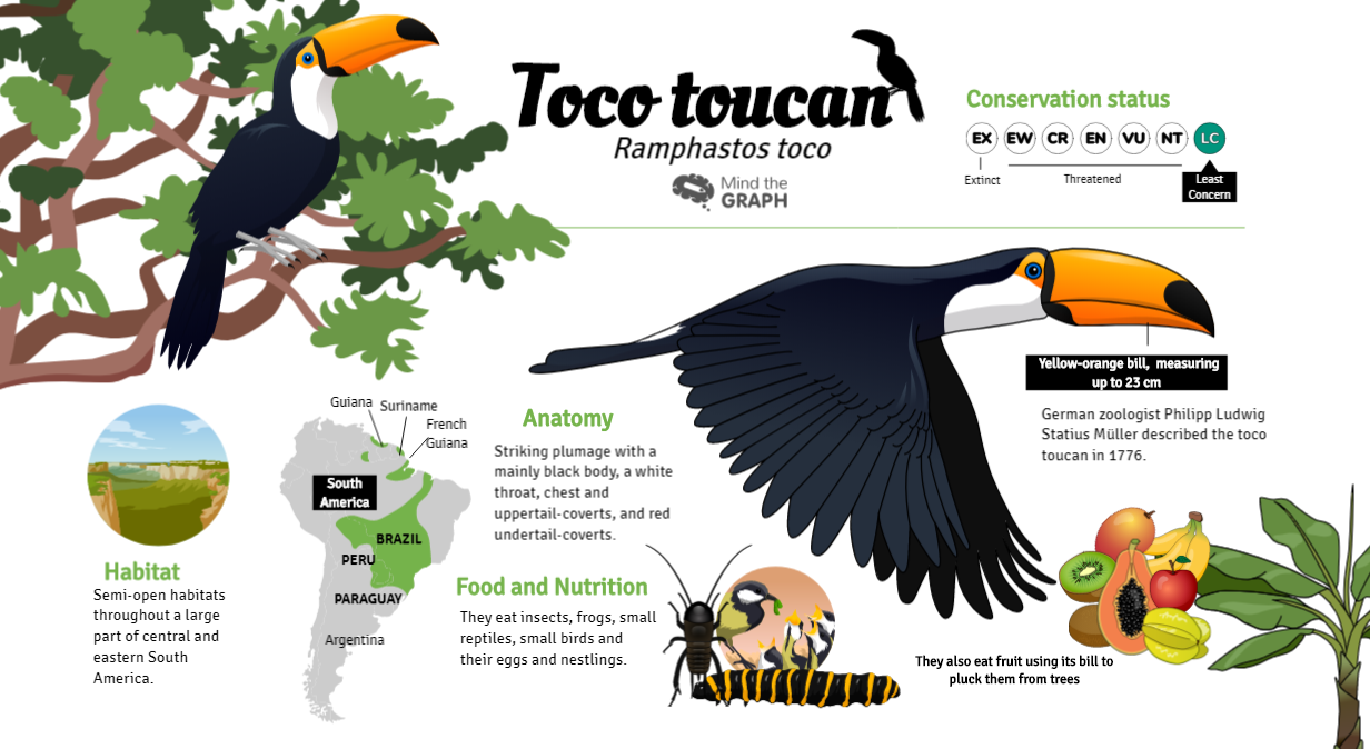
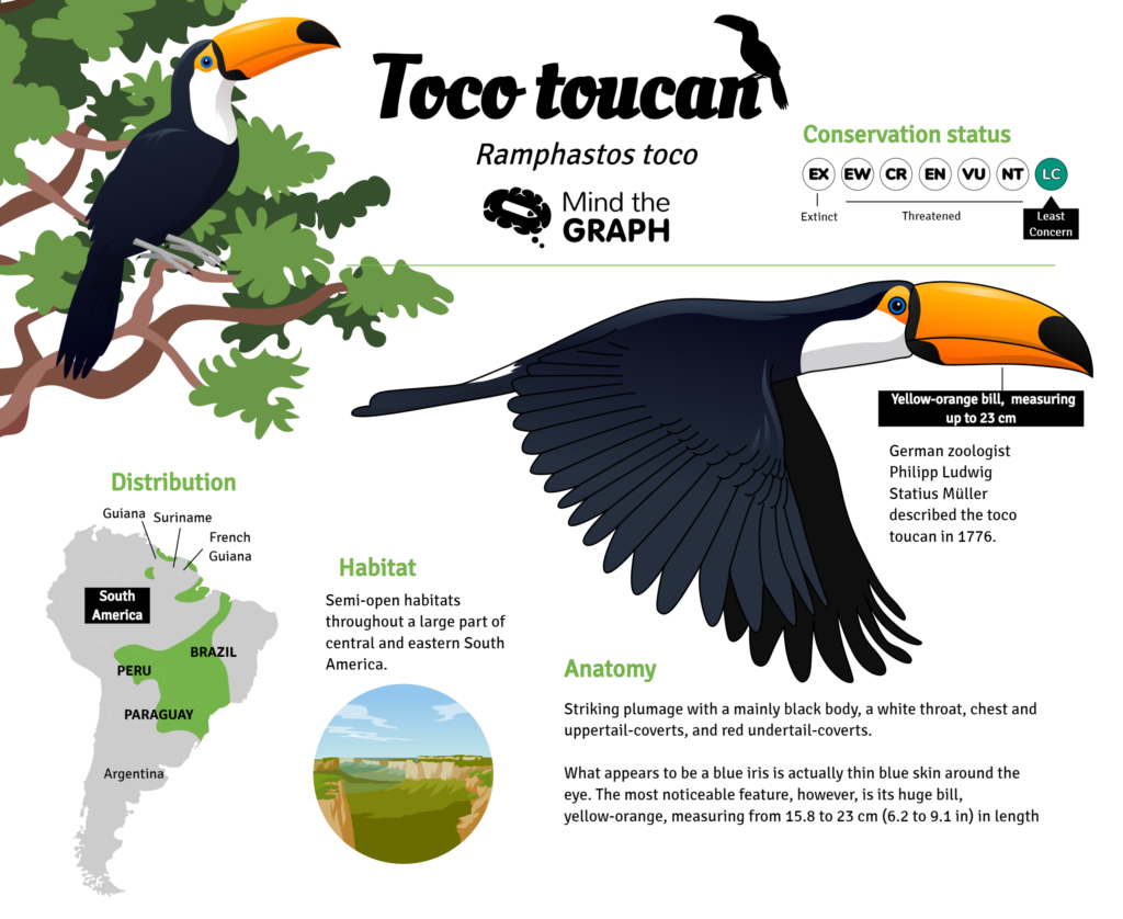
Look this slide template from Mind the Graph to understand the tips:
01. Hierarchy
You need to set the information hierarchy. What do your audience needs to see first? What is your main information? After that, set a good space to your headline and figures and make sure that them are showing your main information and making your audience wanting for more information.
02. Typography
Your presentation needs to be professional. So, skip the comic sans and choose a formal and serious typography. There are a lot of them. I personally like Helvetica.
03. Illustrations
Don’t put too much text on your slide. Again, don’t put to much text!! If you do that, during your talk you will be competing for attention with your own slides. Do you want that your audience listens to you or read your slide? So, use good images to catch the attention and curiosity. We have over eight thousands illustrations available to our users (free users included), so if you are looking for good images for your presentations, try Mind the Graph.
04. Using a slide template
To create a beautiful and professional presentation takes time and requires some skills and experience. But, there is an easier and faster way: don’t start from a blank canvas. You can use a slide template to save time and get design ideas.
We provide several templates, so our users don’t need to start from a blank canvas. Free users can visualize the templates but not edit them. If you are a free user, you can use the template as an inspiration to your creation or upgrade your plan to have access to all features of Mind the Graph. Subscribers can use as many templates as they want and the price starts from 9,00 USD.
You can read more about it on:
- Mind the Graph upgrade: New features to create presentation slides for scientific purposes
- New templates to create your graphical abstracts

Subscribe to our newsletter
Exclusive high quality content about effective visual
communication in science.


