Mind the Graph Blog
  • Infographic maker
  • How it works
  • Tutorials
  • Portfolio
Mind the Graph Blog

An attractive science communication against fake news

Fabiola Soares Inspiration July 25, 2019
Science can change the world. This mean that we as scientists have an enormous power. But, how many people knows about our research? Also, how many people we are impacting with our data? If we want to improve our society…Read more
wave

Science education: 03 ways to improve your classes

Fabiola Soares Inspiration, Tips July 25, 2019
Catch and keep the attention of kids and teenagers is not an easy task. But if you are a teacher, you already know that (very well). So, I am writing this post to help you with this task. As teachers,…Read more
wave

Slide template: Attractive presentations one click away

Fabiola Soares Inspiration, Portfolio July 23, 2019
If you are a scientist, doctor, student or researcher, you know that doing presentations is a part of our routine. And (in my opinion) this is a good thing. We need to be able to present our results and communicate…Read more
wave

Creating scientific protocols and funny notices to your lab

Fabiola Soares Design, Inspiration, Tips June 17, 2019
As you probably know, Mind the Graph is an online platform that allows scientists to create graphical abstracts, presentations, posters for scientific congress and more. But a scientist life isn’t just that. We need to use a lot of scientific…Read more
wave

Brazilian biodiversity in stunning infographics

Fabiola Soares Inspiration June 6, 2019
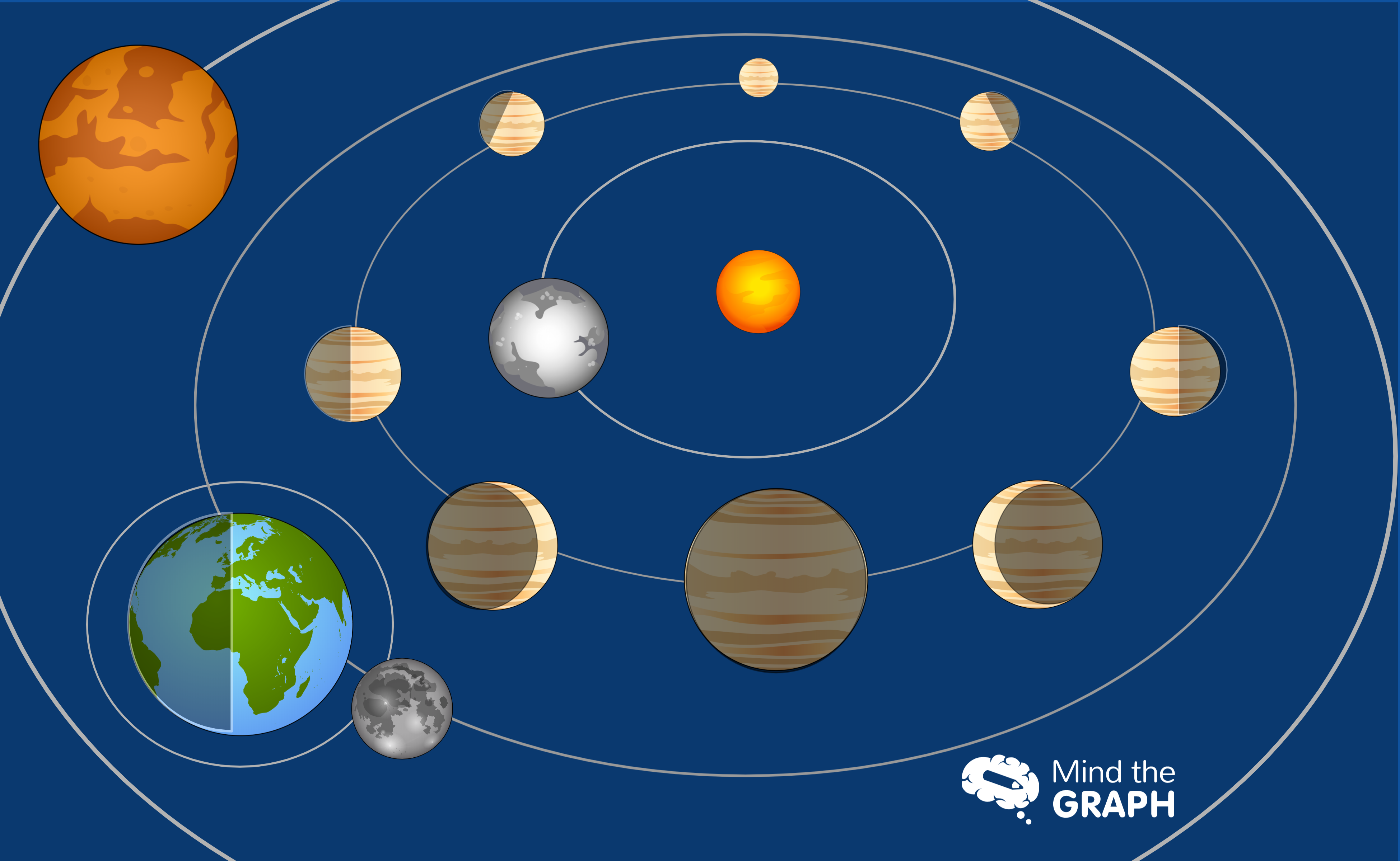
One of Brazil’s most valuable assets is its dense covering of rainforests. Of course, the Amazon Rainforest is the most significant of these. The forest covers a vast portion of the country. Besides that, the Amazon rainforest provides the ideal habitat…Read more
wave

Zika virus: The awarded study that brings new light to the long-term consequences

Fabiola Soares Inspiration June 3, 2019
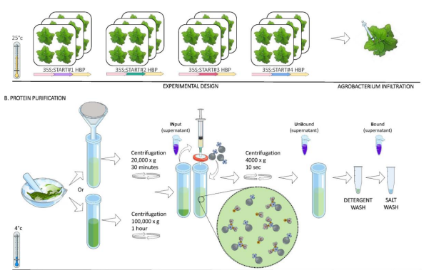
It is always amazing to show the scientific work of our users. So, today I will present you the brazilian scientist Isis de Souza and her work with zika virus. Isis and her colleagues study the impact of early-life Zika virus infection…Read more
wave

Flat Earth and geocentrism: How to show that the Earth orbits the Sun

Fabiola Soares Inspiration May 15, 2019
Science must to be about curiosity and questions, not dogmas and canned responses. So, teachers need more than teach against the flat Earth theory. We need to teach the scientific method of raising hypothesis, make experimentations to explore observations and answer questions. A…Read more
wave

Visual abstract created by user to explain the research paper “Optimized Small‐Molecule Pull‐Downs Define MLBP1 as an Acyl‐Lipid‐Binding Protein” by Yelena Sterlin

Fabiola Soares Data Visualization, Inspiration April 23, 2019
A visual abstract is not easy to create, but’s here to stay. So we always love to show off our users’ amazing work as an inspiring example of visual abstract. We want to empower scientists to enable a more more…Read more
wave

Aves diversity: An eye catching infographic

Fabiola Soares Infographic, Inspiration April 1, 2019
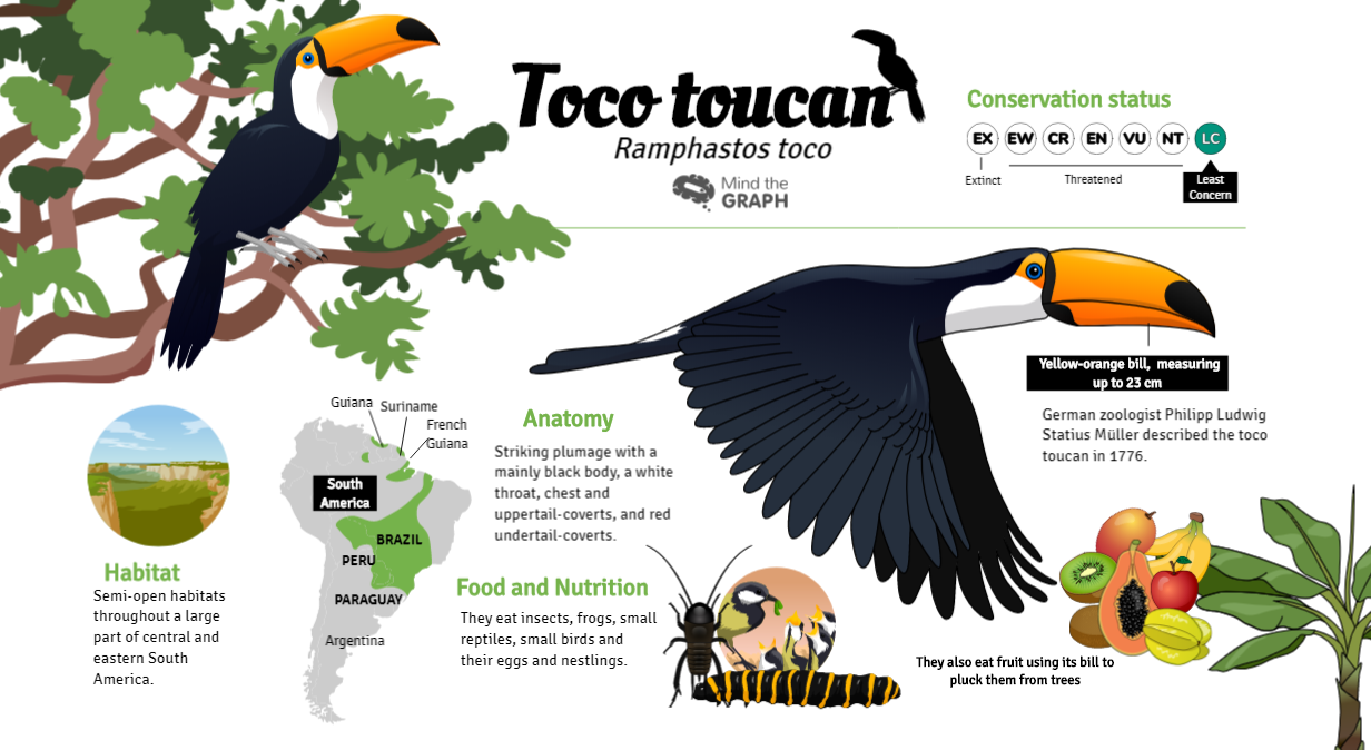
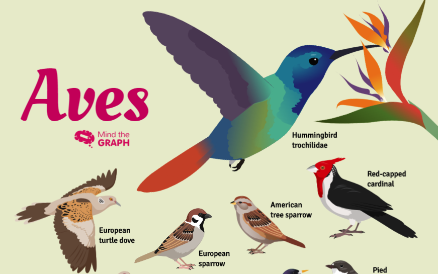
Birds, also known as Aves, are a group of endothermic vertebrates. They are characterised by feathers, toothless beaked jaws, the laying of hard-shelled eggs, a high metabolic rate, a four-chambered heart, and a strong yet lightweight skeleton. Birds are a…Read more
wave

Science communication: improving the Patient information leaflet

Fabiola Soares Inspiration, Portfolio March 10, 2019
Improve science communication is important to reach more people and fight against misinformation. Illustrations are a powerful tool to do that. As humans, we are a visual specie and images are helpful to understand something at a first glance because since a large…Read more
wave

Infographics to explain the 2018 Nobel Prize

Fabiola Soares Inspiration October 31, 2018
The 2018 Nobel Prize was announced this month and brought exciting science news. We select infographics to help you understand the research of  the winners of Medicine, Chemistry and Physics. The infographics were made by Compound Interest, a platform to improve…Read more
wave
  • 1
  • 2
  • 3
  • 4
  • 5
  • ․․․․
  • 8
Mind The Graph Logo
Mind the Graph Facebook Mind the Graph Instagram Mind the Graph Linkedin Mind The Graph Blog Mind the Graph Twitter Mind the Graph YouTube
Cactus Communications Logo

© 2022, Cactus Communications. All Rights Reserved