
A comparison infographic is a great tool to compare and contrast two or more elements. It is very useful in Life sciences to compare different species, treatment and control groups in an experiment, diseases progression and so on. But how to create a successfully comparison infographic? I selected a few examples to explain. Also, all these templates are available on mind the graph, you can start from them and adapt to fit your needs.
03 topics to pay attention when you are building a comparison infographic
-
-
Alignment
-
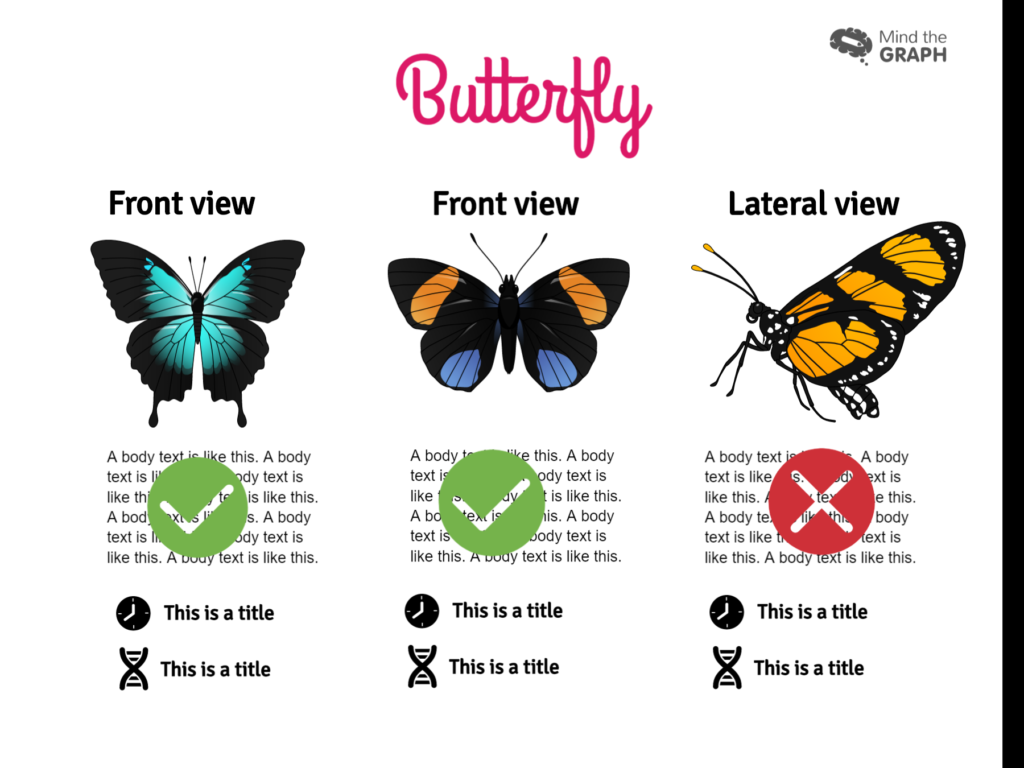
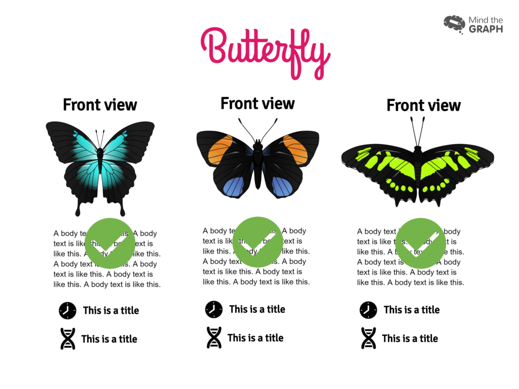
The elements must be on the same level, size and position. Otherwise your readers can find difficulty to compare the elements. Whether it’s two or three elements, you should put everything symmetrical.
Look at these examples:
We created a video tutorial step-by-step to help you create a professional graphical abstract. Check out:
-
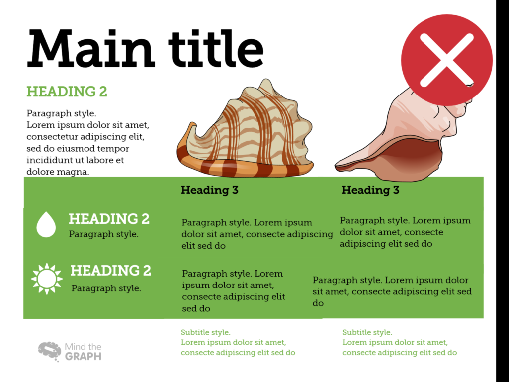
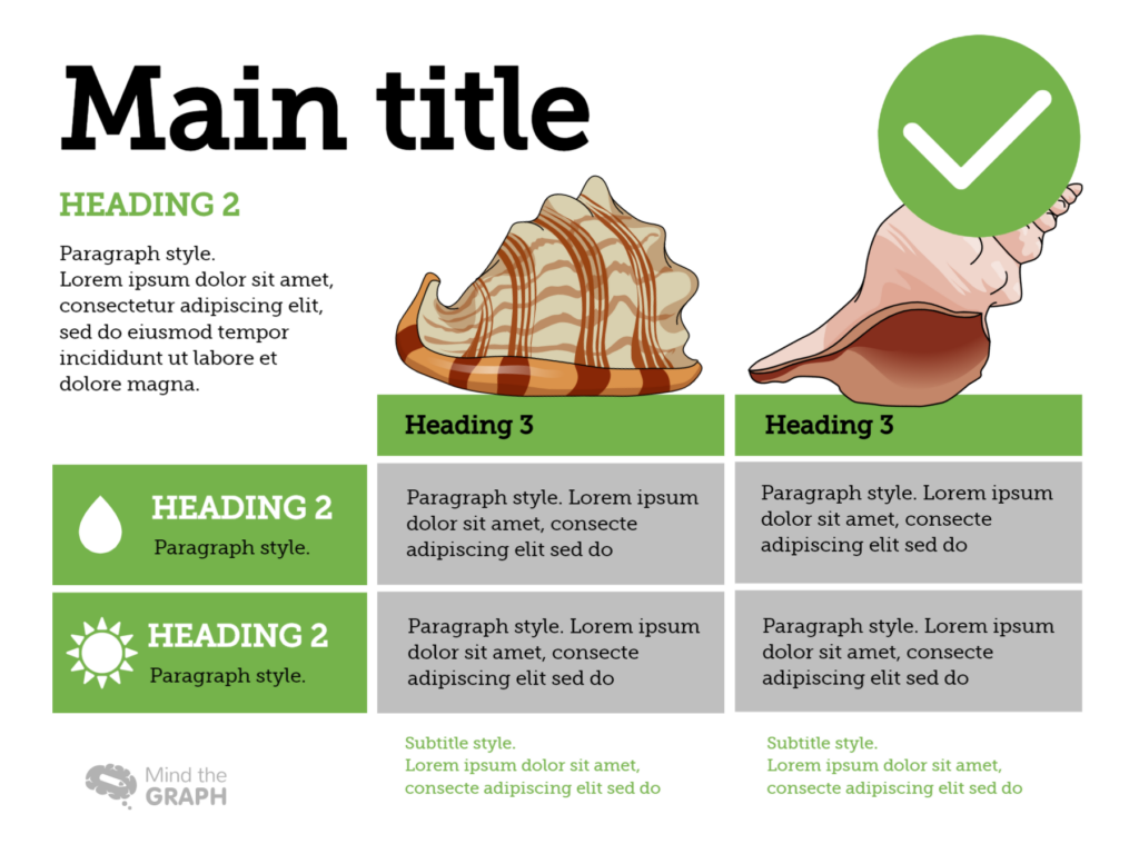
A clear division
You can use colors and boxes to split the content. If you want a clean and minimalistic infographic, you can choose darker or lighter shades of color. You can use contrastant colors as well to compare very contrastant things. Just pay attention to NOT pollute your graphical abstracts using not-matching colors.
Look at these examples:
-
-
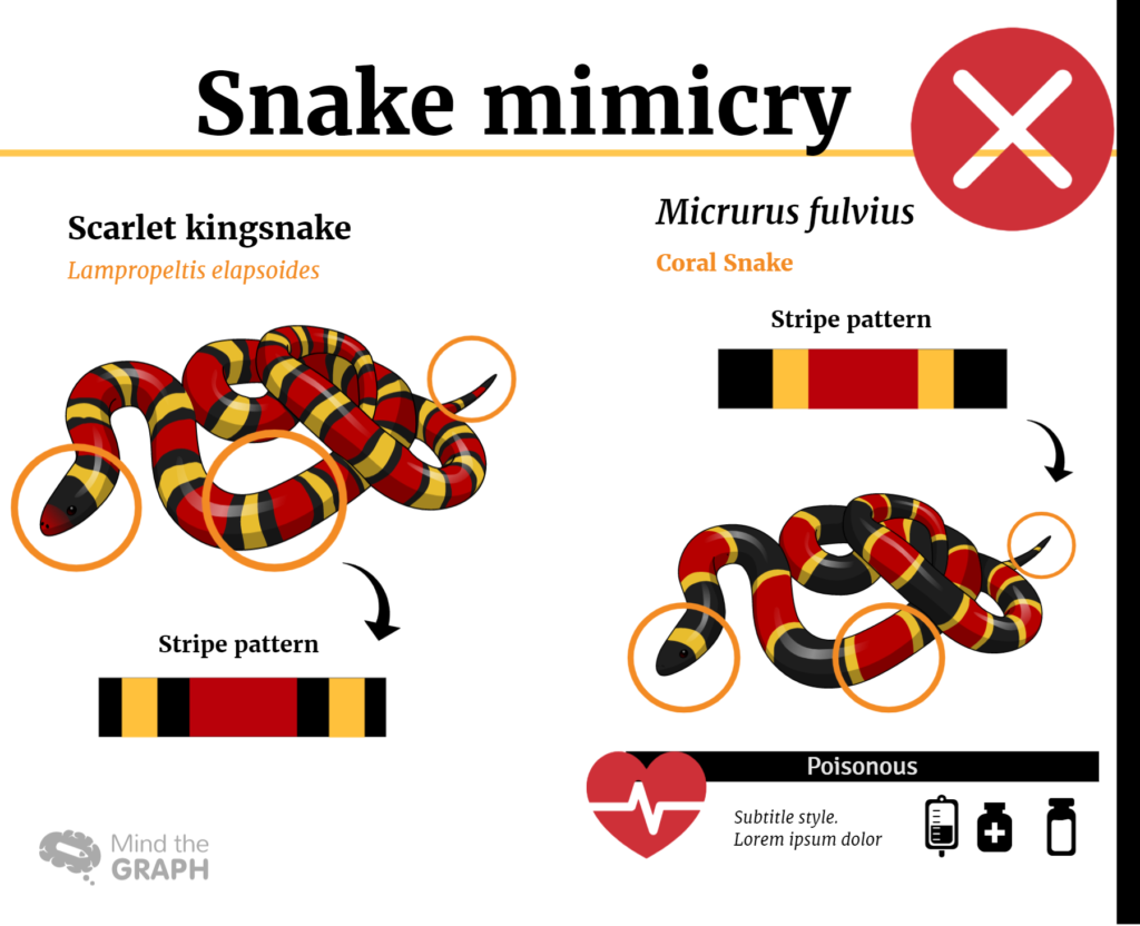
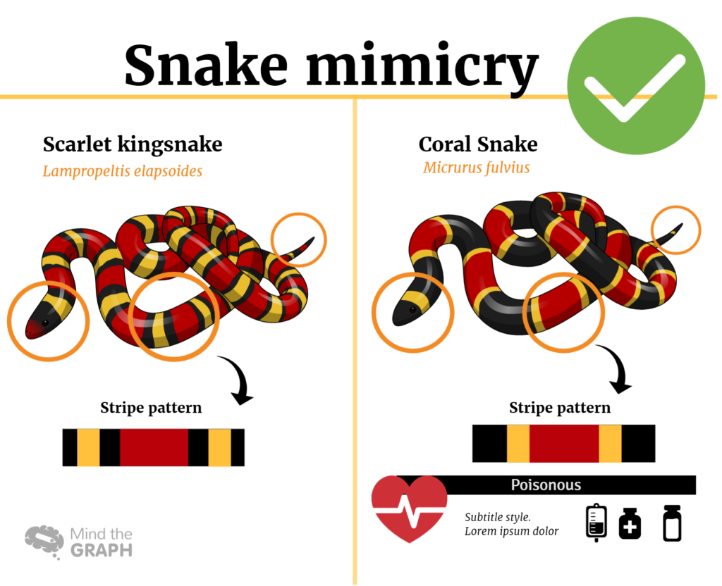
Consistency
-
Stay consistent using the same kind of elements. You must combine the size, view and position of the elements you are using. Don’t choose a illustration that not match with the others. You need to create a pattern with the illustrations, colors, font type and size.
That is why all illustrations on mind the graph have the same pattern, you can combine the illustrations you want and make a harmonic infographic.
Look at these examples:
Check out this other video tutorial. Feel free to subscribe our youtube channel. We post new video tutorials every week.
Have you liked these tips? Starting using mind the graph to create your own graphical abstracts and infographics right now:


Subscribe to our newsletter
Exclusive high quality content about effective visual
communication in science.