Mind the Graph Blog
  • Infographic maker
  • How it works
  • Tutorials
  • Portfolio
Mind the Graph Blog

#36 Find accurate scientific illustrations online

Fabiola Soares Portfolio February 28, 2020
Hi there! I am writing to bring you good news: We have a lot of new scientific illustrations and all them are available for you. On this post you’ll see the newest scientific illustrations available but keep in mind that these…Read more
wave

Building a comparison infographic to explain snake mimicry

Fabiola Soares Tutorials February 17, 2020
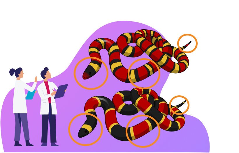
A comparison infographic is a great tool to compare and contrast two or more elements. It is very useful in Life sciences to compare different species,  treatment and control groups in an experiment, diseases progression and so on. But how…Read more
wave

#26 The best scientific illustrations of the week: Don’t miss it!

Fabiola Soares Portfolio September 13, 2019
Hello there. Are you ready to see the best scientific illustrations of the week? As you know, every week we add illustrations that become available to mind the graph users (free users included). If you liked them, you can save in…Read more
wave

#25 Scientific illustrations of the week: Don’t miss it!

Fabiola Soares Portfolio August 30, 2019
cover_scientific_illustrations
Hi there! Are you ready to see the new scientific illustrations? We have a lot of new illustrations to show you. We already have over eight thousands illustrations in our library that are available to all mind the graph users (free users…Read more
wave

#22 Scientific illustrations of the week: Don’t miss it!

Fabiola Soares Portfolio July 26, 2019
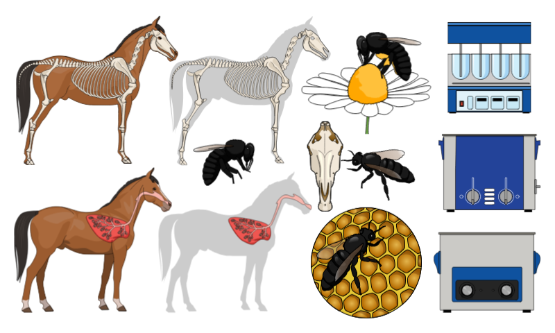
Friday is the day we show off our new scientific and medical illustrations. We already have over eight thousands illustrations in our library that are available to all mind the graph users (free users included). With these illustrations you can create graphical abstracts,…Read more
wave

#19 New scientific illustrations of the week: You don’t wanna miss it!

Fabiola Soares Portfolio June 28, 2019
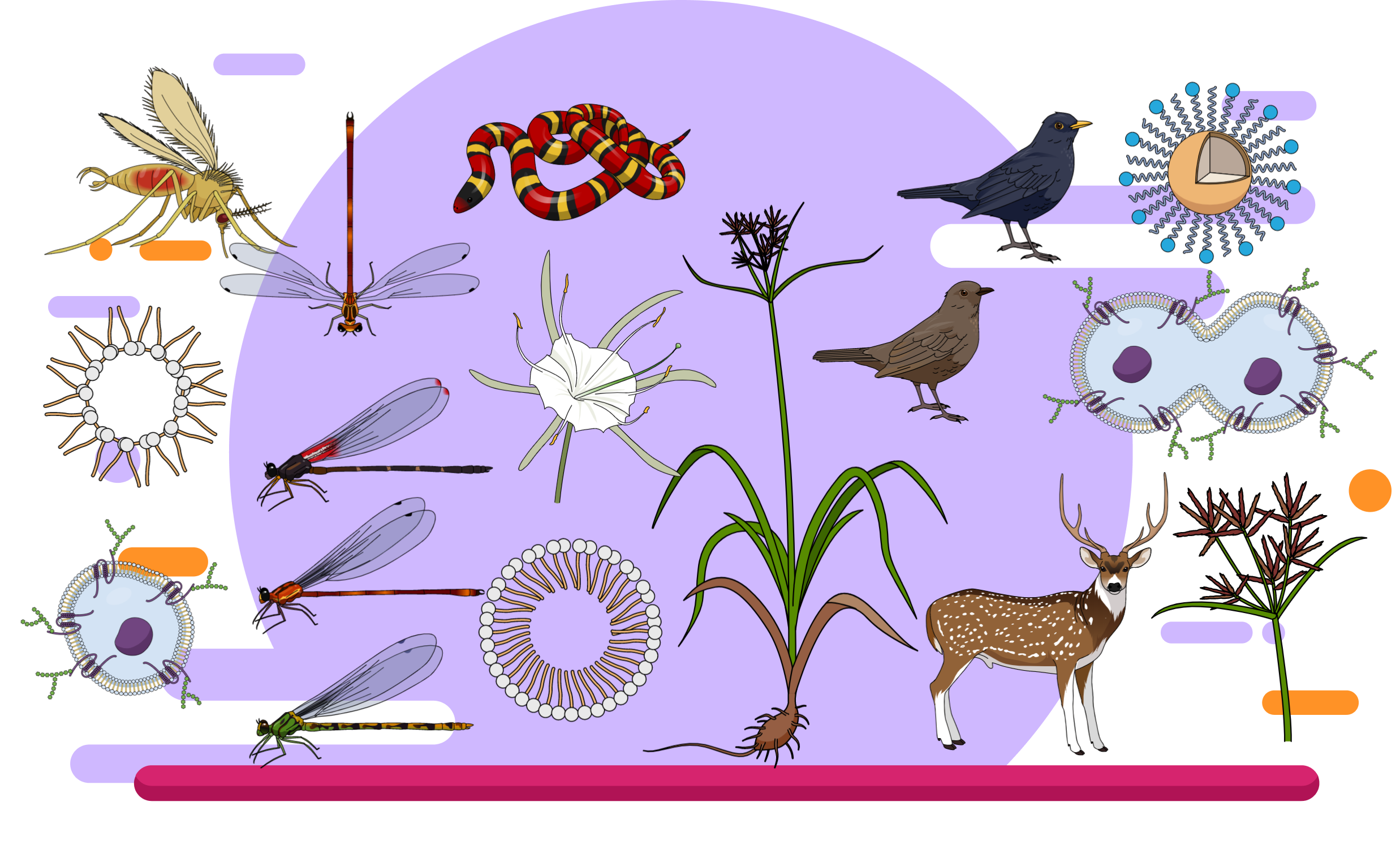
Hello, it is time to show the new Mind the Graph scientific illustrations. We already have over eight thousands illustrations in our library and all them are available to all mind the graph users (free users included). So, if you are…Read more
wave

#11 New scientific illustrations of the week: You don’t wanna miss it!

Fabiola Soares Portfolio April 19, 2019
Hello, it’s friday again (YAY) and it’s time to see the new scientific illustrations of the week! As you know, every week we add many illustrations to mind the graph platform. All these illustrations are available to all mind the…Read more
wave

Aves diversity: An eye catching infographic

Fabiola Soares Infographic, Inspiration April 1, 2019
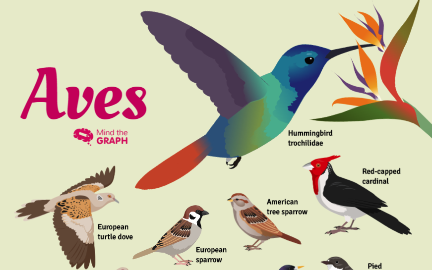
Birds, also known as Aves, are a group of endothermic vertebrates. They are characterised by feathers, toothless beaked jaws, the laying of hard-shelled eggs, a high metabolic rate, a four-chambered heart, and a strong yet lightweight skeleton. Birds are a…Read more
wave

Create beautiful scientific
infographics with no effort

We turn scientists into designers to boost your impact. Globally.

Try for free
TRUSTED BY
© 2019, Gutentim. All Rights Reserved