Transitions and other transitional words and phrases play a vital role in enhancing the flow and clarity of scientific visualizations. In the realm of research and data presentation, these tools serve as seamless connectors between different concepts, allowing for a smooth and logical progression of ideas. As scientists and researchers must communicate complex information effectively, understanding the power of transitions, transition words, and transitional phrases can significantly elevate the quality and impact of their visual content. This discussion will delve into the importance of these linguistic devices in scientific communication, highlighting their ability to improve comprehension and engagement within the scientific community.
Introduksjon til overganger i visualiseringer
Overgangenes rolle i representasjon av vitenskapelige data
Transitions are key in scientific visualizations for guiding the viewer through a series of data points or conceptual illustrations. They act as bridges, facilitating a clear understanding of how one set of data relates to another. In scientific data representation, transitions help in highlighting changes, comparing results, or demonstrating a sequence of events. By effectively employing transitions, researchers can draw attention to the most pertinent aspects of their data, allowing for a narrative that unfolds logically and intuitively. This is especially critical when dealing with complex datasets where the risk of misinterpretation is high. Ultimately, well-executed transitions ensure that the viewer’s attention is focused on the intended progression, making the visualization not just informative, but also engaging.
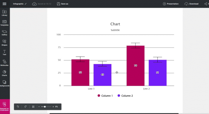
Smart tips: Bruk Mind the Graph for å representere dataene dine.
Forstå det grunnleggende om overgangsfraser
Transitional phrases are linguistic tools that connect sentences and paragraphs in a way that makes the text flow logically and smoothly. In the context of scientific visualizations, these phrases are used to introduce a new section, indicate a change in direction, or highlight a relationship between two ideas. Common transitional phrases include ‘however’, ‘furthermore’, ‘in contrast’, and ‘as a result’. When used effectively, they prepare the reader for what’s coming next, making complex information more digestible. It’s important to choose the right transitional phrase to match the sentence and intended emphasis or relationship between ideas, as the wrong choice can lead to confusion rather than clarity. Mastery of transitional phrases can transform a series of disconnected statements into a coherent and persuasive narrative, crucial for successful scientific communication.
Kraften i overganger
Bedre tolkning av data gjennom overganger
Overganger spiller en avgjørende rolle i tolkningen av data ved å gi publikum en tydelig vei gjennom informasjonen som presenteres. De bidrar til å skape en logisk flyt, noe som gjør tidligere komplekse datasett enklere å forstå og tolke. I en graf som viser en trend over tid, kan overganger for eksempel brukes til å lede betrakterens blikk fra ett datapunkt til det neste og understreke retningen og størrelsen på endringene. Uten overganger kan det være vanskelig for betrakteren å sette sammen hvordan ulike deler av dataene henger sammen, noe som kan føre til feiltolkninger eller at viktige funn overses. Ved å planlegge overganger i visualiseringer nøye kan forskere sørge for at publikum får en dypere og mer nøyaktig forståelse av dataene, og dermed øke effekten av forskningen deres.
Casestudier: Vellykket bruk av overganger
The effective use of transitions in scientific visualization is best illustrated through case studies. For example, a study on climate change might use animated maps to illustrate the transition between different projections, clearly demonstrating the potential impact over time. Another case could involve a health-related study where transitions show the spread of a disease across a geographical area, with each step in the transition highlighting a new area of infection and its intensity. These transitions not only help in conveying the data more vividly but also in creating a compelling story that resonates with the audience. In both cases, the use of transitions enables viewers to grasp the progression of complex phenomena in a structured and memorable way, which is imperative for driving home the message of the research findings.
Å beherske overgangsfraser
Overgangsfrasenes innvirkning på datasammenhengen
Transitional phrases significantly enhance the coherence of data presentation by providing clear signposts for the audience’s journey through the information. They are instrumental in building a narrative that can be easily followed, ensuring that each piece of data presented is clearly connected to what comes before and after it. For instance, phrases like “leads to” or “corresponds with” can effectively indicate causality or correlation between data sets. Similarly, words such “on the other hand” or “in contrast” can help highlight differences or opposing trends within the data. Transitional phrases act like a thread that sews the pieces of data together into a cohesive whole, preventing the audience from getting lost in a sea of numbers and figures. Ultimately, mastering the use of transitional phrases is fundamental for researchers who aim to convey their findings with precision and clarity.
Eksempler på overgangsfraser i vitenskapelige visualiseringer

In scientific visualizations, transitional phrases play a significant role in explaining the data and guiding the viewer. For instance, when presenting a sequence of events in a process, phrases like “initially,” “subsequently,” and “finally” can order and summarize the steps effectively. To show cause and effect, phrases such as “as a result,” “therefore,” and “consequently” are often used. When two pieces of data have a correlational relationship, phrases like “in parallel,” “similarly,” or “along with the same way” suggest alignment without implying direct causation. For contrasting data, “in contrast,” “on the other hand,” and “whereas” clearly signal to the audience that a difference is being highlighted. These phrases, when used appropriately within scientific visualizations, help to ensure that the intended message is conveyed clearly and that the transitions between different parts of the visualization are understood by the audience.
Legger til informasjon:
- Dessutennyere studier har vist en sammenheng mellom søvnmangel og redusert kognitiv funksjon.
- I tilleggble forsøket gjentatt tre ganger for å sikre at resultatene var nøyaktige.
Viser årsak og virkning:
- Derfor erkan det konkluderes med at det nye legemidlet har en positiv effekt på å redusere kolesterolnivået.
- Følgeliger det behov for ytterligere forskning for å fastslå de langsiktige effektene av klimaendringene på de marine økosystemene.
Kontrasterende ideer:
- Menresultatene av studien var i strid med tidligere funn på dette området.
- På den annen sidehevder noen at fordelene med genmodifiserte avlinger er større enn risikoen.
Illustrerende eksempler:
- For eksempelI løpet av vintermånedene trekker flere fuglearter til varmere strøk.
- For eksempelhar forekomsten av fedme økt betydelig i løpet av det siste tiåret.
Oppsummering eller konklusjon:
- Avslutningsvisforskning tyder på at regelmessig mosjon kan forbedre den generelle helsen.
- For å oppsummereStudien understreker betydningen av tidlig intervensjon ved utviklingsforstyrrelser hos barn.
Synergien mellom overganger og overgangsfraser
Forbedring av visuelle fortellinger med kombinerte teknikker
Kombinasjonen av overganger i visualiseringer og overgangsfraser i ledsagende tekst skaper en kraftig synergi som kan forbedre visuelle fortellinger betraktelig. Når begge teknikkene er tilpasset hverandre, forsterker de hverandres effektivitet når det gjelder å lede publikum gjennom fortellingen. For eksempel kan en graf som viser den gradvise temperaturøkningen over tid, effektivt suppleres med overgangsfraser som ordet "gradvis" eller "stadig økende". Denne doble strategien sikrer at publikum ikke bare ser den visuelle overgangen, men også leser et tekstlig hint som forsterker budskapet. Denne sammenhengende tilnærmingen er spesielt verdifull når man har å gjøre med komplekse eller sammensatte data, der risikoen for å miste publikums oppmerksomhet eller forvirre dem er høy. Ved å bruke både overganger og overgangsfraser strategisk kan forskere skape en mer overbevisende og lettfordøyelig historie ut av dataene sine.
Eksemplet ovenfor er en mal som kan tilpasses på Mind the Graph.
Anvendelser og observasjoner fra den virkelige verden
I den virkelige verden kan man se effektiv bruk av overganger og overgangsfraser på tvers av ulike vitenskapelige forskningsfelt. I miljøstudier kan for eksempel overganger i visuelle data vise utviklingen av avskoging over tid, med overgangsfraser i fortellingen som forklarer hvilke faktorer som bidrar til disse endringene. I medisin kan en tidslinje over pasienters tilfriskning bruke visuelle overganger for å vise forbedringer i helsen, mens den ledsagende teksten gir kontekst med setninger og overgangsord som "etter behandling" eller "som et resultat av intervensjon". Disse teknikkene brukes også på områder som astronomi, der det visuelle bildet veksler mellom bilder av himmellegemer til ulike tider, mens teksten veileder betrakteren med setninger som "gjennom årtusener" eller "overgang til i dag". Når man ser på disse bruksområdene, blir det tydelig at overganger og overgangsfraser er viktige verktøy for forskere og vitenskapsmenn for å kommunisere funnene sine på en effektiv måte.
Konklusjon: Overganger og overgangsfraser - et kraftfullt verktøy
Kartlegger fremtiden for vitenskapelige visualiseringer
The future of scientific visualizations is closely intertwined with the continued innovation in the use of transitions and transitional phrases. As data becomes more complex and the need for clear communication grows, these tools will become even more integral to the success of scientific storytelling. Advances in technology will likely bring new types of transitions, perhaps interactive or three-dimensional, which will offer novel ways to present data. Similarly, the language used to describe and connect data points will evolve, requiring researchers to adapt their use of transitional phrases to new formats and audiences. The commitment to improving these aspects of scientific writing and visualizations will be crucial for researchers who aim to share their discoveries with peers and the public. Effective use of transitions and transitional phrases will remain a key skill in the ever-expanding toolkit of scientists and communicators alike.
Avsluttende tanker og viktige lærdommer
Konklusjonen er at strategisk bruk av overganger og overgangsfraser er avgjørende i vitenskapelig visualisering. Disse elementene bidrar ikke bare til å gjøre de visuelle dataene tydeligere og mer oversiktlige, men er også avgjørende for publikums forståelse og engasjement. Viktige lærdommer er blant annet at overganger må brukes for å lede betrakteren gjennom dataene, at det er viktig å velge de riktige overgangsordene og -uttrykkene for å opprettholde sammenhengen, og at en kombinasjon av visuelle og tekstlige overganger er en effektiv måte å formidle kompleks informasjon på. Etter hvert som datamengden og kompleksiteten øker, blir evnen til å kommunisere forskningsresultater på en effektiv måte stadig viktigere. Forskere bør se på overganger og overgangsfraser som uunnværlige verktøy i kommunikasjonsarsenalet sitt, slik at visualiseringene får den ønskede effekten. Fremover vil beherskelsen av disse elementene fortsette å skille overbevisende vitenskapelig historiefortelling fra det som bare er tilstrekkelig.
Visuelt tiltalende figurer for forskningen din
Mind the Graph: Forvandle vitenskapelige figurer på en enkel og effektfull måte. Lag visuelt imponerende figurer som fenger publikum, kommuniserer komplekse konsepter og gir forskningen din større gjennomslagskraft. Opplev kraften i visuell kommunikasjon med Mind the Graph og revolusjoner dine vitenskapelige presentasjoner. Registrer deg gratis!


Abonner på nyhetsbrevet vårt
Eksklusivt innhold av høy kvalitet om effektiv visuell
kommunikasjon innen vitenskap.