Dette er det tredje innlegget i serien Hvordan lage en infografikk. Hvis du gikk glipp av forrige innlegg, kan du lese den her.
Now you know your burning problem, the main question of your research, and also have the data to answer this question, it’s time to choose the best way to show it visually.
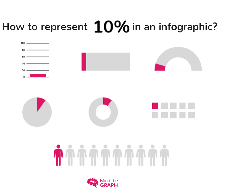
There are many types of infographics. You can show your data in several different ways, depending on what you want to highlight. Therefore, to learn how to make an infographic, you need to learn how to structure your template. An example is: how do you represent 10% of something?
Analyser hvilken type data du har, og velg den beste tilpasningen for å vise dem visuelt.
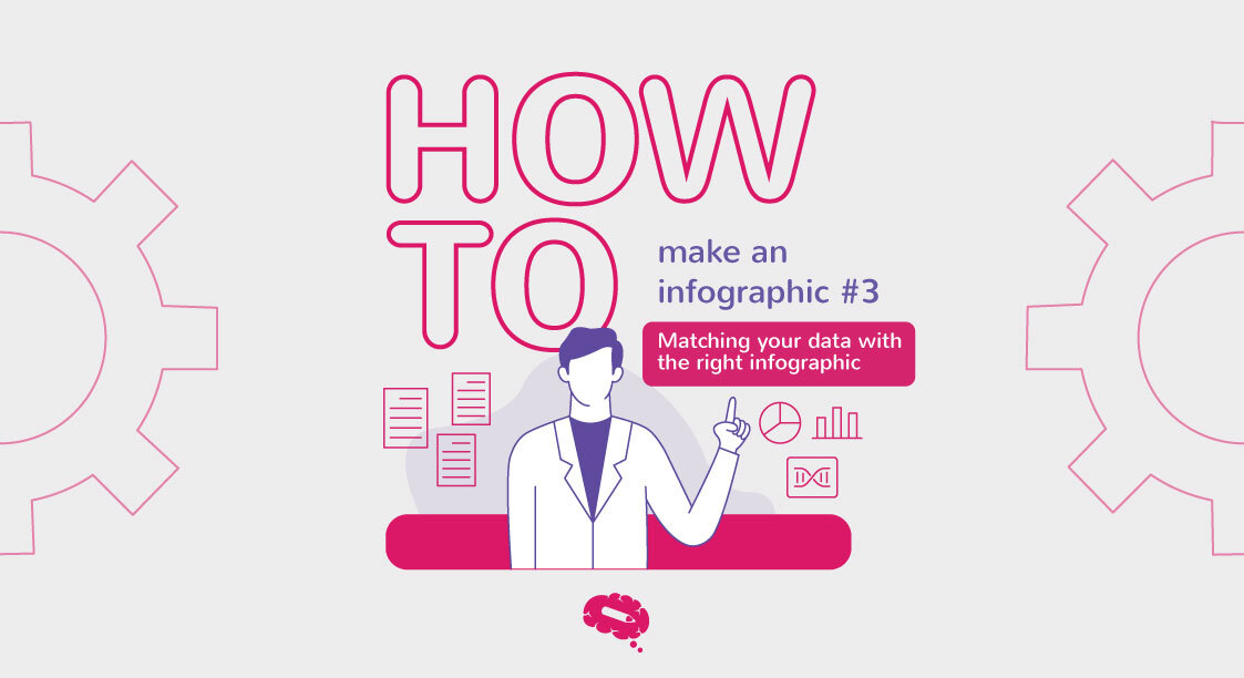
Matche dataene dine med den beste infografikk-typen
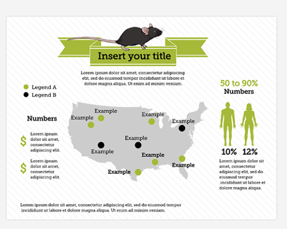
Lokalisering: Hvis du vil vise romlige data.

You can use maps, scenes, anatomical sections with sagittal or transverse views. Another possibility is to use a map series to show how your data changes over both space and time.
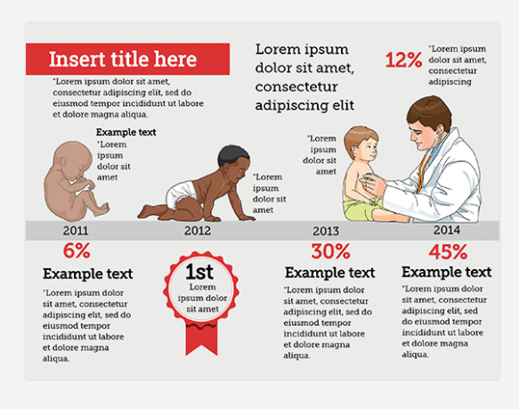
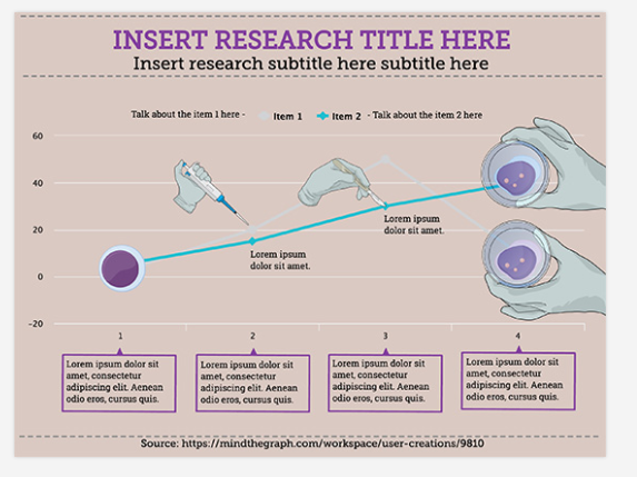
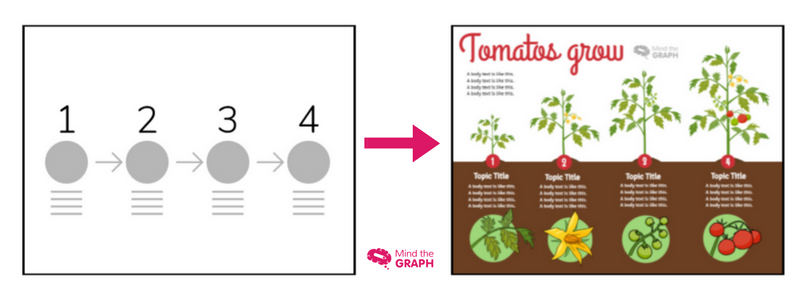
Handling: Hvis du vil vise endring, sekvens, tidslinje eller syklus.
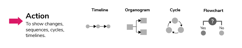
Action is dependent and influences others. Use a line chart or area chart to show continuous changes over time.
Grafer: Hvis du vil sammenligne variabler.
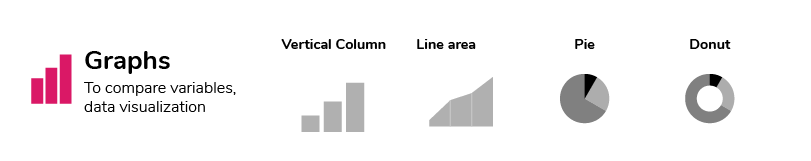
Brukes til å vise likheter eller forskjeller mellom verdier eller deler av en helhet.
Kakediagrammet, smultringdiagrammet, spredningsdiagrammet eller trediagrammet brukes til å sammenligne deler av en helhet. Søylediagram og søylediagram brukes til å sammenligne uavhengige verdier.
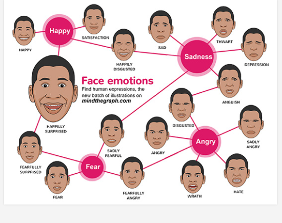
Tilrettelegging: Hvis du vil markere grupper, hierarkier, mønstre, rangering eller rekkefølge.

Disse infografikkene kan ha tabeller, organisasjonskart, genetiske hierogrammer eller mentale kart. Bruk et flytskjema for å vise rekkefølgen i en prosess. Venn-diagrammer og tankekart for å vise organiserte grupper.
Du kan også sjekke Mind the Graph Erfaringsposter for more inspiring infographics, and other figures.
To better organize your ideas and help you to plan your science figures, we create an ebook for you to learn more about how to make science infographics and improve your presentations. Click on the button below and get the ebook for free:

Designertips: Hvordan lage en infografikk?
Skisser og maler
Å velge infografikktype er en organisatorisk oppgave. Ikke bekymre deg eller bruk tiden din på detaljer om estetisk dekorasjon ennå. Renato, vår hoveddesigner, sier at du alltid skal tegne en skisse av hva du vil gjøre, organisere elementene og deretter tenke på de endelige detaljene. Han er en dyktig designer, så det er lurt å følge hans råd.
Bruke Mind the Graph-maler
Infografikeksemplene som jeg viste deg i dette innlegget, er Mind the Graph-maler som er tilgjengelige for våre brukere. Våre designere lager maler for alle typer infografikk, slik at du ikke trenger å starte fra et hvitt lerret. Det er bare å ta en titt, velge din favoritt og redigere som du vil. Det er flott, ikke sant? Hvis du ikke er abonnent, kan du se alle malene, men du kan ikke bruke dem til å lage infografikken din. Ta en titt på Mind the Graph-galleriet og se hvor fantastisk det er å være Mind the Graph-bruker.
Etterserie av Mind the Graph
- #1 Stilling - Kommunikasjon i vitenskapen
- #2 Post - Gjør dataene dine fantastiske
- #3 Post - Den riktige typen diagram
- #4 Post - La oss snakke om farger!
- #5 Post - Mindre er mer: minimalistisk infografikkdesign
- #6 Post - Feil å unngå i forskningskommunikasjon
- #7 Post - En kort oppsummering for å få det gjort


Abonner på nyhetsbrevet vårt
Eksklusivt innhold av høy kvalitet om effektiv visuell
kommunikasjon innen vitenskap.