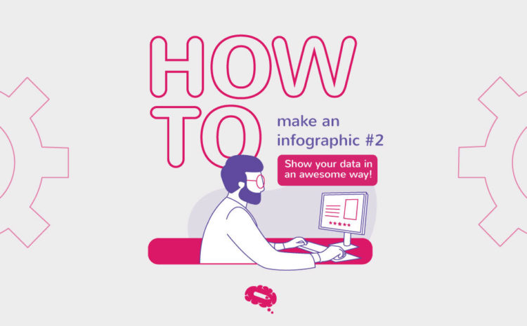
How to make an infographic series
This is the second post of the series How to make an infographic. If you missed the first post, you can read it here.
Now you know the importance of visual assets in scientific communication, Let’s plan your infographic.
What is an infographic?
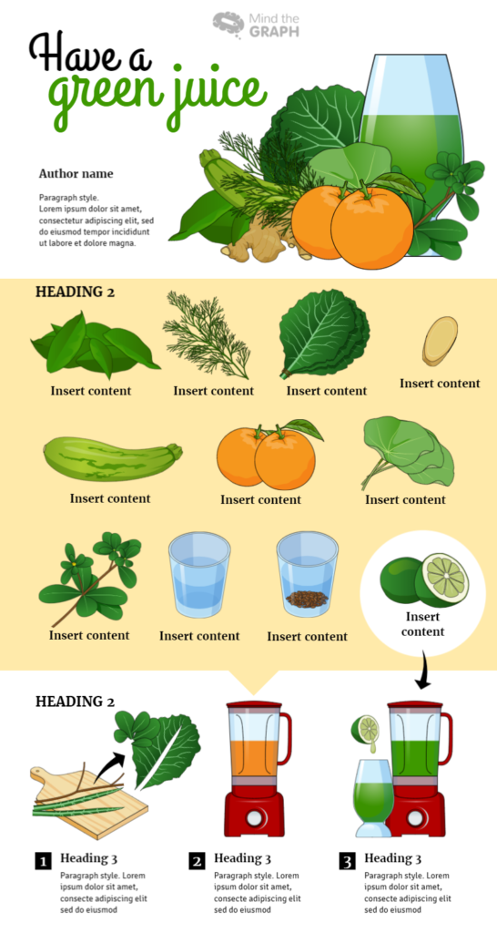
Infographics are visual content with text and images, which can be illustrations, icons, charts, pictograms, etc.
It is a perfect combination of text, visual resources, and design, in which one complements the other, with the aim of always improving the reader’s understanding.
Therefore, do not think that only textual information is responsible for transmitting knowledge. You should use a combination of these elements to accomplish efficient communication. Do not forget, in an infographic, you should show all the relevant information about your work in a clear, visually enjoyable way so that the reader will be able to understand it by himself.
Now you know that Hands-on! You will learn how to make an infographic.
Defining your goals
Do you realize that when we do not set a goal, in any situation, we tend to not leave the place? Learning how to make an infographic isn’t different.
First of all, before you begin to think about design, layout, charts, or aesthetics, you need to think about the goals of your infographic and do the planning. I don’t mean abstract goals like “get visibility to my research”, “summarize complex data” or “to show my work”, your goals need to be clear, concrete, and achievable.

To get goals like this it’s essential to ask yourself a few questions:
Who is my audience? Who I want to reach?
If you are creating a graphical abstract to be published in a specialized journal in your field, you should use a more technical language. Maybe you can let it go with some more basic explanations. But if your goal is to create a presentation for a more general audience, scientific communication in social media, blog post, or a lesson, you need to analyze the language and style used. After all, your infographic must be self-explanatory. This means the main content in your work should be highlighted and understandable only by reading the infographic, without an extra explanation or content.
Answer the questions: Do I need informal or formal dialogue? Can I ignore basic concepts? Is it a general science congress? Is it a scientific congress specific to your field? Are your audience experts? Will there be an oral presentation with the infographic? Is it for a book? Who are your readers?
These answers will establish the best approach, the language to be used, the visual style, design, and more.
What is my main data and what is the most important information that my readers need to understand?
Time to highlight the main data and avoid the too much.
What is the center of your research? What is your main question? That very specific answer is your burning problem. To help you identify your burning problem, you can use the question pyramid. With this method, you should turn it into 3-5 actionable questions to approach in your infographic:

Start with the answer first.
Group and summarize your supporting arguments.
Logically order your supporting ideas.
A strong brief
A great infographic needs a great brief. The brief is vital to keep the full picture vision. Not sure what to include? I have a shortlist to help you with that:
- Title
- Overview
- Objective/focus
- Timing
- Audience(s)
- Current scientific perception about your line of research (whats is the differential of your work? what insights do you propose?)
- Main data
- Tone and language (formal, informal)
- Success metrics
- References or inspiration
Include those basics, plus any additional information you think would be helpful.
With all this information organized, you are 1 step away from creating an amazing infographic.
The next step
Make sure to check out the next post of How to make an infographic #3, and remember, Mind the Graph users receive unique materials to learn how to make an infographic.

If you are not a user yet, stop wasting your time and become one right now, clicking HERE.
If you are already a Mind the Graph user, what do you think about becoming a subscriber? Mind the Graph has different plans for different needs, we are sure that there is a plan that will be perfect for you. Check it out Mind the Graph subscription plans! Right Here.
Mind the Graph How to make an infographic post-series.
- #1 Post – Communication in science
- #3 Post – The right kind of chart
- #4 Post – Let’s talk about colors!
- #5 Post – Less is more: minimalist infographic design
- #6 Post – Mistakes to avoid in science communication
- #7 Post – A shortcut summary to GET IT DONE

Subscribe to our newsletter
Exclusive high quality content about effective visual
communication in science.