
As researchers, we all get used to a traditional structure of scientific publications and scientific works.
We must write an introduction, describe the methodology, present and discuss the results, to finally wrap everything up in a conclusion.
Once learned this format becomes something just like riding a bike, so rooted inside us that we never forget, a task that we don’t even think to perform.
However, what if this current scientific paper format is not enough anymore to catch attention to your work?
With so many scientific articles being published every day, what we could do to stand out our research out of many?
Would be amazing if we could use a different kind of tool, besides the title and the abstract, to capture the reader’s attention, right?
Well, fortunately, there is! And that is when infographics, visual presentations, and graphical abstracts come in!
In the past few years, we started to live under social media influence changing our relationship with any kind of content.
Our daily exposure to visual content, such as photos, videos, stories, gif, stickers, and animations the major reason for this change.
The means used today by social media businesses to capture our attention is to constantly deliver different kinds of visually appealing content.
Therefore, when it comes to scientific communication, sometimes just the title is not enough anymore to catch attention. In addition, the need to increase the dissemination of knowledge while expanding access to all data produced and published is another important factor that worries all the scientific community.
Regarding all that, many authors are adding visual content to their published work, like infographics or graphical abstracts, to better communicate with their audience.
Even some journals are now requesting visual content to submit a paper.
Adding visual content is indeed a remarkable alternative to draw attention to your work.
Still not convinced? Jump in, let me take you on a ride.
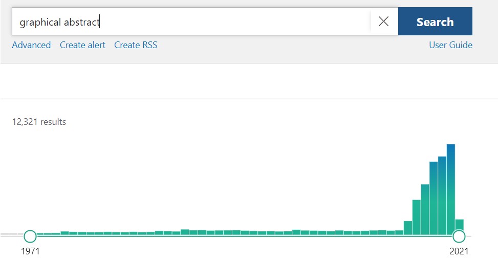
If we do a quick search in PubMed – a free database that contains more than 30 million references – for the words “graphical abstract”, the search will return all articles related to these two words. Interestingly, a graph displaying the number of related articles by year shows that the number of articles mentioning graphical abstracts is going up exponentially.
This possibly means that every day that goes by more researchers from different fields are noticing the value of graphical abstract. That is amazing news, isn’t it?’
Are you already convinced to start adding graphical abstracts into your work? Not yet? ok, let’s continue then.
In 2006 the Annals of Surgery Journal adopted visual abstracts as a way to increase and disseminate the journal visibility and access.
In order to measure if the new strategy was being effective, in 2007 the journal conducted a case-control crossover study comparing outcomes using Twitter.
The researchers compared two types of tweets, one with only the title of the article and another with the title plus a visual abstract. For a year-long, they released the tweets and collected the number of visualizations, retweets, and how many times the article was truly visited.
The study found out that the tweets which had the article title plus the visual abstract had 8 times more views, 8 times more retweets, and 3 times more article visits.
A similar study conducted by the Journal of the American Geriatrics Society in 2019, used Twitter as well to compare the numbers of impressions (views) of tweets without images and tweets with a visual abstract.
Less than a week after running the experiment tweets with visual abstracts had achieved 7 times more impressions than tweets with only textual content.
Therefore, visual content such as an infographic, graphic abstracts, or visual presentations, are indeed responsible for capturing the reader’s attention increasing dissemination and accesses plus it improves the textual content perception allowing the reader to understand important topics faster and even better.
In the end, is not that all we wish for? Make our research reach more people inside and outside academia?
And that is exactly why Mind the Graph was built for!
The platform’s purpose is to increase scientists’ impact, turning them into designers, providing total autonomy to better communicate their research.
We know that it might seem and feel a little intimidating at first, but we are here to help you with whatever you need.
Adding a graphical abstract to your paper is one of the best ways to capture someone’s attention and convince them to read your full article.
The abstract should be a glance at your full article, or a resume, with the highlights of your work, that will be detailed and discussed inside the article.
Thus, the abstract is one of the most important sections of a research paper, it must be appealing enough, and quickly understandable, for the reader to decide if they whether want to read the full article, or not. And the graphical abstract can help you immensely with that.
Adding a graphic abstract to your article is an amazing strategy to increase the dissemination of your work and hence your numbers of readers and quotes.
Even if the journal that you are submitting your paper does not request it, a graphical abstract will improve the reader’s perception of your content.
Furthermore, your reader will understand better and faster what your work is about.
So, a graphic abstract, a.k.a infographics, is basically a figure that gives and explains scientific information in a visual form and should be a self-explanatory way to transmit a message. It has to be designed to give the reader an instantaneous understanding of a certain subject.
Equipped with all the Mind the Graph tools available you can create great visual content without suffering.
The platform is surprisingly easy to use with a huge library containing everything that you may need (and if it doesn’t we can also help you with that).
Let’s see an example of how Mind the Graph turns your science beautiful improving your visual content.
This is a graphical abstract that allows us, the readers, to grasp the main idea of the paper. The first illustration belongs to the original paper published and right below it is the Mind the Graph version.
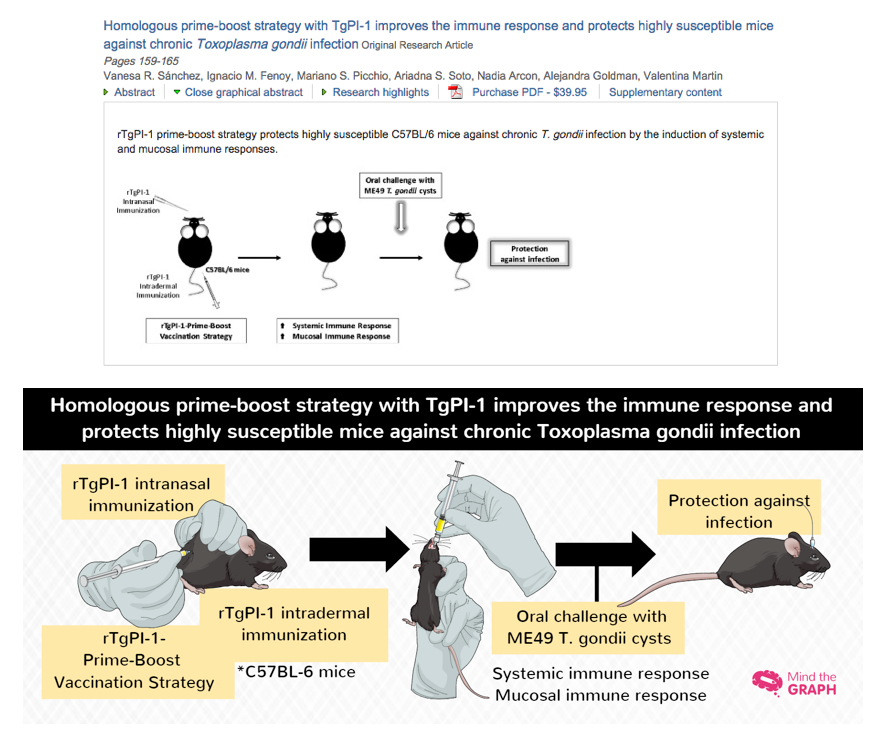
Do you agree that the graphical abstract allowed us, to capture the paper’s methodology and conclusion in less than 15 seconds? The beauty and accuracy of the illustrations demonstrate the actual methodology performed with the mice.
Adding an appealing and detailed illustration (with Mind the Graph’s platform tools) to your paper will make your work stands out, be readily understandable plus fascinate your audience.
Now, are you ready to start creating your visual content and reach more and more people?
Let’s go! Start right now using Mind the Graph!


Subscribe to our newsletter
Exclusive high quality content about effective visual
communication in science.