Graphical abstracts are becoming an essential component in academic publishing, especially in visually-driven fields like digital humanities.
They provide a brief visual summary of your research, making it easier for readers to grasp the key points at a glance. This visual representation not only enhances the visibility of your work but also helps in making your research more accessible to a broader audience.
Now, what does it have to do with digital humanities, and how to draft a graphical abstract for the specified domain? That’s what we are going to see in this article and by the end of it, you know how to create a graphical abstract for digital humanities quarterly!
What is a Graphical Abstract?
By definition, a graphical abstract is a concise visual representation of the key findings or main points of your research paper. It serves as a summary that allows readers to quickly grasp the essence of your work without needing to dive into the full text.
In the context of Digital Humanities Quarterly (DHQ), a graphical abstract can serve as a powerful tool to convey complex ideas in a more digestible format.
The primary purpose of a graphical abstract is to enhance the visibility and accessibility of your research. In academic publishing, where attention spans are short, and competition for readership is high, a well-designed graphical abstract can be the difference between your work being noticed or overlooked.
By summarizing your research through a visual medium, you make it easier for readers, including researchers, academics, and students, to engage with your work. The importance of graphical abstracts cannot be overstated, as they can significantly impact the reach and impact of your research in the digital humanities.
Importance of Graphical Abstracts in Academic Publishing
In academic publishing, the competition for readers’ attention is fierce. With an overwhelming amount of research being published daily, a well-designed graphical abstract can help your work stand out.
It provides a quick and engaging way for readers to understand the essence of your research without having to read through the entire paper. This is particularly important in today’s fast-paced digital world, where attention spans are limited.
Graphical abstracts also play a crucial role in enhancing the discoverability of your research. Many academic journals and online platforms use graphical abstracts as a means to promote articles on social media and other digital channels.
A visually appealing and informative abstract can increase the likelihood of your research being shared and discussed, ultimately leading to more citations and greater recognition within your field.
Benefits of Using Graphical Abstracts in Digital Humanities
In the field of digital humanities, where interdisciplinary research often combines complex data with creative insights, graphical abstracts offer several unique benefits:
- Simplification of Complex Ideas: Digital humanities research often involves the integration of various forms of data, such as text, images, and multimedia.
- Enhanced Communication: By using visual elements, you can communicate your research more effectively to a wider audience.
- Increased Engagement: A well-designed graphical abstract can capture the attention of readers who might otherwise overlook your research.
- Cross-Disciplinary Appeal: Digital humanities often intersect with other fields, such as computer science, history, and literature.
Guidelines for Digital Humanities Quarterly
Digital humanities is a field that combines traditional humanities disciplines, like history, literature, and philosophy, with digital tools and technology. It involves using computers, software, and data analysis to study and present humanities topics in new ways.
For example, you might use digital mapping to explore historical events, or data visualization to analyze literary texts. Digital humanities help you understand complex ideas by blending technology with humanistic inquiry, making research more interactive, accessible, and innovative.
When creating a graphical abstract for Digital Humanities Quarterly (DHQ), it’s essential to adhere to the specific requirements and preferences set by the journal. DHQ is a prominent platform in the digital humanities community, and its standards reflect a commitment to both scholarly rigor and accessibility.
Understanding and following these guidelines will ensure that your graphical abstract effectively represents your research while meeting the journal’s expectations.
Dimensions and Format
DHQ may have specific requirements regarding the dimensions and format of your graphical abstract. Typically, a graphical abstract should be a single image that is clear and legible when reduced in size. Ensure that your abstract fits within the dimensions specified by the journal, such as maintaining a standard aspect ratio (e.g., 16:9) or adhering to pixel dimensions (e.g., 1200 x 675 pixels). The file format is equally important; DHQ might prefer formats like PNG, JPEG, or SVG for optimal image quality.
Content Focus
The purpose of the graphical abstract is to distill the essence of your research into a visual format. DHQ encourages abstracts that highlight the main findings of your work, focusing on clarity and conciseness. Avoid overwhelming your audience with too much detail; instead, emphasize the key points that best represent your research. For instance, if your paper involves a case study, your graphical abstract should visually summarize the methodology and outcomes, rather than presenting every aspect of your research.
Visual Simplicity and Readability
Graphical abstracts should be visually simple yet effective. DHQ values clarity, so avoid cluttered designs and complex visual elements. Use minimal text and focus on creating visuals that speak for themselves. Choose a font that is easy to read at different sizes and ensure that your text contrasts well with the background. Colors should be used strategically—to emphasize important elements without overwhelming the viewer. Remember, simplicity is key to making your abstract accessible to a broad audience.
Accessibility Considerations
Digital Humanities Quarterly places a strong emphasis on accessibility. When designing your graphical abstract, consider color blindness and other visual impairments. Avoid relying solely on color to convey information—use patterns, labels, and other visual cues to ensure your abstract is understandable to all readers. Additionally, provide a brief descriptive caption for your graphical abstract to assist those who may have difficulty interpreting the visual content.
Appropriate Use of Images and Icons
Ensure that any images, icons, or diagrams used in your graphical abstract are relevant to your research. DHQ values academic integrity, so all visuals should be original or properly credited if sourced externally. Avoid using generic stock images that may detract from the specificity of your research. Instead, focus on creating or sourcing visuals that directly support your findings.
Adhering to Journal Standards
Adhering to DHQ’s journal standards goes beyond just following technical guidelines; it also involves aligning your graphical abstract with the journal’s academic and ethical expectations. Here are a few key aspects to consider:
Alignment with the Paper’s Content
Your graphical abstract should be an accurate representation of the content in your paper. Ensure that the visuals directly correlate with the research discussed in your article. For example, if your paper examines the impact of digital tools on literary analysis, your graphical abstract should visually depict that relationship rather than introducing unrelated concepts.
Ethical Considerations
Like all academic publications, DHQ expects authors to maintain high ethical standards. Avoid misleading visuals that could misrepresent your research findings. If your abstract includes any data or statistics, ensure that they are accurately portrayed. Misrepresentation of research through a graphical abstract can harm your credibility and the integrity of your work.
Review and Feedback
Before submitting your graphical abstract, it’s advisable to seek feedback from peers or mentors. DHQ encourages collaboration and dialogue within the digital humanities community. Getting input from others can help you refine your abstract and ensure that it effectively communicates your research. Make sure to review DHQ’s submission guidelines and any specific instructions provided by the journal to avoid last-minute revisions.
By following these guidelines and adhering to Digital Humanities Quarterly’s standards, you can create a graphical abstract that not only meets the journal’s expectations but also enhances the impact of your research.
Also Read: How to Create a Graphical Abstract for IEEE
Steps to Create a Graphical Abstract
Creating a graphical abstract for Digital Humanities Quarterly (DHQ) can seem daunting, especially if you’re new to the concept. However, with the right approach and tools, you can craft a visually appealing and informative abstract that enhances the visibility of your research.
This step-by-step guide will walk you through the entire process, ensuring your graphical abstract meets DHQ’s standards and effectively communicates your work.
Step 1: Understand Your Research
Before diving into the design process, it’s essential to have a clear understanding of your research. A graphical abstract is a visual summary, so you need to distill your research into its core components. Ask yourself the following questions:
- What is the main objective of my research?
- What are the key findings or conclusions?
- How can I simplify these concepts into a visual format?
To effectively convey your research, focus on the most important aspects of your work. Avoid trying to include too many details—your graphical abstract should highlight the core message that you want readers to take away.
Step 2: Simplify Your Message
The key to a successful graphical abstract is simplicity. Remember, the goal is to create a visual summary that is easy to understand at a glance. To achieve this, you’ll need to simplify your message. Here are some tips to help you:
Identify the Core Message: Focus on one or two key points that best represent your research. This could be a significant finding, an innovative method, or a crucial piece of data.
Use Minimal Text: Graphical abstracts are primarily visual, so limit the amount of text. Use short phrases, bullet points, or labels to convey essential information. Avoid lengthy explanations—these belong in the full text of your paper.
Prioritize Visual Elements: Choose visual elements that can replace text. For example, if your research involves statistical data, consider using a chart or graph to represent the information. If your work is conceptual, think about how you can illustrate the concept visually.
Step 3: Choose the Right Tools
Once you have a clear understanding of your research and have simplified your message, it’s time to choose the right tools to create your graphical abstract. There are several tools available that can help you design a professional and visually appealing abstract. Some popular options include:
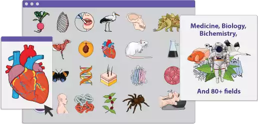
Mind the Graph
A tool similar to Canva, Mind the Graph is known for having a library of templates across several science fields. You can get customized designs using Mind the Graph, allowing you to enhance your research quality.
Adobe Illustrator
If you have some design experience, Adobe Illustrator is a powerful tool for creating custom graphical abstracts. It offers more advanced features than Canva, allowing you to create intricate designs and vector graphics.
PowerPoint
PowerPoint might not be the first tool that comes to mind, but it’s surprisingly effective for creating graphical abstracts. It’s easy to use and offers a range of design features, including shapes, icons, and text options.
The tool you choose will depend on your level of experience and the complexity of your design. If you’re new to design, start with a simpler tool like Mind the Graph or PowerPoint.
Step 4: Design Principles to Follow
Designing an effective graphical abstract involves more than just choosing the right tools—it’s also about following key design principles. These principles will help ensure that your abstract is not only visually appealing but also easy to understand. Here are some essential design tips to consider:
Color Schemes
Choosing the right color scheme is crucial for making your graphical abstract visually appealing and readable. Here are some tips to keep in mind:
- Stick to a Limited Palette: Avoid using too many colors, as this can make your abstract look cluttered. Instead, stick to a limited palette of two to four colors that complement each other. You can use online tools like Adobe Color to create harmonious color schemes.
- Use Contrast for Emphasis: Use contrasting colors to highlight key points or sections of your abstract. For example, you might use a bright color to emphasize a crucial piece of data or finding.
- Consider Accessibility: Ensure that your color scheme is accessible to all readers, including those with color blindness. Avoid using color combinations that are difficult to distinguish, such as red and green. Tools like Color Oracle can help you test your design for accessibility.
Fonts and Text Placement
Text plays a supporting role in graphical abstracts, so it’s important to choose the right fonts and place text strategically:
- Choose Simple, Readable Fonts: Avoid overly decorative fonts, as they can be difficult to read. Stick to simple, sans-serif fonts like Arial, Helvetica, or Open Sans. Ensure that your font size is large enough to be legible, even when the abstract is viewed at a reduced size.
- Use Hierarchy to Guide the Reader: Use font size, weight, and placement to create a visual hierarchy. For example, the title of your abstract should be the most prominent, followed by subheadings and labels. This helps guide the reader’s eye through the abstract in a logical order.
- Avoid Overcrowding: Don’t overcrowd your abstract with text. Leave plenty of white space to make your design feel balanced and uncluttered. This also makes it easier for readers to focus on the key points.
Icons and Imagery
Icons and imagery are essential elements of a graphical abstract. They help convey your message visually and can replace text in many cases:
- Choose Relevant Icons.
- Maintain Consistency
- Use High-Quality Images
By following these design principles, you’ll create a graphical abstract that is not only visually appealing but also effective in communicating your research.
Step 5: Review and Refine
Once you’ve completed your graphical abstract, it’s important to review and refine your design. This step ensures that your abstract meets all the necessary requirements and effectively communicates your research. Here’s how to go about it:
- Seek Feedback
- Check for Accuracy
- Test for Accessibility
- Refine the Design
Finally, ensure that your graphical abstract meets Digital Humanities Quarterly’s submission guidelines. Check the dimensions, format, and any other technical requirements to avoid any issues during the submission process.
Also Read: BMJ Ready: How to Create a Graphical Abstract for BMJ
Practical Design Tips
Creating a graphical abstract for Digital Humanities Quarterly (DHQ) can be a rewarding experience if approached with the right strategies.
In this section, we’ll explore practical design tips that will help you create an effective and visually appealing graphical abstract. Whether you’re new to design or have experience, these tips will ensure your abstract meets the necessary standards and efficiently communicates your research.
Using Templates for Efficiency
One of the most efficient ways to create a graphical abstract is by using templates. Templates provide a ready-made structure that you can customize to fit your research.
When choosing a template, look for one that aligns with the nature of your research. For example, if your research involves data visualization, select a template that includes charts or graphs. If your research is more conceptual, opt for a template with space for imagery and minimal text.
Common Mistakes to Avoid
Creating a graphical abstract is a creative process, but certain common mistakes can hinder its effectiveness. Here are some pitfalls to avoid:
- Overloading with Information
- Poor Color Choices
- Inconsistent Fonts
- Ignoring Accessibility
- Low-Quality Images
By avoiding these common mistakes, you can create a graphical abstract that is both visually appealing and effective in conveying your research.
Resources for High-Quality Graphics
To create a professional and polished graphical abstract, you’ll need access to high-quality graphics. Fortunately, there are many resources available online that provide free or affordable graphics, icons, and images like Canva, Adobe Illustrator, and so on.
Also Read: How to Create a Graphical Abstract for JCI: A Step-by-Step Guide
Additional Resources
To further assist you in creating a graphical abstract, here are some useful links to tutorials and design tools:
- Canva Tutorials: Canva Design School
- Adobe Illustrator Basics: Getting Started with Adobe Illustrator
- PowerPoint Design Tips: Microsoft PowerPoint Tutorials
- Piktochart Infographic Tutorials: Piktochart Academy
These resources offer step-by-step guides and tips for using the tools mentioned in this guide. Whether you’re new to design or looking to refine your skills, these tutorials will help you create professional and effective graphical abstracts.
Reading List for Further Study
For those interested in delving deeper into the topic of graphical abstracts and visual communication in academia, here are some recommended readings:
- “Designing Better Graphical Abstracts” by A. Johnson – A comprehensive guide on the best practices for creating graphical abstracts in various academic fields.
- “A Brief Guide to Graphical Abstracts” by M. Smith – An introductory book that explains the importance of graphical abstracts and how to create them effectively.
- “Visualizing Research: A Guide to the Design and Presentation of Research” by C. Harris – A book that explores the broader context of visual communication in research, with practical tips for creating compelling visuals.
These resources will provide you with a deeper understanding of the role of graphical abstracts in academic publishing and offer insights into improving your design skills.
In conclusion, creating a graphical abstract for Digital Humanities Quarterly involves understanding your research, simplifying your message, and following essential design principles. By using tools and templates, avoiding common mistakes, and adhering to DHQ’s guidelines, you can craft a visually compelling abstract that effectively communicates your findings.
Also Read: Navigating the Journals that Require Graphical Abstracts
High Impact And Greater Visibility For Your Work
Are you seeking greater visibility for your research work by making it impactful? Then you should definitely consider using infographics and graphical abstracts. Well if you are worried about creating one, you can try out softwares like Mind the Graph.
Mind the Graph is a tool that has pre-made templates across 80+ popular fields. You can customize them based on your needs or get help from our experts to create one for you from scratch. Sign up for free to learn more.

Subscribe to our newsletter
Exclusive high quality content about effective visual
communication in science.