Educational posters play a powerful role in enhancing science communication, particularly for scientists and researchers. One platform that focuses on this purpose is Mind the Graph, which offers an online space for creating visually appealing scientific figures, infographics, graphical abstracts, presentations, and posters. With a user-friendly interface suitable for both beginners and professionals, Mind the Graph aims to make scientific communication more accessible and visually engaging. It addresses the challenge faced by many researchers in visualizing complex scientific data without specialized design skills. By providing a wide range and selection of visually captivating illustrations in over 80 popular fields, Mind the Graph caters to the diverse needs of the scientific community.
The Influence of Educational Posters on Science Communication
The Rise of Educational Posters in Science
Over the years, educational posters have grown in popularity within the scientific community. They have emerged as an influential tool for sharing complex scientific information in a condensed and visually appealing format. The rise of educational posters in science can be attributed to their ability to present a large amount of data in a way that is easy to understand and retain. They offer a unique blend of graphics and text, allowing scientists to communicate their research findings, methodologies, and concepts effectively. This trend of educational posters has been further fueled by the digital revolution, making the creation, distribution, and accessibility of these educational posters easier than ever before. As such, educational posters have become an integral part of science communication, aiding in the dissemination and understanding of scientific knowledge.
The Art of Compiling Complex Data into a Poster
Creating an educational poster is an art that requires skill and precision. The primary objective of posters is to encapsulate complex scientific data into a condensed, visually engaging format that is easy to read and comprehend. The process begins with meticulous data selection. It’s crucial to include key findings and information that effectively convey the research’s core message. Next is the design phase, which involves arranging the data in a structured manner that guides the viewer’s eyes through the poster. Here, visuals play a crucial role. Graphs, charts, and images are used to represent data and information visually, making them easier to understand. Moreover, the use of color and contrast can highlight critical points, making them stand out. Finally, the text must be concise and clear, providing context and explanation without overwhelming the viewer. This art of compiling complex data into a poster is a skill that can greatly enhance the impact of scientific communication.
Investigation: How a Poster Can Convey More than Words
An educational poster is a powerful tool that goes beyond the realm of words. It brings together a unique combination of visuals and text to tell a compelling story. The use of imagery, color, and design elements can evoke emotions, stimulate interest, and create a lasting impression, which words alone may not achieve. For instance, graphical representations of data can instantly highlight patterns and trends that would be difficult to comprehend in a text-based format. Similarly, the use of metaphoric or symbolic visuals can intuitively elucidate complex scientific concepts. Moreover, a well-designed educational poster can guide the viewer’s eye movement, subtly directing their attention to the most important information. This ability to convey more than words is particularly significant in science communication, where complex data and concepts often need to be conveyed to a broad audience. Thus, the power of an educational poster extends beyond its physical boundaries, making it an indispensable tool in modern science communication and classroom itself.
Unveiling Min the Graph: Your Essential Tool
Getting to Know Mind the Graph
Mind the Graph is an online platform dedicated to enhancing the visual appeal and understanding of scientific data. It is designed to enable scientists, researchers, and professionals to create educational posters, infographics, graphical abstracts, and presentations. With a focus on user-friendliness, the platform is accessible to beginners who are just starting their journey in scientific communication, as well as professionals who are looking to improve and elevate their visual communication skills. Mind the Graph offers a vast library of scientifically accurate illustrations across 80+ popular fields, providing users with the resources they need in order to create visually captivating content. The platform upholds the value of visually engaging content in science communication, empowering users to translate their complex research data into digestible, impactful visual narratives. Therefore, getting to know Mind the Graph opens doors to a host of possibilities in effective science communication.
The Edge of Using Mind the Graph
Using Mind the Graph provides several key advantages for those involved in science communication. One of its most compelling features is found in its user-friendly interface, which allows both beginners and professionals to navigate the platform with ease. The vast selection of scientifically accurate illustrations available in a wide array of fields provides users with endless possibilities in order to make their data visually engaging. Moreover, the tool doesn’t require users to have expert design skills. With easy-to-use design tools, it enables users to create their own educational posters and infographics without the need for external graphic design help. This feature allows scientists and researchers to focus on their core work while ensuring their findings are communicated effectively. Lastly, Mind the Graph understands the importance of customizability. It provides users the freedom to tailor their creations to their needs, whether that means representing complex data or conveying intricate scientific concepts. Thus, the edge of using Mind the Graph lies in its ability to make science communication accessible, personalized, and impactful.
Customize Your Poster: An Array of Fields and Illustrations
One of the standout features of Mind the Graph is its extensive array of fields and illustrations. With over 80 popular fields covered, users can find visuals that align with their specific areas of research. This broad range caters to diverse scientific disciplines and research areas, making the platform a versatile tool for all in the scientific community. The platform also boasts a robust library of scientifically accurate illustrations, designed to add a visual dimension to the data. These illustrations can be easily incorporated into posters, infographics, presentations, or graphical abstracts. Moreover, Mind the Graph is not just about using pre-existing visuals. It offers users the flexibility to choose to customize these illustrations to fit their specific needs, whether it’s changing colors, resizing, or combining different elements. This ability to choose to customize your poster amplifies the platform’s potential to create personalized, visually captivating scientific communication materials. With Mind the Graph, the power to transform complex data into compelling visuals is truly in the user’s hands.
The Impact of Visual Aesthetics in Communication
Why Visuals Matter: The Psychological Perspective
From a psychological perspective, visuals play a crucial role in how we process and retain information. Research suggests that the human brain can process visual information 60,000 times faster than text. This is because visuals are processed by the brain’s long-term memory, where over time they get encoded for more extended retention. In contrast, text is processed by short-term memory where it can be quickly forgotten. Furthermore, visuals improve comprehension, especially when dealing with complex information or data, as they help to break down complexity and make the content more digestible. Visuals also have an emotional impact. They can stimulate a viewer’s emotions, which in turn can influence their understanding, engagement, and recall of the information. Additionally, visuals can cross language barriers, making the information accessible to a diverse, global audience. In the realm of science communication, where complex data and concepts often need to be conveyed, the psychological impact of visuals becomes even more significant. Thus, understanding the psychological perspective of why visuals matter can greatly enhance the effectiveness of our communication efforts.
The Role of Visual Content in the Scientific Community

Visual content plays an instrumental role in the scientific community. It aids in the communication of complex scientific ideas, theories, and data, making them more accessible and engaging. A well-designed visual can distill complicated information into a format that’s easy to read, understand and remember, thereby facilitating knowledge sharing and learning. Furthermore, visuals can help draw attention and interest to a serious subject or piece of scientific work, thus increasing its impact and reach. They can also serve as a universal language, breaking down barriers and enabling scientists from different parts of the world to share and understand each other’s work. Additionally, in the era of digital communication, visuals play a crucial role in online engagement. They make content more shareable and can significantly increase its online visibility. As such, visual content has become an invaluable tool for scientists, researchers, and educators, helping to advance scientific knowledge and promote a culture of learning and discovery.
The Journey from a Beginner to Professional with Mind the Graph
User-Friendly Tools: Making Your First Poster
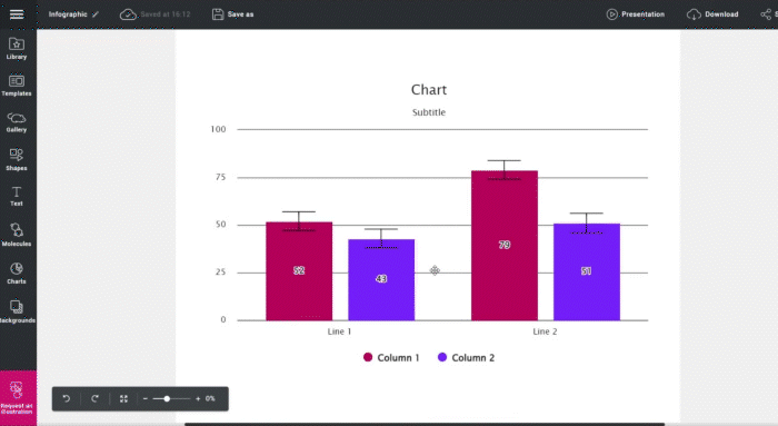
Creating your first educational poster with Mind the Graph is a straightforward process, thanks to its user-friendly tools. The platform provides a range of templates that can serve as a starting point. These templates cater to various scientific fields and can be customized to fit your specific needs. Once you’ve chosen a template, you can start adding your content. There is a plethora of scientifically accurate illustrations available for you to choose from. These can be easily dragged and dropped onto your poster, resized, and positioned as you see fit. The platform also allows you to incorporate your own data in the form of graphs, charts, or images. To add text, simply select the text tool and click where you want the text to go. You can change the font, size, and color to suit your design. Once your poster is complete, you can download it in various formats suitable for print or online use. With these user-friendly tools, making your first educational poster on Mind the Graph is an easy and enjoyable process.
Growing with Mind the Graph: Enhancing Your Skills
As you continue to use Mind the Graph, you’ll find that the platform is designed to grow with you, providing opportunities to enhance your skills and improve yourself. With every poster you create, you’ll gain familiarity with the tools and features available, allowing you to explore more complex designs and layouts. The platform also offers a variety selection of resources to help you improve your skills. These include tutorials, blog posts, and guidelines on best practices in designing educational posters and infographics. You can learn tips on effective visual communication, how to choose the right visuals for your data, and how to create a visually coherent and impactful design. Moreover, the tool is constantly evolving, with new features and illustrations being added regularly. This means there’s always something new to learn and try, keeping your poster creation process fresh and exciting. With Mind the Graph, you’re not just creating posters – you’re on a journey of continuous learning and skill enhancement in the realm of visual science communication.
The Benefits of the Best Infographic Maker Across Scientific Audiences
A Tool for Individuals and Laboratories

Mind the Graph is not only beneficial for individual scientists and researchers, but it’s also a valuable tool for laboratories. For individuals, the platform offers the opportunity to visually enhance and update their research presentations, making them more engaging and comprehensible. This can be particularly beneficial when sharing research findings at conferences, seminars, or during educational lectures. For laboratories, Mind the Graph can serve as a centralized tool for creating and managing scientific illustrations and posters. It allows team members to collaborate on designs, ensuring consistency in the visual representation of lab findings. Furthermore, the platform’s user-friendly interface and extensive resources make it easy for everyone in the lab to use, regardless of their design proficiency. The variety of fields and illustrations available also cater to the diverse research areas found within a laboratory setting. Thus, whether you’re an individual researcher or part of a lab team, Mind the Graph has the tools and resources to enhance your science communication efforts.
Empowering Large Organizations with Mind the Graph
For large organizations, Mind the Graph proves to be an invaluable asset. It provides a platform where diverse teams across different departments or research fields can create and share consistent, visually engaging scientific content. This consistency is critical in maintaining a unified brand image and voice across the organization. Furthermore, the platform allows for secure data handling, ensuring that proprietary information and research findings are kept confidential. Mind the Graph also supports collaboration, allowing teams to work together on designs, share feedback, and contribute to the final product. This can significantly take time and enhance the efficiency and effectiveness of the organization’s science communication efforts. Moreover, the platform’s scalability makes it suitable for organizations of any size, whether they’re creating a few posters for a single project or managing large-scale communication campaigns. By empowering large organizations with the tools and resources to effectively communicate their science, Mind the Graph helps them make a bigger impact in their field and beyond.
Shaping the Future of Science Communication
Making Scientific Data Accessible For All
One of the key goals of science communication is to make scientific information and data accessible to all, and this is precisely what Mind the Graph aims to achieve. By simplifying the process of creating visually engaging educational posters and infographics, the platform enables scientists and researchers to convey complex data in a format that is easily understandable by a wide range of audiences. This is particularly important in an era where science plays a significant role in everyday life and decision-making. Making scientific data accessible to all helps to promote a broader understanding and appreciation of science, fosters informed decision-making, and encourages public participation in scientific discourse. Moreover, it helps to democratize science, making it more inclusive and diverse. By empowering everyone, regardless of their scientific background, to understand and engage with scientific data, Mind the Graph is playing a crucial role in shaping the future of science communication.
Mind the Graph: Changing the Face of Science Communication
Mind the Graph is indeed changing the face of science communication. By prioritizing visual appeal in the presentation of scientific data, enhances the accessibility and understanding of complex scientific information. Its user-friendly platform enables scientists and researchers, regardless of their design skills, to create visually captivating educational posters, infographics, posters, and presentations. This not only amplifies the reach and impact of their work but also fosters a culture of visual learning in the scientific community. Furthermore, Mind the Graph’s commitment to continuously evolving and adding new features ensures that it stays at the forefront of the science communication landscape. It reflects the changing needs and preferences of its users, thus ensuring that it remains relevant and effective in its mission. As such, Mind the Graph is not just a tool for creating visually engaging scientific information and content; it’s a catalyst for change in science communication, driving a shift towards more accessible, engaging, and visually compelling presentations of scientific data.


Subscribe to our newsletter
Exclusive high quality content about effective visual
communication in science.