Mind the Graph gave a talk at a Scientific Illustration Congress! If you couldn’t be there, don’t worry. Here is the output:
How the scientific world express itself
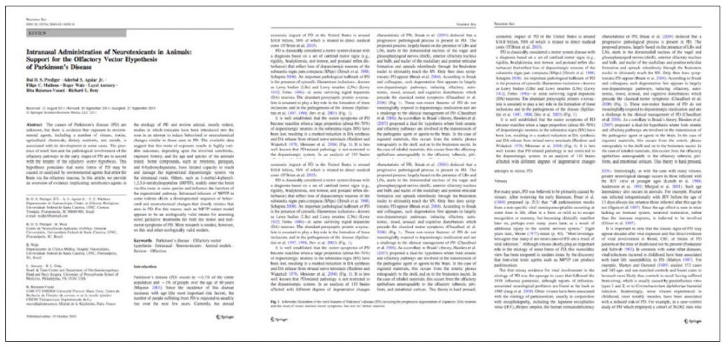
The reality is not good. Most findings are only registered in long and boring papers that will never be read.
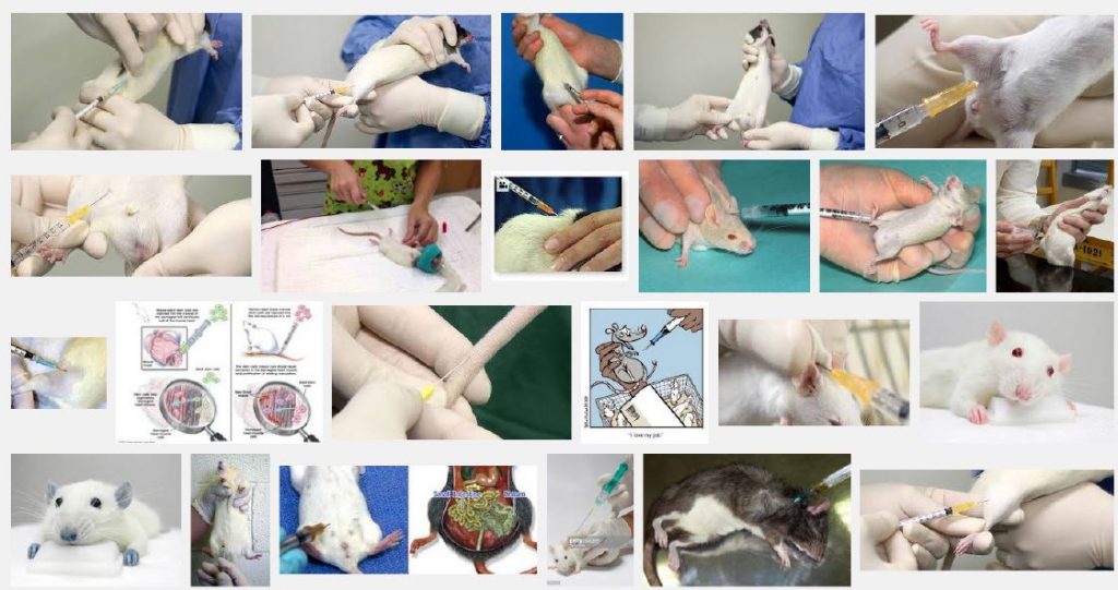
In the meanwhile, if any scientist try to find images to make their findings a little more visual, they have to be satisfied with Google Images since it is very difficult to find scientific illustrations.
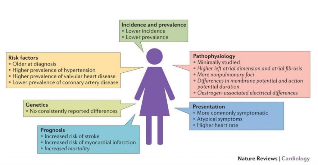
Even the best scientific journals struggle with visual communication. Nature is one of the best journals in science. In fact, at Nature Reviews we can find many examples of translating written data into graphical abstracts. However, some of them could still use some improvements.
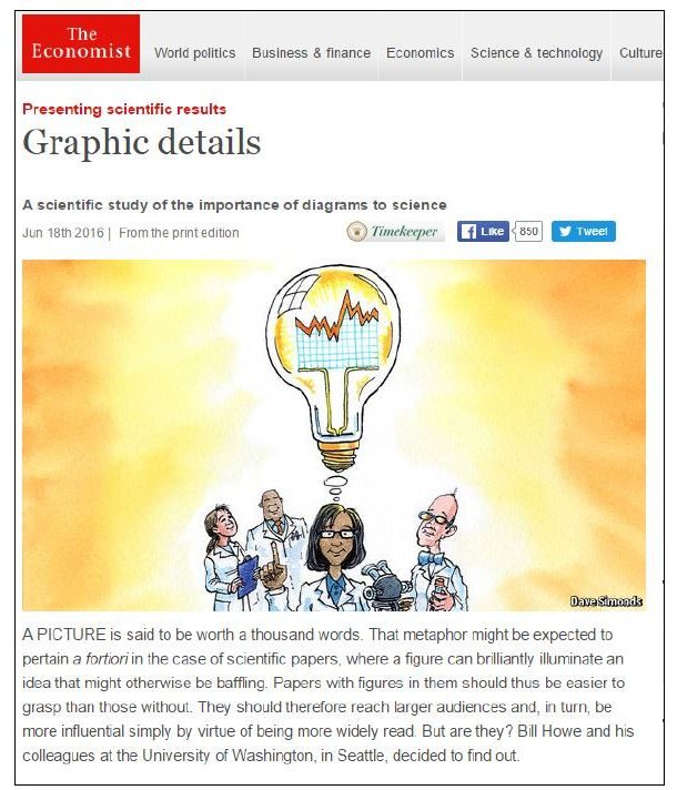
The urge to make science more visual is beheld by the importance papers with graphs or diagrams have. The Economist wrote about the truth behind “A picture is worth a thousand words” saying that graphs and diagrams indeed generate more citations. Which make a lot of sense when you remember the amount of researches published everyday and how we search despairingly for figures everytime we read a new paper.
Science and visual communication
Since there is a need for visual communication in science and we struggle with the images availabre online, a new tool was in need.
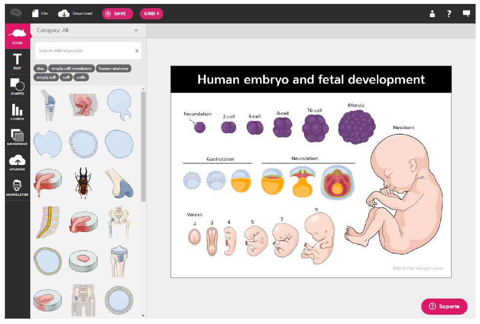
Mind the Graph was created to supply the demand for scientific accurate illustrations. Not only, we still aim to improve science communication and help scientists to get more visibility to their work. However, we are not trying to do it for them. Instead, we want scientists to be 100% capable of building their own graphical abstract, posters, presentations and infographics.
Therefore, we created our platform. From scientists to scientists.
Our creative process
Instead of making a figure by combining shapes and pictures that don’t fit together, now you can find scientific illustrations thought for scientists.
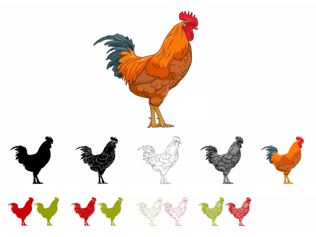
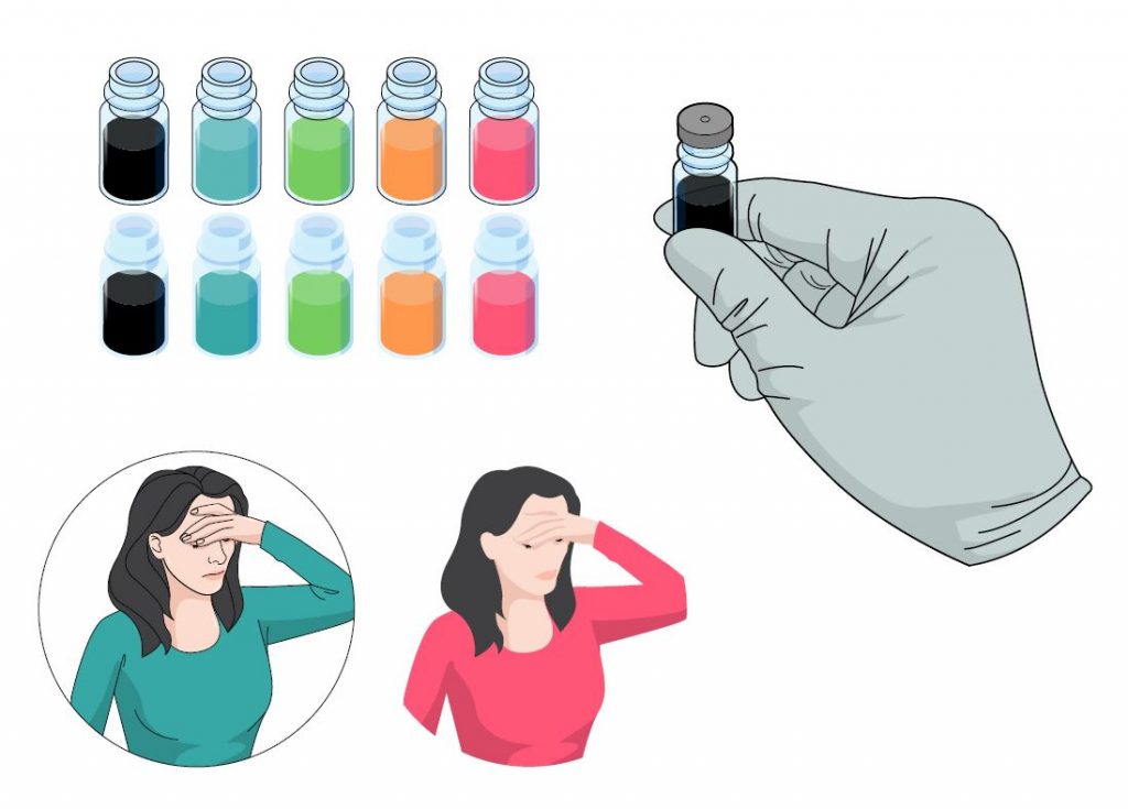
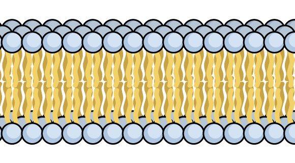
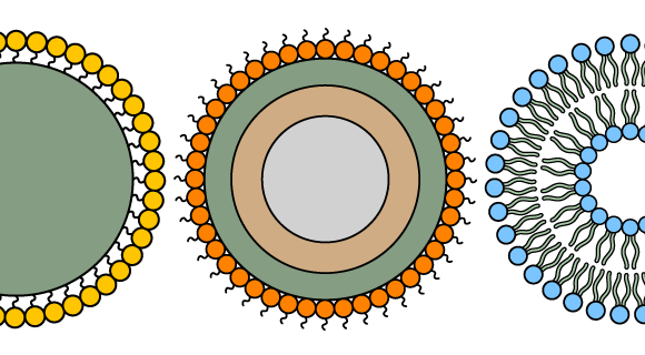
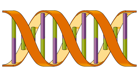
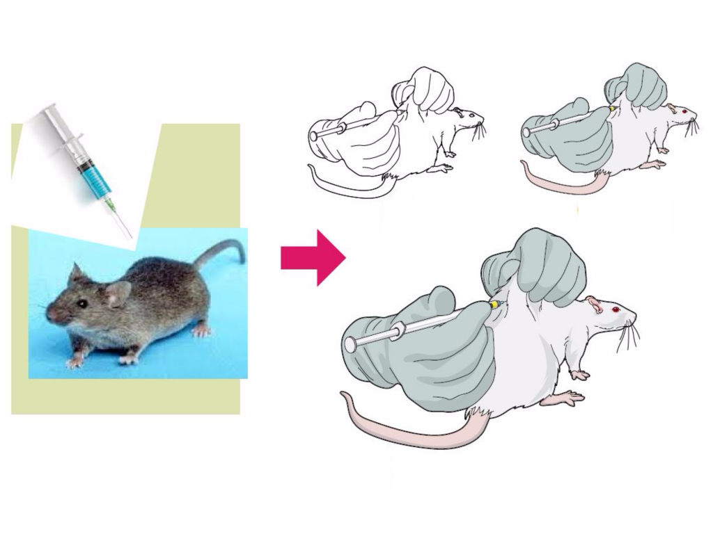 And we have a huge variety of categories. Summing up more than 3000 scientific illustrations. Not only, are users are free to fashion our illustrations according to their needs by using different versions, colours and styles.
And if you don’t have the time to build an infographic from scratch, you can use any of our templates! All of them are open and can be modified to fit the data you have.
Why Mind the Graph
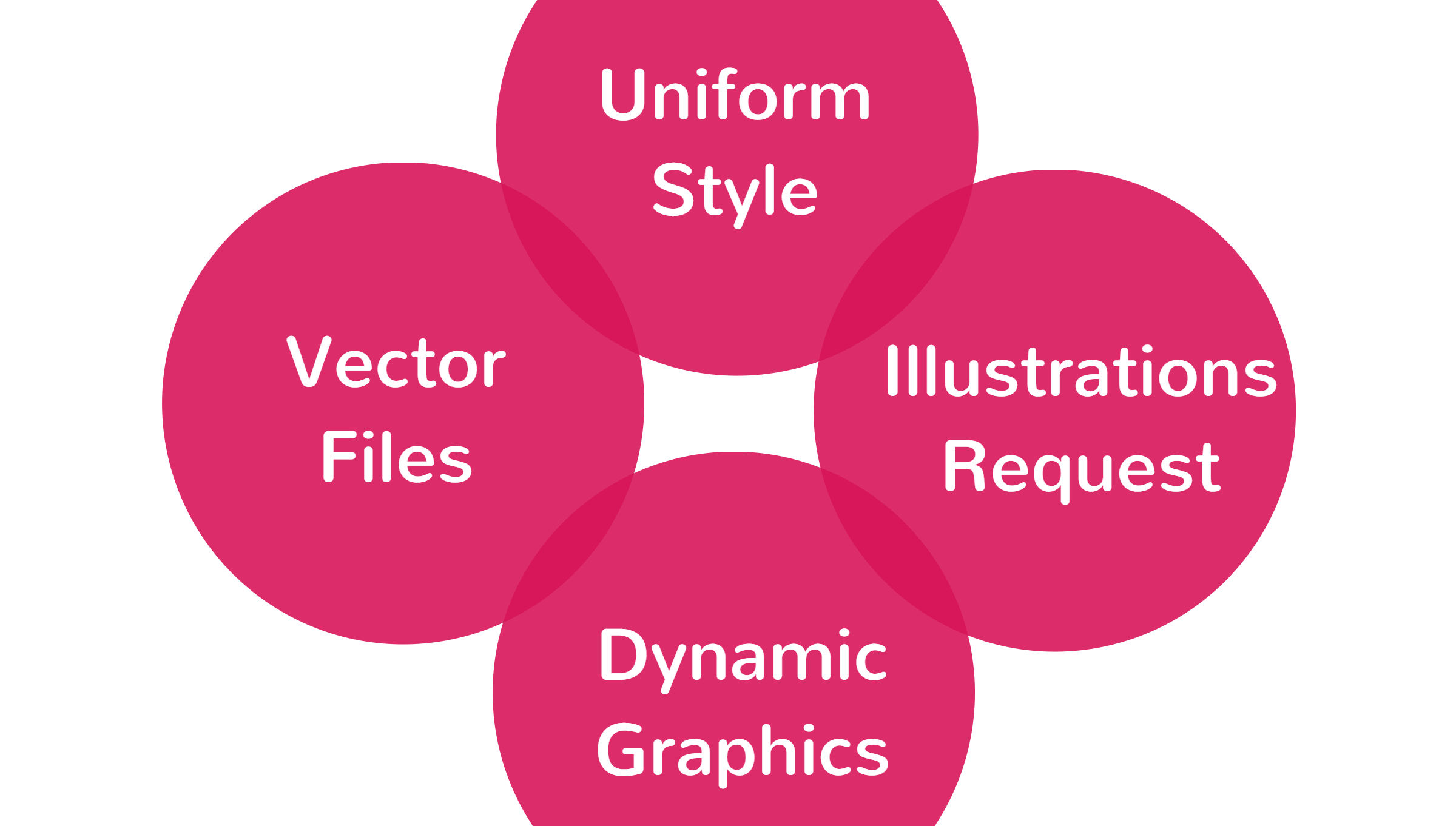
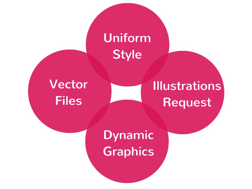
Mind the Graph have four main points that highlights us from any other tools:
Feeling ready to take your scientific work to a whole new level?

Subscribe to our newsletter
Exclusive high quality content about effective visual
communication in science.

