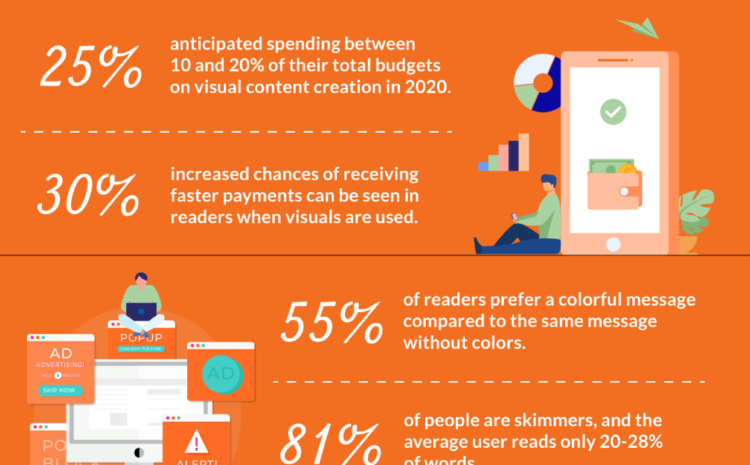
When it comes to visual information, there is a deadlock: some people have a hard time with interpreting data in a more visual format while others think it is the easiest way to comprehend information.
Alright, maybe the issue here is that the concept of visual information brings the idea of something complicated. Black and white graphs, tables and schemes that are poorly built and get the reader even more confused.
Well, if this is your case, let me tell you something: visual information should help you understand not get you confused. Probably the author of this kind of visual information had no idea what he or she was doing.
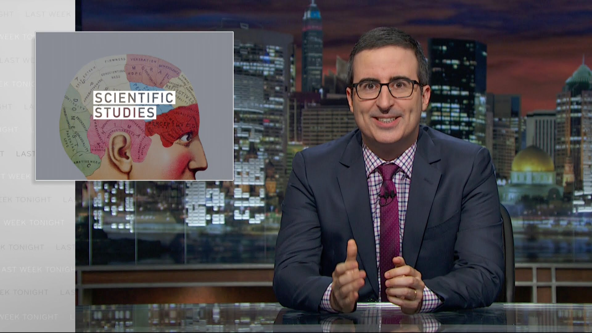
Unfortunately, the science world is full of bad figures and graphs. But how we, as scientists, could help making science communication more visual? And not only visual, but also functional?
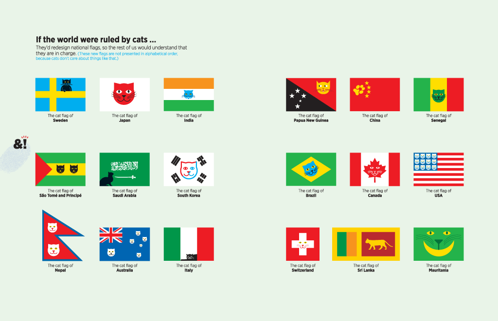
Here are two artists that can help us getting inspired to start. Both have a fun approach and show us that visual information can be something very simple.
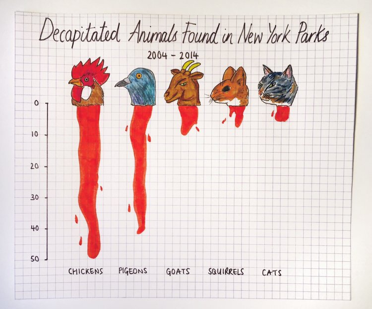
Mona Chalabi is a data journalist and presenter. She is the Data Editor of The Guardian US and a columnist at New York Magazine where she writes a regular advice column called “Dear Mona”. In 2016, Mona’s data sketches were commended by the Royal Statistical Society. The drawings, which are designed to make numbers more relatable, can be viewed on her Instagram account. – Mona Chalabi Website
Nigel Holmes may be the best example of a graphic artist who can take a complex or opaque concept, and make it not just understandable, but fun and inviting. In a 2015 episode of the PolicyViz Podcast, Holmes describes how using familiar, physical things as references can help people grasp difficult concepts. – Amanda Montañez for Scientific American
Science and creativity walk together. Let me ask you something, how would you draw if you had to explain to someone what you research is about?
Need some help with that? Let me:

Subscribe to our newsletter
Exclusive high quality content about effective visual
communication in science.

