Nothing is so good that it can’t be better, am I right? The last weeks our programmers have been working on several upgrades. The goal is to make Mind the Graph easier to use and with more features and scientific illustrations.
I already wrote about one recent update on the presentation tool, because now you can present your slides directly from Mind the Graph. Don’t miss the new tutorial.
Also, there is other amazing new feature that we are creating for you. We expect to launch it next month buuut I will show you a few spoilers today. Get ready!
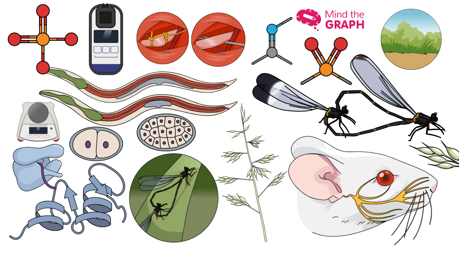
We have more than 8 thousands of scientific illustrations. But, which one do you like most?
As you know, we add new illustrations to the platform every week. This is amazing because on Mind the Graph you can find a complete library of scientific illustrations. However, as new illustrations are being added it can become harder to find an specific illustration.
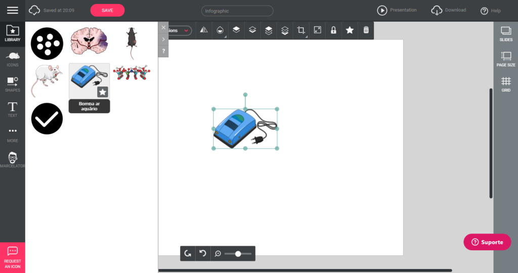
Well, in a few days you will can keep them just one click away. You will be able to create your own library with your favorite illustrations and shapes.
It is cool, right? I also got a few images to show you how the bookmark and personal library will work. Besides that, the full tutorial will be out soon!
If you are a mind the graph user, don’t worry, this feature will be available for you soon. I will keep you posted. If you aren’t a mind the graph user yet, but want to start improving your communication in science, you can try now for free:
Also, we are always open to your feedback and inputs on how our platform can get better and better. And we need your help! So give it a try and enjoy the new updates. If you any feedback, please report to contact@mindthegraph.com. By the end of the day, all we want is to improve science communication and make life of scientists easier.

Subscribe to our newsletter
Exclusive high quality content about effective visual
communication in science.


